- Customize the Standard Contest Section
- Use Multimedia Elements on Your Contest Page
- Partner With Other Brands
- Embed the Contest Into Your Main Site and Set up a Separate Landing Page
- Keep Your Entry Page Simple and Optimized for Mobile Devices
- Add a Human Touch
- Choose Your Giveaway Type
- Launch Your Next Giveaway With KickoffLabs
At Kickofflabs, we believe that giveaways are a powerful marketing tool when they’re used correctly. If you’re looking for inspiration to create a successful campaign, subscribing to our KickoffLabs YouTube channel is a must. We offer a variety of videos from expert best practices, campaign reviews, and valuable strategies to help you build engaging and effective campaigns
Additionally, don’t miss out on the KickoffLabs On Growth Podcast, where you can listen to top users share their experiences and success stories with KickoffLabs. By tuning in to the podcast, you can gain valuable insights from industry experts and learn how they utilized KickoffLabs to achieve impressive results.
If you’re getting set up to run your own sweepstakes or giveaway, here are 6 lessons we’ve learned from companies who have successfully run contests using our platform.
Customize the Standard Contest Section
Vacabee is bringing travel into the 21st century with the blockchain. Members are granted a unique NFT and optional Web3 login to gain access to the largest selection of unique travel options currently available. In addition, Vacabee lets users pay for vacations with both fiat and cryptocurrencies and helps users save money and time while earning rewards.
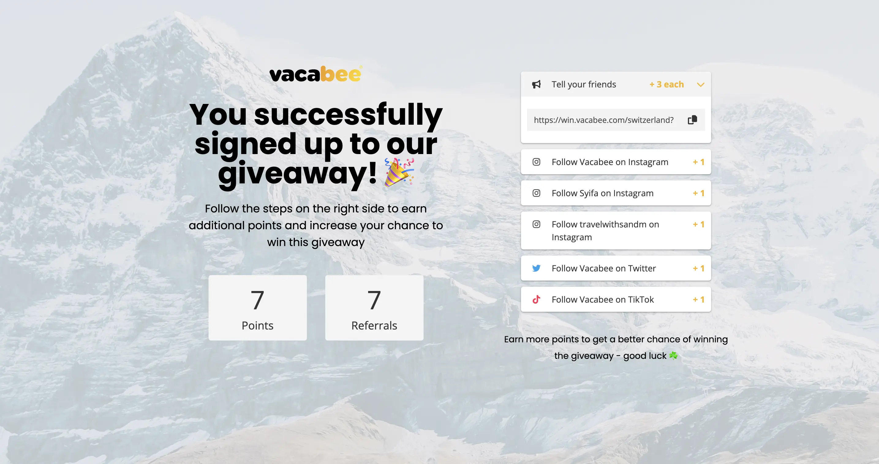
Much as the name would suggest, Vacabee’s Switzerland Valentines Day Giveaway was held in February near Valentine’s Day, and the prize was a weekend for 2 in Switzerland. To enter, participants needed to provide their name, email, Instagram username, and language (English or German). Users could earn additional entries by sharing their unique referral link, following Vacabee’s official social media accounts, and following members of the Vacabee team on Instagram. These contest actions help maximize engagement and viral sharing.
Vacabee used one of our standard Kickofflabs forms for their contest section, but we like how they really made it their own. In addition to explaining the prize and how to accumulate points, Vacabee included a Secret Tip: “Try to get as many of your friends to sign up for the Giveaway, so boost your score to the absolute max.” This wording made it sound like they were speaking directly to the person signing up. This is a great way to engage participants and motivate them to share the contest with as many of their friends as possible.
Use Multimedia Elements on Your Contest Page
Northern Tool + Equipment is a national brand that manufactures and sells a wide range of products designed to maintain buildings and property. Their motto is “Quality tools for serious work.” You’ll find farming and construction equipment, power tools, hand tools, trailers, generators, and more among their offerings.
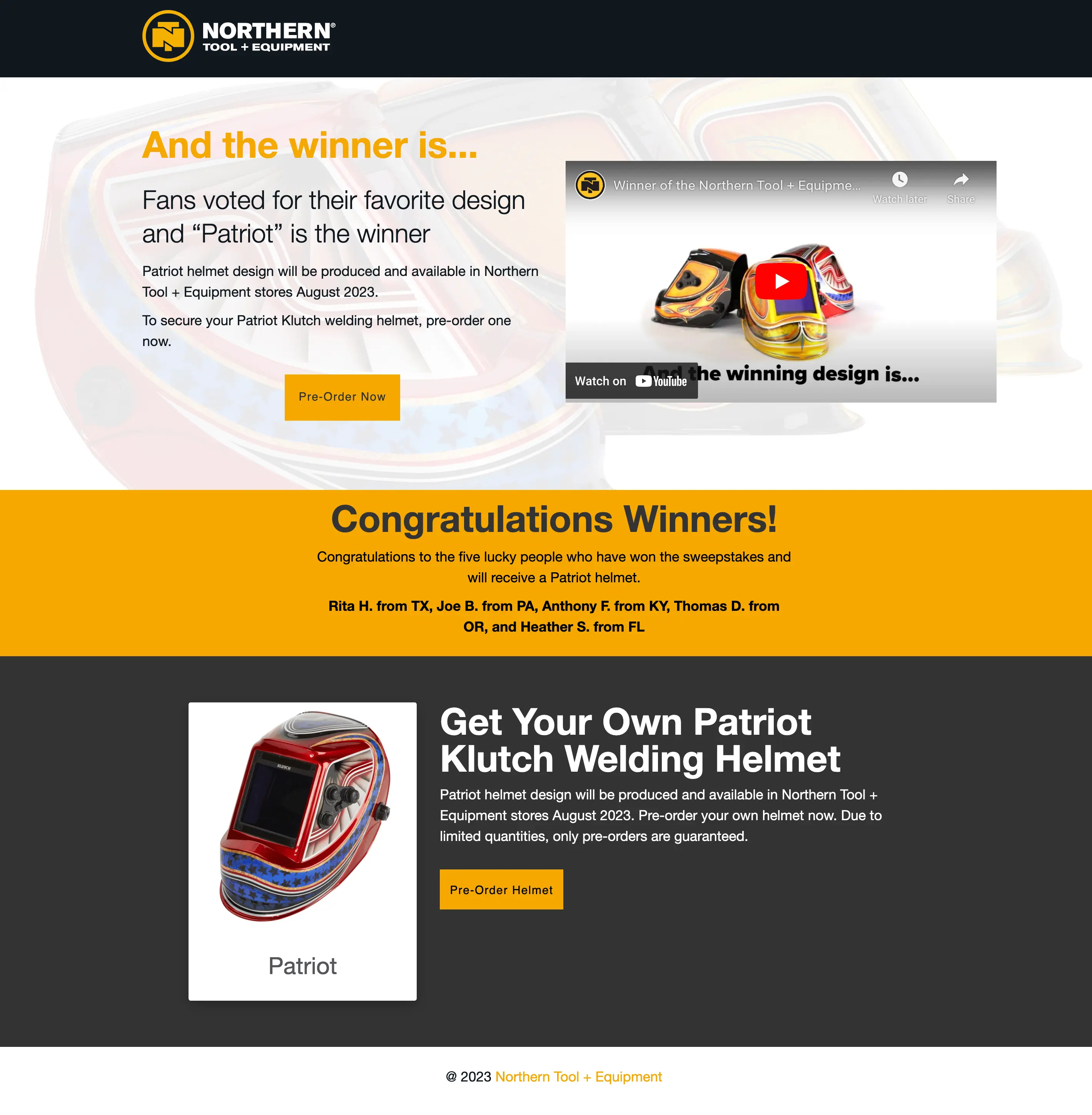
For their Klutch Helmet Design Sweepstakes, Northern Tool + Equipment commissioned legendary painter Dave Perewitz to design three concepts for custom-painted Klutch welding helmets. Customers could vote on their favorite design to be sold in Northern Tool + Equipment stores. Those who voted were entered into a contest to win one of the helmets for free.
At the top of the page, where you would usually find a picture, Northern instead opted to include a video featuring the three different helmet designs and describing them in more depth. However, they didn’t make watching the video mandatory to understand the competition rules or the prize. Instead, they chose a thumbnail that showcased all three designs and included all the relevant information on the contest page.
Multimedia elements, like videos, are a great way to grab viewers’ attention and get them excited about the contest. However, you still want all participants to be able to successfully enter the contest even if they can’t or don’t want to watch a video.
Partner With Other Brands
The Pickleball Clinic describes itself as “America’s fastest-growing pickleball community.” The site offers a forum where pickleball players can connect with each other, get tips to improve their game, find out about upcoming tournaments, and more. The Pickleball Club also has a thriving YouTube Presence and recently introduced a weekly newsletter for subscribers.
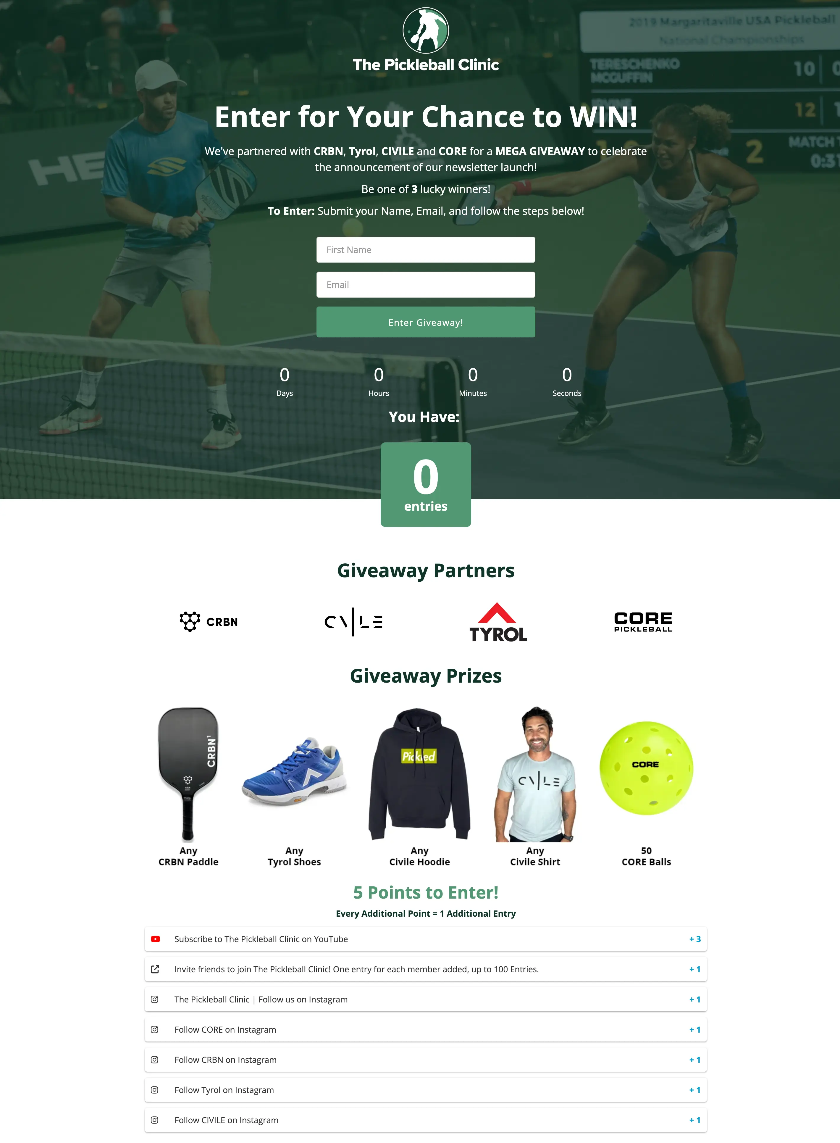
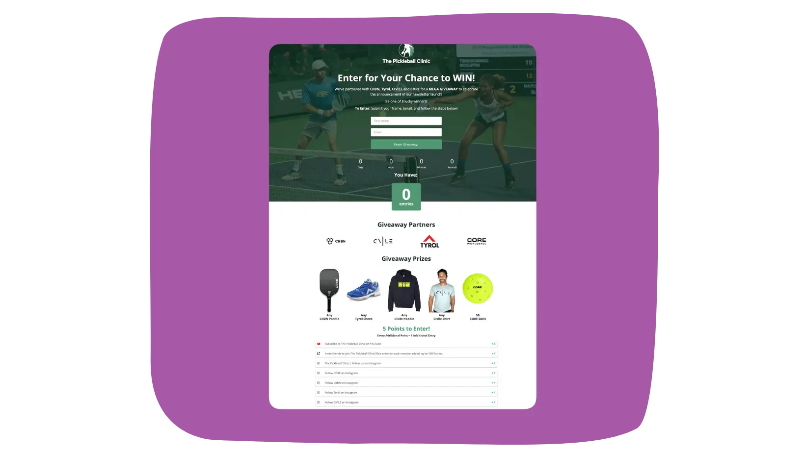
To celebrate the launch of their newsletter, The Pickleball Clinic hosted a giveaway in partnership with sporting goods brands CRBN, Tyrol, Civile, and CORE Pickleball. The prize included any CRBN pickleball paddle, any pair of Tyrol shoes, any Civile t-shirt and hoodie (one of each), and 5 CORE pickleballs. To enter, users had to provide their name and email address. The initial entry was worth 5 points. Participants could earn an additional point each time they completed an action like subscribing to the Pickleball Clinic on YouTube, inviting friends via a referral link, or following any of the participating brands on Instagram.
When you partner with other brands to do a giveaway, the expectation is that both of you will promote the contest across your marketing channels. This way, you both get in front of the other’s audience. This is a much more effective means of reaching new prospects than trying to drum up interest yourself. When considering potential partners, look for brands whose audience overlaps with yours to some degree so their audience is likely to be interested in your products or services. A leaderboard giveaway works particularly well for partnerships, as it encourages competition between participants.
Embed the Contest Into Your Main Site and Set up a Separate Landing Page
Sippd is “your personal sommelier.” The app uses AI to analyze an individual’s tastes and past wine history to recommend wine. Users can set a budget range for their search, locate restaurants in their area that serve wines they enjoy, and even save wines they have enjoyed for future reference. In addition, Sippd is about to launch a personalized wine subscription service called the Sippd Wine Club.
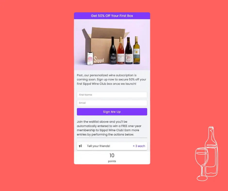
Sippd is currently running a contest for a year’s subscription to promote their new Wine Club. To enter, users must provide their name and email address. To earn additional entries, participants can invite friends for 3 points each or download the app or follow the brand on Instagram for one additional entry each. While there is only one grand prize winner, everyone who enters will receive a promo code for 50% off their first box.
Many brands design a dedicated webpage solely for their contest where participants can learn more about the rules, deadlines, eligibility requirements, and prizes. Sippd has one of these landing pages, but they have also created a pop-up box on their main website that automatically opens when users navigate to their home page. This pop-up box makes it easy and quick for Sippd to collect visitors’ contact information—which is really the point of running any contest—as soon as they enter the site. This makes it easier to retarget users with ads later. There is also a dedicated landing page where participants can learn more about Sippd as a brand and the contest more specifically.
Keep Your Entry Page Simple and Optimized for Mobile Devices
Selkirk Sport is a family-owned pickleball equipment company located in the Pacific Northwest. They sell high-quality, innovative pickleball paddles and equipment, promote the sport, and try to get more players involved. Their site offers resources to help users properly choose and care for their equipment and become USAPA ambassadors. They also sponsor pro pickleball players.
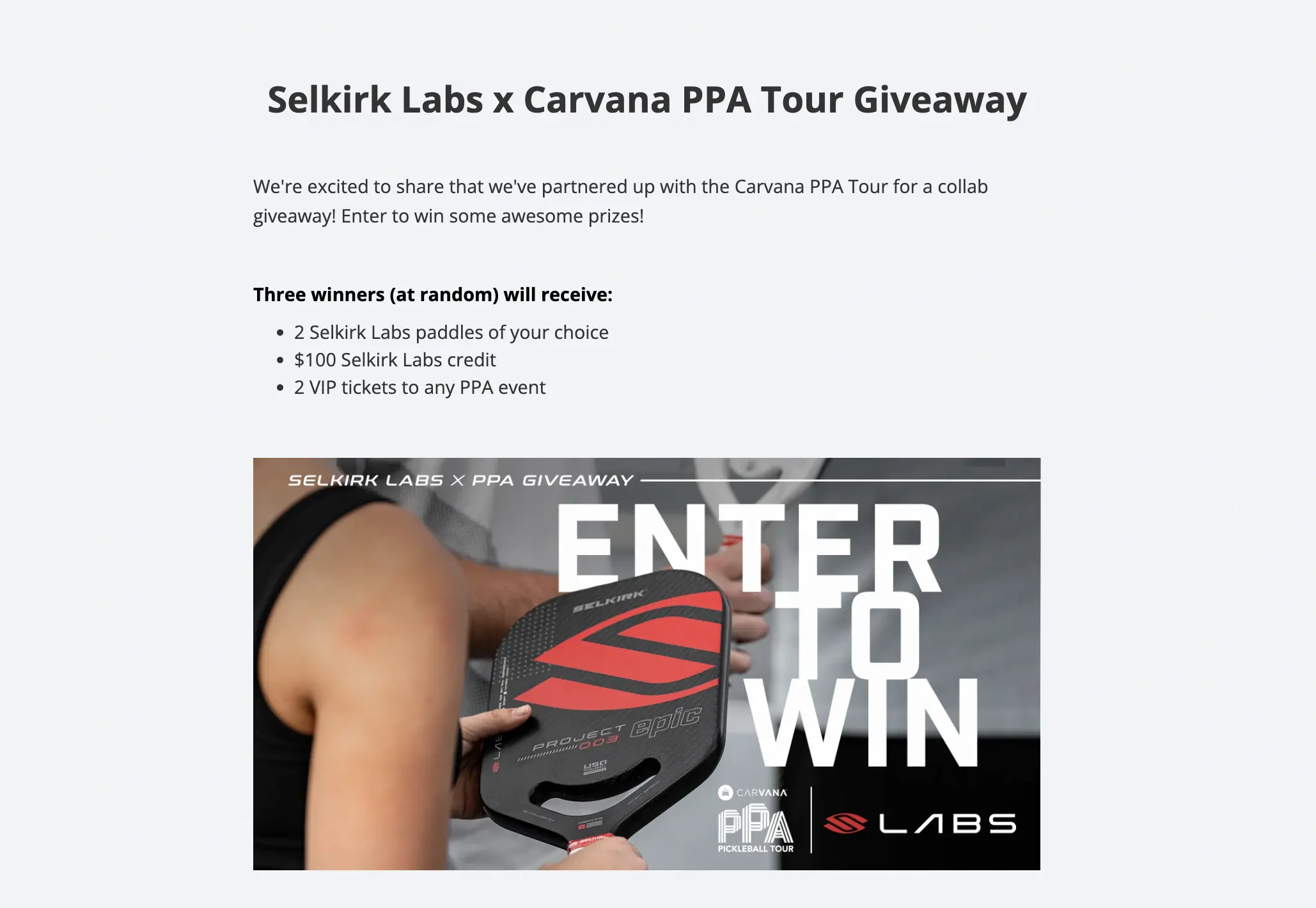
Selkirk partnered with pro pickleball players Mary and Maggie Brascia to give away one Avalee paddle and a $100 Selkirk gift card to three lucky winners. To enter, users had to provide an email address, first and last name, and their Instagram handle and confirm that they had followed Selkirk Sport, Selkirk TV, Maggie Brascia, and Mary Brascia on Instagram. In addition, users could earn additional entries by sharing the contest on various platforms, including email, Facebook, and Twitter.
One thing that stood out about Selkirk’s contest landing page was how simple it was. The information was presented in one streamlined column with the hero image at the top. This format is best for viewing on a mobile device, which is helpful as most of our contest page views are on mobile. This is because brands typically run ads for contests on social media, and participants share the contest on social media or via text for additional entries. Therefore, fewer people will complete the entry process if the contest page is hard to navigate on mobile.
Add a Human Touch
Big Island Coffee Roasters became a business by accident. After Kelleigh Stewart and her family moved to a farm already growing coffee trees, the opportunities started rolling in, and the business practically built itself. They built a vertically integrated coffee roasting and processing center and began selling their coffee wholesale to Hawaii’s hotels and restaurants. When COVID shut down the tourism industry, Big Island Coffee Growers pivoted to e-commerce.
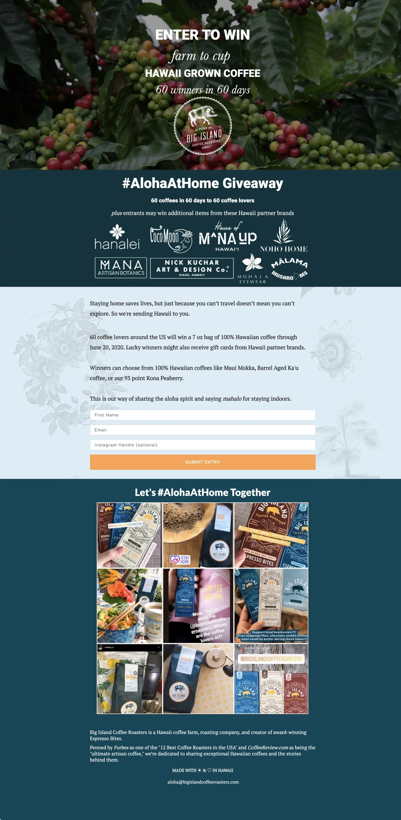
To grow their online presence for their new e-commerce business, Big Island Coffee Roasters hosted a competition to give away one 7 oz bag of their coffee each day for 60 days. They also partnered with other Hawaiian brands to giveaway gift cards and additional items. To enter, participants needed to provide their name and email address. There was also an option to provide an Instagram handle as well. Over the course of their contest, Big Island Coffee Roasters doubled their email subscriber list.
With each bag of coffee, Kelleigh included a handwritten note thanking the winner for participating in the contest and supporting Big Island Coffee Roasters. This adds a human touch that helps customers see the people behind the brand and is more likely to convert a one-time winner into a lifelong customer. Kelleigh and the team and Big Island Coffee Roasters have even stayed in contact with some of the winners. Using a fair winner selection tool ensures credibility and trust with all participants.
Choose Your Giveaway Type
Now that you’ve seen these successful examples, it’s time to choose the right giveaway format for your goals:
- Bonus Entry Giveaway - Classic sweepstakes with viral sharing opportunities like Vacabee and Big Island Coffee Roasters
- Leaderboard Giveaway - Gamify with competitive rankings perfect for brand partnerships
- Launch Giveaway - Combine with product waitlist like Sippd’s Wine Club launch
Key features to implement these tips successfully:
- Contest Actions - Drive engagement with social follows, shares, and referrals
- Pick a Winner - Fair random selection that builds trust
- Fraud Detection - Protect your giveaway from fake entries
- Email Marketing - Nurture leads collected through your giveaway
- Facebook Integration - Leverage social media for wider reach
Launch Your Next Giveaway With KickoffLabs
Ready to grow your audience with a Kickofflabs contest? Get started for free today with our extensive library of landing page templates, to ensure the success of your next giveaway. With a wide range of professionally designed templates to choose from, you can effortlessly create stunning landing pages that captivate your audience and drive conversions. Whether you’re looking for a sleek and modern design or a playful and vibrant layout, KickoffLabs has the perfect template to match your brand and campaign objectives. Take advantage of this invaluable resource and elevate your giveaway to new heights of engagement and success. Reach out to our support team at support@kickofflabs.com for assistance with getting started.
Read more Running Viral Giveaways with the next chapter:
13. Sweepstakes Sites
Learn about sweepstakes sites & if you should use them.
