Contents
- What the best waitlist landing pages have in common
- 1. Robinhood: sell the position, not the newsletter
- 2. Harry’s: make rewards visible before people share
- 3. Monzo: make the queue feel alive
- 4. Notion AI: let the demo carry the promise
- 5. Linear: use the waitlist to protect focus
- 6. Dropbox: reward people with more of the product
- 7. Pronti.AI: put the referral loop behind a clear outcome
- 8. Swingly Toys: bridge the waitlist to the real launch event
- 9. Blacksteel: match page depth to a considered product
- 10. Token: explain a new category with motion
- 11. The 5th: use a countdown only when the deadline is real
- 12. Made In: make the physical product the hero
- 13. Going Pro Yoga: offer founding-member value
- 14. Float: put social proof beside the decision
- 15. Framer: let the landing page demonstrate the product
- Choose the right mechanic for your launch
- A waitlist landing page template you can copy
- Waitlist landing page FAQ
- Build the page, then build the loop
Most waitlist landing pages fail for a boring reason: they ask people to wait without making the wait valuable.
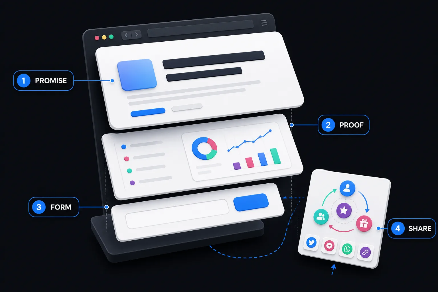
The good examples do four jobs. They make one sharp promise, show enough proof to feel real, collect as little information as possible, and give the new subscriber a reason to share.
Quick answer: A high-converting waitlist landing page needs a specific outcome-driven headline, visible product proof, one primary signup action, and a clear post-signup next step. The strongest examples add queue position, milestone rewards, early-access status, or a useful double-sided incentive. Copy the mechanic—not the brand’s color palette or clever headline.
If you want to build the full system instead of another dead “coming soon” page, start with a viral waitlist campaign. Then use these examples to choose the right page structure and referral mechanic.
What the best waitlist landing pages have in common
Before the examples, here is the test.
- Promise: Can a stranger explain the product after five seconds?
- Proof: Is there a screenshot, product photo, demo, credible number, or specific reason to believe?
- Form: Is there one obvious action with only the fields you actually need?
- Share: After signup, is there a reason and an easy way to invite someone else?
That fourth job is the one most pages miss. A plain form captures demand. A referral waitlist can compound it.
A note on the teardowns: launch pages disappear when products go public. Several examples below are documented historical snapshots, not claims about a company’s current homepage. We link the original company’s account when one is available and label third-party archives as such.
1. Robinhood: sell the position, not the newsletter
Robinhood’s original page was almost aggressively simple: commission-free investing, an email field, and access to the line.
The real product appeared after signup. People saw their queue position and could move forward by referring friends. That turned scarcity into an action instead of decorative “limited access” copy.
KickoffLabs’ Robinhood waitlist breakdown documents the campaign’s path to roughly one million people waiting before launch.
Steal this: If earlier access is genuinely valuable, show the subscriber where they stand and exactly how referrals change the position.
Do not steal: A fake queue. If position has no effect on access, people will notice.
2. Harry’s: make rewards visible before people share
Harry’s used a two-page launch experience. The first page collected the email. The second showed a unique referral link and a ladder of product rewards.
The reward ladder mattered because the next win always looked reachable. One referral was not an abstract “entry.” It was progress toward something the audience already wanted.
In his original campaign account, Harry’s co-founder Jeff Raider explained how the team seeded the launch through personal outreach and built sharing into the experience. The campaign collected more than 100,000 emails in seven days, an estimated 85,000 of them valid. Read the original Harry’s prelaunch write-up on Tim Ferriss’s blog.
Steal this: Put the reward ladder on the confirmation page and show current progress.
Do not steal: Expensive physical rewards before checking fulfillment math.
3. Monzo: make the queue feel alive
Monzo made waiting visible. The experience showed how many people were ahead, how many were behind, and a direct way to get bumped up.
That is better than a generic “you’re on the list” message because the subscriber can see movement. The queue becomes a small game.
Monzo’s own launch updates also kept people informed while cards rolled out over time. That communication matters: a position is motivating only if subscribers believe access is actually moving. See Monzo’s launch update.
Steal this: Pair queue position with regular rollout updates.
Do not steal: A queue with no timeline, movement, or explanation.

4. Notion AI: let the demo carry the promise
Notion did not ask people to imagine a vague AI assistant. Its launch material showed AI working inside a product millions already understood.
That reduced the explanation burden. The waitlist CTA sat beside concrete demonstrations, and the existing Notion product supplied trust.
Notion says the AI waitlist reached one million people in five weeks and approached two million before general availability. The useful part is not the giant number. It is what Notion did with the demand: the team used the alpha to learn how people actually used the product and changed the messaging. Read Notion’s launch lessons.
Steal this: Show the product doing one valuable thing above the fold.
Do not steal: A cinematic teaser that never explains the use case.
5. Linear: use the waitlist to protect focus
Linear’s waitlist was not just a hype machine. It was an intake valve for a controlled beta.
The team invited small groups, watched how different target users worked, gathered feedback, and widened access deliberately. Linear’s own retrospective calls the waitlist a tool for maintaining focus and finding the right early adopters. Read Linear’s account of its early waitlist.
Steal this: Ask one qualification question if the answer will determine who gets invited or what you build next.
Do not steal: Ten “qualification” fields that turn a signup into a job application.
6. Dropbox: reward people with more of the product
Dropbox is a referral example more than a classic prelaunch page, but its incentive is too useful to ignore.
Both sides get more storage. The reward is immediate, easy to understand, and makes the product more useful. Dropbox still documents the same core exchange on its official referral program page.
For a waitlist, the equivalent might be extra launch credits, a larger usage allowance, priority access for both people, or a feature unlock.
Steal this: Use product value before gift cards.
Do not steal: A reward unrelated to what you sell. It attracts people who want the prize, not the product.
7. Pronti.AI: put the referral loop behind a clear outcome
Pronti.AI’s story works because the page was not selling “a waitlist.” It was selling help deciding what to wear.
The referral mechanic accelerated a promise people already understood. In the KickoffLabs customer conversation, Pronti.AI describes growing from 3,000 to 80,000 users with the waitlist playing a major role. Read or listen to the Pronti.AI story.
Steal this: Write the outcome first. Add the referral mechanic second.
Do not steal: Leading with “Join our viral waitlist.” Nobody wants your growth tactic. They want the result.
8. Swingly Toys: bridge the waitlist to the real launch event
A crowdfunding waitlist has a specific job: create enough warm demand to move fast when the funding page opens.
Swingly Toys used a KickoffLabs campaign before its Kickstarter and went on to raise more than $17,000 in pledges. The useful design lesson is sequencing. The landing page is not the finish line; it prepares subscribers for the date, offer, and action that come next. See the Swingly Toys story.
Steal this: Name the next event. Tell people what joining now gets them on launch day.
Do not steal: Collecting emails for months without a launch sequence.
9. Blacksteel: match page depth to a considered product
Blacksteel combined early access, milestone rewards, and paid traffic. Its page gave visitors enough product context to decide whether the offer fit before asking them to participate.
That campaign collected more than 10,000 leads while spending about $10 per day, according to the KickoffLabs Blacksteel customer story.
Steal this: If your product needs explanation, add proof and detail below the form instead of cramming the hero.
Do not steal: A long page that repeats the same promise six times.
10. Token: explain a new category with motion
Token’s historical prelaunch page had a harder job than “new razor coming soon.” It needed to explain a smart ring that stored credentials.
The page used an explainer video because a static product photo could not show the full interaction. That is the right reason to add video: it removes confusion.
Steal this: Use a short demo when the product’s behavior is the proof.
Do not steal: Autoplay video that delays the form, hides the promise, or makes mobile visitors download a small movie.
11. The 5th: use a countdown only when the deadline is real
The 5th used launch pages for limited watch releases and collections. A countdown made sense because the product drop happened at a real time.
The timer did not manufacture urgency. It clarified it.
Steal this: Tie a countdown to a launch, cohort opening, inventory release, or actual founder-price deadline.
Do not steal: A timer that resets when the visitor reloads. That is not urgency. It is a tiny public lie.
12. Made In: make the physical product the hero
A documented Made In cookware waitlist example puts the limited product front and center. That is the correct hierarchy for a physical drop: show the object, explain why it is special, then capture demand.
Moosend’s waitlist landing page roundup preserves the campaign snapshot.
Steal this: Use real product photography, expected availability, and a concrete subscriber benefit.
Do not steal: Abstract launch art when buyers need to inspect the thing.
13. Going Pro Yoga: offer founding-member value
Going Pro Yoga offered founding members free lifetime access, according to Kit’s coming-soon landing page examples.
That is stronger than “be the first to know.” It answers the subscriber’s obvious question: why should I join before everyone else?
Steal this: Give early believers a durable benefit—founder pricing, lifetime access to a limited tier, a locked-in allowance, or a meaningful bonus.
Do not steal: An unlimited promise your future unit economics cannot support.
14. Float: put social proof beside the decision
Float’s documented coming-soon page placed a specific signup count near the access form. The proof appeared at the moment of hesitation, not buried near the footer.
ConvertFlow’s coming-soon examples preserves the page and its “join … and 2,368 others” pattern.
Steal this: Put one credible proof point beside the form: real member count, known customers, beta quote, or a concrete product milestone.
Do not steal: A fake counter. Start with a founder quote, prototype, or transparent “first 100” offer if the list is small.
15. Framer: let the landing page demonstrate the product
Framer’s prelaunch page reportedly used the product’s own interactive strengths. Visitors could experience motion and responsiveness instead of reading claims about them.
LaunchList’s 2026 waitlist examples documents the pattern.
Steal this: If your product creates something visible, let the page itself prove the output.
Do not steal: Interaction for interaction’s sake. The form still needs to be obvious, fast, and usable without a mouse.
Choose the right mechanic for your launch
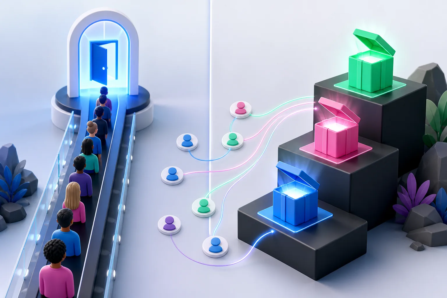
The examples break into four useful models:
- Queue: Robinhood and Monzo. Best when earlier access has real value.
- Milestones: Harry’s and Blacksteel. Best when several attainable rewards can motivate repeat sharing.
- Product reward: Dropbox and Going Pro Yoga. Best when you can give more of what people already want.
- Controlled beta: Linear and Notion AI. Best when the waitlist helps you select users, learn, and release in waves.
Do not choose the mechanic because a famous startup used it. Choose it because the incentive matches your launch.
A waitlist landing page template you can copy
Use this as the first draft—not the final copy.
Headline: Get [specific outcome] without [painful alternative].
Subhead: Join the early-access list for [product]. We are inviting [audience] in [honest rollout window].
Proof: Show one product image, demo, result, or reason to trust the team.
Form: Email address. Add one segmentation question only if you will use the answer.
CTA: Join the early-access list.
Confirmation: You are in. Your current position is [number]. Invite friends with this personal link to [move up/unlock reward/get access together].
For the full build sequence, use our pre-launch waitlist guide and waitlist launch validation guide.
Waitlist landing page FAQ
What should a waitlist landing page include?
Include one clear product promise, proof that the product is real, a short signup form, an honest description of what happens next, and a post-signup action. If referrals affect access or rewards, explain the rule before asking people to share.
How long should a waitlist landing page be?
As short as the decision allows. A familiar product with a strong visual may need one screen. A new category, expensive physical product, or high-trust service may need demos, FAQs, founder credibility, and rollout details below the fold.
Should I show the number of people on my waitlist?
Show it when the number creates confidence and is accurate. If the list is still small, use different proof: a working prototype, a customer quote, a transparent founder story, or a limited founding cohort.
Should a waitlist have referrals?
Not always. Add referrals when sharing can improve access, unlock a relevant reward, help both people, or support a real launch goal. Skip them when access must be assigned by qualification, geography, safety, or capacity.
What happens after someone joins?
Immediately confirm the signup, explain the rollout, send a welcome email, and show the next action. Then keep the list warm with useful product updates. Silence turns an excited subscriber into an old email address.
Build the page, then build the loop
A sharp hero can earn the first signup. It cannot create a launch by itself.
The launch comes from what happens next: proof, follow-up, progress, referrals, and a real reason to care before the product is widely available.