For a long time, we’ve been doing free 1-to-1 consultations with new paying customers to help them get more conversions. We wanted to see if we could take this a little further and start helping a broader audience. So we decided to start doing a live landing page review series, this is now the 6th in the series.
Find the prior reviews here:
- 9 Landing Page Teardowns
- 9 More Landing Page Teardowns
- 7 In-Depth Landing Page Reviews
- 15 Landing Page Reviews
- 9 Landing Page Designs Reviewed
It’s always a lot of fun, the only caveat is that there are always a ton of improvements that every campaign can make; that would involve how the pages are marketed, advertised, etc. We’re going to focus on the 80% changes, the ones that will make the most improvement based on what we can see on the landing pages.
Be sure to watch the full video for plenty more marketing advice.
1 – HandPick
What we like
- Simplicity of the page
- short, watchable video that entices people to hit play
- It’s mobile responsive
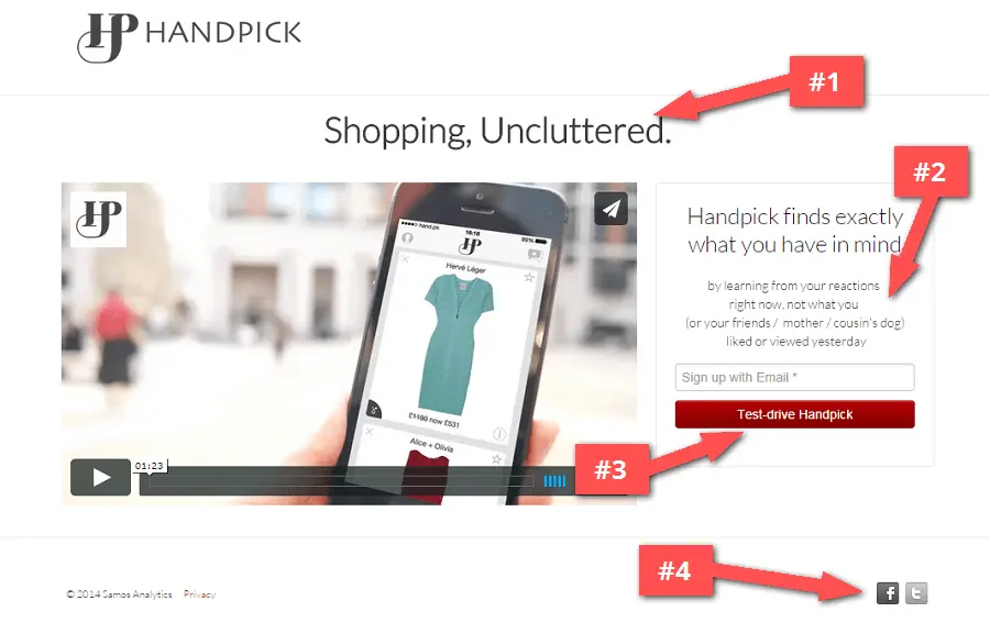
Things to improve
#1 – Tagline is too simple. You want to have some more context on the page, like the video does to explain your service. Maybe using a tagline underneath you main headline encouraging people to watch your video.
#2 – Add an incentive. Why should people sign up today?
#3 – Customize your share message and remind about the incentive. People need to have a great reason for sharing your page with their friends. Even if it’s a simple goal like “Get 1 friend onboard and we’ll give them something for free”.
We had a customer recently that didn’t include any kind of incentive where they were getting around 20% of the people to bring on additional referrals. When they added a simple incentive, that # shot up to 60% of the people coming through personal referral links!
It’s really a huge win to get people to think about the second step and add the incentive there.
#4 – Leave out the social media buttons. Especially if you’re just starting out and don’t have a large following, don’t expect your landing page to generate thousands of fans & followers. At this point, focus only on getting the email and avoid people clicking away from the page.
However, your thank you message should always include social share options.
http://www.handpick.co
2 – Kunvay
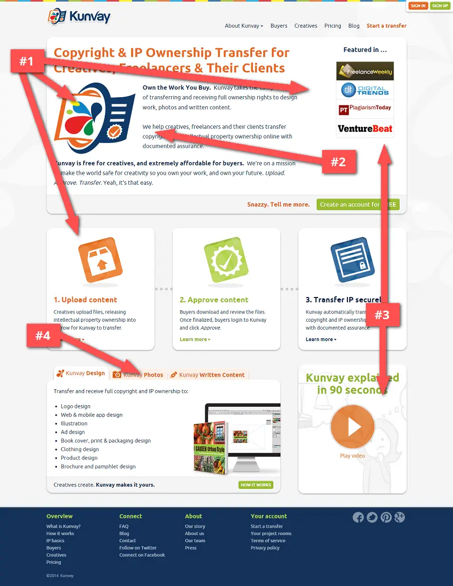
Things to improve
#1 – Eyes get torn in too many directions. The main call-to-action is buried underneath all the graphics. The first thing to grab people, after they see a teaser headline, should be your call-to-action button.
#2 – Stay away from “we”. The first lines of copy are talking about your company. Focus on writing the headlines and the first two paragraphs from the perspective of your customer. Don’t say “WE”, say “YOU”, and relate to their business problem first instead of trying to sell your solution.
#3 – Placement matters. There are several elements that we’d recommend experimenting with. Perhaps the most effective change would be placing the explainer video more prominently, in place of the “Featured in” elements.
#4 – Don’t constrain the page. We are not fans of tabs, they only work to hide content. You’re better off creating separate sections on the page.
https://www.kunvay.com
3 – Phase2Body
What we like
- Great faded background image that hints at the product
- The page is mobile responsive… of course it is, it’s a KickoffLabs page :)
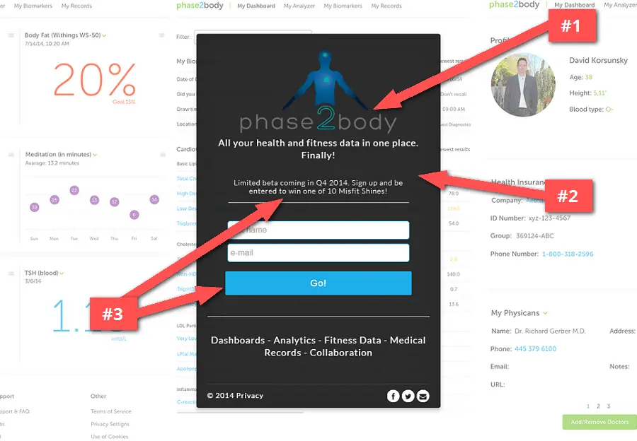
Things to improve
#1 – Your logo needs to stand out. The logo could be easier to read if the text was a whiter color. When designing your logo, a great option is to design a normal color logo, a black colored logo (for light backgrounds), and a white colored logo (for dark backgrounds).
#2 – Clean up the fonts. Limit the font choices and colors on the page for a cleaner overall look.
#3 – Link your incentive. There is a great prize that is buried in the text. This isn’t as obvious to visitors as it should be. Use your call-to-action text imply there is a contest on the page. If people happened to miss the incentive, they see that there is one in the button text.
http://www.phase2body.com
4 – LifeLogger
What we like
- Minimal design with a focus on the form
- Great headline that makes it easy to understand what they’re doing
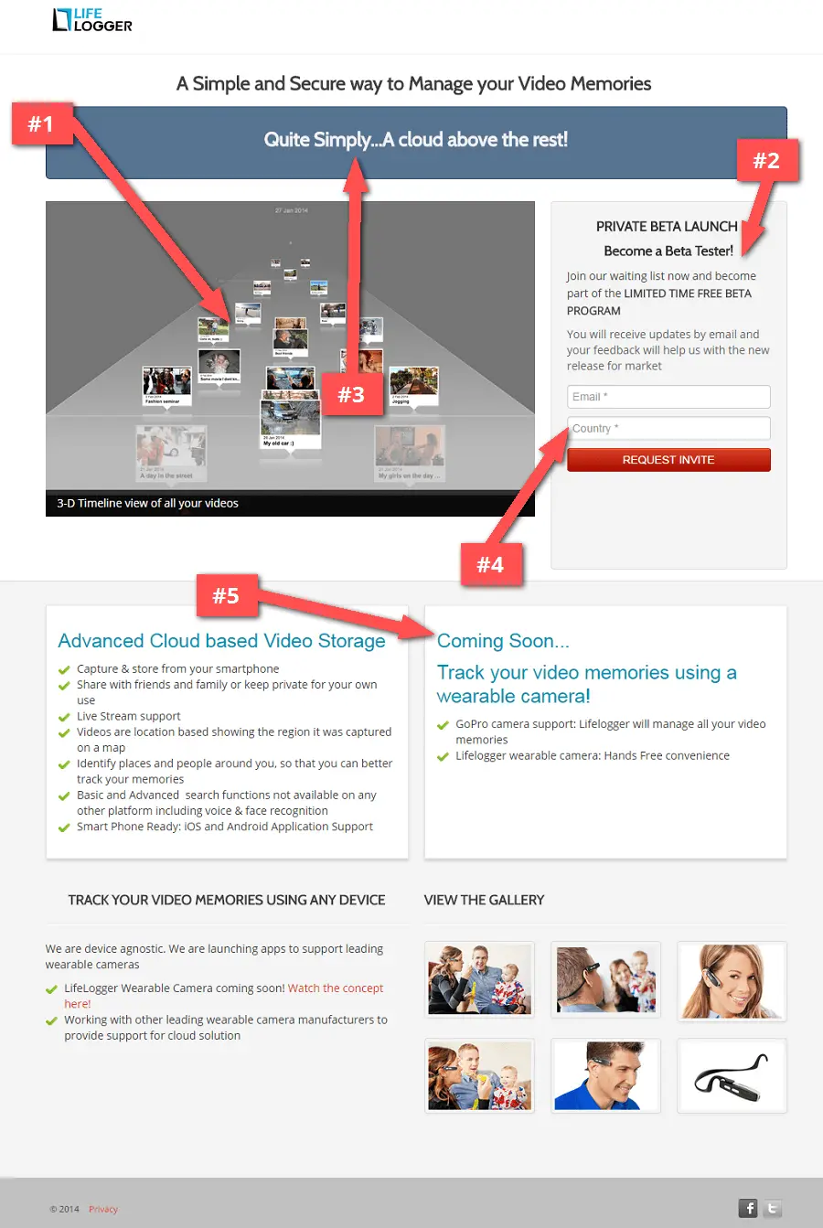
Things to improve
#1 – Fix slow loading images. Due to their file size, the images took an awful long time to load. When placing images on the page, make sure that they are sized appropriately and optimized before you upload!
#2 – Give a real reason to sign up. There is no clear incentive on the page. What’s in it for people now?
#3 – Match the tagline. Saying you’re “above the rest” can be said about any company, it’s not specific to you. Think about how you’re using that space to augment your message and speak to your visitors.
#4 – Collect only useful data. Generally, any additional required information on the form is a little out of place. If you’re a KickoffLabs customer, you’ll notice that we automatically record valuable information about your signups, so you don’t have to ask these unnecessary questions.
#5 – Remove misleading headlines. You probably don’t need the “Coming Soon”. The product is in beta, but this makes it seems as if the product is not ready at all.
5 – Body Of A Spartan
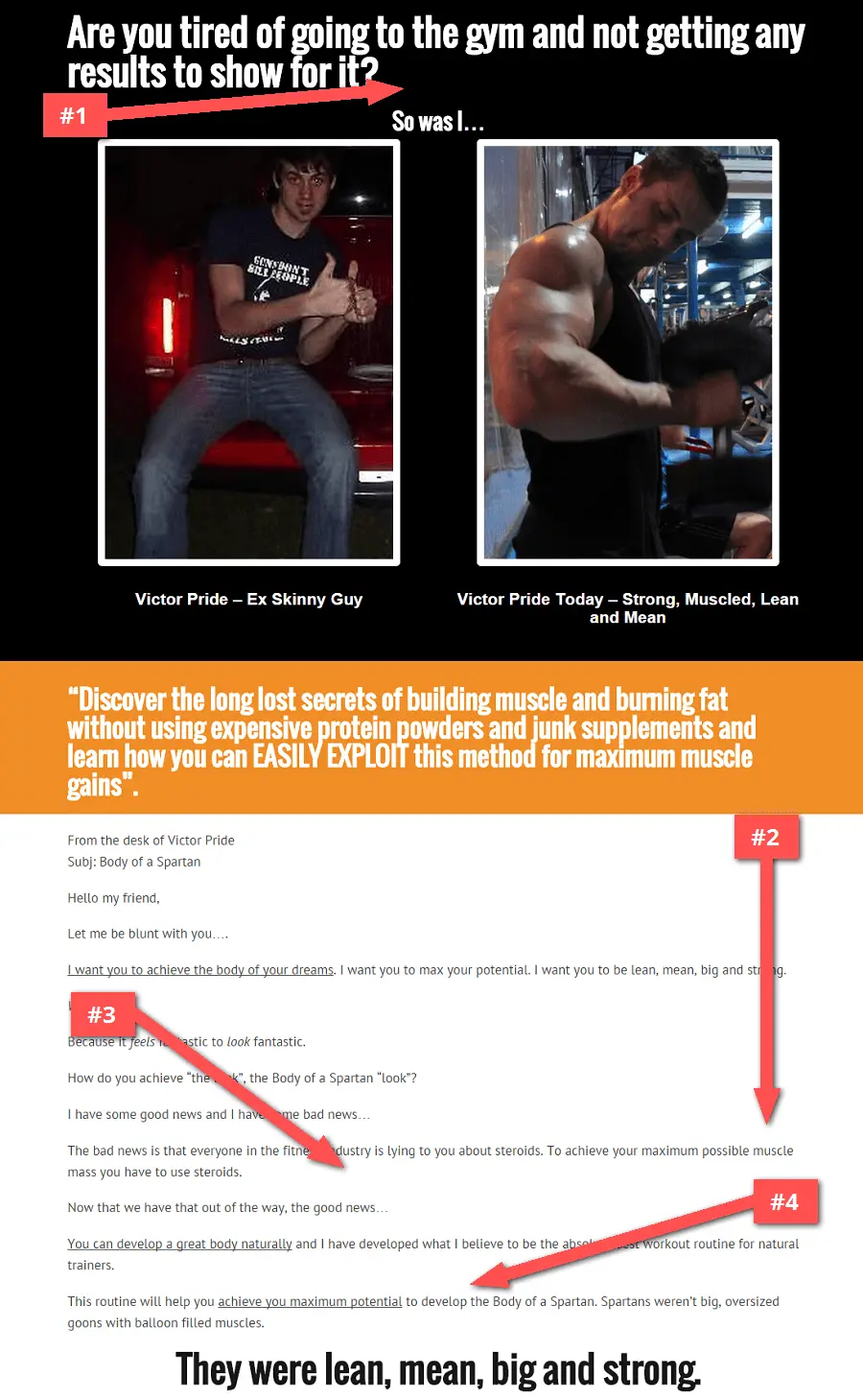
Things to improve
#1 – Design for the sale. A sales pitch can work, but only if you design for it. Even changing the color of the header would have a big impact in not making the page feel so seedy.
#2 – Price = Page length. The page is too long for a sale that is $25. Usually these types of long sales pages are used to convince people in paying for high-ticketed items. If you want to sell something, the page copy should scale appropriately to the size of the sale.
#3 – Offer up a free incentive. There is plenty of information on the page where you could create a separate download to give away for free as an incentive in exchange for an email address. From there you can follow up with all the people that visited your site, but never bought.
#4 – Include a secondary call-to-action. If I don’t buy the product, there is nothing for me to do on the page. Again, getting at least the email address is a big win.
http://bodyofaspartan.com
6 – Dropz
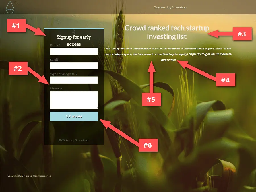
Things to improve
#1 – Form placement matters. People usually start looking at the left hand side of their screen. If the first thing they see is a signup form, it’s vital seconds lost in your visitor looking for an explanation of your product or service. Usually (but NOT always) your form is best place on the right hand side of the screen.
#2 – Limit form fields. Don’t include non-descriptive form fields like “message”. It has no place on a signup page. It’s a lot better to follow up any questions via email. Ask only for the information you need to get going.
#3 – Define the unique value proposition. The headline is hard to understand. You as the builder of the page, or the founder of the company have a ton of knowledge on what you’re selling, but for the average person that comes to the page has almost zero context.
#4 – Speak directly to your visitors. The copy is very “me” focused, when it should be “you” focused. How are you going to help people? What is the benefit to them?
#5 – What is the competition doing? Look at other companies in your space and see how they’re pitching to their customers. That will give you some indication of what works and what doesn’t. It’s OK to borrow a little learned knowledge from them.
#6 – Customize the thank you message. The share screen is fairly dry, there’s not even any social share buttons to really get an extra boost from your newly gained subscribers. This is what is going to provide those additional huge wins.
http://unbouncepages.com/dropz
7 – Dojo4.us
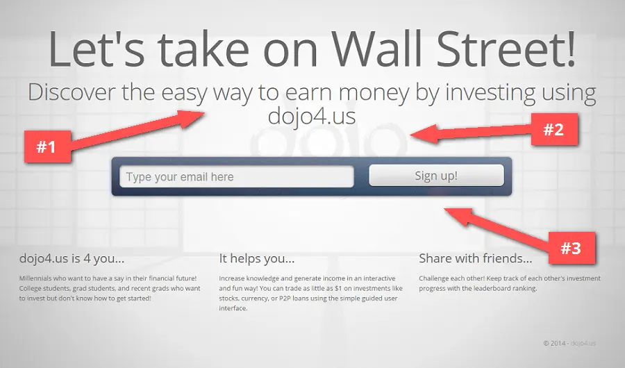
Things to improve
#1 – Clearly describe the advantage. Use more descriptive headlines to provide better information about the benefits of your product.
#2 – Increase brand awareness. The background image could place the logo more prominently, that way you wouldn’t have to mention your company name as many times on the page. On top of that, it’ll add to the pages trust factor.
#3 – Provide a good reason to sign up now. Nowhere in the page is there any mention of an incentive. If you really want to motivate people to give up their email address and share with friends, you have to offer up something of value in exchange.
http://www.dojo4.us
8 – SortMoney
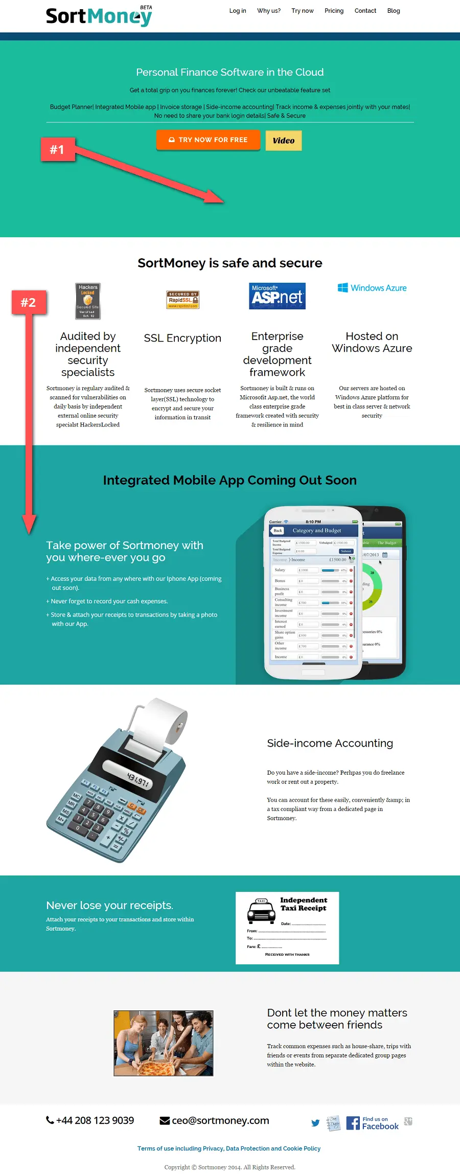
Things to improve
#1 – Inform right away. The top of the fold area feels a little sparse. You could place an image or an explainer video in the empty area below the call-to-action button.
#2 – Guide your visitors. The sections on the page could use a bit of reordering. First you need to inform people what your product is, and then why they should trust you.
http://www.sortmoney.com
In Closing
Hopefully you were able to extract at least a few gold nuggets of useful information. Now it’s up to you to take what you’ve learned and build the best darn campaigns you can!
If you ever need any assistance getting a killer landing page up, we’re more than happy to help. Send us an email at support@kickofflabs.com and we’ll take good care of you and your conversion rates.
Go forth and convert the world!
Thanks for reading AND for sharing,
Josh Ledgard
Co-Founder of KickoffLabs