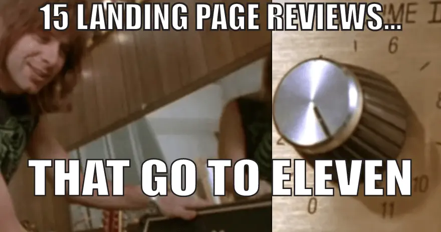
- The Landing Page Teardowns
- 1. Lilly + Sid
- 2. Illinois Mutual / Hatfield Media Group
- 3. ChrisCurtess.com
- 4. Irish Design Assembly
- 5. Carib Travel Tips
- 6. Deals For Health
- 7. DRUM Lessons In LA
- 8. Onboardly
- 9. Petit Zarafa
- 10. Lose W8 Now
- 11. Law Enforcement ID
- 12. SetSee
- 13. Collabinate
- 14. RemindMe2Save
- 15. 52 Metrics
- Key Takeaways
- Final comments
Have your own landing page that you’d like reviewed? KickoffLabs offers FREE landing page and conversion optimization advice during our bi-weekly Live Marketing Chats! Visit kickofflabs.com to submit yours.
What’s super awesome about working at KickoffLabs for our founders, Josh and Scott is that I get direct access to ALL of our customer metrics and can see exactly what types of landing pages and designs are killing it at conversion rates… AND what kills conversion rates.
These are some pages that we didn’t have time for during our last “Landing Page Reviews” live marketing chats. I’ve been given free reign to basically go all out on what I think these pages are doing right AND wrong.
Note that I may not be as courteous (gentle) as Josh, but that’s because I really REALLY want your pages to achieve the best conversion rate possible! Lets get to it…
The Landing Page Teardowns
1. Lilly + Sid
What works:
- Colorful images of kids wearing cool clothes that make you want to click. There’s plenty of research that proves both cute images and images with faces increase engagement.
- Awards and press mentions make the page feel trustworthy.
- Nice pastel color scheme that directs my attention towards images (with the products they’re selling).
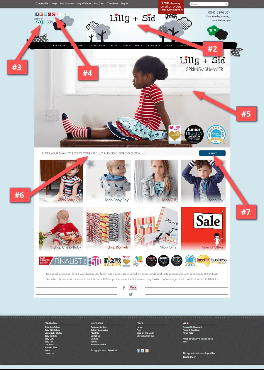
What could use some work:
#1 – Get the email first! A bit of praise – They realize the power of 1-to-1 email and are using a popup to capture emails.
Yes, out in the wild we hate them. But once you start seeing signup numbers go up, it’s well worth the slight visitor disturbance.
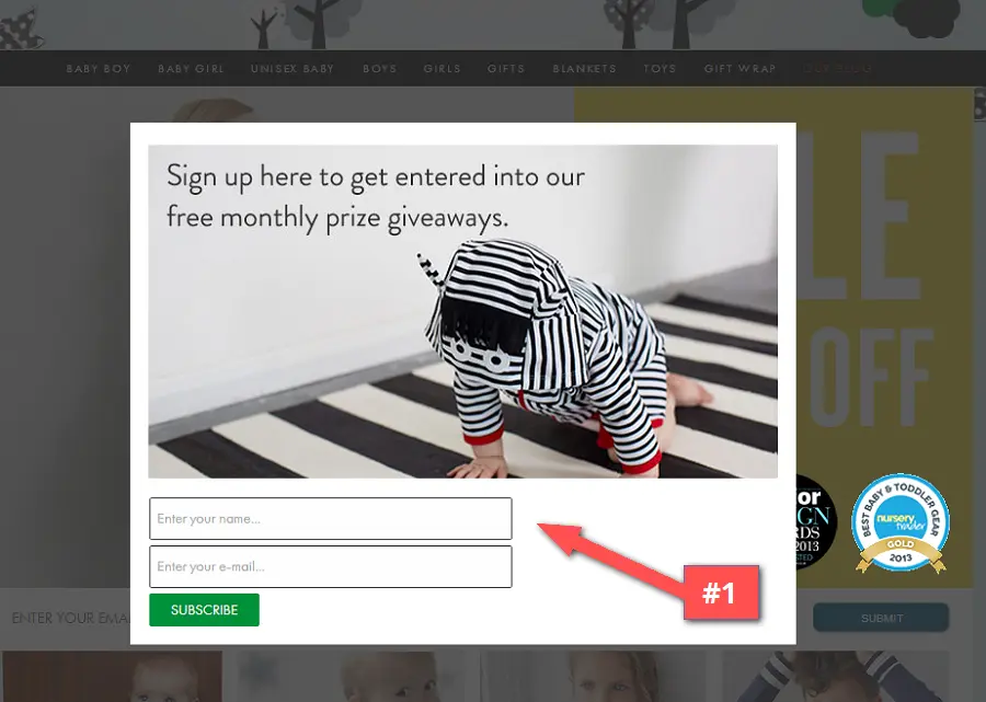
For the popup though, I’d recommend centering the form and making the button the same width. I would also perhaps change the incentive (like for the children’s ebook offered in the page signup form). That and maybe switch out the image… the child without a face kinda creeped me out a little :)
#2 – Answer the “what”. At first glance, this page feels like an ecommerce store that carries different brands. It’s not until I get to the small bottom text “Designed in London, loved worldwide” that I find out it’s the online store of the actual Lilly + Sid brand.
I’d use that brilliant tagline (or another that mentions your award- winning children’s clothing) underneath the main logo to give visitors an instant background on your company.
#3 – Save trust symbols for the payment page. Most people’s attention is called towards the left when they’re visiting sites. The first thing I notice in that direction is a prominent “Secured by..” logo, and I don’t think anyone’s buying from the homepage.
#4 – Place social links at the bottom. Same goes for the social links which are prominently placed to the left. First off, they send you away from the page. Second, why should I like your page without knowing what your company is about?
#5 – Link up images. There’s a great header image highlighting the Spring/Summer collection, but try and click it and you’ll get nowhere. The category images are linked to a url yet the main image is not and uses up a lot of screen real estate.
I would advise that ALL images on an ecommerce site be clickable and linked to a url. Beautiful images trigger positive emotions, and people will click these images, so be sure they trigger an action.
#6 – Call out the signup form. It took me more than 5 seconds to locate the email signup call-to-action on the page. It’s small, buried between two main content areas and doesn’t contrast well against the page.
In case you didn’t get the email with the popup, give people a 2nd opportunity to sign up by using a larger form.
#7 – Customize the CTA text. It was obviously a programmer – way back when – who labeled “submit” into form buttons. First off, it’s a horrible word that literally means “surrender”, and nobody wants to feel as if they’re giving something up. On the contrary, people like feeling as if they are in control.
So when writing convincing copy, we have to think like a copywriter. An important step in building forms that convert is changing the standard “submit” text for something more personalized to the action being taken.
#8 Develop and update your site remotely. On my visit, things were looking… not so great:
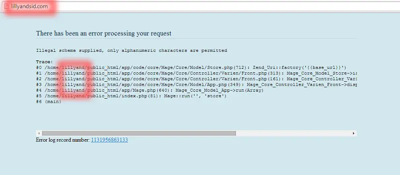
What makes matters worse, is they are investing money in Google Ads and retargeting.
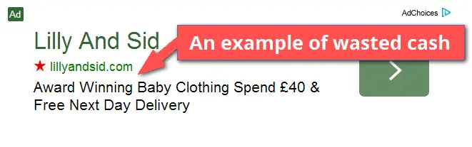
So people clicking through might be presented with the same ugly error. Do you think they’ll ever be back?
The consensus is to use a separate server for development and your main server for the always live site. Some services like WPEngine make it super easy to setup and push changes from one server to the other. Talk to your developer about potentially setting this up.
http://www.lillyandsid.com/
2. Illinois Mutual / Hatfield Media Group
What works:
- It’s a centered form that gets my attention.
- The right amount of form fields for their business.
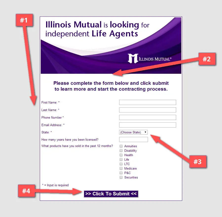
What could use some work:
#1 – Make it feel like a page. The form is the only element on the page, and the solid grey background gives it an even emptier look. Adding a little more color can help the page feel more “complete”.
Perhaps using a variation of your color scheme as a background, or even a non-distracting background image giving a visual representation of what it’s like to work at Illinois Mutual.
#2 – Provide more information. While I personally would include more information on the page, it could be that you’re already sending qualified agents to send in more details about themselves.
However, if a cold lead drops in, I’d suggest linking the header image to another page where potential agents can find more information. Just use the target=”_blank” attribute to open the page in a new tab and avoid them leaving the form page.
#3 – Ask for the right amount of information. Normally I would critique including this amount of form fields. But it seems they’re asking for just the right amount.
We get a lot of people asking how many form fields are appropriate to include without hurting conversions. As we see here, it really depends on your business needs. Never ask for too much information or for things that you can easily investigate on your own.
# 4 – Update the “Submit” button text. Another ugly “submit” button. “Learn more” would be more relative to the action being taken.
http://fd10.formdesk.com/hatfieldmediagroupllc/iml2/
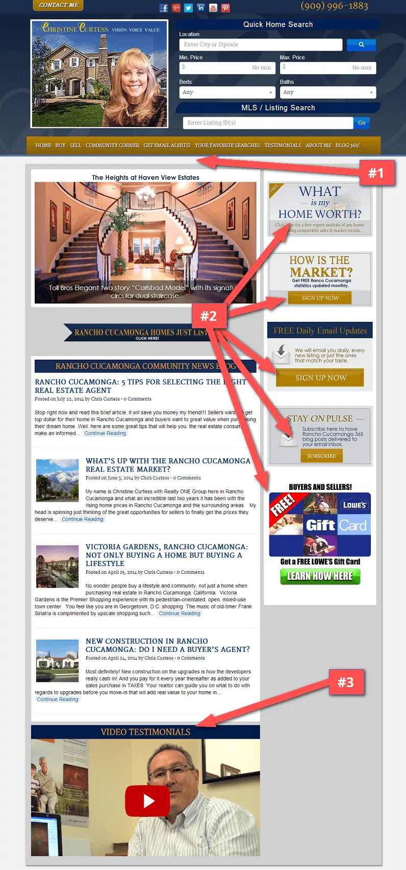
3. ChrisCurtess.com
What works:
- Uses a unique url for creating a brand around a name – “Christine Curtess”.
- The photograph at the top helps to establish a professional image.
What could use some work:
#1 – Tell people what community you serve. I can look at the phone number up top and come to the conclusion that it’s a California based area code. But if I’m not familiar with or am new in town (and looking for a home). Letting people know which community you service will allow them a faster decision whether your offering applies to them.
Real estate is a location based service, so I’d even recommend using a headline that says “Servicing the Rancho Cucamonga community since…” or something similar. I’d also make the blog section stand out more, that’s where it becomes clear the site is targeted to Rancho Cucamonga.
#2 – Don’t give me too many options. With a total of 5 call-to-actions in the sidebar, it’s unclear to me which action to take… Ask yourself: What is the #1 thing you want people to do immediately?
My advice is to focus mainly on creating one strong newsletter signup CTA that allows you to quickly capture email addresses. Doing so, you’ll have access to peoples email inbox and can later send updates, top blog posts and more information such as on listings in the area.
#3 – Use testimonials directly on the page. Love the use of testimonials to make it public that real people trust you. However, this page includes only 1 video testimonial (which links to a video testimonials page). There is also another testimonials page with only text.
Combine these two sections and place TEXT testimonials prominently on the homepage. You’ll build trust with visitors faster and help separate yourself from other agents.
#4 – Use error pages to collect leads. There is a main call-to-action form at the top which is nicely visible. My only gripe is when I tried out a search (even for the community she serves), I’m presented with a “Page Not Found”.
Include an email capture form on the error page and use it as an opportunity to collect emails for sending out newsletters related to your industry and community.
http://www.chriscurtess.com/
4. Irish Design Assembly
What works:
- Copy certainly isn’t lacking on the page (maybe a little too much?)
- The page is mobile responsive.
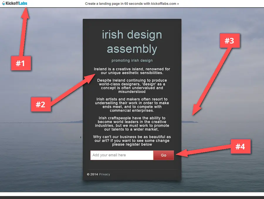
What could use some work:
#1 – Clear away distractions. For a start, removing our branding from the landing page can definitely help increase your conversion rate.
#2 – Limit your copy to context. There’s a lot of great copy on the page, yet it’s still somewhat unclear to me what the page is about. Is the page for artists or patrons of the arts? I find no compelling reason as to why it benefits me. What do I get out of it and what’s the benefit in signing up?
#3 – Use background images that draw attention to your CTA. The background image get’s lost behind the form and really does nothing to give an idea about the business. If it’s an art collective that you’re promoting, put up a background image of the artists or their creations.
#4 – Make the button text more meaningful. At least it doesn’t say “Submit”, but the “GO” button text doesn’t really describe what I’m doing or getting.
5. Carib Travel Tips
Not being too mean, but did I just travel back to the web of 1999? The site looks quite dated, for several reasons which I’ll get into below. But first…
What works:
- The call-to-action is obvious. Pay $19 through PayPal and get access.
- Using bullet points to describe the benefits. They include 10, though I would cut it down to half.
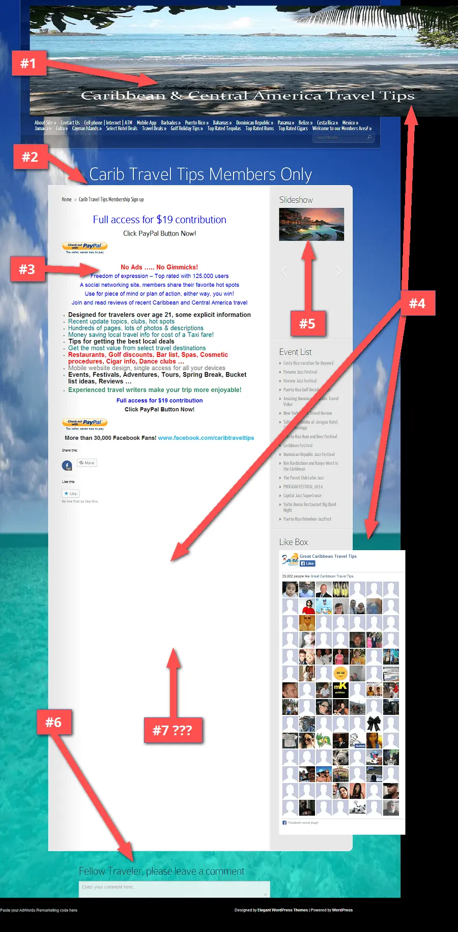
What could use some work:
#1 – Drop unnecessary elements. The header image and menu are way too big. This takes up valuable screen real estate that could be used for the headline and call-to-action.
If the main goal is to get the member signup, focus only on that and leave out the top navigation menu.
#2 – Call out your strengths. Looking through the site, the unique offering is exclusive content for vacationers that might be hard to find elsewhere on the web. That to me is the main strength and one that should be played upon.
I would focus the copy on the exclusives to explain WHY your site and content is different and superior to free sites like TripAdvisor or Expedia.
#3 – Design for today’s standards. The font colors stick out like a sore thumb, and not in a good way. I wouldn’t use blue or red font colors for non-linked text, this is what “web 1.0” sites used to do. Stick with a standard black font. It’s still okay to use blue, but mainly for links.
I could go on about the many design flaws, but I’ll offer this one small chunk for now… Seeing as how this is a WordPress site, achieving an new look that works in modern browsers can be as easy as slapping on an updated, mobile-responsive theme.
Updating the look of your site – even slightly – will assure visitors there is recent activity on the site and that the site is professionally run.
#4 – Page layout matters. The images are off-balance. The slideshow transitions in an unusual way. The Facebook Like box doesn’t properly fit into the sidebar. The page is unnecessarily long and has too much blank space at the bottom. I could go on…
… If you’re attempting to prime for the sale, all of these minor imperfections can have a huge impact on how your traffic converts. Increasing the overall trust factor of the site is essential before asking for the money.
For a quick lift in visitor confidence, try including customer testimonials to give a real perspective on the benefits of membership.
#5 – Use slideshows sparingly (as in hardly ever)! The slideshow here does nothing to motivate me. For one, the images are small. And second, when images are clicked, lead to a “No Results Found” page. For god’s sake, even the background image is a slider!
I’d suggest doing away with the slideshows completely and including images directly in the main content area. You don’t want people clicking away from the page if the goal is to get them to signup now.
#6 – Social proof can sometimes hurt conversions.
This page almost looks as if no one has ever paid for a membership; it’s quite the lonely experience, even among “30,000 Facebook Fans”. I’d recommend removing the Facebook like box, social share and the comment box at the bottom of the page.
For pricing or paid signup pages, potential customers don’t care how many fans or shares on Facebook you have. People care about whether or not your solution is worth paying for. How do you let them know it’s worth it? Use customer testimonials!
#7 – Where’s the email capture box? Nowhere on the page do I see a way to collect email addresses. Yes, this page is meant for paid signups, so people visiting SHOULD be ready to buy. But how about giving people a 2nd option in case they’re not convinced?
Instead of relying on distracting elements such as the slideshow or Facebook like box for engagement, try putting an email capture form within the page. Giving people an option to sign up for your email list is WAY BETTER than complete abandonment.
http://www.caribtraveltips.com/carib-member-options-page/
6. Deals For Health
What works:
- They’re using a KickoffLabs landing page
- The page is simple and focused.
- Earlier I criticized a grey background color, but this uses shadows to add depth.
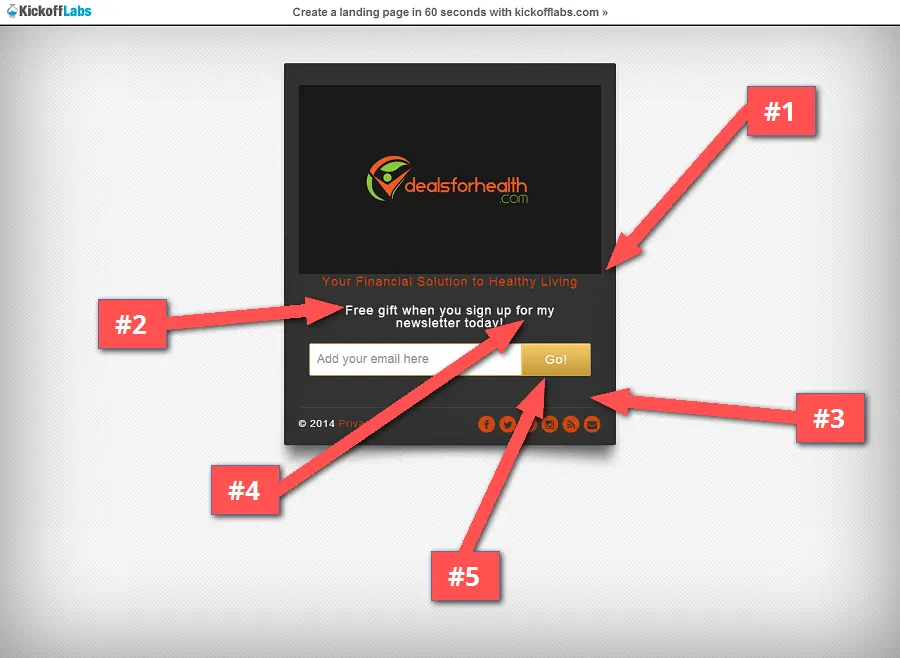
What could use some work:
#1 – Add more support copy to the page. The page is rather vague as to what the product is actually about. Upon visiting the actual site (which also lacks in copy) I find out that the product is about helping you sleep better…
Mention this in your landing page copy to give your visitors more information about what they’re signing up for. How can sleeping better improve my health finances? Provide some examples and proof.
#2 – Define the incentive. There’s a mention of a free gift for signing up, What’s the free gift? People want to know what they’re getting before they sign up.
#3 – Be sure your CTA is what stands out the most. The orange colored text and icons on the black background reminds me of halloween. And the social icons actually draw away attention from the signup CTA.
I would suggest changing the colors to a lighter shade of orange. The color doesn’t have to exactly match your logo color, a variation of it would work just fine.
#4 – Sound professional. Using the words “sign up for my newsletter” makes it seem as if it’s a small operation. Maybe that’s what you’re going for. If not, I would update the text to say “sign up to the newsletter”. At times, it’s okay to make your business sound bigger than it actually is.
#5 – Update the CTA. One last note; I recommend changing the “GO” button text to something that applies more to the page. At least it’s not the ugly “Submit” text, but maybe something like “Get my free gift” could work better.
7. DRUM Lessons In LA
What works:
- Starts off speaking directly to the visitor.
- Clear headline and subheadline that define the rest of the copy.
- It’s easy to tell what the page is offering.
- Ebook image helps to reinforce the message.
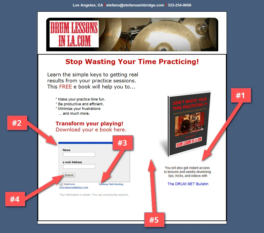
What could use some work:
#1 – Call out the incentive. The main copy is brief and to the point, which I like. And sure, the free ebook could be enough incentive for people to sign up. But there is another incentive to get “instant access to lessons…”. This is an incentive that could be more obvious.
I would try including a brief video lesson as an sample of what people will receive by signing up for the newsletter. You’ll raise people’s motivation to purchase by giving away more free material.
#2 – Make the page look consistent. The form on the page looks very different from the rest of the page layout and could use a little redesign.
Matching the look of the form to your page will give a better overall coherence. If the software you’re using doesn’t allow you to fully customize the form, at least update the colors so they better match your site.
#3 – Remove 3rd party branding. I understand that you may be trying to “keep it lean” by using a free 3rd party service for the email form, but having another companies url on the page brings down trust and could lead to people clicking away from your page.
Even if it’s just a few bucks a month, treat your business like a business. Invest in making sure your online image is as professional as possible. We have a Starter Plan that could be perfect for you.
#4 – Stay away from “Submit”. I’d try out a different button text, maybe one that says “Get my free lessons”.
#5 – Rely on past customers to do the selling. If you’ve been teaching for some time, you most likely have success quotes from past students that you can include on the page.
Include these text testimonials into your copy and let your past customers do the selling for you. The use of testimonials gives any site instant credibility!
http://stefanoashbridge.com/listbook.htm
8. Onboardly
What works:
- A great book image that stands out.
- CTA button text says “get my free guide”.
- Asking for minimal information.
- Great testimonial quotes.
- Instant PDF download that’s also emailed to me.
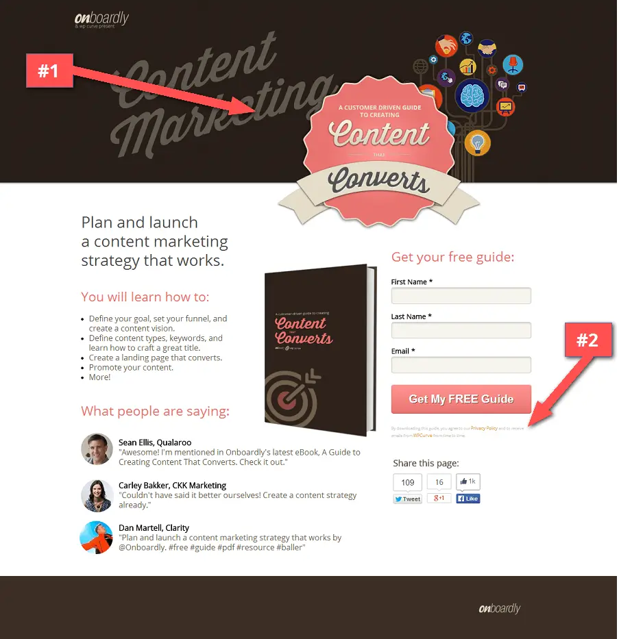
This is already a great looking page that is pretty well optimized (my #CRO hats off to you). But still a few things to further optimize…
What could use some work:
#1 – Craft your page space. Frankly, the header image and badge are bee-u-tee-ful, BUT on smaller resolutions take up a little too much space.
This is how I saw the page on my iPad:
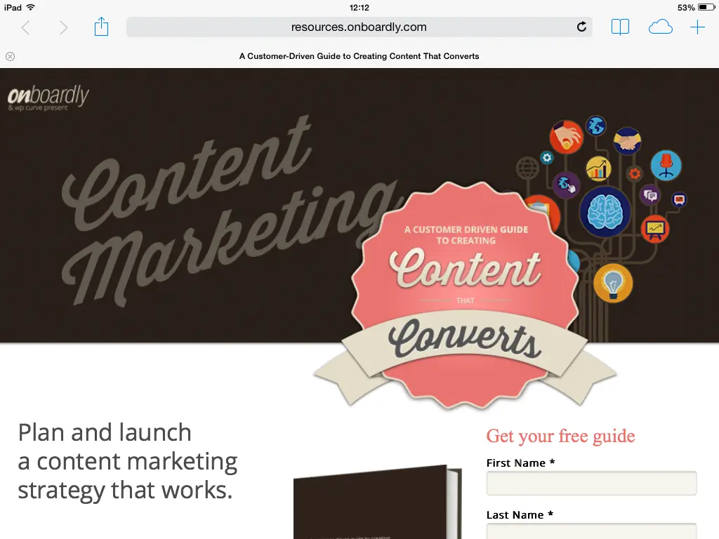
The main headline is there but the enticing book image gets cut off. And since this page isn’t mobile responsive, I can imagine what it must look like on my smartphone.
There’s plenty of space in the header for placing the badge inside (and maybe to the left), and not overlaid on top to save some screen real estate.
#2 – Don’t hide the fine print. The minute disclaimer text below the form feels as if you’re trying to hide the fact that users will be subscribed to another mailing list when signing up. I actually think you should be highlighting partner companies.
Let people know (with a larger logo or text) that the ebook partner is WPCurve. It’s something that’s important for potential leads to know before they sign up to your (and someone else’s) mailing list.
#3 – Offer to share after signup. I was surprised to see social share buttons on the page but not on the post signup message page. I don’t think people are very likely to share an ebook page without at least getting the instant gratification of the immediate download first.
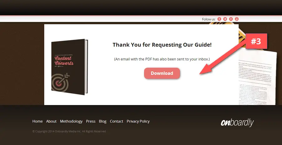
I’d recommend removing the share buttons from the page and giving people the option to share after signup. This is your chance to get people sharing your content among fellow minds.
9. Petit Zarafa
What works:
- A joyful image that lifts the spirits (mine, anyways).
- The page scales down perfectly to mobile sizes.
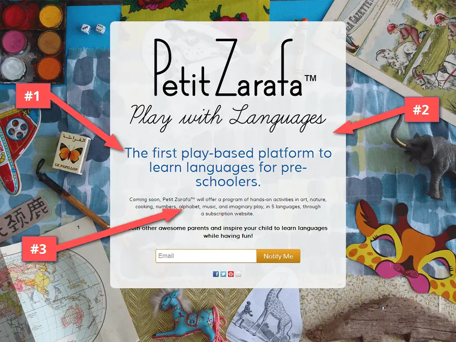
What could use some work:
#1 – Define the subheadline. Maybe it’s my simpleton brain, but I feel as the subheadline is a little too complicated to read and understand.
I get that it’s a platform, though I’d suggest a simpler subheadline like “Simple language learning for children”.
#2 – Limit your font choices. There’s too many font styles on the page that make it slightly distracting to read. I’m sure you meant for the text to seem as playful as the copy and platform. But in my opinion, it just works to confuse.
#3 – List out the features. The activities that will be included in the app (play-based alphabet, art, cooking, etc) could use some more calling out. As a parent, I might strongly identify with one of the mentioned activities. Try creating bullet points out of these and list them as features to make them more obvious for visitors.
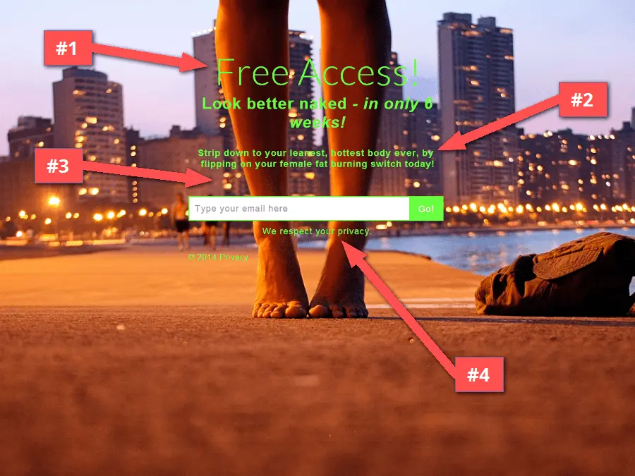
10. Lose W8 Now
What works:
- A large contrasting CTA that is hard to miss.
- Use of an alluring visual image.
- Bonus points for being a KickoffLabs customer!
What could use some work:
#1 – Lead with the right copy. The subheadline, to me, is more helpful and informative than the main “Free Access!” headline. Problem is when you scream “Free”, people know there’s a catch… which there is as we’ll see in a bit.
#2 – Make your text readable. Even though the background photograph was clearly taken in the evening, it’s still pretty bright and makes the text slightly hard to read.
Your background images should always be optimized for text being overlaid on top. I would suggest a better contrasting font color, and blur or darken the image a bit so the text is easier to scan.
#3 – Add the incentive. It kind of feels as if visitors are being sent down an unknown path. Sure, this page attempts to intrigue by hinting at how you’ll “look better – in only 6 weeks”. But what’s the immediate benefit in people entering their email address?
#4 – Let people know what they’re signing up for. The copy gives visitors the impression that they’ll get “Free Access” to something… But what?
I entered my email to find out and was unpleasantly directed to a completely different site; with another companies branding and an autoplay video… Major marketing foul.
This is going to cause your bounce rate to skyrocket! Why? Because people don’t like surprises (which is a topic in one our recent blog posts).
I would add some support copy to the page to let people know that it’s “presented by…” and your company name. That way it’s not as much of a shock when they’re whisked away to a completely different site.
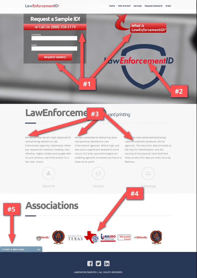
11. Law Enforcement ID
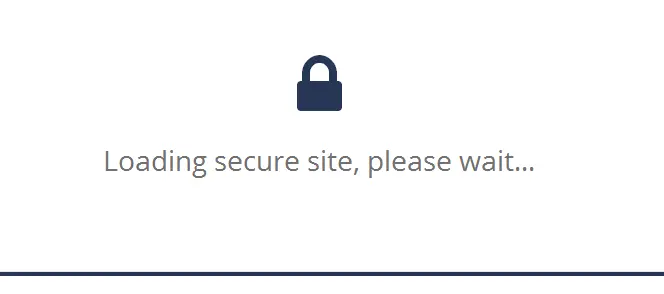
What works:
On visit, I’m presented with a “Loading Secure Site” screen (just in case I didn’t notice the “https” in the url). Normally, I would be annoyed by a loading screen like this. But considering it’s for a law enforcement services site; it’s actually pretty badass and a smart move for giving visitors a better sense of security.
What else works:
- The CTA* and form is hard to miss.
- Page is mobile responsive and correctly scales down.
- Site looks modern and up-to-date.
What could use some work:
#1 – Define your main CTA*. While I like how the CTA contrasts on the page, there are 3 call-to-actions on the page: “Call Us”, “Request Sample”, and “What is”. As a business, you might be thinking that more options for contact is better. However, it’s easy to overwhelm visitors by giving them too many options.
In my opinion, the “What is” CTA is unnecessary and draws attention away from the other lead focused call-to-actions. The page is short enough to include the “What is” directly on the page. I’d remove that one entirely.
If your company insists on having the 3 CTA’s, determine which ONE of the three is more valuable and effective for collecting leads and make that one super obvious! Either that or differentiate between the different call-to-actions by changing the color of each button.
#2 – Give people more information. “Request a sample ID” is a great headline, although I’m sure visitors would like to get more information about the ID’s you provide. And since by getting sample ID’s into prospects hands is potentially the best way you’ll make the actual sale, I would focus mainly on describing the benefits and features.
Try including some bullet point copy next to the form to let people know more about what they’ll receive. I’d also swap out the repeated logo for an image of a sample ID.
#3 – What do visitors gain by using your service? The page is suffering from what I refer to as we-we syndrome: The copy is all about your company, when it should be about your potential customers.
If you want to see higher conversions, write up some new copy that is more focused on the benefits for law enforcement agencies. Avoid using the term “we” and start offering up a real solution by using the word “you”.
#4 – Avoid using image sliders. Once again, an image slider (or slideshow, whatevs) that only serves to move and hide content from the page. Not only that but they take up a lot of heavy javascript code that increase page load time. I would get rid of the image slider entirely and use static images instead.
For decreasing bounce rate, I’d also recommend NOT linking images back to partner sites, at least on the homepage.
Just because we’re touching on the subject, here are several more reasons NOT to use slideshows:
- The original idea for slideshows was to give people more access to content from the same area. But from a #cro perspective, slideshows only work to hide content! I’d rather see a slightly longer page with full images as opposed to slideshows, any day of the week.
- When A/B testing with sliders, results may be inaccurate due to element transitioning. If you use heatmap tracking like CrazyEgg, you won’t be able to correctly track exactly what and where people are clicking.
- Most slideshows aren’t gesture optimized for the growing mobile culture.
With all that, if you (or your boss) still insist on using a slideshow, ensure that images are optimized, and the controls are noticeable and easy to click.
#5 – Don’t use live chat as a contact form. There is a live chat widget installed on the page, but when I visited midday no one seemed to be taking chats. Seems to me that it only serves as a contact form. To add, it has more form fields than the main CTA.
If getting people to contact you is the primary objective, I would build the form into the page and exclude the chat widget.
https://lawenforcementid.com/
12. SetSee
What works:
- Great initial message and question for the visitor.
- A shaded box element around the copy to make the text more readable.
- The page properly scales down for mobile viewing. Yup, cause it’s a KickoffLabs page :)
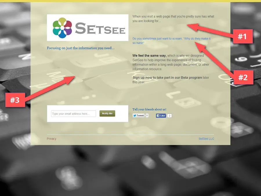
What could use some work:
#1 – Ask questions, but also answer questions. The service claims to “improve the experience of finding information”. But explain to me, how is your service better than say, CTRL+F? The copy is great at asking questions to intrigue readers, but is lacking in information on how the product actually works.
#2 – Don’t circle through your message. The second blue subheadline is a rotating message that asks different questions. While I’m sure you’re hoping to strike a match with your potential leads. I would recommend testing out the different headlines separately.
You never know which copy will get someone to convert. Better to test and go with the single best option, instead of circling through copy without knowing which resonates best with your audience.
#3 – Use images to help describe your product. I think the page could use some images that show off how the product works. There’s a good background image of a computer keyboard, so visitors already have an idea that the product is technology based. Although including some screenshots could definitely help reinforce your message.
http://beta.setsee.com/
13. Collabinate
What works:
- Use of brief, yet informative headlines.
- Nice screenshots with examples of end results.
- Plenty of information on the page.
- Use of testimonials near the pricing section (though I would put them closer).
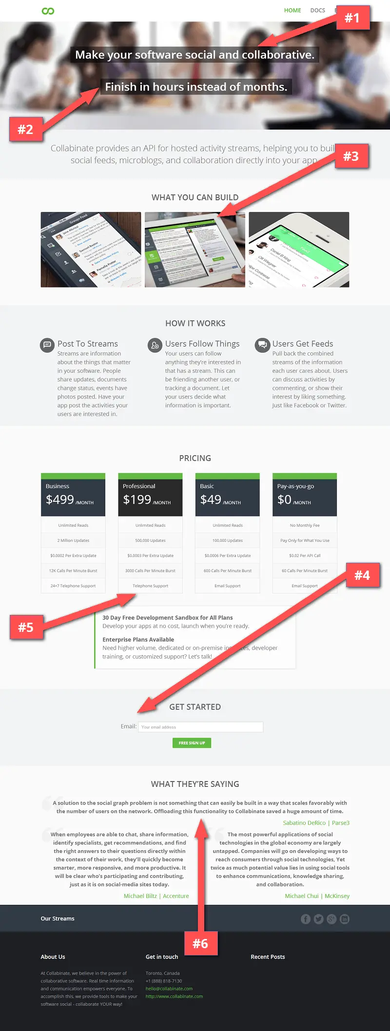
What could use some work:
#1 – Remove animations. When the page is loaded, the headline doesn’t appear right away. It’s animated but I don’t see any real reason to do this, especially with content that’s “above the fold”.
I would skip the code-heavy animations altogether and place the static text on the page.
#2 – Use the headline to compel people to read more. While I like that the headline is directed towards the visitor. It’s not until I get to the lower text section that I find out that it’s an API platform.
I would recommend adding to the headline “Our API lets you finish in hours instead of months”. Use the headline to give visitors enough information for deciding whether or not to continue reading.
#3 – Use product images to show more. When the product images are clicked, they only give me a same size preview of the image. By clicking the image, I intended to see a larger preview. Just sayin’.
#4 – What is the call to action? The page only has only one “Get Started” button, and it’s buried way down near the bottom of the page. The idea might be to get people reading down the page, but it’s going to hurt your conversion rate if you don’t have a clear CTA located above the fold.
#5 – Pricing tables need buttons. By the looks of the pricing table, the product is ready for sale. Yet there are no buttons underneath the pricing columns. How are people supposed to buy? If the intention is to get them to sign up for a free account first, put the pricing table on its own unique pricing page.
#6 – Who’s giving the testimonials? It’s unclear to me who the people in the testimonials are. Instead of “What They’re Saying”, use something more meaningful like “What our customers are saying”. Or in the case of a pre-launch startup that has no customers yet, “What the experts are saying”. It’s even totally okay to mix between the two.
14. RemindMe2Save
What works:
- This page clearly gets across what they’re doing.
- A good problem statement (everyone wants to save money).
- Use of an explainer video.
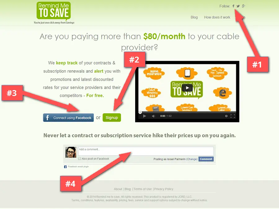
What could use some work:
#1 – Place social links at the bottom of the page. One of the first things I notice are the social follow buttons right above the navbar. If nobody is using the follow links at the top, use that space to actually provide more value to customers right away with the links to your blog, how it works and login for existing customers.
#2 – Make your main CTA noticeable. The call-to-action feels a little buried within the page because it’s the same color green throughout. From a conversion rate perspective, you want all your CTA’s to be a color that highly contrasts against the background.
#3 – Choose a single CTA. There are two signup options on the page, one through Facebook, and the other a normal “Signup” button. Not sure how many people you get clicking on each, but I would go with one button and possibly one link option.
#4 – Remove empty content. The facebook comment box (which has zero comments) adds no real value to the page. Use that space for adding longer copy on the page that explains what you’re doing on the main page…
More people will stay longer if you’ve got more content to read. Whether that gets people to sign up at a higher rate depends on how convincing your copy is. But it’ll definitely increase people’s attention on the page.
15. 52 Metrics
What works:
- Page is beautifully designed.
- Navbar and CTA are fixed to the top when scrolling.
- Cute images give a laid back and easy to use vibe.
- Bullet points that list benefits, not features.
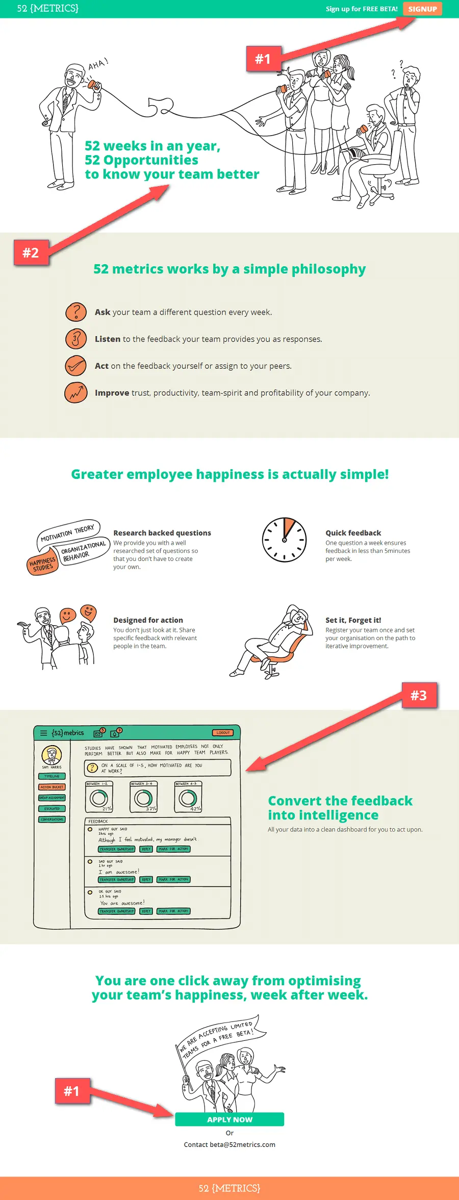
What could use some work:
#1 – CTA gets lost in the scheme of things. With the top CTA an orange color and the bottom CTA in green, there is a lack of consistency. Another big deal is that both CTA’s are getting lost amidst a similar color background.
I’d make both CTA’s a strong, contrasting color that’s consistent throughout the entire page. Use a completely different color for your buttons, maybe even a white colored button would stand out more.
#2 – Message for your market. I’m a busy person, and I don’t even run my own business. So I would think that business owners and managers are 10 times more busy than me. Selling the app with the notion of “getting to know my team better” seems to imply more managing time and people on my part.
I know it ties in with your brand image, but you may want to rethink your main message. Keep in mind that B2B selling means having to convince old-school business users (even for youngin’s like me) to adopt new ways of managing their process.
#3 – Use a real product image. I like the overall cartoony look of the page. The only area where I would like to see a real image is for the app screenshot. You’ll give people a better sense of the tool by showing them what they’re in for.
#4 – Optimize the signup flow. Good and bad here: What’s great is that the signup form quickly pops open on the same page, saving the user time and distractions.
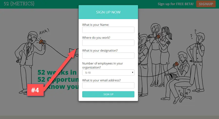
What’s bad is that there are too many form fields. Sure you can ask where a person works, but that’s just lazy when you could just go to LinkedIn. Or better yet, use your KickoffLabs account to automatically collect important contact information from across the web. We call it Magic Contact Data, ooohhh aaahhh.
Post signup, I get asked if it’s okay to follow up with an email or a phone call. While that’s awesome for direct customer contact, I would reserve that invitation for the follow up email. Use your post signup message as an opportunity to get people sharing the beta.
#5 – The page is not mobile responsive. One final gripe: A lot of traffic these days come in via mobile devices. That said, nowadays your pages have to be viewable on Androids, iPhone, yup, even Windows Phone.
Key Takeaways
- Focus on getting the email!
- Personalize the generic button text on your CTA’s. For pete’s sake STOP using “Submit” on your buttons.
- Use images the right way; to support your copy or to provoke an action. Oh and NO slideshows!
- Testimonials are a proven way to boost your conversion rate, but place them near your signup form or CTA.
- Your call-to-actions need to STAND OUT!
- Limit your copy to only the essential for getting your message across (though not always true for some sales pages).
- Use your headlines to compel, subheadlines to inform and support copy to convince.
- Craft a great user experience by focusing on design that’s coherent and consistent throughout the page.
- People are now mobile more than ever. Your page needs to be responsive and scale down to smaller sizes.
- Use as many form fields as needed, but at the same time use as few as possible.
- Once you get the sign up, ask people to share immediately after with strategically placed social share buttons.
Final comments
Most of the advice is standard stuff (or at least in my marketing and conversion rate optimization world it is), so I might end up repeating myself from time to time.
But that just goes to show how many people are in need of optimization help for their pages.
Which is why…
Hold on let me grab my superhero cape…
At KickoffLabs it’s our mission to help everyone increase their landing page and website conversion rates! We want you to get more people signing up and to get more possibilities to make money from those leads.
How do you get that chance?
Visit this page to send us your page for a free professional review.
And be sure to join us for more LIVE landing page reviews and marketing chat every other Thursday at 11AM Pacific time: https://kickofflabs.com
I want to thank everyone who has submitted their page. We do these reviews with the best intentions for helping you get more out of your landing pages, websites and campaigns.
But what did you think? Was I too harsh on some of these pages?
Send me your praise or backlash on Twitter.
If you found these reviews useful, let the world know by using this tweet that I’ve written out for you. All you need to do is 1 lazy click maneuver:
CLICK HERE TO TWEET OUT THE ARTICLE 
Hope you enjoyed, thanks for reading!
-Izzy Palmerin, growth and conversion rate optimization guy at KickoffLabs