I truly love looking at (and tearing down) landing pages. Seriously, I could do it all day!
Having said that, it’s always a great experience helping people better their businesses by optimizing their online presentation card: the landing page.
During last weeks live chats webinar, I had the opportunity to review 7 brand new pages, as well as re-review 2 pages that have recently been improved. So let’s get straight to business…
The Landing Page Reviews
Be sure to check out the video for plenty more hidden marketing gems!
1. PlayTank
What I like
- Playful colors and imagery that play well with the brand.
- The page is appealing in the way things are presented.
- Problem focused copy, which is good but I have some suggestions.
- The page is mobile responsive.
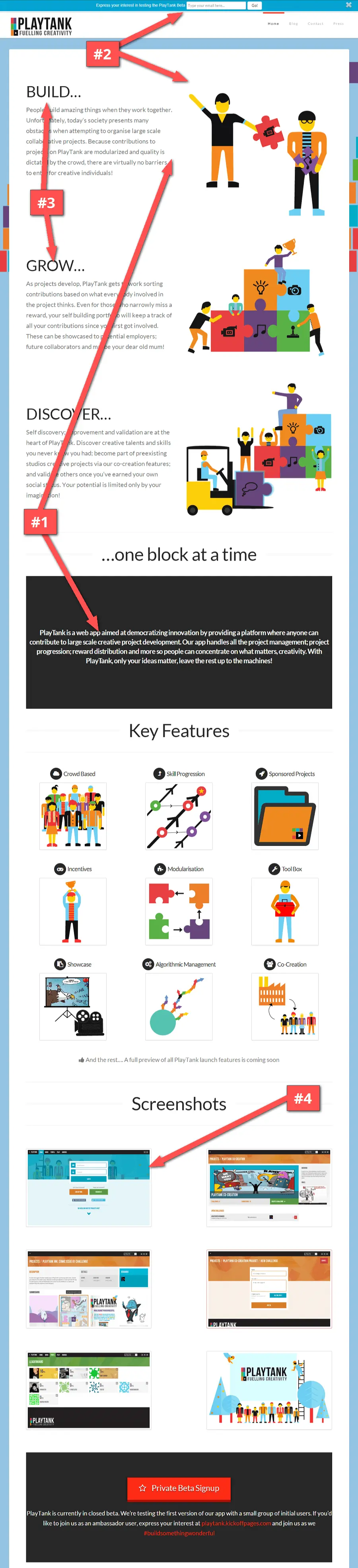
Things to improve
#1 – Tie down good copy with a good headline. My biggest challenge with the page was that it took me a lot reading copy to understand what they were after. This is where get into a problem of context on landing pages where people who are writing the landing pages (the marketer, business owner, etc) doesn’t understand exactly how little people know about your product when they come to your page.
When I first landed on the page it struck me as sort of an edu-tainment type of product. Something that my kids can play with, until I got to the description…
I feel like it should be higher up on the page. There needs to be some sort of central tagline or headline on the page that says either what it is or something else that gets the point across.
#2 – There is no clear call-to-action. There is a signup bar at the top, which is great, but since the color is blue with al lot of blues in the background, it doesn’t stand out as something that I should do right away.
Apart from that, there are no buttons on the page; where people’s eyes are normally drawn to. I would use this space to include a strong CTA. If you’re looking to keep the page clean, you can even use a button that opens a modal popup and not include a form on the page.
#3 – Use detailed headlines. One word headlines look good, but I think it’s important to give it that second word to answer the “what”. There needs to be a little bit more text, because you can’t assume that people know what the benefits they’re getting out of it are.
#4 – Images can break user flow, if… The other thing I notice are when I click on any of the screenshots they take me to the plain image link that opens in the same browser window. For one, the image isn’t that much bigger, and two, I just lost my place on the page!
When you include screenshots, I’d try to have open in a new window or, ideally have them popup with a lightbox. That way you’re not interfering with your visitors flow. Don’t make people click back to the page just because they wanted a closer look at the screenshot.
#5 – Avoid distracting elements. The website turns the mouse cursor into a big funky purple pointer. I found it distracting and initially couldn’t figure out where my mouse was. I just thought it was part of the landing page.
I think it’s just one of those playful things that aren’t necessary. I haven’t seen any studies or done any tests to know whether or not doing this would lower or increase conversion rates. I just found it personally distracting.
http://playtank.net/
2. Nudge mobile app
What I like
- Another responsive page, which is huge because there’s a large % of views coming in through mobile. Sometimes up to 45-50%, based on our internal data!
- The use of a countdown to create a sense of urgency*.
- Based on the screenshots, it’s clear that it’s an app.
- The background image is great because there is nothing about it that draws attention, but I feel like it pulls your eyes in. Nice pic!
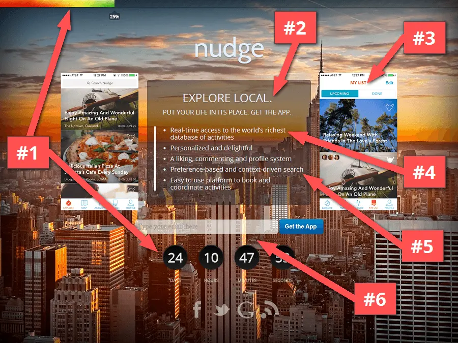
Things to improve
#1 – Use scarcity… scarcely. While the intention to create scarcity is good. I don’t think that in this case the progress bar isn’t being used for anything. I would just cut the progress bar.
#2 – Make your text readable. The text color is a little too off-white for the background and I feel like the contrast is a little bit lower than it should be.
So either the background should be darker or the text should be whiter. The text basically needs to be easier to read on the page.
#3 – Choose one solid product image. I felt that having two images squeezing the text makes the page feel really complex. One quick solution would be to just cut out 1 of the 2 images, and to move the copy and signup form to be on the right side of the 1 image.
I think you only really need one screenshot to get the point of the app across if the text is good. Both screenshots are very similar anyways, and are competing for the same attention on the page (and taking away attention from the center call-to-action).
#4 – Explain the benefits. There’s a lot of talk in the copy and I have a hard time understanding what the difference is from this to something like Yelp. You need to make that difference clear to really stand out in a mobile app space.
The app is activity focused, so maybe that should be front and center. You need to explain to people why they should sign up. Features are fine, but benefits are better.
#5 – Use terms that your target market can understand. The product uses the term: “preference based context driven search”. I’d love to see that phrase tested against your target market to see if they actually understand what that means.
Don’t over-complicate the copy. You could simply say “Easy search to find great activities”, and that could even be your tagline.
#6 – You need a real incentive. There’s no reason that I should sign up today. If I sign up before the counter is up, what do I get? Do I get extra kudos on my profile? Early access to the app? Inclusion as a beta tester? There needs to be some sort of incentive to sign up for the list.
There’s also no incentive for sharing. So if someone decides to sign up, there is nothing they get from referring their friends!
http://iphone.nudgemobileapp.com/
3. Tai Creation
What I like
- Page has a simple, clean look.
- The button color on the form clearly stands out.
- Clicking on images opens up a larger view in a lightbox.
Things to improve
#1 – Get to the point. I had to read a lot of the copy to understand what they’re offering. The page starts off with the claim that they’ll “help you start your online business”… Thing is so can just about any other service where you can buy a domain or put up a website.
Anybody can use a generic sales term, but you need to explain what you are doing specifically?
#2 – Highlight your strengths. Reading through the page I discover their niche is that they’re best at taking a retail store, integrating with a point-of-sale device, and putting the store online.
I think that is a real value proposition that can be really specific. “Put your retail store online today”, would be a much better title for the page because it gets to exactly what you’re offering and to where you’ve had success in the business so far.
#3 – Add context to images. The other thing that I would do is add some captions to the images. You’ll help explain the service a lot better with a bit of helper text underneath your images.
#4 – Cut down on form fields. The form feels a little lengthy. Do you need to collect all that information in one swoop? I’m not sure you need the message field, and it would pull the CTA button up higher if you removed this field.
You could probably guess the company name from their email address – if they have a company email address. So I would probably remove that too. Once you do that the button will line up more with the bottom of the images in the desktop view for a cleaner look.
By the way, if you’re using KickoffLabs we automagically retrieve a lot of the information you’re asking for, so no need for conversion-killing clutter!
#5 – Show off your customer successes. I would say “See stores we’ve made”, something that mentions that these are examples of customers you’ve worked with.
#6 – Use relevant copy. Where it says “Check this out”. I would update this to say “What we do”, because that’s what you’re saying here.
Say what you do and who you’ve done it for, and that’ll fit a lot better on the page in this case.
http://www.taicreation.com/
4. Konsolidate
What I like
- Nice big headline, with a clear CTA.
- Perfect subheadline layout.
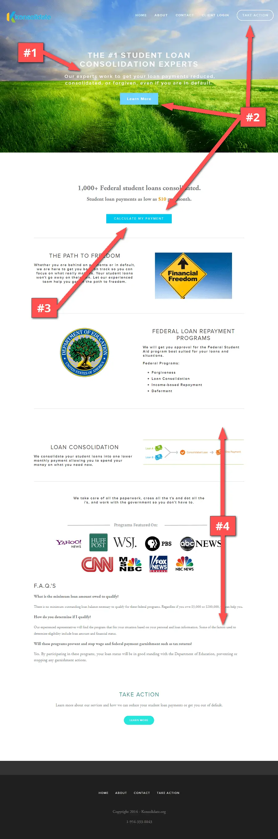
Things to improve
#1 – Readability is top priority. The header text, because of the clouds, is a little hard to read. It also contrasts with the green grass, making the white text harder to read over that.
I would maybe use a shadow on the font to make the white stand out, or even just use a darker background image that allows the copy to stand out.
#2 – Choose a CTA and make it stand out. The “Take Action” button is really buried and doesn’t use a contrasting color. You’d maybe want to take one of the colors of your logo; like a nice orange that everyone seems to agree is the universal color of conversion!
#3 – Clearly define user interactions. There are conflicting interests on the page… You’ve got “Calculate my payment”, but it doesn’t popup a payment calculator, it just pops up a form. Your call-to-action should line up with what you’re asking people to do.
#4 – Always have a visible CTA. I’ve said this a few times in the reviews, but it’s worth mentioning again:
You don’t know which piece of copy will get people to take action and thus the next step.
But what you do know, is that when people decide they want to take the next step, it needs to be obvious where that is. That’s why you see pages with multiple buttons and call-to-actions.
http://www.konsolidate.org/
5. U Street Pub Crawls
What I like
- Great example where the background helps reinforce the message.
- Logo clearly describes what’s going on.
- Image comes to life with animation by hovering over the form, (that’s a KickoffLabs theme).
- Clear description of “What” it is and “Who” it’s for.
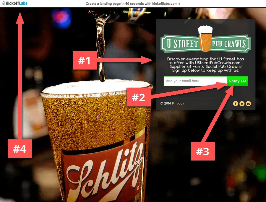
Things to improve
#1 – Answer the “why” people should sign up. People want to know what’s in it for them, now! Every landing page and signup form needs an incentive.
I would offer up a coupon code, a free list on top pubs, or something else that creates immediate value for your signups. Use the space below the form and put the incentive there. You need to clearly explain to people why they should sign up.
#2 – Match your brand colors. The call-to-action is loud (which is good), though I think it should be a bright orange instead of the bright green to kind of go with the overall landing page color scheme. That’s probably a minor thing but helps to achieve a more balanced look of the page.
#3 – Personalize your CTA button. I think that “Notify Me’ could be “Start Crawling” or something more playful to go with the main message. Something that relates to the action that signups are taking.
#4 You should take off our branding from the page. We’ve tried branding on the bottom, we’ve tried branding on the top, etc. Pretty much any 3rd party branding will lower your conversion rate by about 35%.
If you care about conversion rates at all, you should remove the branding on your landing pages. Whether you use us or another paid solution, it’s worth it.
http://www.ustreetpubcrawls.com/
6. Purple Slate
What I like
- It’s got a really clean and simple look.
- CTA button stands out on the page*, see suggestion #1.
- Second CTA at the bottom, for people who scroll through.
- Page talks to the person. Uses “you”, not “we”.
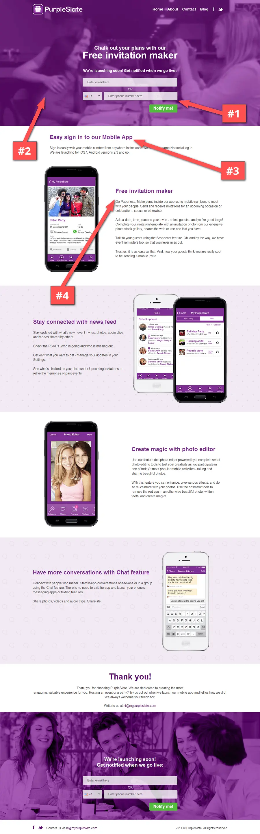
Things to improve
#1 – Optimize the form. It’s a great CTA, but I think that the button could be bigger and also the full width of the form. I would also personalize the sign up button with some playful, action-based copy.
#2 – Big videos can be distracting. I’m not a huge fan of video backgrounds on pages. Not a fan at all. Haven’t seen a test or any research on how landing pages with or without the video background can affect conversions…
I just personally find it distracting. Anything that potentially takes away attention from your main CTA is a no-go in my book. I actually think that a still photo would probably work better. That and the site would load a little faster too!
#3 – Lead with your strongest headlines. As I go through the copy, the first headline I see is “Easy sign in to our Mobile App”… Is this really the headline you want to lead with? I mean, really hope that it’s easy to sign in to.
Those are just specific features that don’t work to engage visitors. I would move that headline down the page as just a bullet point and not focus on that being a key reason to use the app.
#4 – Define your core value proposition. I’m not 100% sure what the app does… I get that it’s a free invitation maker, but what’s the key differentiator from other apps doing the same thing?
I would use something that explains the benefit more clearly, like: “Create invitations on the go with our mobile app”.. Whatever it is people get out of using your product, you need to make that immediate and obvious.
http://www.mypurpleslate.com/
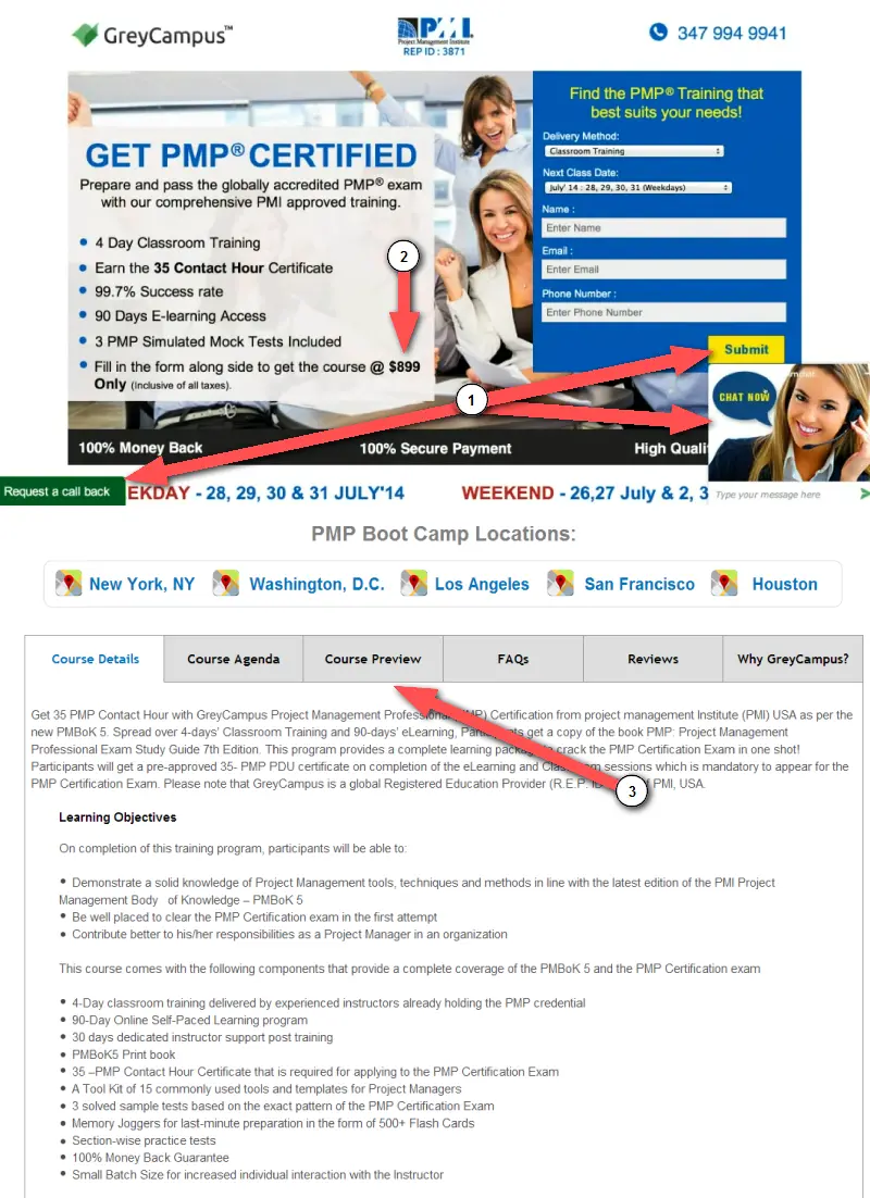
7. Grey Campus
This is an updated page based on some feedback we gave during a previous live landing page teardowns.
Before:
After:
What I like
- It’s much simpler than it previously was, before it was cluttered.
- I can now understand what they’re offering.
- Nifty templates for convincing upper management to try the service.
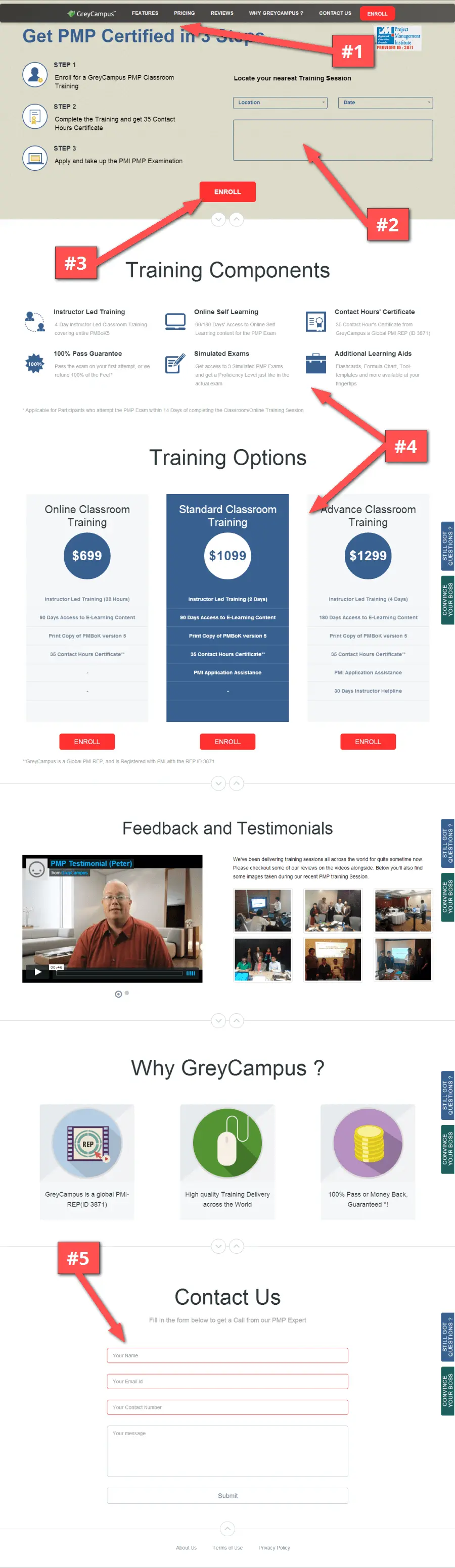
This page is a significant improvement on the first page we had a look at! Here are a few more suggestions:
Things to improve
#1 – Good spacing increases readability. I think you can add a little bit more space between the headline and the top of the page.
#2 – Don’t confuse with secondary CTA’s. I thought that the form was a required step for signing up, but then I noticed that it’s for finding a location near me, and that there’s another call-to-action on the page that says “Enroll”.
You need to decide which call-to-action you want people to take. Do you want them to select a training location, or to enroll? It’s okay to have a secondary call-to-action on the page, just be sure to properly differentiate between the two.
#3 – Provide a solid second option. I also think that you’re asking people for a lot of money right off the bat. If I click “Enroll”, there’s no secondary call-to-action to capture email addresses.
I would use a signup widget, a form, etc… just something that’ll help grab emails because not everybody is going to sign up right away. First you’ve got some convincing to do!
You might as well start a relationship by sending them some tips, a pdf ebook, etc. Getting more leads in the marketing funnel should be one of your primary goals.
#4 – Animations do not help conversion rates! People ask us to include these in their pages all the time! It does not help conversion rates, if anything it lowers them.
When I load the site, the page looks blank for a split second. As I scroll down, the page also looks blank for a second. This does not help engage people and it’s just for show.
You’re better off just having your content appear normally on the page and not having stuff appear like this. I guarantee you’ll do better without having the animation. 99% of the time it’s not visually pleasing, it’s just distracting.
#5 – Include a proper incentive. The second call-to-action on the page is to receive a sales call. Trust me, a sales call is not a reason to give my information… You need to provide a real incentive for collecting people’s information. If I’m getting something in return and then you follow up with a sales call – that’s a much better exchange.
http://marketing.greycampus.com/pmp-certification-classroom-training-usa/
8. Wine Awesomeness
I really like the changes they made and it’s a huge step forward from when we first reviewed their page.
Before:
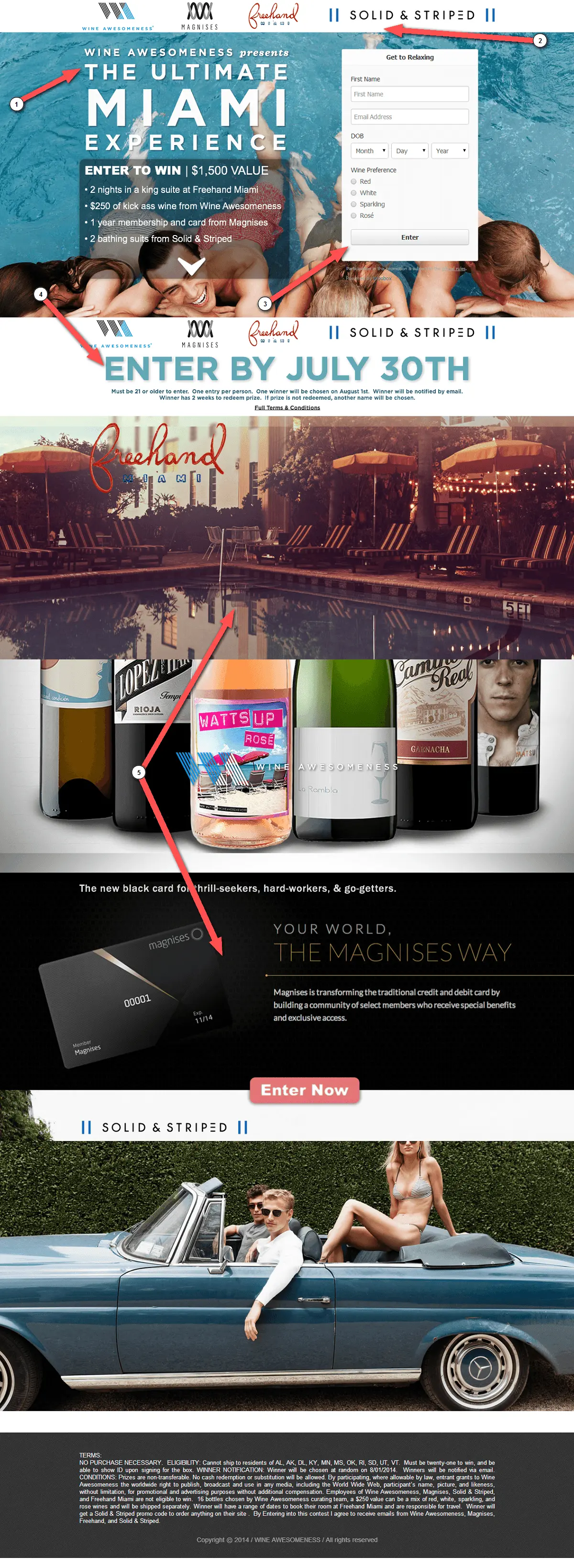
After:
What I like
- The copy now gets to the point.
- Not asking for too much information on the form (like they were before)
- Sponsors have good placement on the page.
Things to improve
#1 – Text should be easy on the eyes. The page uses some great background images, but the lightness of the text box makes the text hard to read. I would try making the box a little more opaque and less transparent.
#2 – Add support copy. To reinforce the prizes and contest partners, I would include the text “Contest includes great prizes from.. ” and then name the sponsors.
This will help provide a secondary backup to what you’re offering. You’ll get people more excited if you explain who the prizes come from.
Going after the page with a focus on readability is the next step!
http://wineawesomeness.com/
9. Crully
What I like
- A six-letter domain, so it couldn’t have been cheap.
- Big primary call-to-action.
- Good concept of using video for apartment listings.
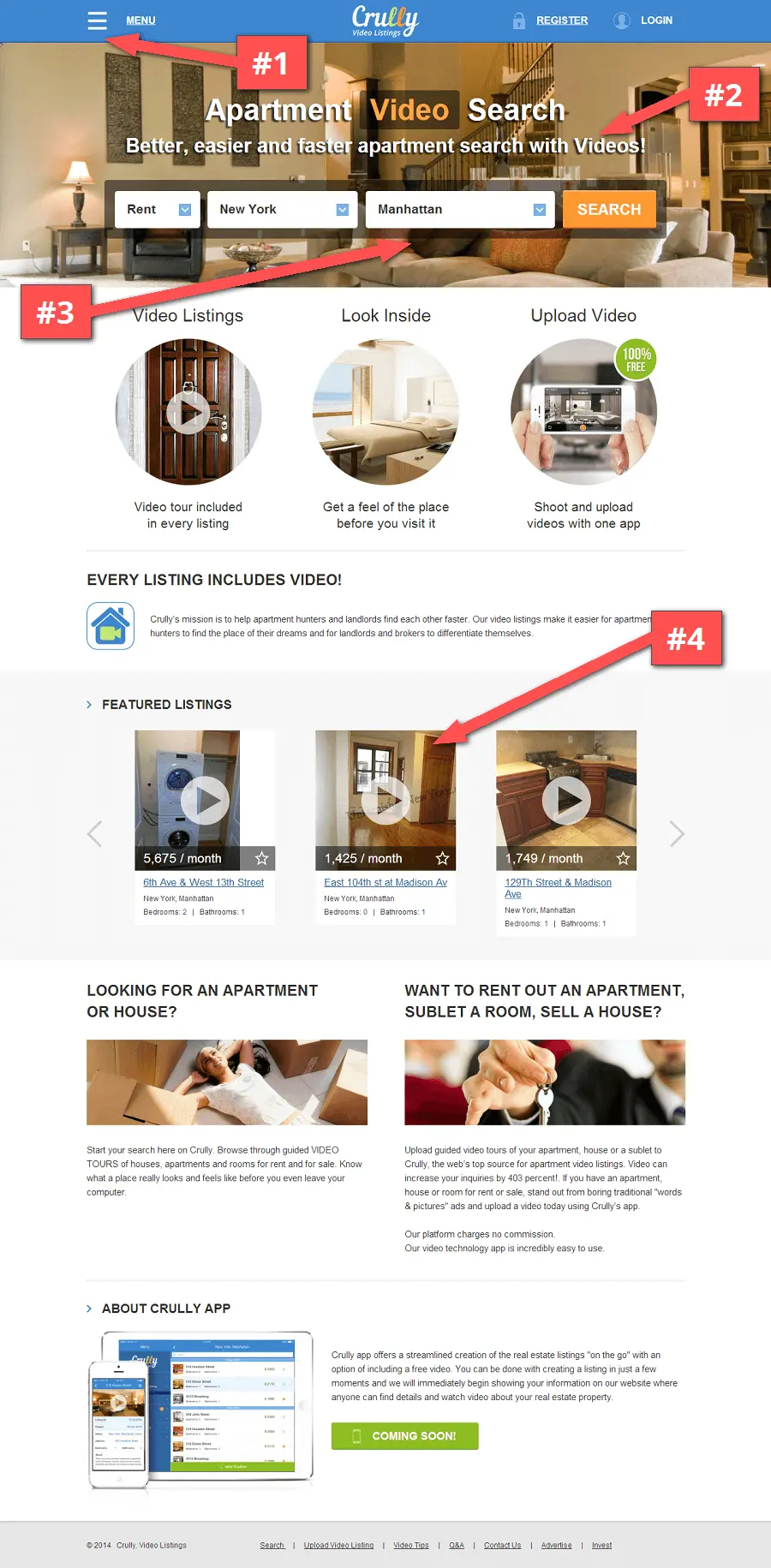
Things to improve
#1 – Don’t hide your navigation. Do you really need the menu “sandwiched” in desktop mode? Would people know to click the menu to get more options? I would perhaps place the logo a little more to the left and place the menu items directly in the navigation bar.
#2 – Better explain the product. I think you should explain the “why” a little better. Why should people use your app for finding listings? Why should landlords use the service to rent out apartments? This product has a little explaining to do and with good reason: there’s something unique about the app. Speak to the benefit of why you’re “better, easier and faster”.
#3 – Give people a secondary call-to-action. There’s no call-to-action on the page other than the search. Which seems to be the primary goal. But what do I do if I want to rent an apartment?
#4 – Optimize the user experience. I wish the video popped up as opposed to sending me to the listings page.
http://crully.com/
In Closing
The aim with these landing page reviews has been to help people optimize their pages for maximum conversion rates. Hopefully, you’re also able to take away some good advice and tips that you can implement on your own landing pages and marketing campaigns.
What did you think about the reviews? Do you have any suggestions for improving landing page conversion?
Be sure to give us a shout out via social to let us know!
Thanks for reading!
-Josh Ledgard,
Co-Founder – KickoffLabs
P.S. If you’re ready to start building smarter campaigns, you really should give KickoffLabs a shot. We offer a more detailed, hands-on conversion rate optimization for all of our paid customers. Give us a try, you’ll be glad you did!