We’re back with more landing page reviews! This is a recap from our latest Live Chat: Your Landing Pages Reviewed webinar, which we host every other Thursday. You really should join us sometime.
Here are the landing pages that I reviewed during the live webinar:
Watch the video for marketing tips and strategies that go into greater detail!
#1 – NightFood
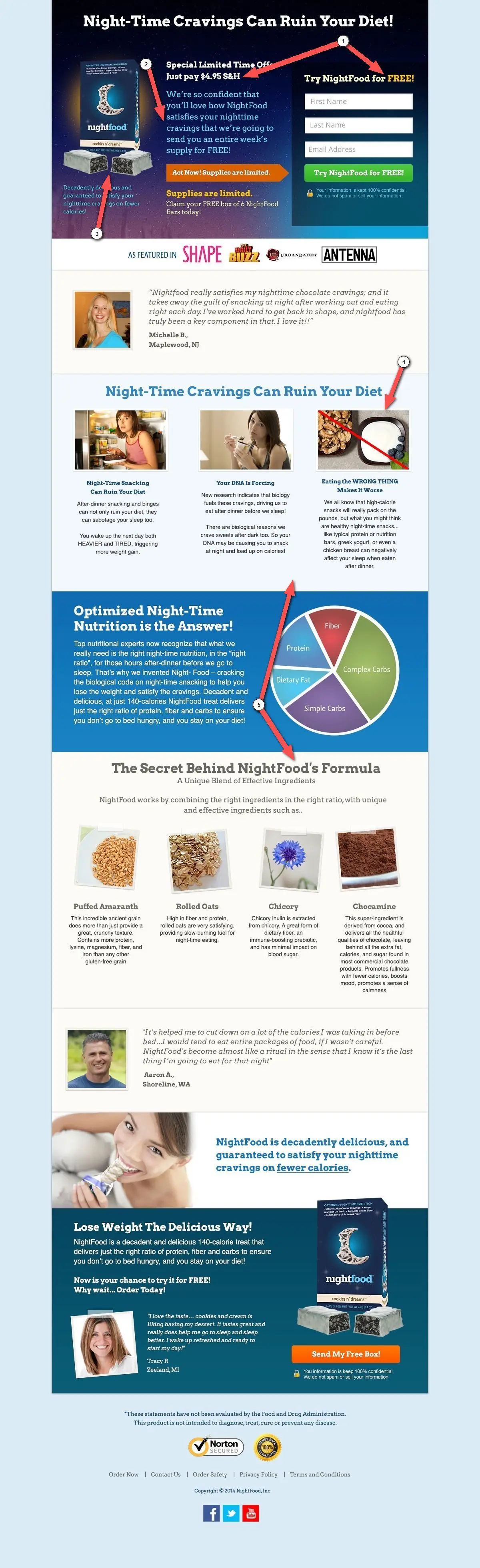
What to like:
- The headline prominently displays the problem statement.
- People can probably identify with the images.
- The form stands out, even with a dark background.
- “As featured in” section increases trust factor.
- Use of a customer quote with a picture.
- Copy that creates a sense of urgency.
Things to improve:
1. Don’t confuse customers. Looking at the text, I really like the first headline but feel that the follow up copy is lacking in describing what the product is. If you keep reading, you’ll notice that right away they’re asking for money. It’s only for shipping and handling, but it can feel a little premature. Asking for $4.95 upfront also conflicts with the “Try NightFood for FREE” call-to-action.
You should get to your offer and explain what it is as soon as people are done reading the headline. I would cut out the “pay $4.95 S&H” and include the statement about the free samples right underneath the main headline.
2. Avoid confusing clutter. The top section in general feels very squeezed and cluttered, there is a lot going here. In total, there are 10 different font styles on the page and it can somewhat confuse the brain when reading the page. Cut back on the total number of font sizes and styles to make the page easier for people to digest (no pun intended).
3. Show more of the product. You could also cut back on some copy and use the extra space to feature the product a little more. In this example, the packaging image is too prominent. Let the food speak for itself. I should look at the first part of the page and my mouth should be watering! If you cut out and simplify some of the text, you can feature more images of the product.
4. Use the right imagery for getting your message across. The image that’s labelled “Eating the WRONG THING…”, I felt like this image was going to be chocolate cake and it wasn’t. When I think about wrong foods to eat at night, I think about raiding the candy drawer, not the greek yogurt. I would go with the opposite of what the image currently is.
5. Include more than one CTA. The different page sections are nicely separated. However, when you have a landing page that is more than a couple scrolls, you should have a secondary CTA button so people don’t have to scroll all the way back up to sign up.
You should include a CTA once at the top, once in the middle and once at the end of the page.
Site: NightFood.com
#2 – Team
![]()
What to like:
- The subtle, elegant, and non-distracting background image that teases the product.
- Great example of how startups can get across what they’re working on.
- Keep it simple with fonts, colors, and copy.
- Page is mobile responsive and will scale to a mobile browser.
- Well-thought sharing and referral process – they use sharing as a contest.

- Follow up email describes the offer and reinforces the message.
Things to improve:
1. Have fun with your CTA buttons! I always tell people to try and think of something else other than “submit” for the call-to-action button.
Maybe it should say “Join the beta” or just “Join”. Use something that goes more along with your copy and what your product does.
2. Make the CTA stand out more. I hate messing with such a clean design, but if there was a complimentary third color introduced on this page it would be on the button.
Perhaps make the button a complimentary orange to really make the center stand out.
3. Describe who it’s for. I felt like there needed to be a little something added to the copy. There needs to be like a sub-tagline to give a little more information on the product. Something that explains who it’s for. Clearly you’re after a specific segment, I just can’t quite figure out who it’s for.
If you made it a little clearer with an extra word here or maybe an extra subheadline, I don’t think it would take away from the page. I actually think it’ll entice people more.
4. Declare a better incentive to sign up. Nobody wants to join a “list”, but maybe they want to join the beta. There needs to be a hint of an incentive upfront to join, besides just being on somebody’s email list.
Site: Team Time Tracking
#3 – Practicia
What to like:
- Copy that speaks to the users problem right away.
- A video that clearly explains what they’re doing.
- Good CTA button copy that is both the incentive and the message.
- Page is mobile responsive (of course it is, it’s a KickoffLabs page).
Things to improve:
1. Design for visitor flow. I think the page could flow better by including the problem statement, a quick explanation of what it is in text, the video, and then maybe you’re ready to ask for the sign up.
It just needs a little something to tie the visitor flow of the page together. Think about how visitors start in the top left and then come down the page.
2. Remove unnecessary form fields. I don’t know if many people are filling out the comments section in the form. If you’re only getting 1 out of 10 comments, I would simply just ask for feedback in the follow up email and drop the comment request so the form is a little shorter.
3. Don’t take away from your credibility. Take out the word “future” from the statement “What our future BETA users are saying…”. It makes it sounds like your users are made up.
I’m assuming that this is what real users are saying about the product. So it should probably say “What our BETA users are saying…”. Anything that takes away trust from the statement on the page is something that you should consider removing or changing.
4. Provide consistent images. It’s sometimes hard for pre-release products to talk about features of the product. One of the things that was a little bit jarring as I was going through the sections is all of the images are a different size.
The page would look a lot cleaner if the images were all scaled to the same size. I know it’s hard when you’ve got something in development and trying to perfect screenshots. But just something that makes the page feel a little bit more conducive.
5. Provide an incentive for sharing. When a person submits an email to the page, I would also add some kind of incentive on the share screen. Something that gives people the incentive to use the sharing links.
BONUS ADVICE: Do people scroll in landing pages?
There’s been a long debate about it… What I say is: Design the top of the page with the assumption that people are NOT going to scroll, BUT expect that they will!
What I mean by that is, the top of the page should be engaging and get across the top point of the page and the goal without the user having to scroll. But people will scroll up and down on pages.
You can install a tool like CrazyEgg that does heatmap tracking to look at how much people are scrolling on your pages.
#4 – Wine Awesomeness Contest
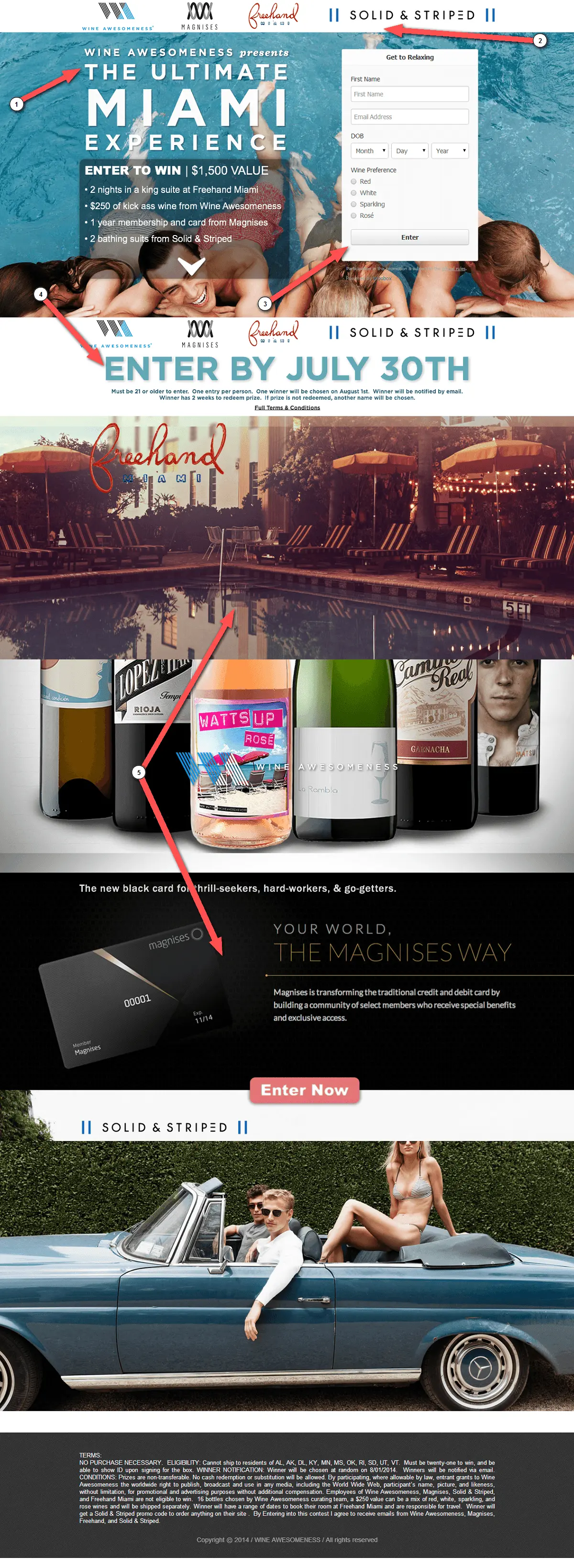
What to like:
- The text is readable and works really well with the background image.
- A strong headline that stands out (but I think you can repeat it on the page).
- Clear explanation of the value.
- The page is “cookied” and remembers whenever I come back so I don’t have to go through the age gate again :)
Things to improve:
1. Make it obvious it’s a contest. I feel like something in the headline needs to say “Win”. Something upfront that implies you’re entering a contest.
2. Put images in their place. The first header row of images has nothing to do with what you want people to do. My eyes were initially drawn to these images and I realized they were links. These would take me away from the page and lower the conversion rate!
You could cut them because they are duplicated beneath the main section. Below the main section is the perfect place for the sponsors and you would actually see it without having to scroll (at least on my large screen size). That way people’s eyes are drawn to the headline.
3. Place your form within the flow. The form is very subdued off to the side. People’s eyes are going to be drawn sort of down the page to where the people in the image are, but you want them to be drawn towards the CTA.
4. Tell people when to activate. The contest end date could be moved up higher, right beneath the “Enter to win” and include the phrase “Enter by”. Having the incentive of limited supplies right next to the button is going to be a strong motivator to get in. That’s really important copy that is missing from the top part of the page.
5. Use images to reinforce explanations. I’m not sure how the rest of the images on the page relates to the contest. I know that they are the prize sponsors, but maybe actually have a section that says “Sponsored by” or “Prizes from”.
Use these images to explain what you’re giving away. First do the summary of the prizes, then the motivation to enter, and as you scroll down you should summarize what the prizes are in the extra space on the page. If you’re going to have extra copy and extra images, make it related to the top.
6. Don’t neglect mobile visitors. The page is not responsive and will not correctly scale down for mobile viewing. Especially if you’re promoting via email or via social networks, people are going to be visiting the page on mobile devices. What’s the experience going to be like for them on a mobile browser?
Site: Wine Awesomeness
BONUS ADVICE: Is it better to have fewer form fields when capturing people’s information?
I love this question because it’s one that gets asked a lot. When you’re choosing how much information to capture on the form, I look at it and say: How are you going to use that information? My rule is: if you’re not going to use that information immediately in a way that benefits the person signing up, I wouldn’t ask for it.
Name for example, is an easy win. If you’re going to use the name in an autoresponse email or an email where you follow up with the person later, the name is really great thing to have.
I see pages all the time that ask for a combination of occupation, role, zip code, etc. Yet I feel that they don’t use that information in any way that benefits the person filling it out. It also feels a little lazy. If someone wanted to reach out to me and find out what my occupation was, they could do it with just my email address.
KickoffLabs actually goes out and pulls a bunch of that complimentary information, including peoples LinkedIn profiles, whenever somebody enters an email address. Because we pull in that information, we help you make shorter forms and you don’t have to ask. We call this our Magic Contact Data.
My rule of thumb is, ask for information that is immediately valuable and going to be put to use, by either the person filling out the form or that you are going to use for some reason (it’s required, you need it to take a next step, etc). After you have them engaged to sign up, then you can follow up with a poll that asks some more detailed questions in a medium that’s more intended to ask questions – email.
#5 – WhiteSpace TV
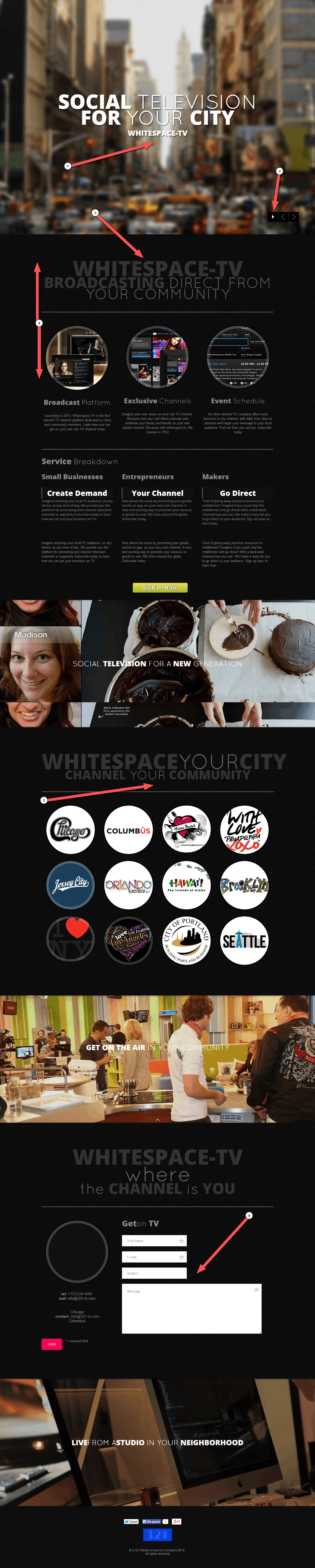
This is a page that relates to the previous “do people scroll or not?” question.
What to like:
- An incredibly clean look.
- Page is mobile responsive… but the headline renders too small mobile phones.
Things to improve:
1. Include a CTA at the top. What’s missing right away is either a CTA to learn more or to sign up. I think you lose a lot of people on the page that just see it and walk away.
2. Don’t hide content from visitors. The last thing I noticed, is that the main background image is a non playing slideshow. This text should’ve been on the main page without having to hit a slide. I might have never clicked there!
All these are benefits are hidden because it doesn’t play automatically (and I wouldn’t advise it play automatically). You have to know to click there and it takes away from the page. You should be optimizing for people scrolling down on the page instead of for using sliders.
3. Provide more initial information. It wasn’t until I got to the second section that I understood what the page is about. I feel that it’s missing from the top of the page. The top of the page can still be clean if you included the second headline there and it would tie in better with what it is.
I had to scroll quite a bit to find the CTA in the middle of the page. But it’s still not clear to me what I’m signing up for. You need to make it clear what someone is signing up for and what they are getting.
4. Design for usability. As you scroll there is a lot of effort on parallax effects, where the background moves and the text stays in place. Maybe I’m just old, I honestly think it’s a waste of time and design resources because it’s not helping people read the page.
Same goes for using grey font color text on a black page. It’s more difficult to read than it needs to be. It doesn’t have to be shiny bright, but you could bring up the text a few shades to increase readability on the page.
5. Give some context about your launch. It’s cute that you’re using buttons to call out cities where you’re launching. But it doesn’t say: “These are our launch communities”.
6. Use only one form on the page. There are a total of 3 forms on the page, two of which are accessed by clicking either the middle CTA button or the cities list. Yet ALL THREE use different form fields? You could’ve combined all these questions in the main form to simplify the signup process.
7. Design for mobile viewing. The page is responsive. But when I looked at the page with my phone, the top of the page is just image. I’m never going to scroll anywhere when I get to it from my phone.
Site: 321 Media
#6 – Endlessly Fit with Gary
What to like:
- A really clean-looking page.
- It’s mobile responsive and the headline stands out on small screens.
- The page and headlines tell a story.
- Starts visitors down the “yes path”.
Things to improve:
1. Long form sales copy can work if… You never know which piece of copy is going to convince somebody to want to sign up. Somewhere within this first section there needs to be a CTA, as you scroll down a bit
2. Add more CTA’s to the page. You get to primary call-to-action until the very end of the page. You could take the “Yes I’m In” text and use that as the CTA at the top of the page. That way, when a person clicks the CTA, they’ll be scrolled to the bottom form and still see that there is a story to be read on the page.
When it’s something to buy, people will be scrolling up and down on the page.
3. Include a secondary CTA. The other thing that I really recommend is whenever you’re asking for somebody to buy, this is exactly the situation where I would have a secondary call-to-action. I might not be interested in buying, but I might be interested in learning more.
The other CTA could be a popup form on the side, or an exit intent that pops up when you go to leave the page. You just need to capture people that are leaving. Whenever you’ve got “Enter you credit card” you’re going to lose a ton of people that you don’t need to be losing when you could be at least starting a relationship with them.
Site: Endlessly Fit
#7 – RocketCrowd
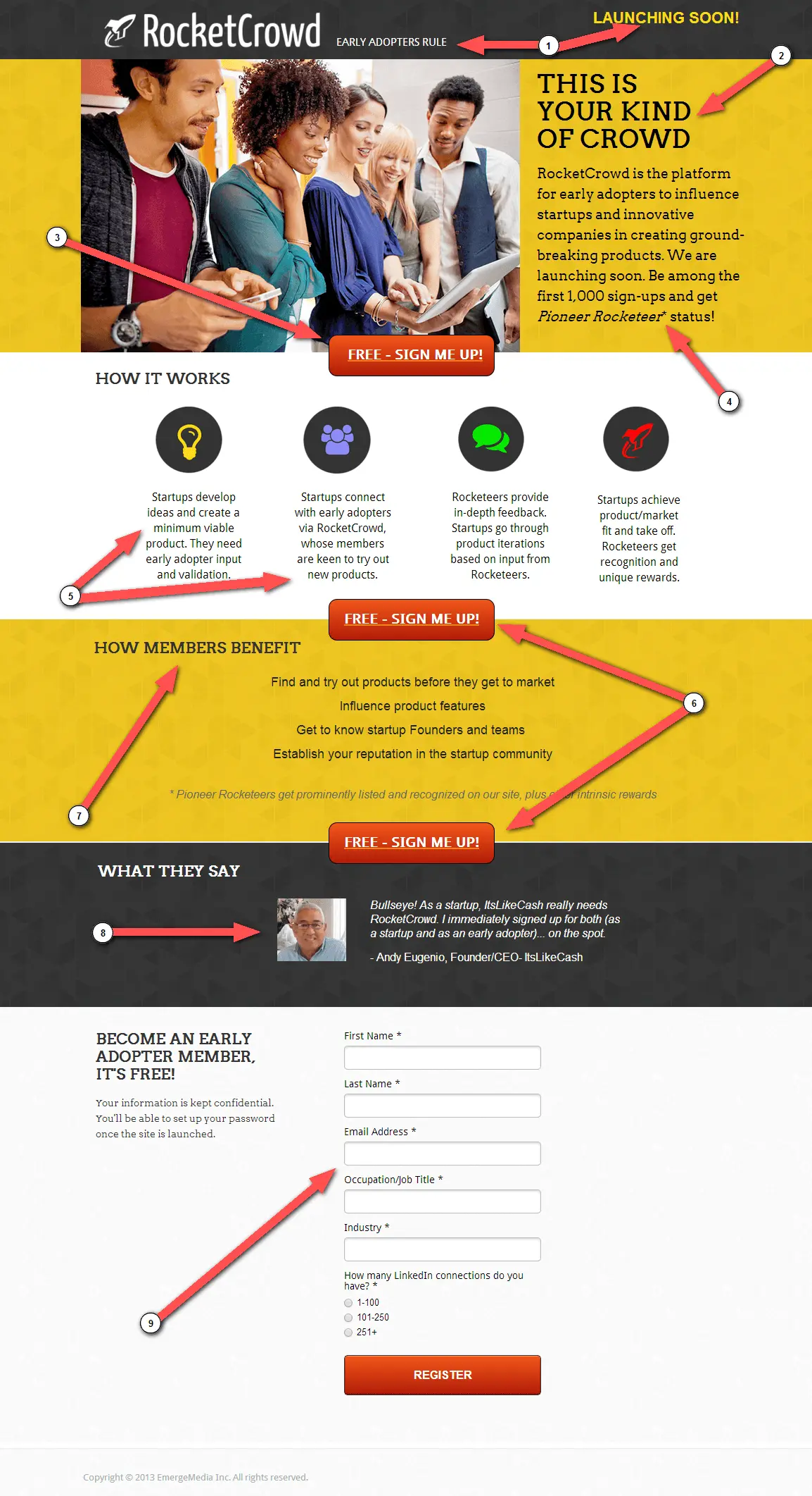
What to like:
- The people in the image drive attention towards the CTA button.
- CTA doesn’t take you to another form page.
- Use of a real customer quote.
Things to improve:
1. Use a better tagline. I don’t think the “Launching Soon” text is needed here. You’ve got the “Early Adopters Rule” text, that is already a good tagline. It’ll get noticed more if you replace it with the former.
2. Give people an opportunity. I’m not convinced by the “This Is Your Kind Of Crowd”. It’s a great tagline but doesn’t explain what it does and doesn’t explain the opportunity. We just met and you haven’t clearly explained the problem that you’re going after. If you start with a problem statement, you’re giving me an opportunity and not just saying I’m part of the crowd.
3. Answer questions before asking for sign up. I think there’s a lot of space on this top of the page devoted to the stock photo. If it’s not stock you can call me out, but it looks like a stock photograph and that’s immediately what my eyes are drawn to. The people in the image are kind of looking down on the laptop, which does bring your eyes to the “Free – Sign Me Up” button.
I feel it’s a little bit out of order because your eyes go from the logo, to the picture, to the signup button. People don’t have time to answer the question: What am I signing up for? An easy change would be flipping the text and the image (and the direction people are facing obviously if the image is mirrored on the other side).
4. Call out the incentive. The incentive text is buried within a paragraph, but should be next to the signup button. Put it to the side or below the sign up button.
5. Shorten your copy. The “How It Works” copy is really wordy. This could all be said simpler in one sentence instead of the longer sentence that is here.
6. Cut back on CTA’s. There are multiple call-to-actions that are almost too close. This might be going a little too far in the other direction of including too many CTA’s on a page.
7. Get the benefits across first. I would swap the “How It Works” for the “How Members Benefit” to include how people benefit higher up on the page. First let people why they should join, then explain how it works.
8. Use customer quotes near signup buttons. I think the customer quote section could be removed and instead include the quote next to the form. You can have the incentive, then the quote and the form right next to those. You’ll have a quote about a customer talking about how great your service is and a signup button right next to it.
9. Optimize signup forms. Looking at the form, this is where I really wonder again: Are all these form fields really needed? I feel like you’re making the person do work. The form also doesn’t have the incentive to fill it out.
Site: RocketCrowd
In Closing
There are a plenty more hidden marketing gems and a couple more quality reviews to watch and learn from in the video. Be sure to check it out in your spare time.
For now, here’s what we’d love to know: Are these landing page teardowns helpful for building your own landing pages and campaigns?
If you have a published landing page or even a mock-up that you’d like us to help optimize for a better conversion rate, send it over for our review! And be sure to join us during the next Live Marketing Chats!
Reserve your spot for our next LIVE event by clicking here!
Keep in mind that the # of pages people want us to review keeps increasing, so we’ll be getting to your landing pages as soon as we can…
… but TWEET this and you just might get bumped to the front of the line ;)
“I want my landing page professionally reviewed for FREE by @kickofflabs![]() “
“
Thanks a lot and see you at the event!
-Josh,
Co-Founder – KickoffLabs