We offer free consultations for new paying customers to help them optimize their landing page conversions. It works great, but what if we expanded that to review anyones landing page? So we decided to host a live webinar and ask people to submit their landing pages for review!
It was awesome! We got WAAAYY MORE entries than we had anticipated for being the very first KickoffLabs webinar. Of course a 1:1 review would cover a lot more, but you can learn a LOT for the changes suggested for these examples. We focused on changes that could be made ASAP designed to have an immediate impact to their conversion rates.
By going through some of the many pages that were submitted by our audience for review, I’m sure you’ll find some advice that will help out with your own landing pages. So let’s start off and go page by page that people have to improve.
The Landing Page Teardowns
Be sure to watch the full video for plenty more hidden marketing gems!
#1 – Davai
Positives
- A clean and simple design.
- Mobile responsive and looks appropriately at smaller sizes.
- Copy is straightforward and clearly describes what the app does.
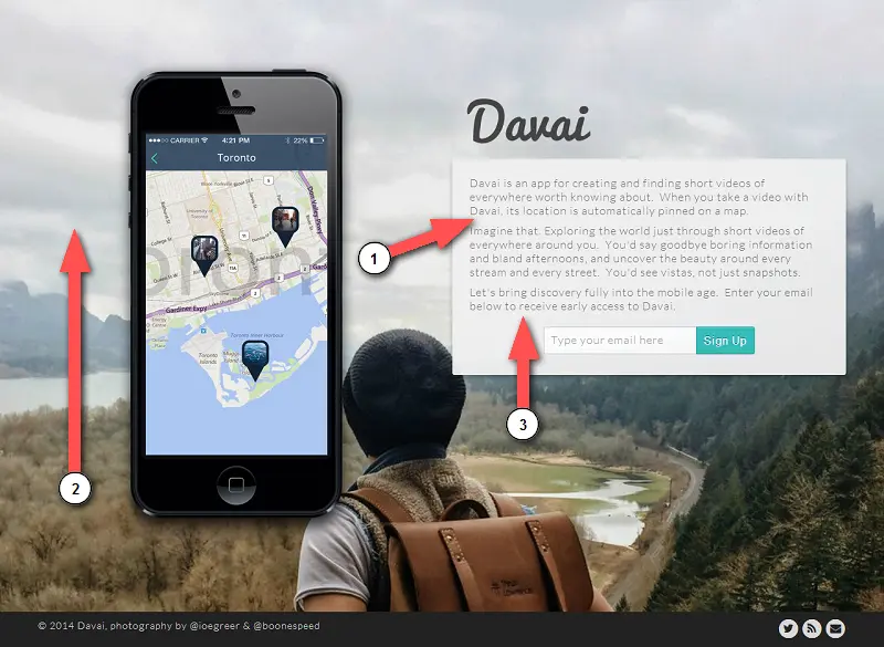
Improvements
1. Make the page more skimmable. Without a text headline or subheadline, you force people to read small print copy. Call out a strong piece of copy and make the text larger.
2. Use a cheerful background image. The photograph is great, but is of a gloomy day. Including a brighter image can help put people in a better mood when they’re looking at the page. Then again, maybe it’s just me because I live in Seattle and prefer to look at some sunny weather :)
3. Optimize your signup copy. A great post-signup share message can help boost your viral conversions by 30 – 40%. Give people exactly what they asked for and think about an incentive that will get people sharing.
#2 – Blue Apron
Positives
- The page is extremely visually appealing.
- Hero image stands on its own and almost doesn’t need any copy to explain the product.
- Good use of page animations that aren’t distracting to the copy.
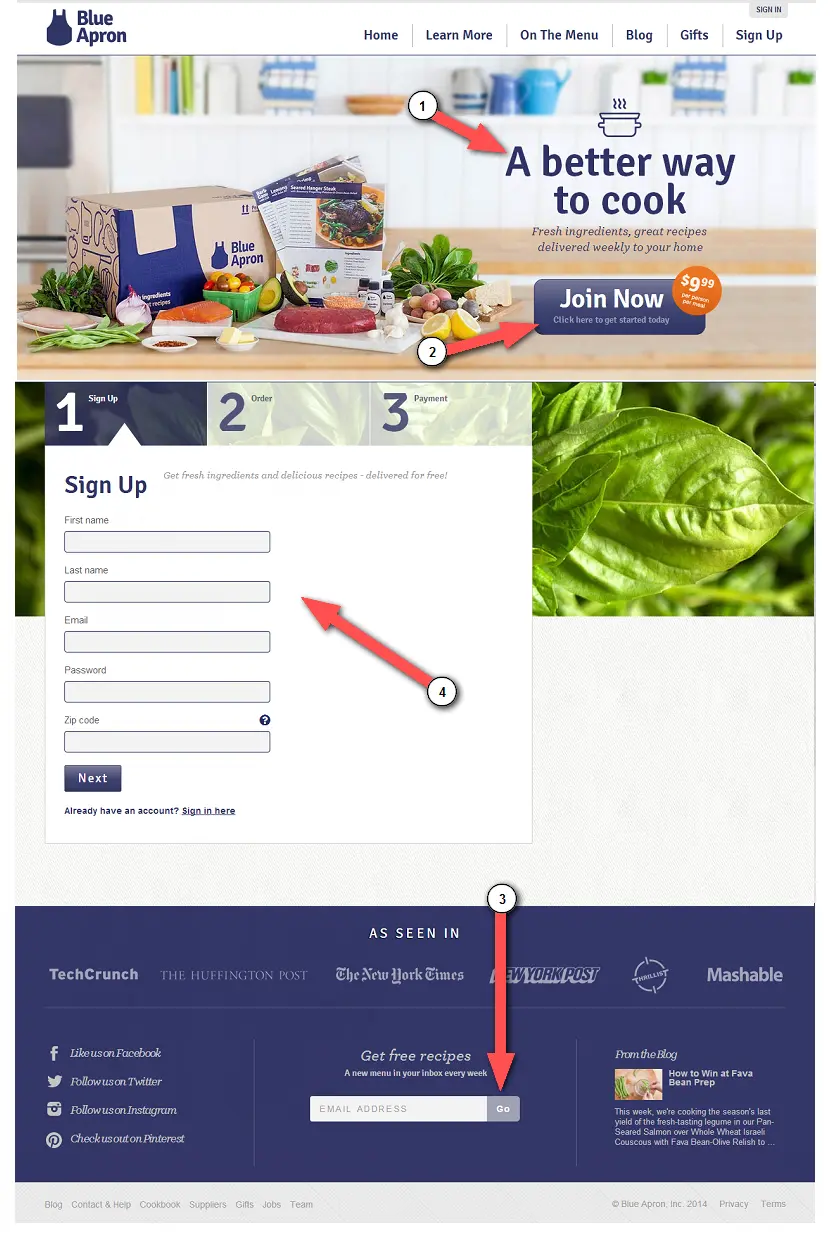
Improvements
1. Start A/B testing headlines. Test out different headlines that avoid the use of generic terms like: “a better way to…” or “a simpler solution to…”. Focus on what your value proposition is and give a clearer explanation of why it’s “better” or “simpler”.
2. Use big, contrasting buttons. Can you see the call-to-action buttons if you stand back 10 feet from the page? Kinda. This pages primary color is blue and uses a blue “Join Now” button with pricing in orange. Make sure your buttons stand out by swapping out your primary color for one that is more noticeable.
3. Paid service? Use a secondary call-to-action! When you’re at the stage of people considering to spend money on your product or service, they might feel a little intimidated. At this point, having a secondary call-to-action asking for an email address is critical. You want to start building your audience because a lot of your leads will start out with a free experience (an email course, curated content or recommendations, etc).
We do this on KickoffLabs.com with our Landing Page Course popup widget to draw more attention to our free email course and can say that it’s helped to increase conversions.
4. Optimize for customer purchase flow. Too many form fields or steps can overwhelm people. Reducing the number of steps involved for signup will lower dropoffs. The longer the form, the lower your conversion rate.
#3 – Gameblyr
Positives
- Great looking logo that catches the eye.
- Easy to read, highly visible tagline.
- The phrase “Limited Spots Available” creates the illusion of scarcity.
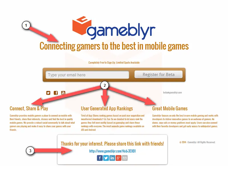
Improvements
1. Speak to the person reading the page. Imagine a person that just saw that a link posted by a friend… Speak to that individual person instead of just describing your service in general. Don’t make it sound like a pitch, make it sound like a conversation.
2. Features are fine, but benefits are better. Focus your copy on the specific problems that you’ll be solving for people. Describe the benefits in signing up and try using the main problem statement as a headline.
3. Give an incentive to share. After sign up, adding an incentive as to WHY people should share will increase the amount of shares. Even if you’re not providing a free download or product, inviting friends to your service could be the actual incentive.
#4 – FinVox
Positives
- The page is visually appealing.
- You can see the CTA 10 feet from the screen.
- Page scales down and is responsive on mobile devices.
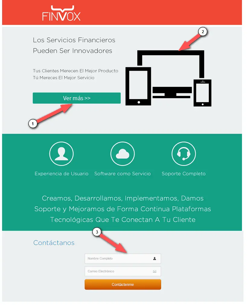
Improvements
1. Use images that explain your service. Using vague images doesn’t explain to visitors what is going on. If you use images, make sure they include obvious examples of the kind of service you provide.
2. Provoke an immediate response. Rather than having your call-to-action merely scroll to another element on the page, make sure call-to-actions ACTUALLY DO SOMETHING. Getting someone to contact you, capturing an email address, or signing up for a service is a call-to-action
3. Don’t hide your signup form. If you bury the email form too far beneath your copy, you might prevent people from signing up. Keep a signup form at the top of the page and use additional text below that supports your case.
#5 – FlockUnlock
Positives
- Beautiful and modern-looking design.
- Plenty of call-to-actions on the page.
- Good descriptive subheadlines.
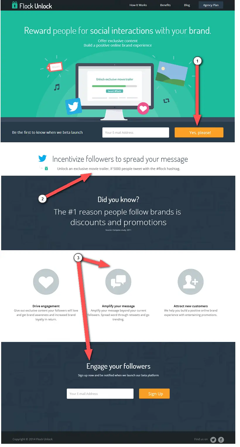
Improvements
1. Take into account different screen resolutions. On certain resolutions your CTA may be getting lost! Be sure not to obscure the view of your primary call-to-action buttons with odd placement or unnecessary elements. If you’re using chat support widgets, be careful with the positioning so that you don’t cover up something that is important on the page.
2. Show off your service. Use your landing page as an example of your service to reinforce what you’re doing. If you’re launching a company, include an incentive that uses your beta and speaks about your brand. Take your idea and build something from your launch landing page.
3. Wordiness doesn’t lower conversion rates. Use as many words necessary to clearly explain your product or service. You never know what format or copy is going to get people to convert. Repeating certain copy in the body or headlines isn’t going to hurt your conversion rate, it can actually help increase!
#6 – RushTix
Positives
- Each of the individual header options was good. Pick a good one and drop the animation.
- The tagline, underneath learn more was good.
- Narrow focus on one market, for now, good to exclude people and focus on a market.
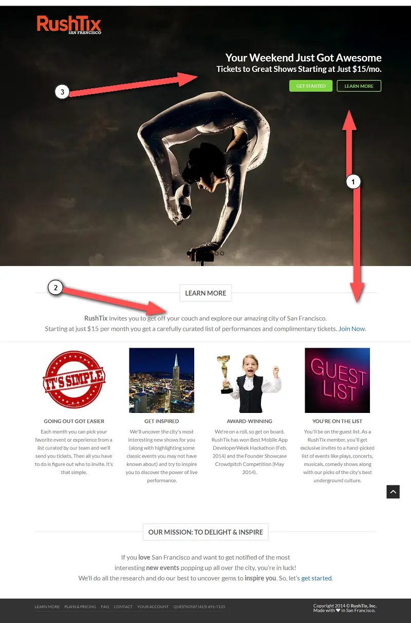
Improvements
1. Isolate important copy and elements. Above the fold space should not be distracting to your primary copy and call-to-action. In this case, there is an oversized slider that is getting in the way and not complimenting the call-to-action. Not everything on the web needs to be animated, especially if it’s preventing people from reading further on down.
2. Exclude people you’re not for. If your business is location based, it’s in your best interest to say “we’re not for these people, but we are for these people”. It makes the people you are for, feel like part of an exclusive club.
3. Copy trumps visuals. You might have a great set of images or videos included at the top of your landing page. But if something is not primary data that you want to get across, save it for later on down the page. Your copy is more important than any visuals on the page.
#7 – ScoPerks
Positives
- Creates exclusivity in the text “to be considered”, etc.
- Button clearly stands out to submit the email.
- The what is nearly defined.. but could be expanded on.
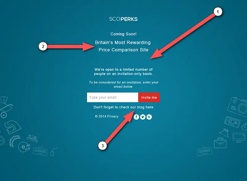
Improvements
1. Use font size as a design tool. Your text needs to stand out! Try using large text for the logo, medium text for your headline and small text for your body text. It helps to add more sense of design to the page.
2. Give away information. A lot of new startups have a fear of giving away too much at the beginning. This couldn’t be further from the truth… people love to read about progress and feel as if they’re a real part of your community. Add information and context to let people know what they’re getting into and what they’re signing up for. Don’t make people guess.
3. Include secondary CTA’s in a response email. Take off secondary call-to-actions from the page. When somebody signs up, use an autoresponder email and include links to 2 or 3 of your most recent blog posts that are worth reading. There’s not much of an incentive in “check out our blog”, but there is probably more incentive in some of your blog headlines. Recommend helpful articles in your autoresponder emails to start solving people’s problems will get people to click-through and read the blog.
#8 – Diverge
Positives
- Nice background image that lights up the page as you hover.
- Use of a simple, polished form.
- They’re a KickoffLabs customer :)
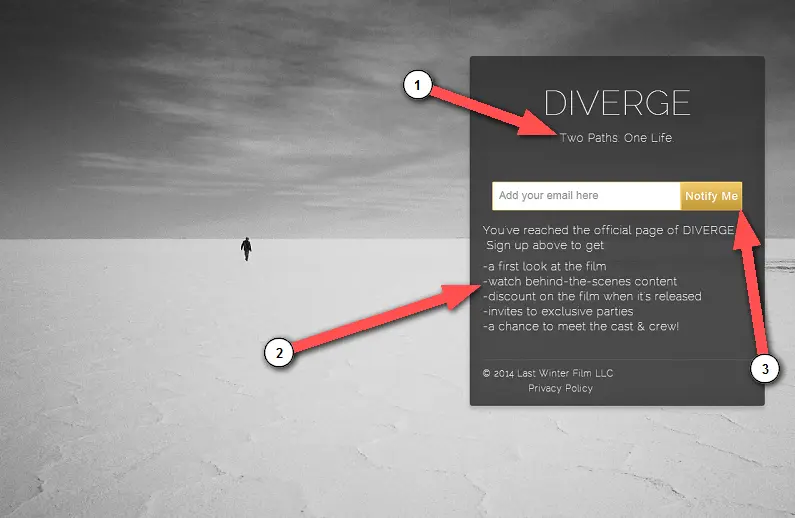
Improvements
1. Make the page obvious. Make sure people know exactly what it is they are looking at. Provide enough obvious context as to what the page is about and maybe try including the “what” as a subheadline.
2. Form placement matters. If you’re giving away some valuable incentives, it’s worth placing the incentive copy above the form to motivate people. Tell people what they’re getting right before you ask for the email address. Even if a small amount, somebody’s email address is still a form of currency.
3. Be clear about what they’re clicking. Instead of using the standard “Notify Me” call-to-action, the button text should match what you’re giving to reinforce what’s on the page.
#9 – GetFeedbac
Positives
- Leverages potential audience by integrating with popular services.
- Well spaced form with a CTA that’s hard to miss.
- Good use of social proof in the form of customer testimonials.
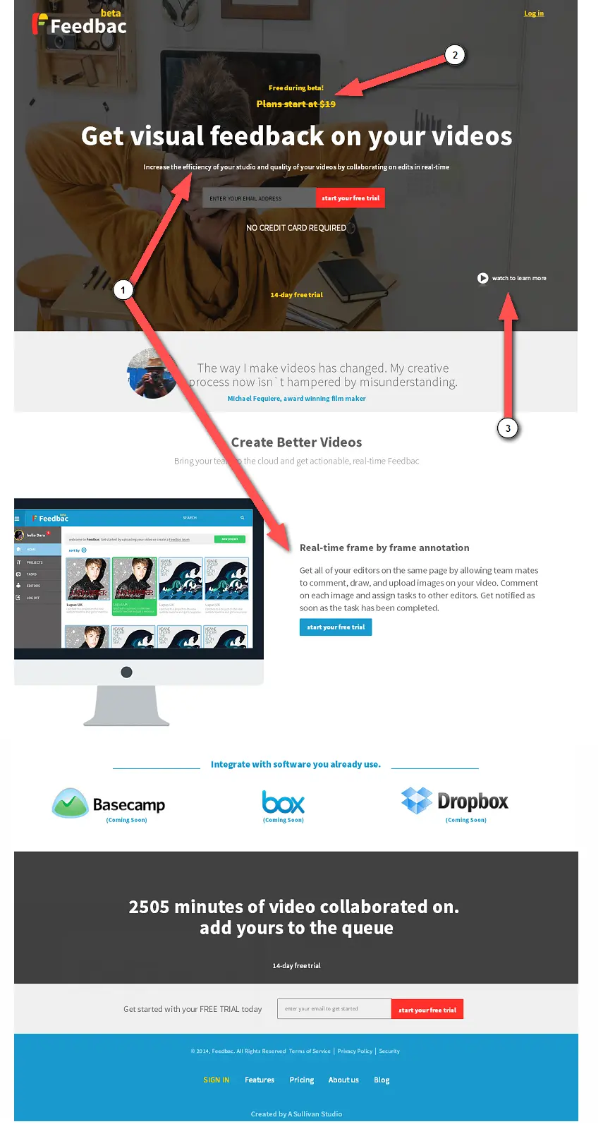
Improvements
1. Aim directly for your target. You should know who your target customer is and clearly explain the product or service to them. Don’t force people to figure out if it’s right for them or not. Promptly clarify your service/product and message to your visitors.
2. Free trials and betas don’t mix. There’s really no need to emphasize price on a beta release signup page. Highlighting the free early beta access is more than enough to drive valuable early adopters (influencers!) into signing up. After you officially launch, then send out an email to let customers know it’s time to upgrade to a paid account.
3. Highlight how your product is used. This is clearly a video based product, yet the explainer video isn’t as noticeable as it should be. Demonstrating the product is essential for users to gain an understanding of potential use cases. Leave no room for doubt, especially if you’ll later be charging people money for your service!
At KickoffLabs, we call it “Drinking Your Own Champagne”, i.e., dogfooding. We use our own product ALL THE TIME for landing pages, contests, & email capture. People see our campaigns and know exactly what our product is about.
In Closing
Did you find these kinds of teardowns useful? Helping people optimize their pages for first contact and providing solid advice for conversion lifts is always a gratifying experience for me. But by the amount of entries, I know there are still tons of people that are looking for marketing advice on their pages and campaigns…
… Which is why we’re planning on doing more of our Live Marketing Chats!
Would you like us to provide your landing page with some awesome optimization tips that will help boost your conversion rates? Reserve your spot for our next LIVE event here!