We recently presented our 2nd “Your Landing Page Teardowns” live webinar. An event where I review and help optimize peoples landing pages. Normally I review customer landing pages, but this is a chance for anyone to get a professional review for FREE.
Once again, turnout was great and the number of pages submitted far exceeded my expectations. As such, we only had air time to get through 9 pages during the live webinar. Still I made sure that all my advice was helpful, immediate and can apply to enhancing just about any landing page.
There’s a ton of advice packed into every review!
Here’s a look at the pages that I went over during last weeks webinar:
Be sure to watch the full video for plenty more hidden marketing gems!
#1 – GreekRush
Positives
- Form at the top is clearly the primary goal.
- Benefits statements are focused on the visitor.
- Good use of reinforcement copy under the bullets.
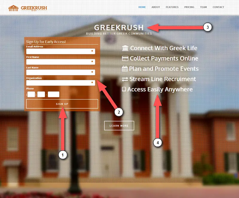
Improvements
1. Match your calls to action. Use the button text to tell people what you’re giving them once they sign up. In this case, they are giving people “early access” to the app. Matching the button call-to-action is a good helpful reminder for people to know what they’re after.
2. Slim down the signup form. If you have a form field that is not required, look at how many leads are filling out that section. If not many people are, it makes sense to remove it so you’re signup form is simpler and smaller. It feel less intimidating if you’re not asking for more information than absolutely necessary.
3. Try combining your brand name and subheadline. You’re brand name and logo may speak directly to you, but not necessarily to a visitor who has just arrived at your site. Try combining your brand name and subheadline into a new headline. The statement could be a headline that goes across the page and helps make the copy more cohesive.
For example, the headline for this page could be “GreekRush helps you build better greek communities”.
4. List the biggest benefits. Highlight one to two of the biggest immediate benefits in signing up NOW… Is it free? Will they get early access? Don’t confuse features with benefits either.
#2 – Fundura
Positives
- Simplicity of the launch page.
- Page is responsive and works across all mobile devices.
- They’re a KickoffLabs customer :)
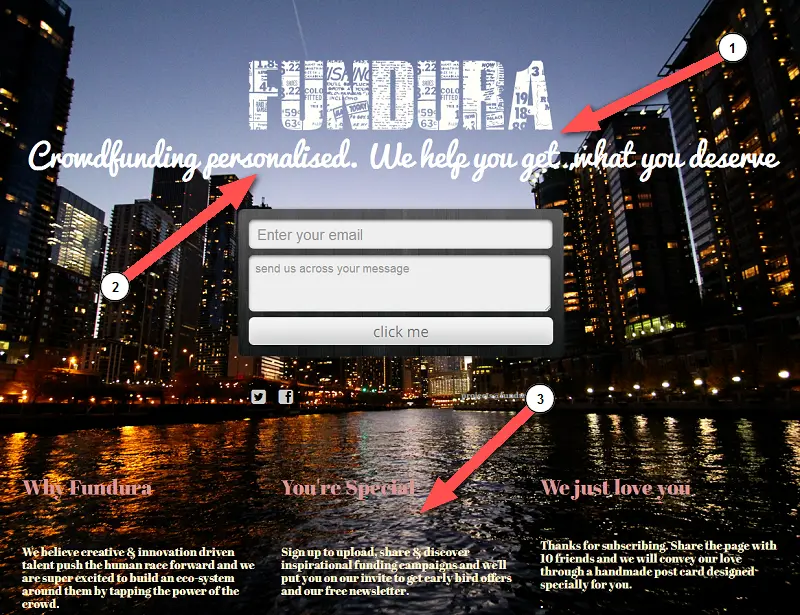
Improvements
1. Readability of the page is a priority. When it comes time to choose your fonts, colors and images; be sure that all copy is readable on the page. If you use a background image, try using a blur or darken effect. Choose fonts that are easy to read and contrast well against the background. Be aware of how your artistic design impacts overall readability.
2. Give more information prior to sign up. Don’t have it a complete mystery about what you’re doing. Try including some bullet list items or a two sentence explanation beneath your logo and subheadline to give a bit more information about the service. Certain statements might be great to say about your company, but do not clearly describe as to why people should sign up and how your service helps them.
3. Place benefits near the form. Place your most compelling piece of copy (the problem statement) either directly above or below the form. Put it front and center so people know exactly what the main benefit is. Don’t make any assumptions that people know what the page is about just by including buzzwords.
#3 – SSP Mexico
Positives
- Using a background image slider, but the form still stands out along with the CTA.
- Call-to-action button clearly stands out.
- Testimonials add an element of trust to the page.
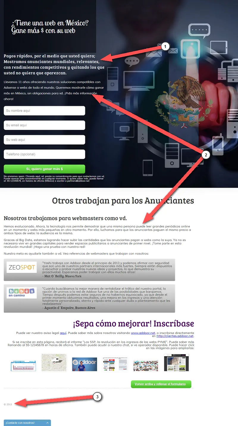
Improvements
1. Quicker headlines. Brief headlines work better than longer headlines. Give people short descriptions before they decide to jump in and read the rest of your copy. Try using more subheadlines underneath headlines if you need to add more support copy.
2. Use half as much text as there is on the page right now. Tighten up some of the copy by using bullet lists and summarizing what you offer. There’s no need to give your visitor the complete story now when the goal is to get them to sign up. Use your autoresponse message and newsletters for following up and completing the story.
3. Keep your page and copy updated. Tiny little things, like the copyright date, can influence the overall trust factor of the landing page. You never know what copy is going to convert someone, so it’s best to keep your copy updated and fresh. Maybe they weren’t convinced at the top, but are convinced at the bottom of the page.
#4 – Motorpaneer
Positives
- Site loads incredibly quickly.
- Brand is minimized and the copy is much more about the customer.
- Persistent call-to-action at the top on scroll.
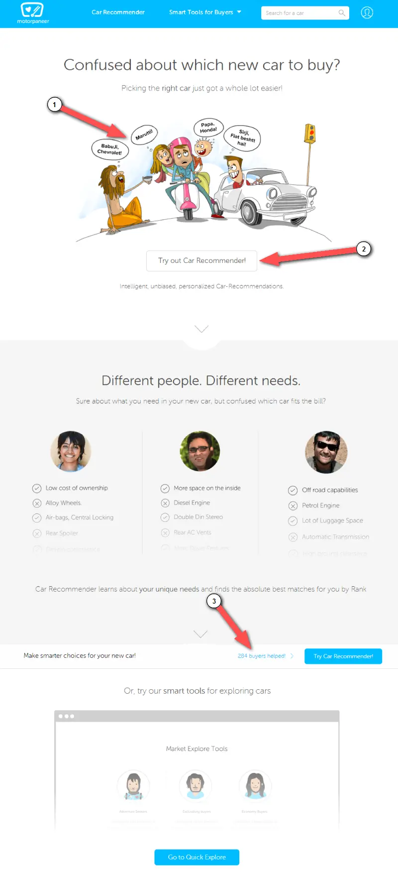
Improvements
1. Lead your leads. Make sure your copy flows directly towards the signup button or form. That way, you’ll get immediate action from a person who has read the copy and is ready to sign up.
2. Get the email FIRST! Focus on capturing peoples email addresses, especially if the product requires you collect a good amount of information upfront. You can try breaking up the steps, but will still most likely see a large percentage of drop-offs. By collecting the email address first, you’ll still have direct access to peoples inbox for following up later.
3. Sometimes social proof can actually hurt your conversions. If your service is just starting out, it might not be in your best interest to mention the number of people that have used your service. If it not in the thousands, it probably not worth showing off yet. Most people simply don’t enjoy being the first ones to the party. Instead, try using additional microcopy to increase visitor confidence.
#5 – Golf Lessons Ebook Page
Positives
- Good leading question and offer for readers.
- Uses a video to reinforce the pitch.
- Repeats call-to-action at the bottom of the page.
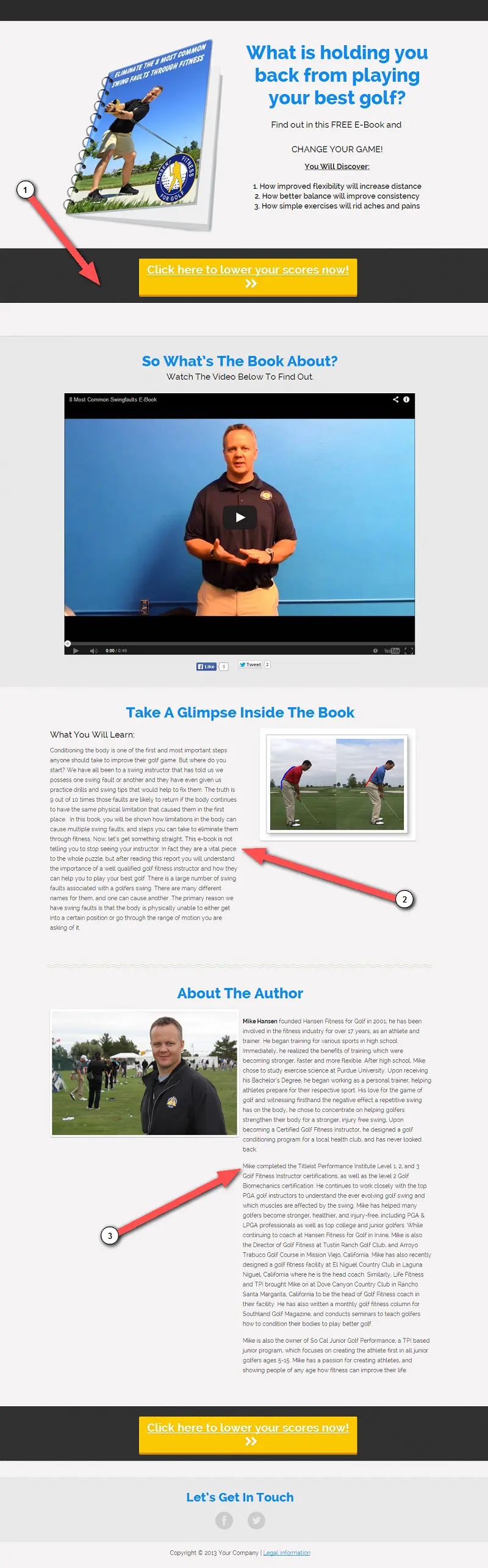
Improvements
1. Beware of noticeable page breaks. Using dark background areas or images can cause people to think that the page has ended, when only a section has come to an end. They will stop reading if they come to a large line or page break because mentally, people see it as the end of the page. Give people the chance to know that you have a lot more great information.
We used to see this on our home page. For a while, the top was completely blue and there was a page break below that. When we looked at heatmap data, people weren’t scrolling because it looked like the page ended!
2. Show them what they’ll learn. If you’re giving away an ebook, go light on the copy and include more than one sample page from the book. These will serve as better visual examples of what’s inside and will entice people to get more.
3. Make it skimmable with great headlines. Some of this pages copy feels a little long. Try making the page easier to read by using bullet points… Be sure that all your headlines are great. There are a lot of things you can say, but you don’t need to necessarily say it all.
#6 – GreyCampus
Positives
- Good bulleted items that support the benefits.
- Phone number instills trust and is not distracting.
- Use of trust statements below the form.
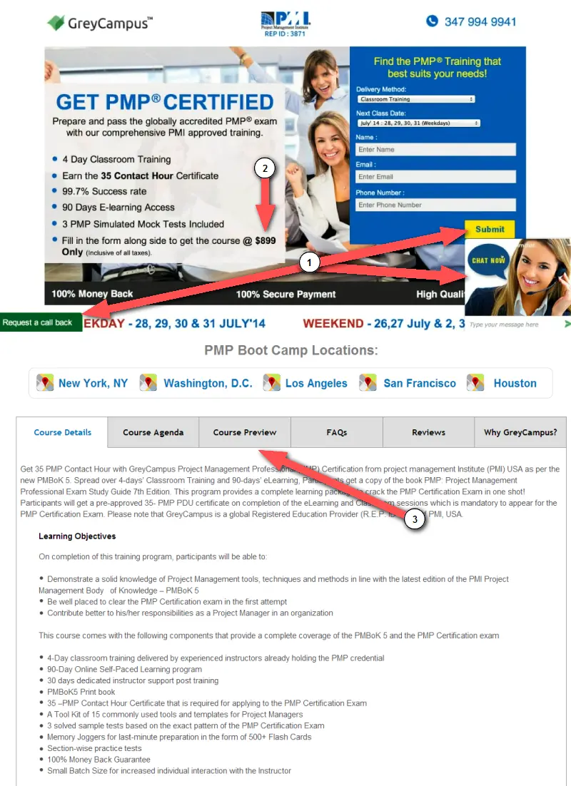
1. Call out the single next step. Looking at this page, immediately there are five things that attempt to grab my attention. When you give people too many options, in many cases they will not know what to do. You need to focus on ONE primary step before experimenting the others.
2. Don’t ask for the money yet. Especially with this being a high-priced item (at $899!). A better strategy would be to use an incentive – like a discount on the course – for collecting emails. Use the cost as a benefit to let people know the incentive in entering their information now.
3. Tabs hide your content. I’ve never been much of a fan of copy behind tabbed content. Oftentimes, you’re better off having a long-form copy lead page. Where your tabs are broken out into headlines and the page has a longer scroll. Yeah, the page will be longer, but each different section is now more apparent to visitors. Tip: On long-form landing pages, be sure to always have a call-to-action visible on the screen, as well.
#7 – Aegis
- Page is mobile responsive.
- A short and snappy headline*
- A contrasting CTA that’s hard to miss.
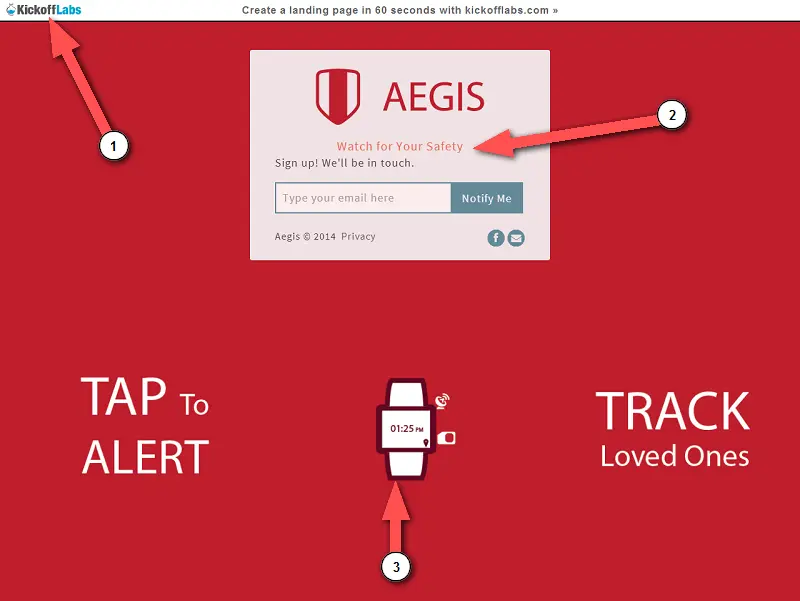
#1 – Make the page about your business. Don’t distract people into clicking away from your site. This page is clearly on a free KickoffLabs account. And while we appreciate the free promotion, having any sign of a third party service will drive away visitors and hurt your conversion rate!
#2 – Give away details. The headline is short and snappy BUT* doesn’t really describe what the product does. Don’t leave people guessing… Clearly state exactly what you do and use subheadlines to reinforce your problem statement.
#3 – Don’t rely on images to communicate your message. There are things that should be said with text on the page. You can’t put too much important copy on the background image of a page, you need to put it within the content of the page. Depending on your visitors screen size, images may get buried behind forms or other content. Use images for adding context, not for your explanation.
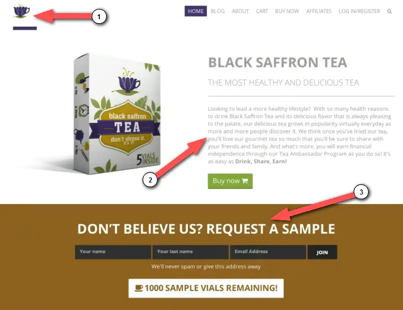
#8 – BSTea
Positives
- Call-to-action button stands out.
- Great use in offering free samples of their physical product.
- Creating the illusion of scarcity with the incentive.
Improvements
1. Check that your site always loads correctly. If you view the video, you’ll notice that as I was loading the site, there was some sort of CSS loading error. If this happens to people the first time they visit your page, odds are they will abandon ship and will not be coming back…
… Even when I went back to grab a screenshot from the page, I was presented with this error:
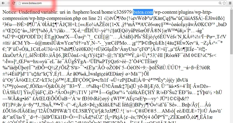
Keep your sites performance fast and errors to a minimum!
2. Break up your text. If you have a large block of body text, try extracting some of the copy to create one or more subheadlines. This makes your text more readable and skimmable. Take your story and call it out, then reinforce the benefits further down the page.
3. Focus on the quickest and simplest thing people can do first. If you feel that your product speaks for itself, focus on all the calls-to-action being “Get a sample”, as an example for this page. Once you have their information, you can then share any other programs you offer that people can get involved with. Think about the steps in the funnel you want people to go through and walk them through that on the landing page.
#9 – B8ak
Positives
- Phone number is highlighted in case people want to call right away.
- A clear “Help” button for immediate support.
- Nice, clean design.
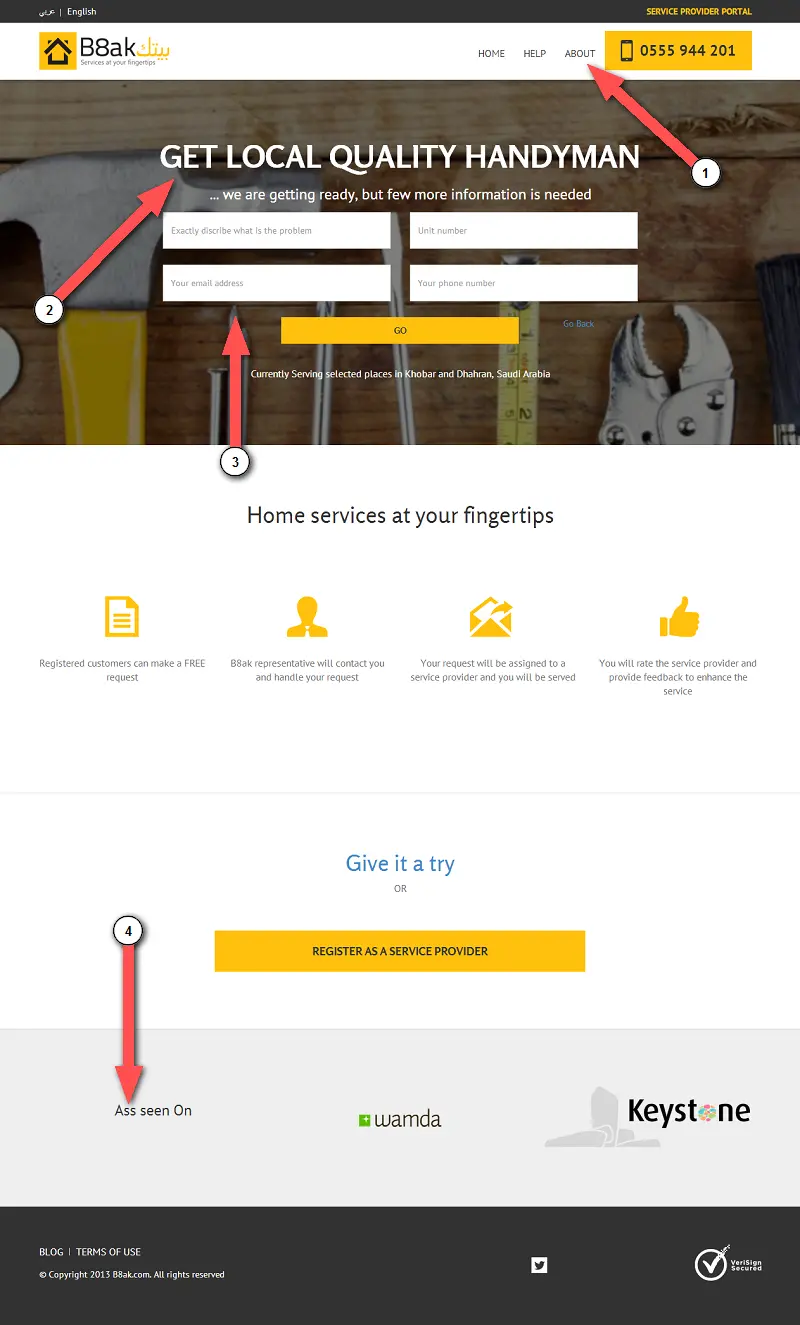
Improvements
1. Forget the “About”. Answer the “Why”. A lot of sites across the web use a standard “About” us page. I’ll try to put it nicely: People don’t care about you or your company… YET! Tell people “Why” they should choose your company over others. What can you do for them?
2. Be upfront about your call-to-action. It’s not crystal clear what the call-to-action is on the page. Do they want people to call? Do they want people to choose a service? Use headline your copy for specifically directing people into taking the primary desired action.
3. Reduce steps for sign up. This page forces you to choose a service, then the form pops open asking for additional details. I think the page would work better if the form was always visible on the page and as immediate as the phone number. You’ll get better acceptance if you have the form upfront and visible, the less steps the better.
4. Proofread your copy! Nobody wants to be “ASS seen on” anything!.. And I wasn’t going to point this out (actually I didn’t, someone else in the chat during the live webinar did). But even as a foreign company, it’s never okay to have spelling errors. Always proofread your landing page copy to check for misspells and grammatical mistakes. Better yet, get someone else to double-check the copy for you.
In Closing
Did you find these kinds of teardowns useful? It’s always a blast helping people optimize their pages for maximum conversion rate! And I’m more than ready to help YOU get more from your landing pages.
Get your landing page reviewed for FREE during our next landing page teardowns! Reserve your spot for the next LIVE event here!
Thanks for reading,
-Josh, Co-Founder – KickoffLabs Follow @joshaledgard
P.S. Stay posted for more landing page reviews coming very soon!
If you enjoyed these Landing Page Teardowns, be sure to let the world know by using the share buttons below!