Contents
- The Four Giveaway Page Frameworks
- 1. The Prize-First Sweepstakes Page
- 2. The Referral Contest Page
- 3. The Waitlist Giveaway Page
- 4. The Product Bundle Giveaway Page
- 5. The Gift Card Giveaway Page
- 6. The Seasonal Giveaway Page
- 7. The Partner Giveaway Page
- 8. The Creator Collaboration Page
- 9. The Leaderboard Challenge Page
- 10. The Bonus-Entry Actions Page
- 11. The Local Business Giveaway Page
- 12. The Post-Entry Share Page
- What makes a giveaway landing page convert?
- How to Build These in KickoffLabs
- The Bottom Line
Free tool: Compare your page against these examples with the Giveaway Landing Page Grader.
Most giveaway landing page examples online are too pretty and not useful enough.
They show a nice hero section. Maybe a button. Maybe a prize image. Then they stop right before the part that matters: why someone would enter, why they would trust you, and why they would share after entering.
A giveaway page has one job: turn attention into entries. A great giveaway page has a second job: turn those entries into more entries.
That is the difference between a normal landing page and a giveaway landing page. You are designing a tiny growth loop.
Quick answer: The best giveaway landing page examples have a clear prize headline, visible prize image, short entry form, deadline, official rules link, mobile-first layout, and a post-entry referral step. The highest-performing formats usually fit one of four patterns: prize-first sweepstakes, referral engine, waitlist launch, or partner giveaway.
Below are 12 example types you can steal. Not fake brand screenshots. Not invented case studies. Practical page patterns you can adapt for your own campaign.
If you want the tactical checklist first, read our giveaway landing page best practices guide. This post is the swipe file.
The Four Giveaway Page Frameworks
Before we get into the examples, group your page into one of four frameworks.
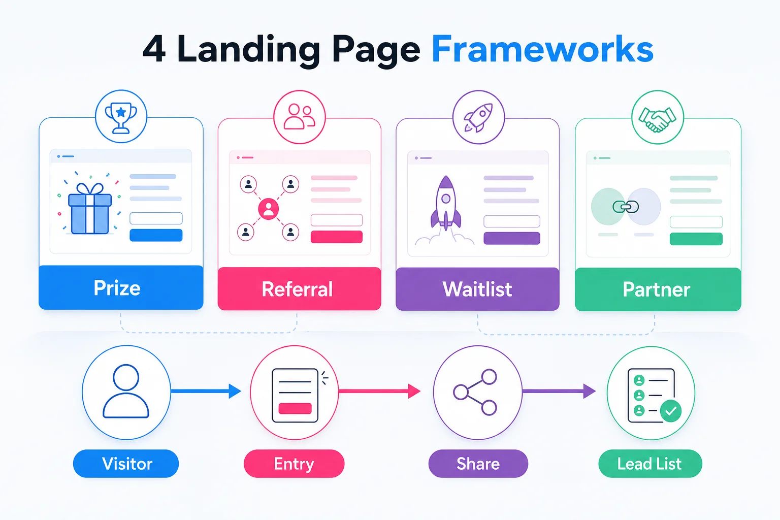
Prize-first pages sell the value of the prize. These work best for sweepstakes, product bundles, gift cards, and seasonal giveaways.
Referral-engine pages sell the chance to improve your odds by sharing. These work best when you want your entrants to become your distribution channel.
Waitlist-launch pages sell early access, status, or priority. These work best for SaaS, apps, memberships, crowdfunding, and product launches.
Partner-giveaway pages sell combined value and borrowed trust. These work best when two or more brands can reach the same audience without competing.
Pick one primary framework. You can borrow pieces from the others, but do not turn the page into a junk drawer.
1. The Prize-First Sweepstakes Page
This is the classic giveaway landing page because it works.
The page opens with a blunt headline: Win [specific prize] worth [value]. Under that, show the prize and put the entry form close enough that nobody has to hunt for it.
Use this structure:
- Prize image on one side
- Entry form on the other
- Deadline near the form
- One-sentence prize description
- Official rules link below the form
The mistake is getting clever.
“Your next adventure starts here” might sound nice in a brainstorm. “Win a $750 camping gear bundle” gets entries.
Use this format when the prize is the reason people care.
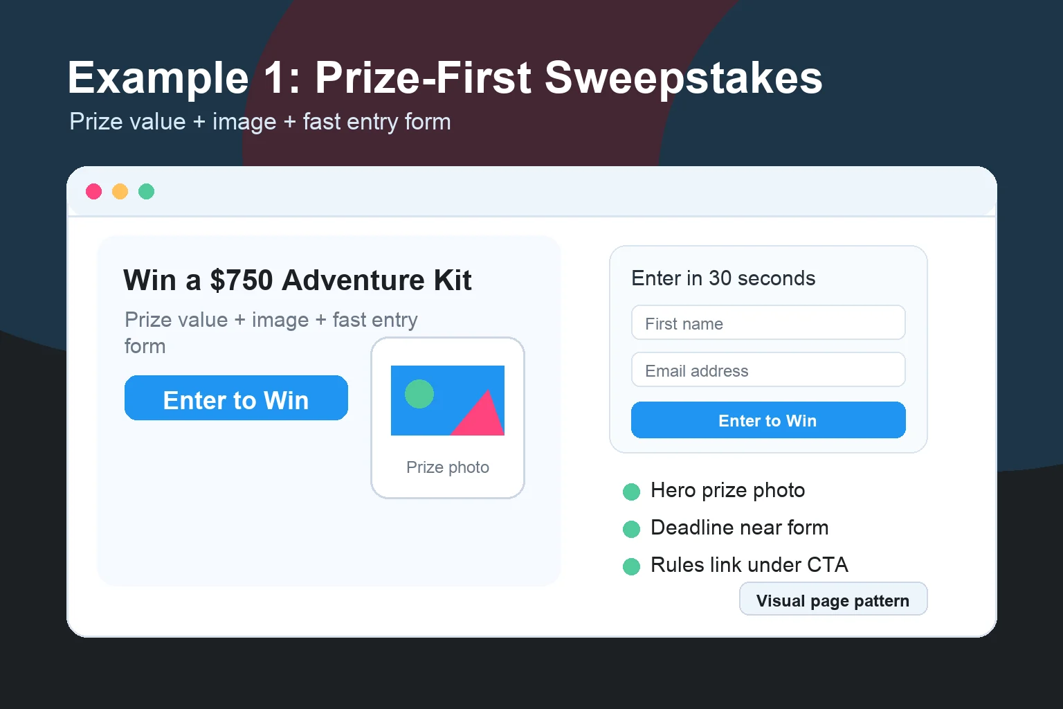
Steal this CTA: “Enter to Win”
2. The Referral Contest Page
A referral contest page is not done after the first entry.
The entry page should still be simple. The magic happens on the thank-you page, where the entrant gets a personal referral link and a reason to share it.
The page promise is different from a normal sweepstakes:
Enter once. Share with friends. Earn more chances to win.
That sentence does more work than a paragraph of fluffy copy.
The best referral contest pages explain the loop before entry without over-explaining it. Something like:
- Enter with your email.
- Get your personal share link.
- Earn 5 bonus entries for every friend who joins.
That is enough.
KickoffLabs was built around this mechanic. Real campaigns like Haugen Racing used a giveaway plus referrals to grow a 14,500-lead list. The lesson is not “copy their prize.” The lesson is that the share step needs to be part of the campaign architecture, not an afterthought.
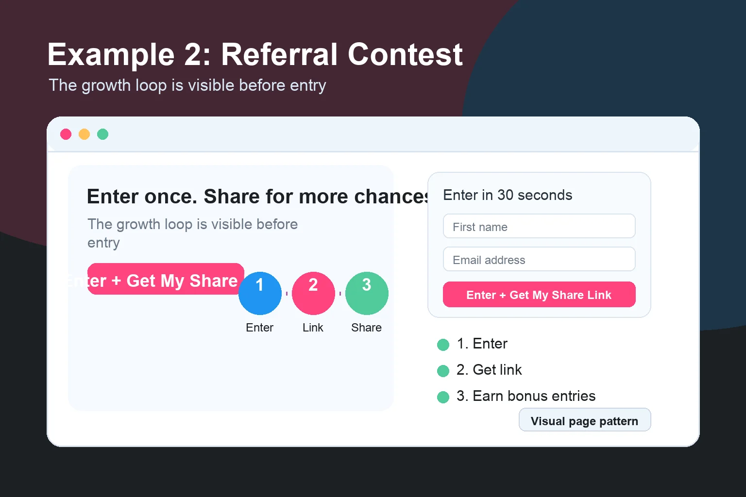
Steal this CTA: “Enter + Get My Share Link”
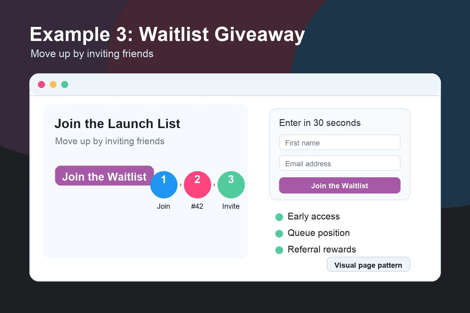
3. The Waitlist Giveaway Page
Waitlists convert when they feel like access, not a form.
The strongest waitlist giveaway pages combine early access with a reward mechanic. People join the list, then move up by referring friends or completing bonus actions.
Your headline should not be “Join Our Waitlist.”
That is a chore.
Use something sharper:
- “Get Early Access to the Private Beta”
- “Join the Launch List and Move Up by Inviting Friends”
- “Be First in Line for the Drop”
Then show what they get by joining: early access, founder pricing, limited inventory, beta invites, private community access, or launch-day bonuses.
This is especially useful when the product is not fully available yet. You are not asking people to buy. You are asking them to raise their hand and prove demand.
We break down the full setup in our pre-launch waitlist guide and the waitlist campaign type page.
Steal this CTA: “Join the Waitlist”
4. The Product Bundle Giveaway Page
A product bundle is easier to sell than a single item when the bundle tells a story.
Do not stack random products together and call it a prize. Theme the bundle around a real outcome.
Bad: “Win 8 products from our store.”
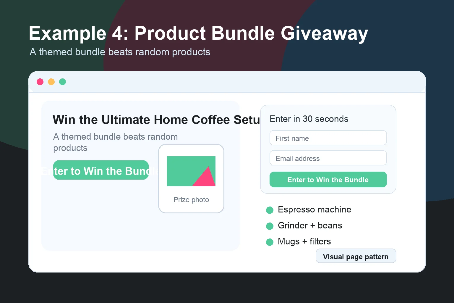
Better: “Win the Ultimate Home Coffee Setup.”
Better still: show the full bundle with a clean list:
- Espresso machine
- Grinder
- Starter bean pack
- Two mugs
- One-year filter subscription
Now the visitor can picture the win.
Make the bundle feel bigger than the sum of the items. Show everything together, use short bullets, add approximate retail value if you can support it, and link to rules.
This is great for ecommerce because every entrant has told you what category they care about. The follow-up email sequence practically writes itself.
Steal this CTA: “Enter to Win the Bundle”
5. The Gift Card Giveaway Page
Gift cards are boring if the page is boring.
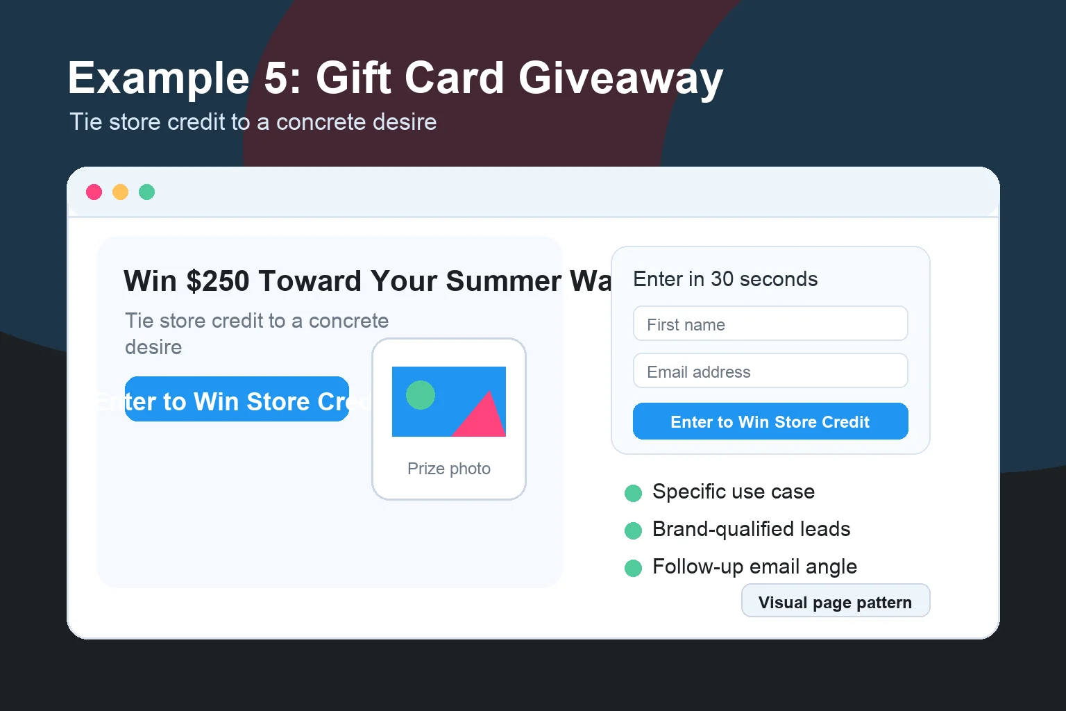
A $250 gift card can work extremely well when the audience already wants what you sell. The page has to connect the gift card to a specific desire.
Instead of “Win a $250 Gift Card,” try:
- “Win $250 Toward Your Summer Wardrobe”
- “Win $500 for Your Home Office Upgrade”
- “Win a $100 Bookstore Run”
Same prize. Better mental image.
Gift card pages should also qualify the right leads. If your prize is an Amazon gift card, you will get people who like Amazon gift cards. That is everyone. If your prize is store credit toward your product, you get people who are more likely to buy later.
We go deeper on this in the gift card giveaway guide.
Steal this CTA: “Enter to Win Store Credit”
6. The Seasonal Giveaway Page
Seasonal pages work because the context is already in the visitor’s head.
Back-to-school. Black Friday. Summer travel. Holiday gifting. New Year resets.
You do not have to create urgency from scratch. The calendar does half the work.
A seasonal giveaway page should make the timing obvious in the headline:
- “Win a Back-to-School Tech Bundle”
- “Enter Our Black Friday VIP Giveaway”
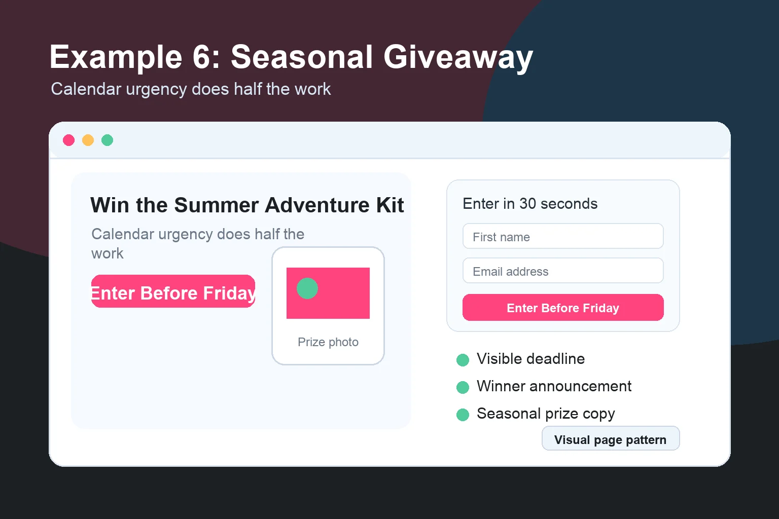
- “Win the Summer Adventure Kit”
- “Join the 12 Days of Giveaways”
Show the campaign timeline. Seasonal campaigns have natural start and end dates, so use them. Add a countdown timer, put the deadline near the form, and mention when the winner will be selected.
If the campaign includes multiple prizes or daily winners, make that clear above the fold.
Steal this CTA: “Enter Before [Date]”
7. The Partner Giveaway Page
Partner giveaways are powerful because you are borrowing trust and distribution at the same time.
The landing page needs to answer one question fast: why are these brands together?
If the connection is obvious, the campaign feels bigger. If the connection is weak, it feels like a logo pile.
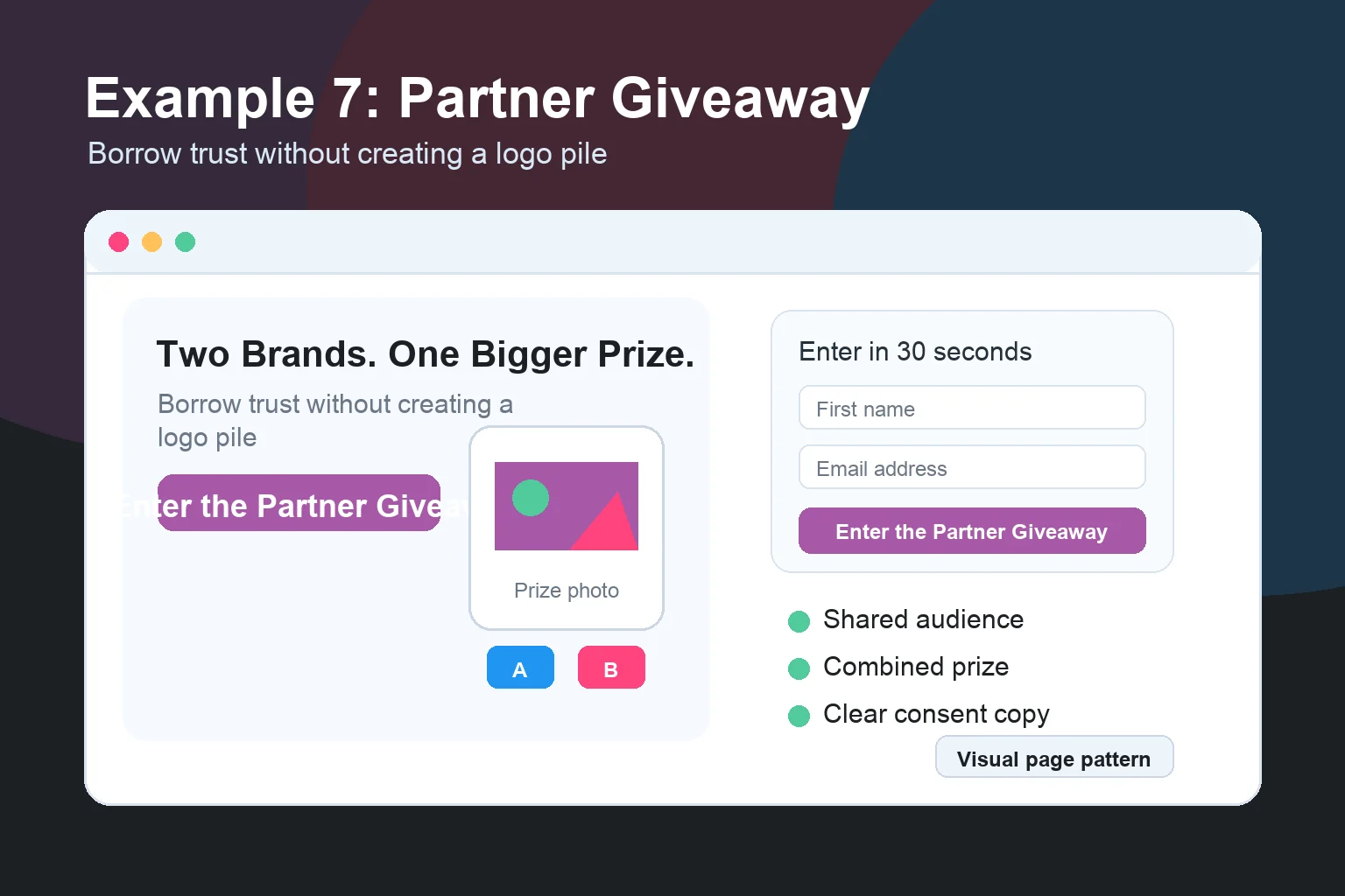
Good structure:
- Shared audience headline
- Combined prize image
- Logos from each partner
- One short sentence explaining the collaboration
- Entry form
- Optional checkbox or disclosure for partner email opt-ins
Be careful with consent here. If multiple partners want to email entrants, say that clearly. Do not bury it in a sentence nobody reads.
The FTC’s guidance on disclosures is written for endorsements and influencers, but the same principle applies: material relationships should be easy to notice and understand.
Steal this CTA: “Enter the Partner Giveaway”
8. The Creator Collaboration Page
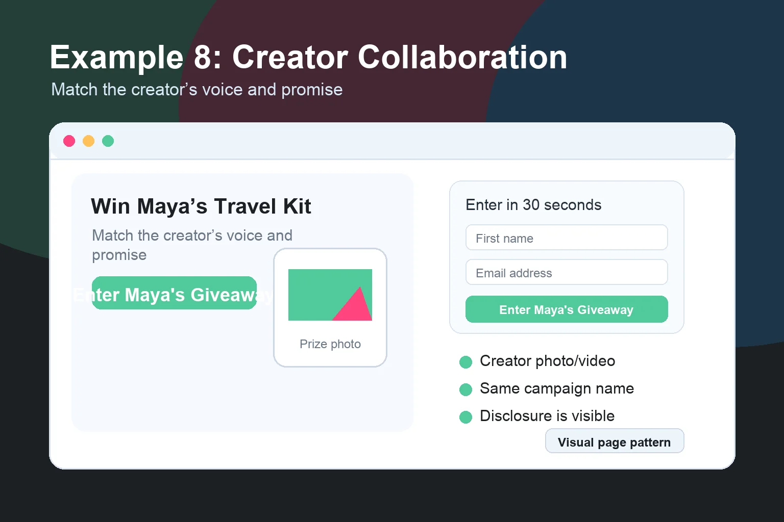
Creator giveaways need the creator’s face, voice, or audience promise near the top.
People are entering because someone they follow told them it is worth it. The page should feel like a continuation of the creator’s post, video, or email. Use the same campaign name, prize promise, and CTA language.
If the creator says “enter to win my travel kit,” the landing page should not say “register for our promotional sweepstakes event.”
Creator pages also need clean disclosure. If the creator is paid, receives free product, or has another material connection, the endorsement needs to be disclosed clearly. The FTC says disclosures should be hard to miss, not buried behind a more link.
Steal this CTA: “Enter [Creator Name]’s Giveaway”
9. The Leaderboard Challenge Page
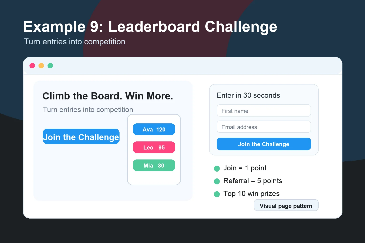
A leaderboard page turns a giveaway into a game.
This works best when the audience is competitive or status-driven.
Explain the scoring system simply:
- Join = 1 entry
- Refer a friend = 5 points
- Follow on social = 2 points
- Top 10 win bonus prizes
The leaderboard does not have to dominate the first screen, but the existence of the competition should be clear. People need to know there is a reason to keep coming back.
Use this when you have enough audience momentum to make competition feel real. If the board is empty, hide it until there is activity or use milestone rewards instead.
Steal this CTA: “Join the Challenge”
10. The Bonus-Entry Actions Page
Sometimes the goal is not only email capture.
You may want followers, survey responses, product feedback, app installs, webinar registrations, or social engagement. Bonus-entry pages help you collect those actions without making the first entry painful.
The trick is sequencing.
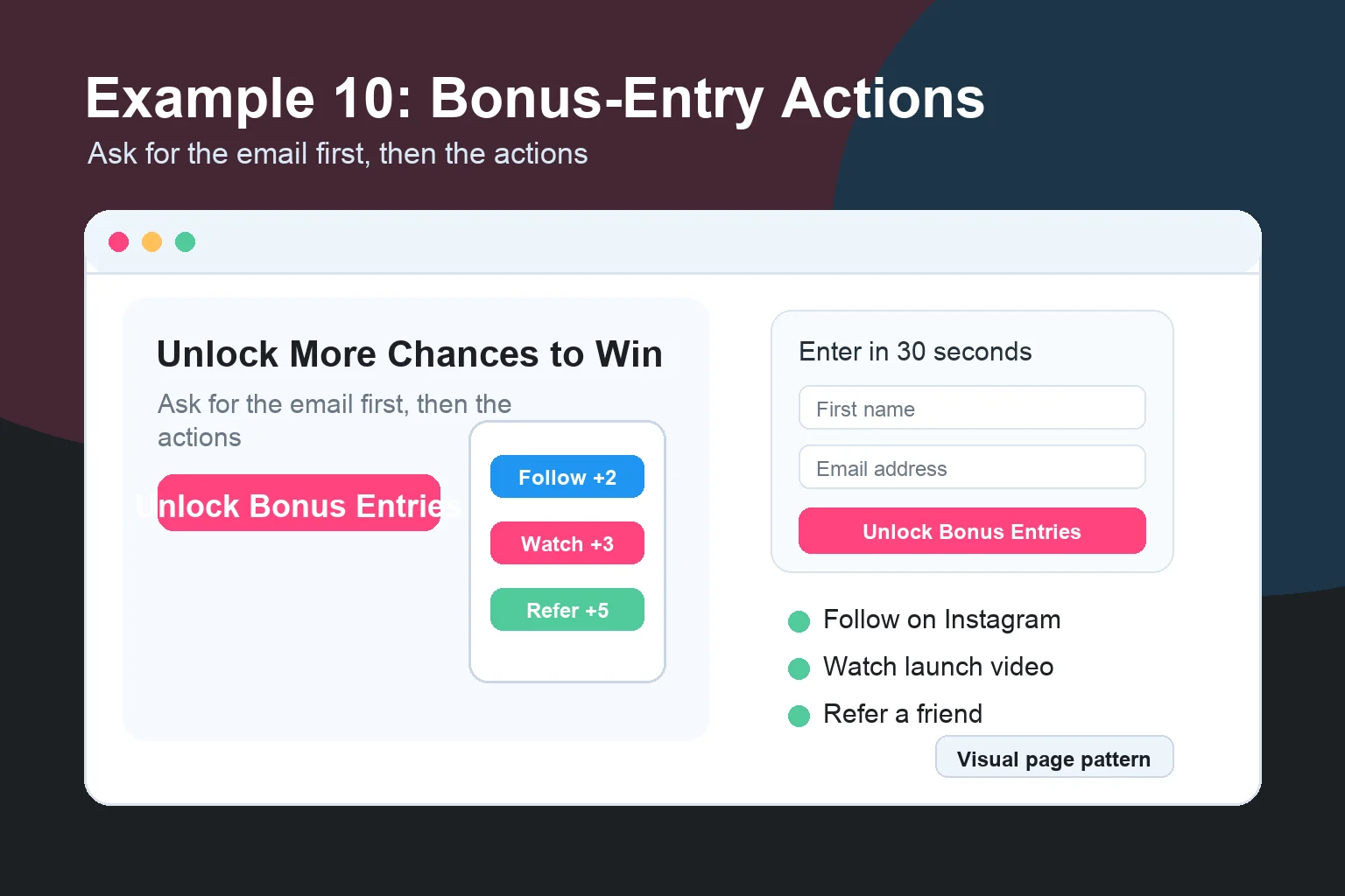
Ask for email first. Then show optional actions:
- Follow us on Instagram
- Watch the launch video
- Answer one product question
- Refer a friend
- Visit the product page
Each action should earn a clear number of bonus entries or points. KickoffLabs supports this with contest actions, referral tracking, and post-entry sharing because the tracking needs to be automatic. Manual spreadsheets are where giveaway operations go to die.
Steal this CTA: “Unlock Bonus Entries”
11. The Local Business Giveaway Page
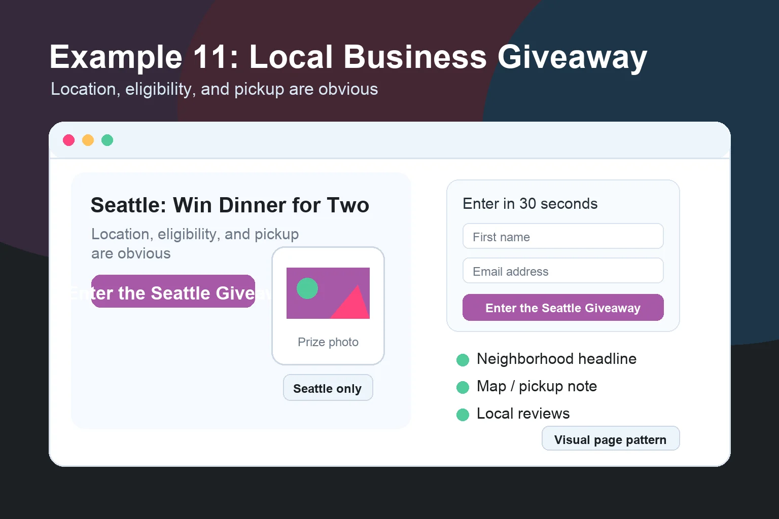
Local giveaway pages need location clarity right away. If your prize is only useful in Seattle, say Seattle in the headline. If pickup or eligibility limits apply, say that before the form.
A strong local page includes:
- City or neighborhood in the headline
- Prize photo from the actual business
- Map or address if pickup matters
- Eligibility note
- Winner announcement date
- Local social proof, like reviews or community partners
Local pages do not need to be fancy. They need to feel real. Make it obvious who the prize is for and where it applies.
Steal this CTA: “Enter the [City] Giveaway”
12. The Post-Entry Share Page
This is the page too many marketers forget.
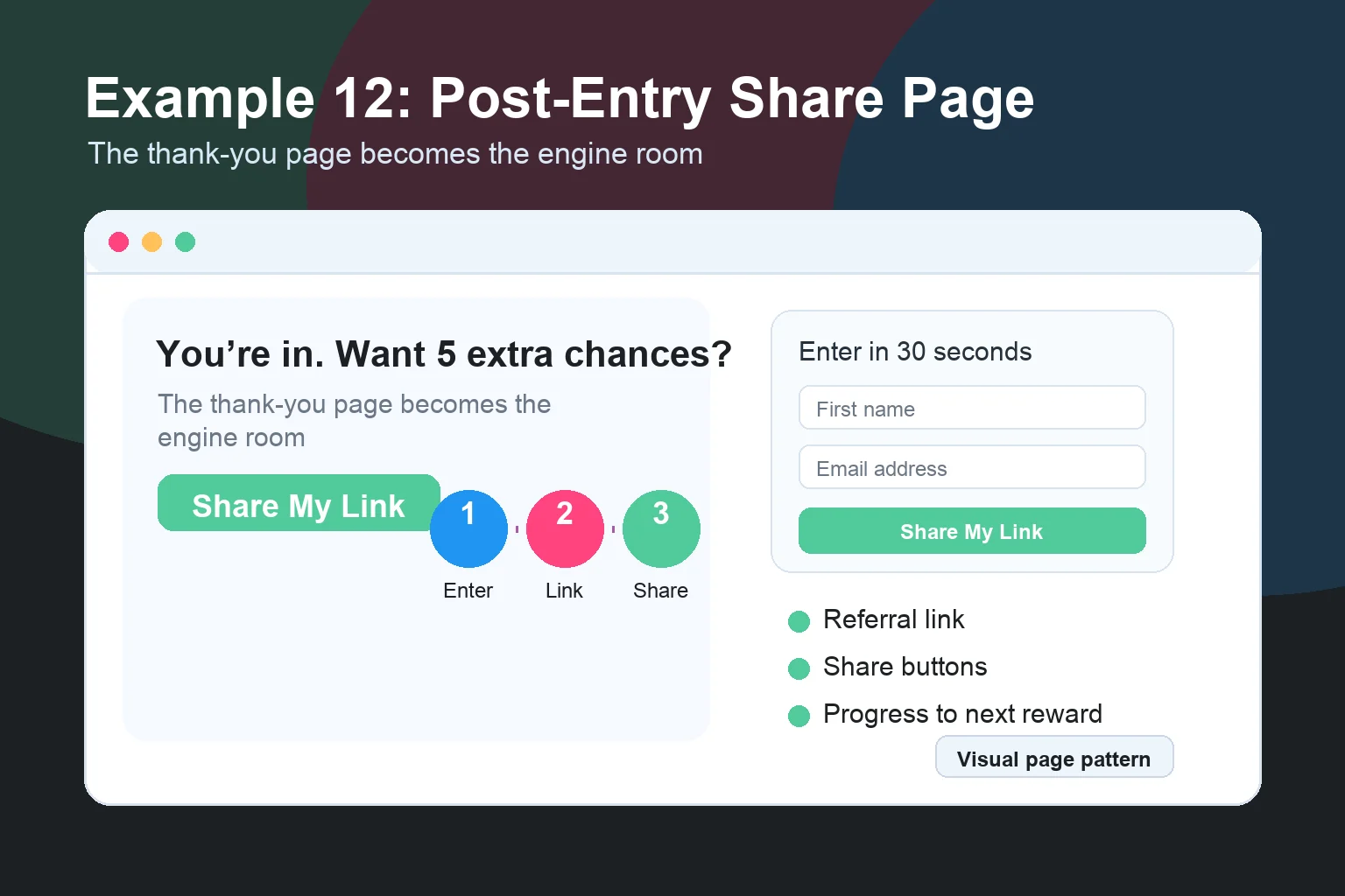
The thank-you page is not just a receipt. It is the highest-intent moment in the whole campaign. The entrant just said yes. Now you can ask for the share.
A strong post-entry page includes:
- Confirmation that they entered
- Personal referral link
- One-click share buttons
- Bonus-entry explanation
- Progress toward next reward or better odds
- Optional actions
The copy should be direct:
You are in. Want 5 extra chances to win? Share your link with friends.
That is it.
Do not send people to a generic “thanks” page and waste the moment. If the giveaway is your growth engine, the thank-you page is the engine room.
Steal this CTA: “Share My Link”
What makes a giveaway landing page convert?
These examples are different, but the foundation stays the same:
- A specific prize promise. Tell people exactly what they can win.
- A short form. Name and email first. Everything else has to earn its place.
- A real deadline. Put it near the form and repeat it in the rules.
- A rules link. Include eligibility, entry method, prize details, odds, winner selection, and sponsor information. Start with our contest law best practices and social media giveaway rules.
- Mobile-first design. Most entrants will arrive from social, email, or text.
- A share step. If you want viral growth, the referral ask needs its own page.
Beauty is not the goal. Clarity, trust, and sharing are the goal.
How to Build These in KickoffLabs
You can build all 12 patterns in KickoffLabs without stitching together five tools. Start with the campaign type:
- Use sweepstakes for prize-first giveaways.
- Use reward levels for referral milestones and bonus actions.
- Use waitlists for launches and early access.
- Use landing page templates when you want a fast design starting point.
Then add the mechanics that match the example:
- Entry form
- Countdown timer
- Official rules link
- Referral tracking
- Share buttons
- Bonus-entry actions
- Email follow-up
- Analytics
The big win is keeping the entry, referral, rewards, and reporting in one campaign. If you want a proven page structure before you start, use this:
Headline: Win [specific prize] by [deadline].
Subhead: Enter in 30 seconds. Share your link for bonus chances to win.
Form: First name + email.
Trust: Official rules, sponsor name, prize value, deadline.
Thank-you page: Personal referral link + bonus actions.
Not flashy. It just works.
The Bottom Line
Do not start your next giveaway by asking, “What should this page look like?”
Start with a better question:
What job does this page need to do?
If the job is to make a prize irresistible, use the prize-first example. If the job is to turn entrants into promoters, use the referral contest or post-entry share page. If the job is to validate demand, use the waitlist page. If the job is to borrow reach, use the partner or creator page.
The layout follows the job.
That is how you build a giveaway landing page that converts instead of one that just looks nice in a screenshot.