- Quick Answer: What Is an AI Landing Page Example?
- Why Most AI Landing Pages Feel Empty
- The Prompt Framework: Give AI the Campaign, Not Just the Page
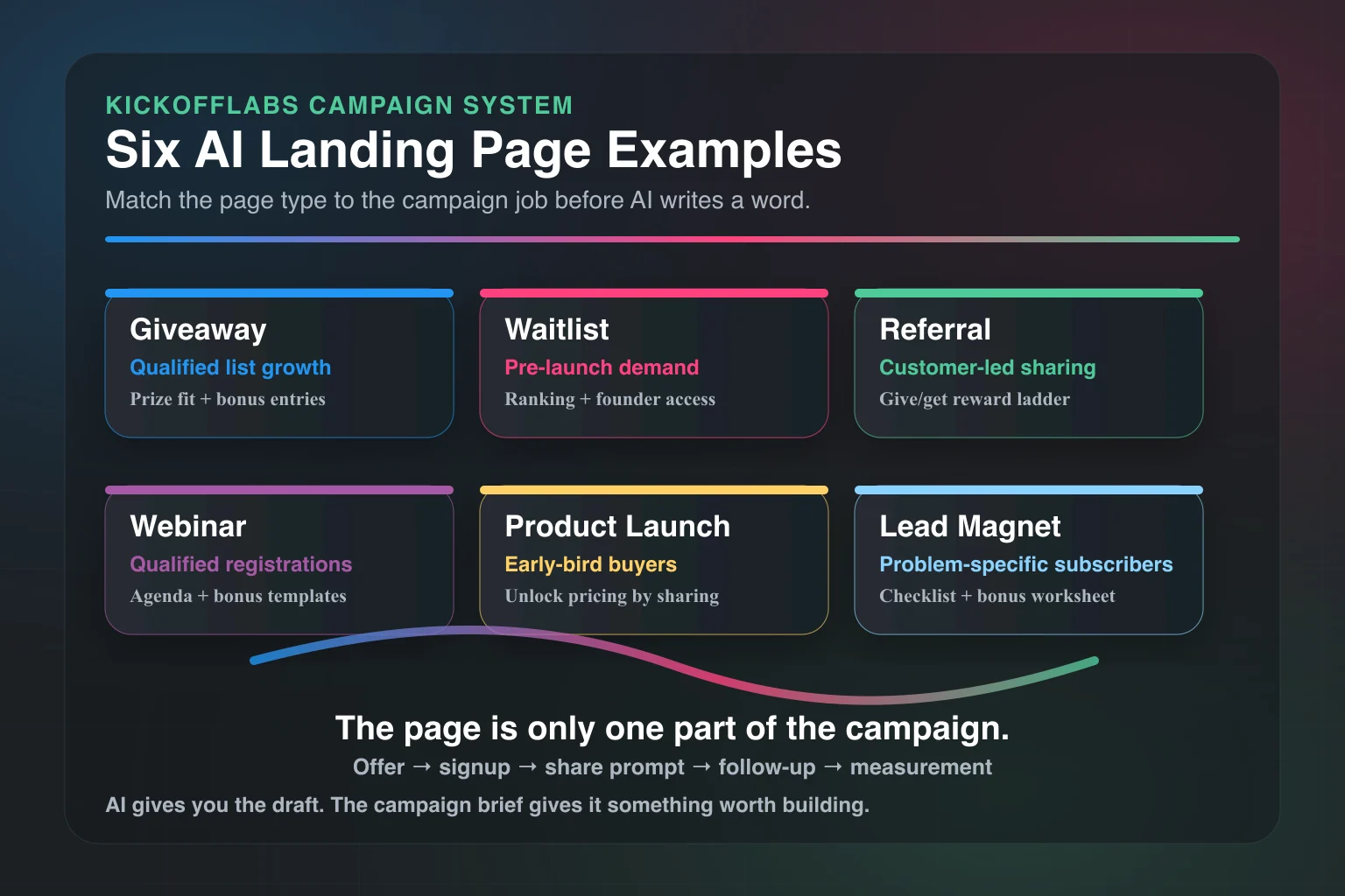
- Example 1: AI Giveaway Landing Page
- Example 2: AI Waitlist Landing Page
- Example 3: AI Referral Landing Page
- Example 4: AI Webinar Registration Page
- Example 5: AI Product Launch Landing Page
- Example 6: AI Lead Magnet Landing Page
- What to Ask AI After It Drafts the Page
- The AI Landing Page Checklist
- Common AI Landing Page Mistakes
- How KickoffLabs Fits the Workflow
- Final Take: AI Is the Draft. The Campaign Is the Strategy.
AI can make a landing page fast. That does not mean it made a good one.
The difference is the prompt.
Bad prompt in, generic page out. You get a vague headline, a stock-looking hero section, three benefits that could belong to any product, and a button that says “Get Started.” Congratulations. You have created the same landing page as everyone else.
A useful AI landing page starts with a campaign brief. Who is it for? What are they trying to get? Why should they act now? What happens after they submit the form? How will sharing, referrals, rewards, and follow-up emails work?
That is where AI gets interesting.
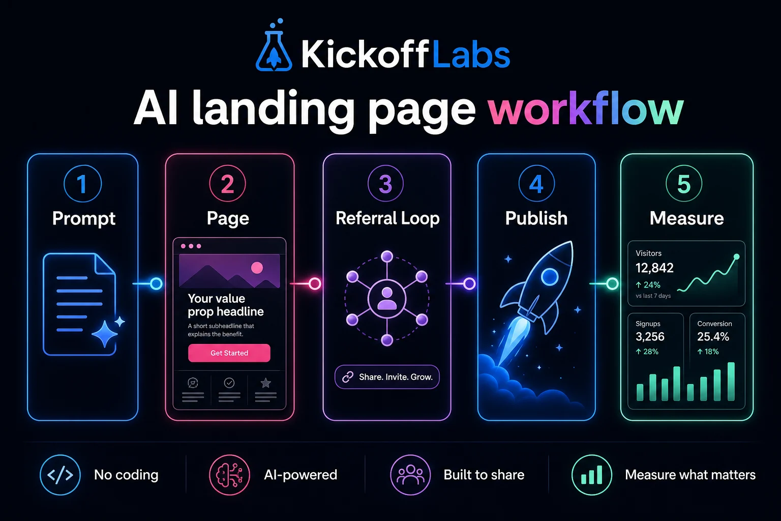
Not as a magic page machine. As a fast campaign assistant that turns your strategy into a first draft you can publish, test, and improve.
If you want the fastest path, KickoffLabs’ AI campaign builder can help generate the campaign page, copy, emails, and rules from a tighter brief. If you want to turn your own notes into a stronger first prompt, use the free Marketing Copy Prompt Generator. If you want to understand what a strong brief looks like first, use the examples below.
Want the copy-and-paste version? Download the no-email-required PDF: AI Landing Page Campaign Brief Workbook.
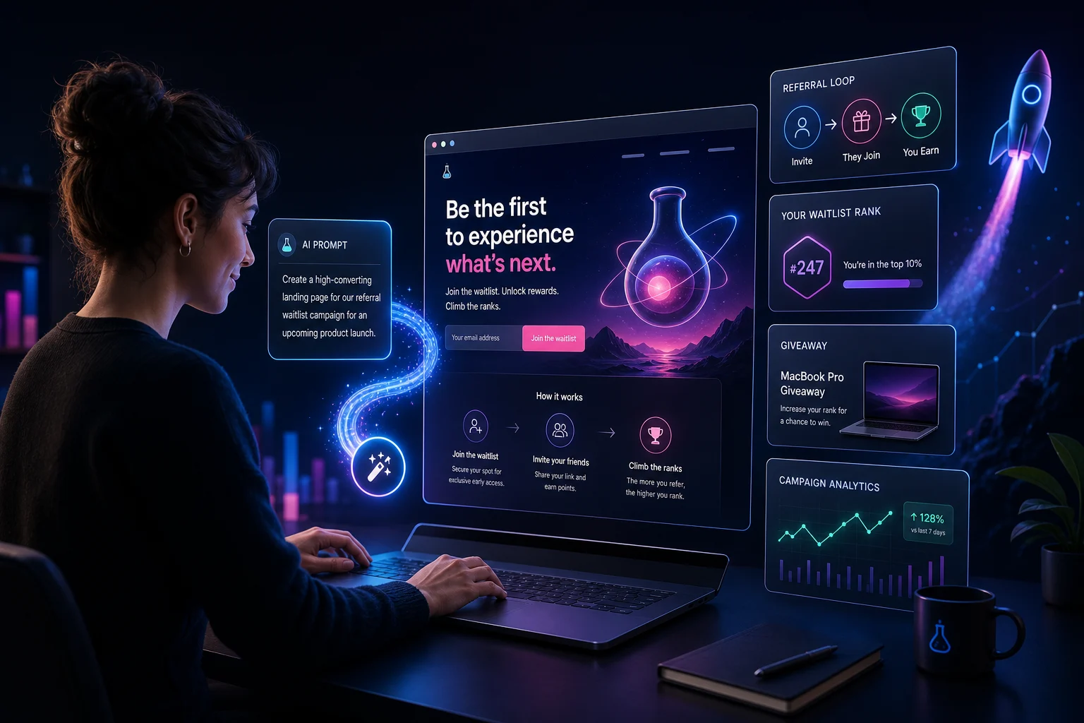
Quick Answer: What Is an AI Landing Page Example?
An AI landing page example is not just a screenshot of a page an AI tool generated. A useful example shows the prompt, the campaign goal, the audience, the page structure, the conversion action, the follow-up plan, and the measurement system.
For campaign landing pages, the best AI examples include four things:
- A specific audience and offer.
- A page built around one conversion action.
- A viral or follow-up mechanic, such as referrals, reward tiers, or email nurture.
- A measurement plan tied to lead quality, not just form fills.
That is the bar.
A pretty page with no campaign logic is just decoration.
Why Most AI Landing Pages Feel Empty
Most AI landing page builders promise speed. The market is full of tools positioning around quick generation, easy editing, conversion optimization, mobile-first pages, and testing workflows. You can see that in current AI landing page builder coverage from sources like GetResponse, Unicorn Platform, Perspective, and Unbounce’s landing page examples.
But speed is not the hard part anymore.
The hard part is making the page answer the visitor’s real question:
Why should I care enough to give you my email right now?
AI does not know that by default.
It will happily write:
Join our waitlist and be the first to know when we launch.
That is not terrible. It is just weak.
A stronger page says who it is for, what they get, why the prize or access matters, and what they can do after joining to move up, earn rewards, or unlock more value.
That is campaign strategy.
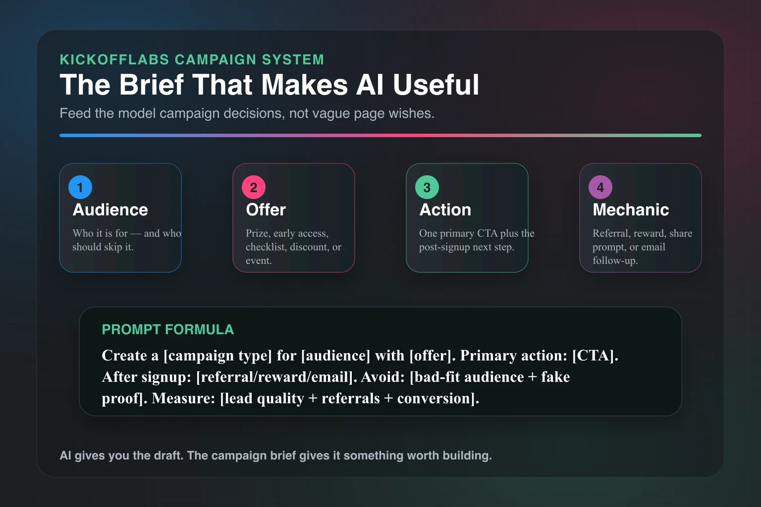
The Prompt Framework: Give AI the Campaign, Not Just the Page
Use this structure before you generate anything:
Create a landing page for [campaign type].

Audience: [specific audience]
Bad-fit audience: [who should not enter or join]
Goal: [email leads, waitlist signups, demo requests, preorders, referrals]
Offer: [prize, early access, discount, bonus, resource, event]
Main action: [enter giveaway, join waitlist, request invite, register]
Referral action: [share link, invite friends, earn points, unlock rewards]
Tone: direct, useful, not hypey
Required sections: hero, why it matters, how it works, rewards, FAQ, rules/disclaimer, CTA
Avoid: vague claims, fake stats, generic startup language
Measurement: track signups, referrals, lead source, email engagement, conversion after campaign
That prompt gives AI constraints.
Constraints are your friend. They stop the page from becoming a fog machine.
Below are practical examples you can steal and adapt.
Example 1: AI Giveaway Landing Page
Use this when: You want to grow a targeted email list with a prize people actually want.
Bad version: “Win a free iPad!”
That will get entries. It will also get people who want an iPad and nothing else from you.
A better giveaway page starts with prize-audience fit.
Prompt
Create a giveaway landing page for an independent coffee brand launching a new cold brew subscription.

Audience: coffee drinkers who buy specialty coffee online and care about taste, convenience, and small-batch roasting.
Bad-fit audience: people only looking for generic electronics prizes.
Goal: collect qualified email leads before the subscription launch.
Offer: win a 3-month cold brew subscription bundle plus early access to launch pricing.
Main action: enter with email.
Referral action: invite friends for bonus entries.
Tone: confident, warm, no fake urgency.
Required sections: hero, prize details, how to enter, why cold brew fans will care, referral bonus, launch reminder, FAQ, rules link.
Page Structure
Hero:
- Headline: “Win 3 Months of Cold Brew Before We Launch”
- Subheadline: “Enter for a chance to win the first subscription bundle and get early access when orders open.”
- CTA: “Enter the Giveaway”
Prize section: Show exactly what is included. Do not bury the prize.
Referral section: “Get bonus entries when friends enter through your link.”
FAQ: Eligibility, winner selection, shipping limits, launch timing.
Follow-up: A welcome email, referral reminder, last-chance email, winner email, and post-campaign launch offer.
Why This Works
The page filters for the right audience.
It does not chase everyone. It chases people likely to buy cold brew later.
That is the whole game with giveaways. Leads are cheap if you ignore quality. Growth gets expensive when your list is full of people who wanted the prize but do not care about your product.
KickoffLabs can handle the entry form, bonus entries, referral links, winner selection workflow, and post-entry sharing. Start with the campaign brief. Then let the AI help you write the page faster.
Related read: How to Build a High-Converting Giveaway Campaign with AI.
Example 2: AI Waitlist Landing Page
Use this when: You are launching a product and want demand before the product is fully available.
A waitlist page should never feel like a locked door.
It should feel like a line worth joining.
Prompt
Create a waitlist landing page for a lightweight project planning app for solo founders.

Audience: solo founders and indie hackers who need a simple weekly planning system without enterprise project management clutter.
Goal: collect qualified beta users before public launch.
Offer: early access, founder pricing, and first access to launch templates.
Main action: join the waitlist.
Referral action: move up the list by inviting other solo founders.
Tone: blunt, practical, founder-to-founder.
Required sections: hero, problem, what you get, how the waitlist works, referral incentive, beta criteria, FAQ.
Avoid: enterprise language, productivity buzzwords, fake social proof.
Page Structure
Hero:
- Headline: “A Weekly Planning App for Founders Who Hate Project Management Software”
- Subheadline: “Join the beta list. Invite other solo founders to move up.”
- CTA: “Join the Waitlist”
Problem section: Name the pain in plain English.
“Most project tools assume you have a team, a manager, and twelve workflows. You need a clean plan for what matters this week.”
Waitlist mechanics: Explain how ranking works. People should know what they get for sharing.
Beta fit section: Tell people who should join and who should not.
This is underrated. Saying “not for enterprise teams” improves lead quality.
Why This Works
A good waitlist page sells progress, not access.
“Join the waitlist” is weak by itself. “Join the beta, move up by inviting qualified founders, and get founder pricing when we launch” gives people a reason to act.
For a deeper setup walkthrough, read How to Set Up a Pre-Launch Waitlist That Actually Converts and the KickoffLabs waitlist campaign page.
Example 3: AI Referral Landing Page
Use this when: You already have customers, subscribers, or fans and want them to bring in more of the right people.
Referral pages need clarity.
If someone has to think for more than three seconds about what they get, you lost them.
Prompt
Create a referral landing page for an online course creator launching a new cohort.

Audience: past students and newsletter subscribers interested in improving their freelance sales process.
Goal: drive referred signups for the new cohort.
Offer: give a friend $100 off; earn a private workshop invite when 3 friends join the interest list.
Main action: claim your referral link.
Referral action: share the link with peers who would benefit from the course.
Tone: helpful, direct, not spammy.
Required sections: hero, how referrals work, reward levels, who to invite, share copy, FAQ, terms.
Page Structure
Hero:
- Headline: “Invite a Freelancer. Unlock the Private Workshop.”
- Subheadline: “Share your link. Friends get $100 off the next cohort. Get 3 qualified referrals and you are invited to the live sales teardown session.”
- CTA: “Get My Referral Link”
How it works: Three steps. Get link. Share. Unlock reward.
Who to invite: Be specific. “Freelancers selling strategy, design, writing, development, or consulting services.”
Reward levels: Keep them simple.
Share copy: Give people copy they can paste into email, LinkedIn, or a group chat.
Why This Works
The incentive is tied to the audience.
A private workshop is more relevant than a random gift card. The friend gets a clear benefit. The referrer gets status and access.
That is better than “refer friends and earn points” with no emotional reason attached.
If referral growth is the goal, read How to Build a Referral Program That Actually Grows and The Complete Referral Marketing Guide for E-Commerce.
Example 4: AI Webinar Registration Page
Use this when: You need qualified registrations, not a giant list of people who never show up.
Webinar pages get bloated fast.
A good one tells people what they will walk away with.
Prompt
Create a webinar registration landing page for a B2B SaaS company teaching customer marketers how to launch referral campaigns.

Audience: marketers at SaaS companies with existing customers but no structured referral program.
Goal: drive qualified webinar registrations and demo follow-up interest.
Offer: live training plus a referral campaign checklist.
Main action: register for the webinar.
Referral action: share the webinar with another marketer for access to bonus templates.
Tone: practical, experienced, no guru language.
Required sections: hero, what you will learn, who it is for, agenda, speaker credibility, bonus templates, FAQ.
Avoid: inflated promises, fake attendee numbers, vague transformation claims.
Page Structure
Hero:
- Headline: “Build Your First Customer Referral Campaign Without Turning It Into a Mess”
- Subheadline: “A practical live session for SaaS marketers who want referrals, not a points program nobody uses.”
- CTA: “Save My Spot”
What you will learn: Make this concrete.
- Pick a referral incentive that makes sense.
- Write the invitation email.
- Build a tracking link flow.
- Follow up after the first share.
Bonus: “Invite another marketer and get the referral campaign checklist.”
Why This Works
The page qualifies the audience before the form.
That improves show-up quality and follow-up quality. You do not need more random webinar signups. You need people with the problem your product solves.
Example 5: AI Product Launch Landing Page
Use this when: You want early demand for a product, course, app, or service before the full sales page is ready.
Launch pages are where AI can save real time.
You can draft positioning, objections, FAQ, email follow-ups, and share copy in one pass.
Prompt
Create a product launch landing page for a new travel backpack designed for remote workers.

Audience: remote workers and digital nomads who travel with a laptop, chargers, headphones, and clothes for 2-4 days.
Goal: collect launch interest and early-bird buyers.
Offer: early access, launch discount, and a packing checklist.
Main action: join the launch list.
Referral action: invite friends to unlock early-bird pricing before public release.
Tone: crisp, practical, premium.
Required sections: hero, product promise, key features, use cases, early-bird offer, referral unlock, FAQ, launch timeline.
Avoid: generic travel cliches, unsupported durability claims, fake reviews.
Page Structure
Hero:
- Headline: “The 3-Day Work Trip Backpack”
- Subheadline: “Built for remote workers who need one bag for clothes, laptop gear, and the weird pile of chargers we all pretend is organized.”
- CTA: “Join the Launch List”
Feature section: Organize around jobs-to-be-done, not product specs.
- Pack for a long weekend.
- Keep laptop gear separate.
- Grab cables without unpacking everything.
- Unlock early-bird pricing by sharing.
Referral unlock: “Invite 2 friends to unlock early-bird pricing before public launch.”
Why This Works
The page makes the product easy to understand.
It also turns launch interest into distribution. Every signup has a next action: share to unlock better access.
That is how a launch page becomes more than a signup form.
For launch strategy, read 30 Prelaunch Promotion Strategies to Build Hype and Startup Landing Page Validation.
Example 6: AI Lead Magnet Landing Page
Use this when: You want subscribers around a narrow problem, not a broad newsletter signup.
Lead magnets work best when the page makes the outcome painfully clear.
Prompt
Create a lead magnet landing page for a downloadable checklist that helps ecommerce brands plan a giveaway.

Audience: Shopify store owners planning their first serious giveaway.
Goal: collect qualified email leads and route them into a giveaway setup sequence.
Offer: a printable giveaway planning checklist.
Main action: download the checklist.
Referral action: share the checklist with another store owner to unlock a prize-planning worksheet.
Tone: direct, useful, no marketing fluff.
Required sections: hero, checklist preview, who it is for, what is inside, bonus unlock, FAQ, privacy note.
Page Structure
Hero:
- Headline: “Plan Your Giveaway Before You Pick the Prize”
- Subheadline: “Get the checklist that keeps your campaign focused on qualified leads, referrals, rules, and follow-up.”
- CTA: “Download the Checklist”
What is inside: Show the sections.
- Audience fit.
- Prize fit.
- Entry rules.
- Referral plan.
- Email follow-up.
- Winner selection.
- Measurement.
Bonus unlock: “Share with one store owner to unlock the prize-planning worksheet.”
Why This Works
The page has a narrow promise.
It does not say “grow your business.” It says “plan your giveaway before you pick the prize.” That is concrete. Concrete converts.
Related read: Giveaway Landing Page Best Practices and How to Grow Your Email List with Giveaways.
What to Ask AI After It Drafts the Page
The first draft is not the finish line.
Run a critique prompt before you publish:
Review this landing page draft as a skeptical campaign strategist.

Find:
- Any vague claims.
- Any section that does not help conversion.
- Any missing objection.
- Any fake or unsupported proof.
- Any CTA that is unclear.
- Any audience mismatch.
- Any place where referral or follow-up mechanics are weak.

Then rewrite the page to be clearer, more specific, and more direct.
This is where AI gets useful again.
It can pressure-test its own draft if you ask the right question.
Do not ask, “Is this good?” It will tell you yes.
Ask it to find what is broken.
The AI Landing Page Checklist
Before you publish, make sure the page has these pieces:
- One audience.
- One offer.
- One primary CTA.
- A specific reason to act now.
- A clear next step after signup.
- A referral or sharing mechanic if growth matters.
- Plain-English rules or terms for contests and giveaways.
- A thank-you page that does more than say “thanks.”
- Email follow-up for entrants, waitlist members, or registrants.
- Tracking for source, referrals, conversion, and lead quality.
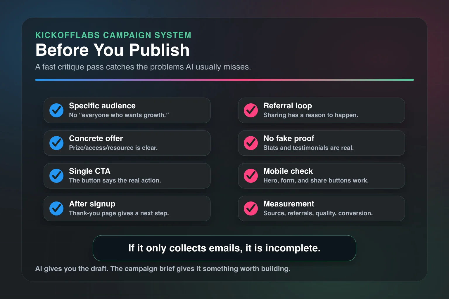
If the page only collects emails, it is incomplete.
The thank-you page, share copy, email sequence, and measurement plan are part of the campaign.
Common AI Landing Page Mistakes
Mistake 1: Asking for a Page Before You Know the Offer
AI cannot rescue a fuzzy offer.
If you are not clear, the page will not be clear.
Mistake 2: Letting AI Invent Proof
Do not let AI make up stats, customers, testimonials, or rankings.
Use real proof or skip it.
If you have no proof yet, use a founder note, product screenshots, demo video, transparent timeline, or a clear explanation of why the offer exists.
Mistake 3: Treating the CTA Like a Button Label
“Get Started” is not always wrong. It is just usually lazy.
Use CTAs that match the action:
- Enter the Giveaway
- Join the Waitlist
- Get My Referral Link
- Save My Spot
- Download the Checklist
- Unlock Early Access
Specific beats clever.
Mistake 4: Forgetting Mobile
Most campaign traffic comes through social, email, SMS, and referrals. That means mobile.
Check the hero, form, prize image, rules link, and share buttons on a phone before you send traffic.
Mistake 5: Publishing Without Follow-Up
The page is only the first handshake.
Plan the emails before you launch. At minimum, you need confirmation, referral nudge, deadline reminder, winner or access update, and post-campaign offer.
How KickoffLabs Fits the Workflow
KickoffLabs is built for campaign landing pages, not just static pages.
That matters because the highest-performing campaigns usually need more than a headline and form.
They need:
- Landing pages for giveaways, waitlists, referrals, rewards, and product launches.
- Entry forms and lead capture.
- Referral tracking.
- Bonus entries and reward tiers.
- Thank-you pages with share prompts.
- Email follow-up.
- Integrations with email providers and website builders.
- Winner selection and campaign measurement.
AI helps create the first draft.
KickoffLabs helps turn that draft into a campaign people can enter, share, and come back to.
If you are starting from scratch, build the brief first. Then use AI to generate the page, rules, referral copy, and email sequence. Then publish with the mechanics attached.
That is the difference between an AI page and an AI-powered campaign.
Final Take: AI Is the Draft. The Campaign Is the Strategy.
AI landing page examples are useful only if they show the thinking behind the page.
The prompt matters. The offer matters. The audience matters. The referral loop matters. The follow-up matters.
Use AI to move faster, not to avoid making decisions.
Give it a real campaign brief. Make it criticize the first draft. Tie the page to a thank-you page, emails, referrals, and measurement.
Then publish.
Not because the AI made something pretty.
Because you gave it enough strategy to make something useful.