
You need a landing page to sell your products, grow your email list, share the details of your contest, and reach different segments of your audience. But what visual elements should you add to your landing page to get visitors to follow the right path?
Let’s take a look at the nine necessary visual components to add to your landing page.
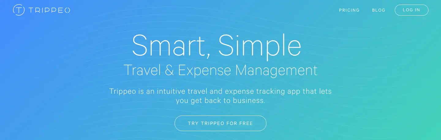
1. Colors That Convey Tone
The Internet has made a lot of things possible, but it still hasn’t solved the problem of tone.
In person, we have the benefit of body language and voice inflection. The way you raise your eyebrows can indicate that you have a question or (if you’re me) you’re being sarcastic.
On the Internet, you must work extra hard to convey your message. But here’s a little hack to help– use color.
On the Internet, you must work extra hard to convey your message. But here’s a little hack to help. Click To Tweet
Color can immediately convey emotion and tone. Before a visitor reads one word or processes one image, the understand a lot about your brand and what you’re selling based only on the colors you’ve chosen.
There’s a lot of options to use on your landing page. You can go for your brand colors to focus on consistency, or you can use a combination of colors to evoke an emotional response.
Here’s a quick and easy-to-follow guide for finding the perfect color for your brand. Subscribe for this extra resource.
![]()
2. The Headline
The headline is one of the most important parts of your landing page. But since this guide is all about visual elements, we’ll direct you to this post for crafting compelling headlines, and instead focus on how to make headlines visually pop.
First, use fonts to instantly engage your site visitors. A few rules of thumb:
Make sure that the headline is instantly readable. Avoid overly stylized fonts that are cute, romantic, but almost completely irrelevant. If it looks like it belongs on the Declaration of Independence, scrap it.
Test that it’s readable for five feet away. That’s right– stand five feet away from your desktop screen and test that you can read your headline. If you can, high five! (Get it, five?)
Supersize it. Just like you’re at McDonald’s. Your headline should take up a lot of real estate and be impossible to miss.
Use a color that’s bold but not too competitive. Keep in mind that your headline will be bigger in size than supporting text, so you don’t need to have it dancing, flashing, or blinking red. In fact, I’d recommend saving red or some other emotionally driven color for your call to action button and keeping the headline black or white.
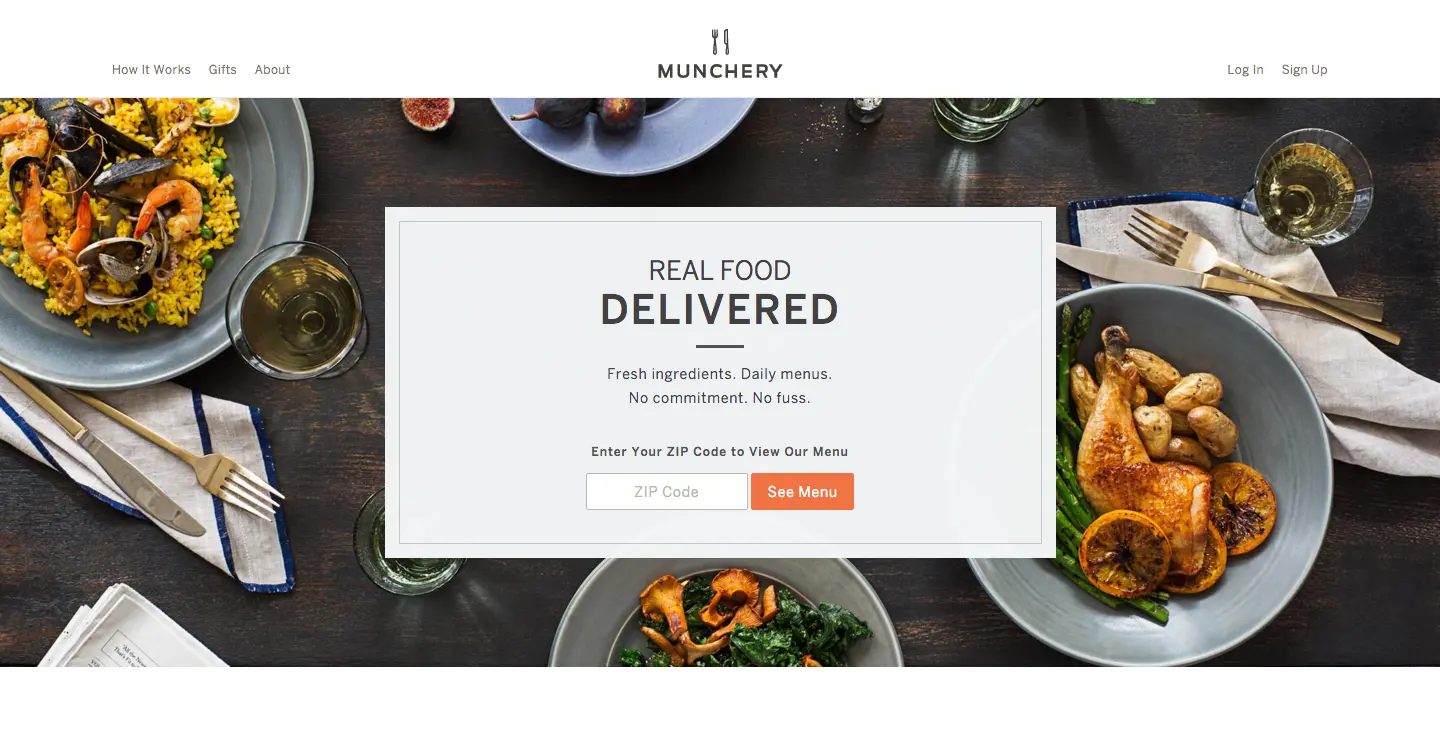
3. The Hero Shot
Here’s your first opportunity to build that all-important trust. You should always include a hero shot of you, your product, or your ideal customer interacting with your product.
This is known as the hero shot, and it should take up a huge portion of your screen. I like how Munchery</a> uses its hero shot as a delectable background image. It’s well-positioned and not in-your-face, but it still conveys the idea that this page is about sophisticated food.
Use an image here that reinforces the message of your landing page.
4. Video with a Still Shot that Compels
Alternately, or maybe in addition to the hero shot, you can add a video to your landing page. But there are rules. Your video must follow these guidelines:
If there’s sound, it should be push to play. Let’s leave autoplay video with sound back in 2015 (or hell). If your video introduces your brand, product, or contest with music or voice, it should wait politely until your visitor clicks play.
If there’s no sound, play all day. Oversized background video is a growing trend, and it works because it instantly compels a visitor to see what’s happening with the moving image. By all means use this type of video, but make sure that it makes sense as a loop on your landing page, and that it’s relevant to the topic.
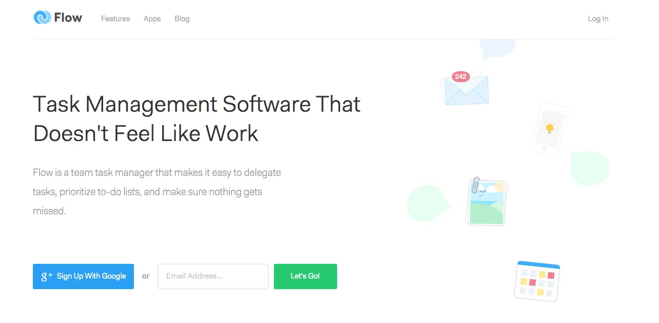
5. Form (friendly)
There’s all sorts of landing pages, but I have a soft spot for the ones with forms. They are straightforward with their ask, and that’s refreshing.
What’s not refreshing is having to fill out 15 required fields, including telephone number, zip code, and date of birth. My mother doesn’t even know all of that information– I’m certainly not giving it away on a landing page to someone in the shadows.
Avoid hesitation on the part of visitors with a simple, sleek form that asks for as little as possible. Flow asks only one question on its form. Visually, a one-question form invites more engagement because it creates a low barrier for entry.
6. Show How Your Product Works
There’s the hero shot, a still (or video) of your product in action. But if your product is particularly complicated or revolutionary, you may need to include a visual tutorial to show how to use it.
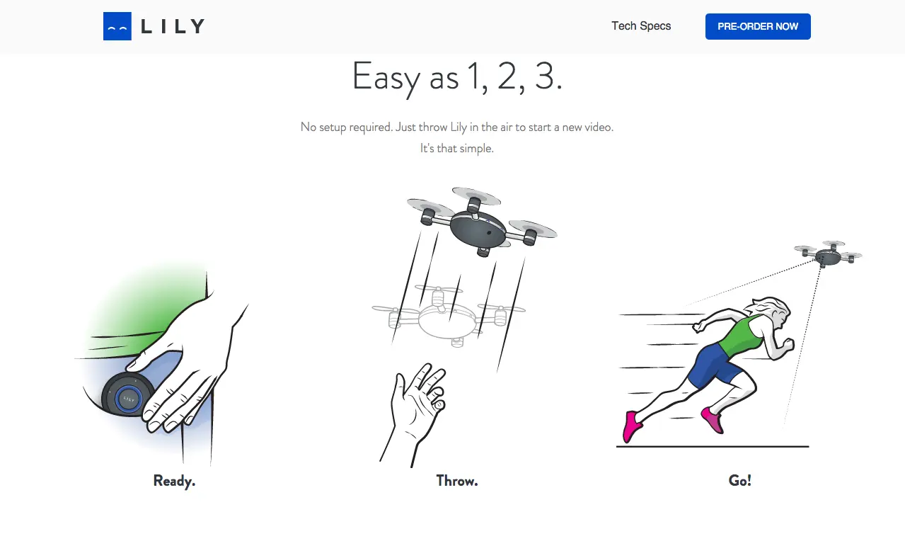
Image Courtesy of Lily Camera</a>
7. Testimonials
Since trust is so important in Internet marketing, you should also consider adding testimonials to increase your perceived value.
Testimonials add a visual flair to your landing page. It’s an opportunity to add images and positive words from people who’ve tried your product and loved it.
The more testimonials, good reviews, and positive tweets, the better.
You have two options for displaying testimonials on your landing page. You can pick out your absolute favorite testimonials and arrange them in a grid display, or your can put them on a loop or slider and throw a parade of positivity, like Kaye Putnam does here</a>.
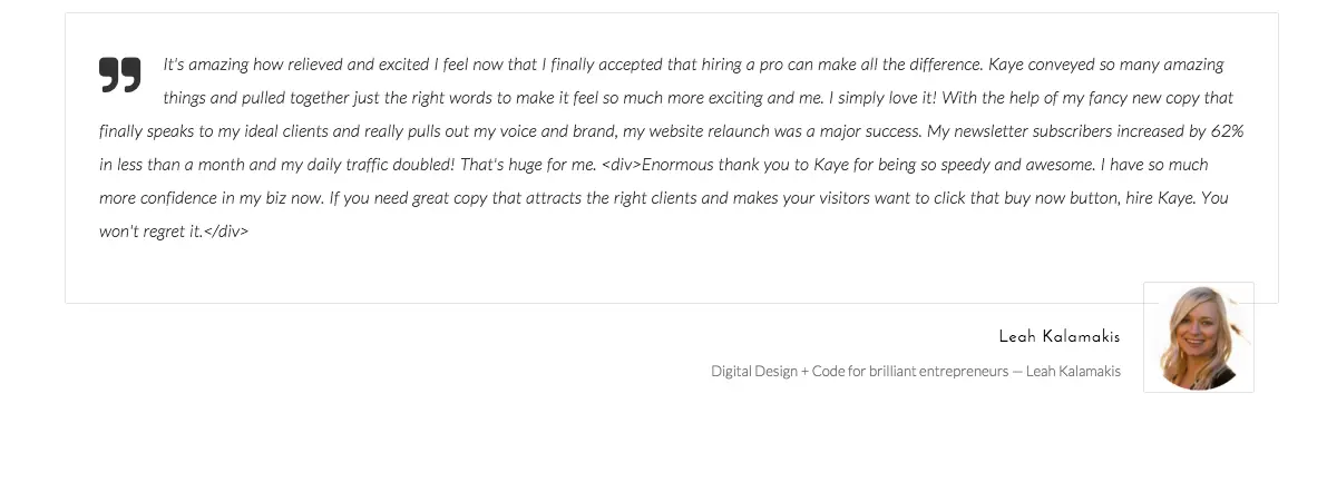
Image Courtesy of Kaye Putnam</a>
8. Endorsements
Along with testimonials, you should also list your professional endorsements. These are brands you’ve worked for or who’ve used your services in a business-to-business transaction.
Also include your certifications and any press you may have received over the lifespan of your brand.
Be sure to include their company logos on your page. Most brands offer a high resolution logo as part of their media kit. Search for this kit on the brand’s About Me page.
9. Call to Action Button
Last, but certainly not least, your call to action button should stand out and be noticed. Similar to your headline, I should be able to see your call to action button from five feet away (although I probably won’t be able to read the text on it).
The easiest way to create an outstanding call to action is using a color that won’t be ignored. You won’t go wrong with red, yellow, or orange, but any color can work as long as there is enough contrast from the background. Choose a color that almost pops off the screen.
For more help on what to say, check out your guide to creating an epic call to action here.

Final Thoughts
Your next landing page should incorporate most, if not all, of these visual elements. By doing so, you’ll create an irresistible page that’s sure to convert.
Here’s a quick and easy to follow guide for finding the perfect color for your brand. Subscribe for this extra resource.