Brands live and die by their calls to action. Am I being a tad dramatic? Nope, I’m not being dramatic enough. Your call to action is the single most important element on your page. It’s what gets the reader to initiate a higher level of engagement with you. If your call to action sucks, it could be costing you valuable conversions. Ain’t nobody got time for that.
Instead, let’s focus on creating calls to action that don’t suck: it’s easier than you think. Let’s get started with eight actionable tips you need.
How to Recognize a Killer Call to Action
The best calls to action are always three things: persuasive, easy to read, and value-driven. Oh, and they never say “submit.” Let’s break it down:
It’s Persuasive
A successful call to action will make you want to click it. It instantly disables any argument against it. It’s a smooth operator.
It’s Easy to Read
Save the multi-syllable words for pretentious dinner parties. If you really want to drive clicks, use simple words that can be read in mid-scroll.
It’s Value Driven
Immediately communicate why your audience should care. This is why using “submit” doesn’t work, but using “I want my free download” does work.
An epic call to action will immediately communicate why your audience should care. Click To Tweet
Every call to action that you write should contain all three of these components. Impossible? Not for you. You’ve got this guide, lucky you. Follow these tips to create an epic call to action every time:
Here’s a list of questions to ask when creating an epic call to action. Subscribe to receive this extra resource.
1. Keep Your Goal in Mind
What would you like the reader to do? You may want the reader to subscribe or download. You may want them to contact you or purchase a product. You should craft every page, and every section within that page, to achieve a specific goal.
Don’t expect your reader to intuitively know what to do next.
Whatever your goal, make sure that you’re pushing it in no uncertain terms.
2. Be Active
Use actionable words and phrases that drive the outcome you hope for. Readers aren’t persuaded with passive phrases, such as “for sale,” “download,” or “next.”
A successful call to action must contain an action. It should use words like “send me those plugins” or “show me my heat map.” Notice how each call to action starts with a doing word, i.e. a verb. Include a verb in each and every call to action that you use.
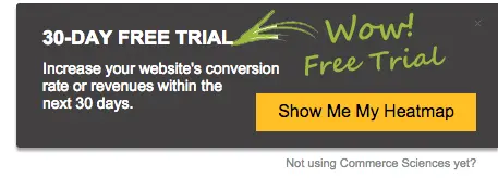
“Show me my heatmap” Courtesy of CrazyEgg
3. Get Personal
Studies show that personalized calls to action create higher conversion rates. You can craft a call to action that mimics the reader’s internal dialogue. For example, instead of using a perfectly acceptable call to action like, “grow your business,” check out how Neil Patel gets epic:
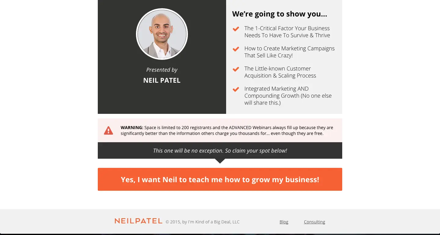
“Yes, I want Neil to teach me how to grow my business!” Courtesy of Neil Patel
Personalize it. Notice how he uses “my” instead of “your.” Use first-person, instead of second-person language to gently nudge the reader into following your call to action.
4. Get Specific
It’s human nature to get suspicious, and that nature goes into overdrive when someone’s asking us to do things like fork over our precious email address.
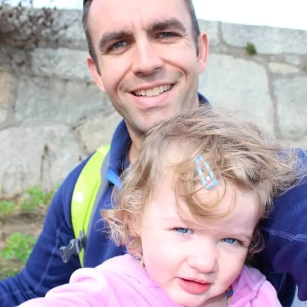
You’re going to be hard pressed to find someone who wants to click your non-descript call to action, unless your demographic is this guy:
To overcome your readers’ natural reticience, explain exactly what you’re giving them in exchange for their click. For example, don’t just say “buy” say “buy for $11” as Erika Madden does on Olyvia.co. Observe:

“Buy for $11” Courtesy of Olyvia.co
5. Keep it Short
If you can keep your call to action three words or less, you’ve won the Internet. But sometimes it’s okay to go longer. However, never use even one word more than you have to. I prefer to keep the call to action short and use surrounding content to persuade the reluctant.
Regina of ByRegina.com uses a two-word call to action on her standout button (sign up), but then expands on why. She does it with a 22 word description of what the reader will receive in exchange for signing up. Check it:
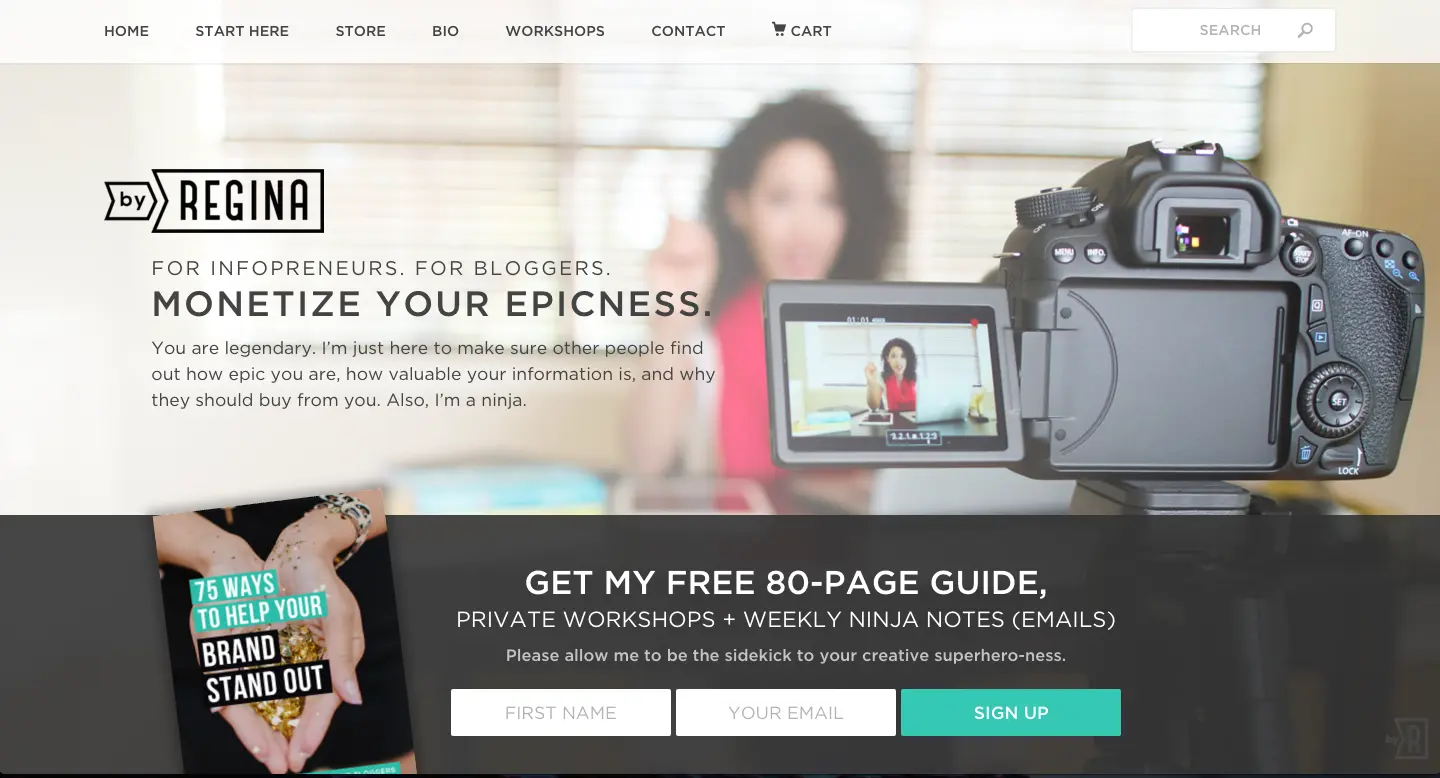
“Sign up” Courtesy of ByRegina.com
6. Choose Between Buttons or Links
Ah, the age old question– should you go for buttons or links for your call to action text. Here’s an answer straight from the oracles: it depends.
There are times when a button performs miracles and other times when a link is just what the doctor ordered. Okay, the metaphors are getting out of control.
Here’s a quick guide on what to use when:
You can use a mix of the two, but for the main call to action, go with buttons.
Here’s an extra tip for buttons. Instead of using images, use an html table element as your button. This is especially important on email. Your subscribers may disable images which means that your call to action won’t show. When you use html, you won’t have to worry.
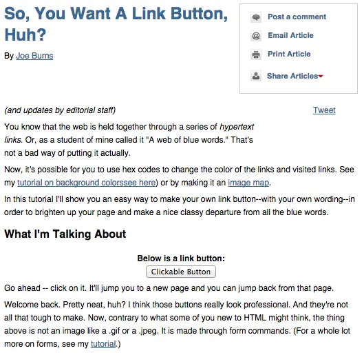
For more information on how to create a link button, check out this tutorial by Joe Burns.
7. Focus on Visual Elements
Aside from killer copy, invest in the design. This is important for both link and button calls to action, but more so for buttons.
There’s a number of ways you can do this:
By Shape
According to Paul Olyslager, a rounded rectangle makes the best button design. “Rounded corners point inward and draw the attention to the inside (content) of the button.”
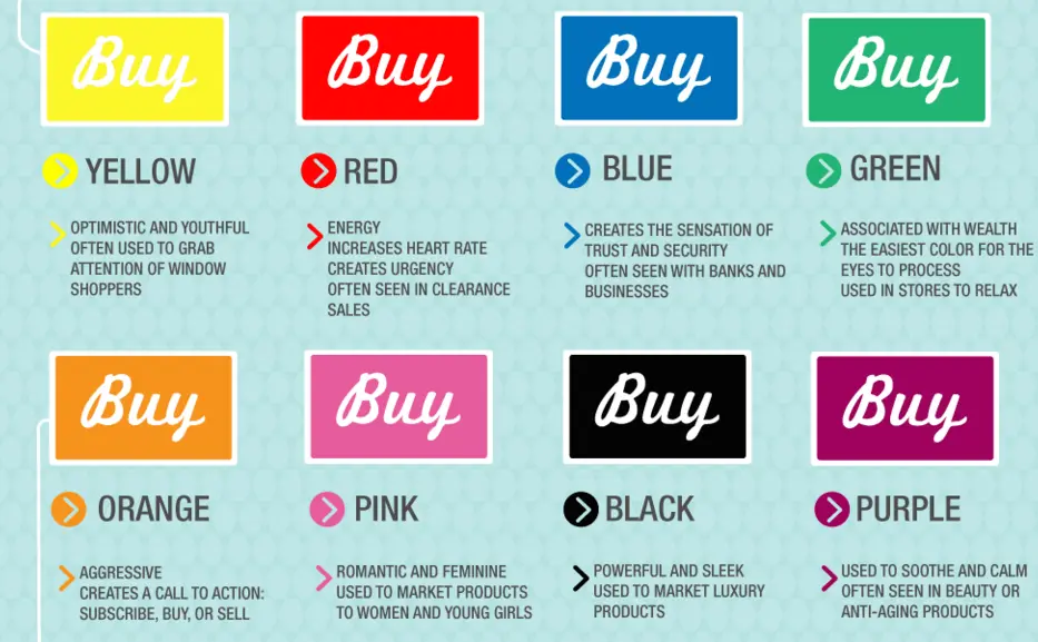
By Color
Color has the power to persuade us. Stop signs are red because they grab your attention. Bank logos are usually blue because it indicates security and trust. Choose a color for your call to action that emphasizes your goal.
Want to create a sense of urgency? Choose red.
Want grab their attention? Use yellow.
Want to give off the “safe and secure” vibe? Go for blue.
Here’s a handy graphic from Kissmetric about color psychology:
By Font Size & Type
Use a different font than your main body for your call to action. You can also keep the same text but go bolder or a few sizes larger. Just make sure that it stands out from the crowd. Up the contrast level by making the call to action type a different color than the surrounding text or the button’s background color.
8. Be Repetitive
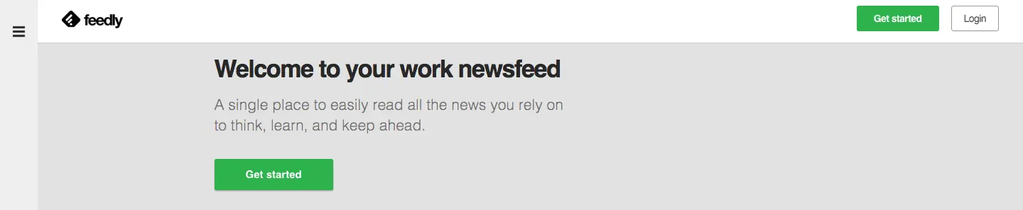
You can use the same call to action more than once within the same page. You can even use it in close proximity, as Feedly does here with the “get started” call.
If you have a longer site like a landing page for a product, include a call to action for each section. This will reinforce the reader’s next step, even if he isn’t ready to take it until arriving at the end of the page.
Final Thoughts
I hope this post took away the mystique from crafting the perfect call to action. Follow the above eight tips to create a call to action that gets noticed and acted upon. By the way, if you’d like to read more on the subject, check out the most successful calls to action of all time.
Here’s a list of questions to ask when creating an epic call to action. Subscribe to receive this extra resource.