Every so often we give people the opportunity to submit their page for a TOTALLY FREE professional landing page review (these kinds of reviews normally cost well into the thousands of $$$’s).
We do this because we really want to assist customers and non-customers alike, get the best conversion rates possible from their landing pages and online forms. Think of it as doing our part to help make the internet a better place for businesses and consumers.
Now let’s have a look at the pages that we reviewed during our last KickoffLabs Live Marketing Chats!
Rather watch the video? It’s chock-full of extra advice, be sure to view it.
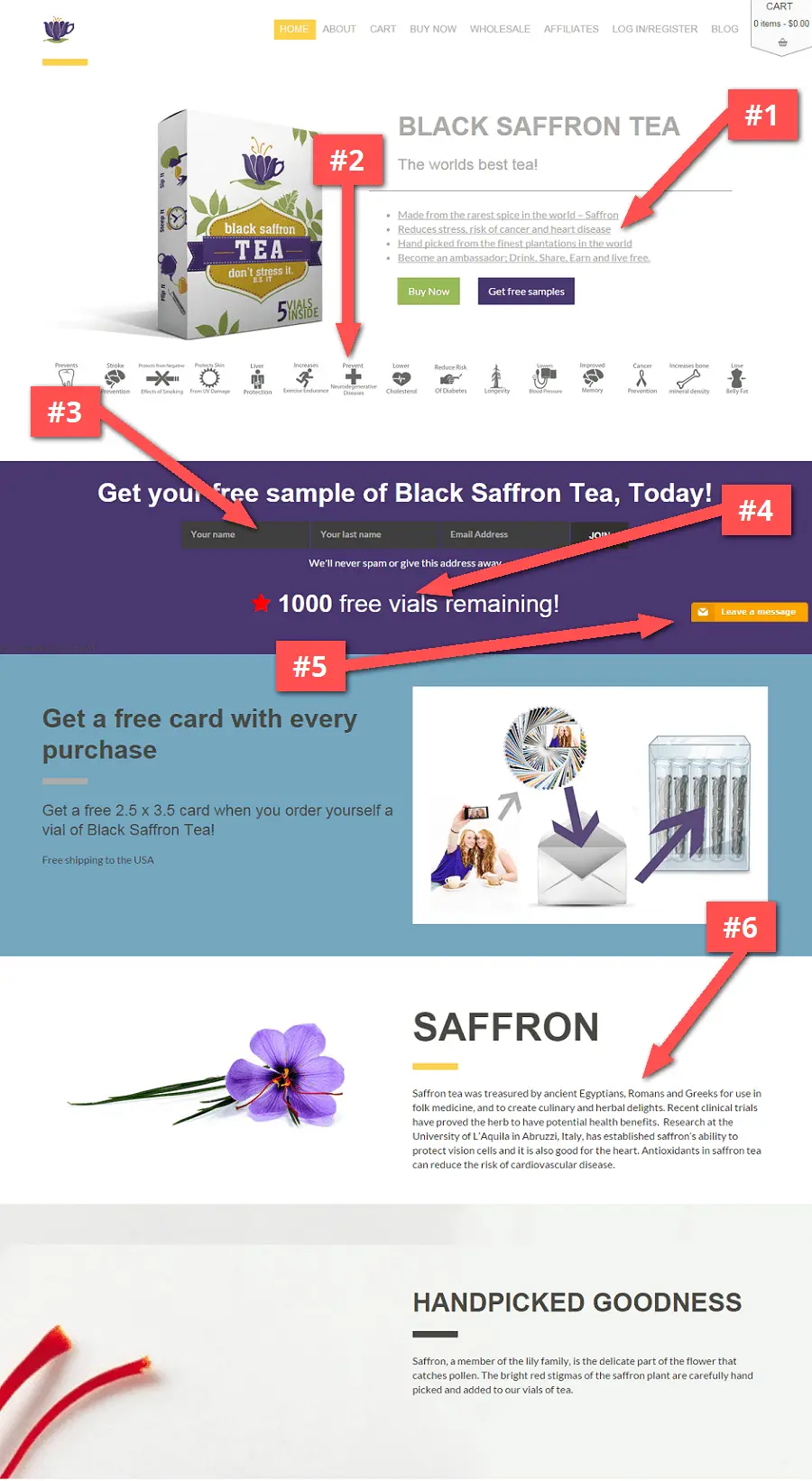
1 – BS Tea
This layout has improved quite a bit since the last time we reviewed this site.
What we like
- The box with the hero image explains exactly what it is.
- Logo up in the corner is nice and not too distracting.
- Good color scheme that draws and directs the eyes.
What to improve
#1 – Style accordingly. The links in the top section don’t really look like links because of the grey coloring. Also not sure if these need to be underlined. It makes the sentence copy hard to read.
#2- Focus on the flow. The layout could still be optimized for user flow; the headline is a little too short, the benefits icons open up a small static image, and a few other misperfections.
Possibly a layout where there is a short paragraph of text explaining the product and including 4 or 5 of your best icons below the paragraph (the icons draw you in a little bit more than the text).
Your visitors eyes will flow better towards your main CTA’s instead of skipping past the Buy Now buttons towards the icons below, which is how it feels right now.
#3 – Stick to standards. We always worry about dark boxes for form input fields. People usually expect to see white boxes and these feel more non-standard. The button in this section is also a dark color, and feels almost disabled, it doesn’t feel like it’s clickable.
Anything on a form that’s nontraditional will make people question what’s going on. That’s where you have this dichotomy between what a designer suggests and what is a standard. Designers will always come up with things that look great potentially, but maybe frighten off users.
#4 – Don’t give away the gimmick. The incentive of a free sample says “1,000 remaining”. If I fill this out, it’ll probably still say the same thing. When you give away a number on a page, try being more specific.
The number would be more powerful if it said something like “687 remaining” where it looks like it could actually be counting down. Whether or not it actually is, is irrelevant. When you use a non-specific number and someone comes back to the page later, they’ll know it was fake.
#5 – What’s the purpose of the chat box? The downside to installing a chat box on your landing page or website, is they end up being an extra distraction. If you have one installed, make sure that people actually engage and leave messages.
It should also be really clear what your message to the visitor is. Ask the visitor a direct question about your product or service. Being specific about your chat message call-to-action might get you what you’re hoping for on the page.
#6 – Format for readability. Some of the paragraph text seems a little too crowded. Create headlines and use bold text for highlighting your most important copy.
www.bstea.com
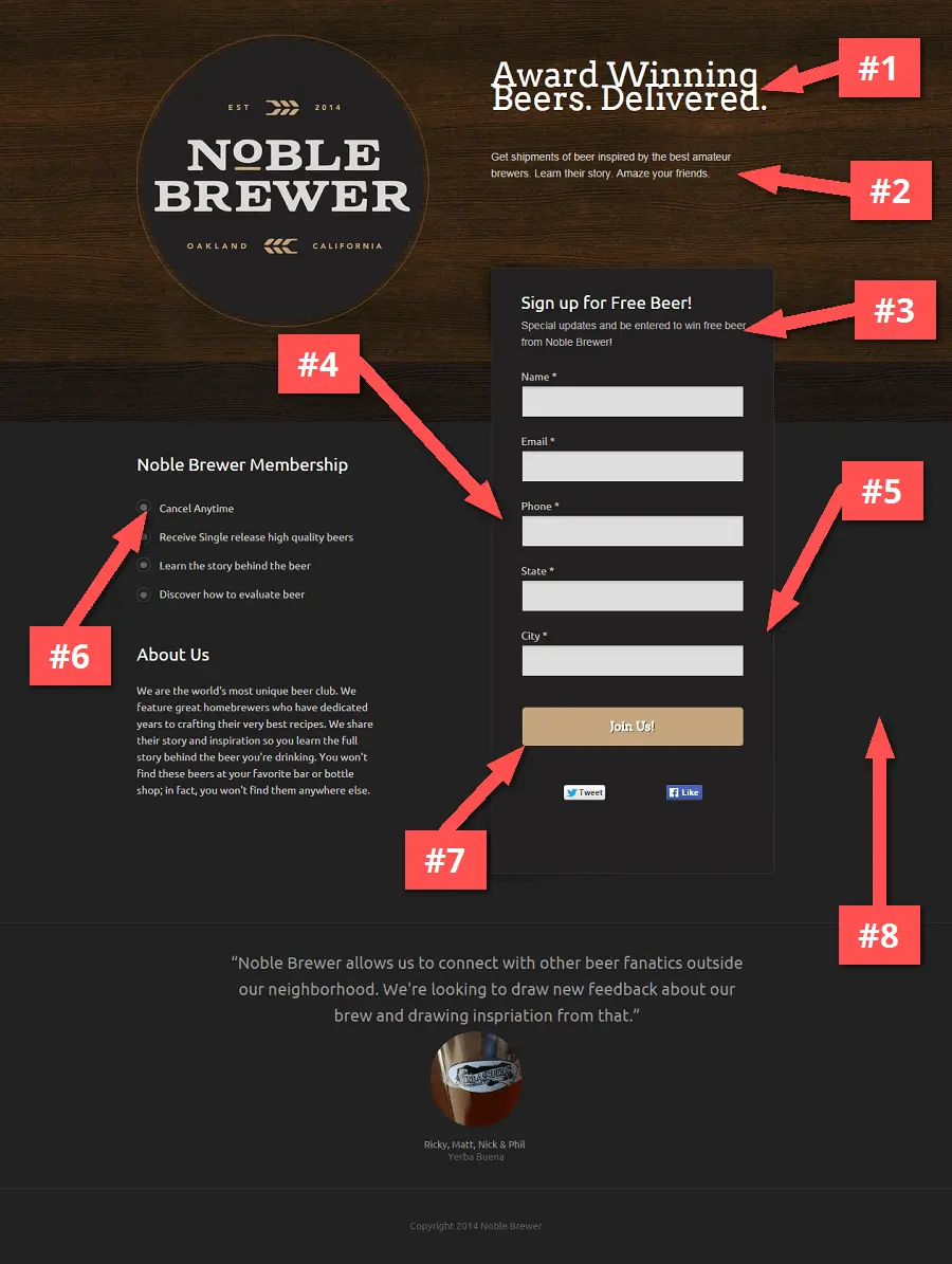
2 – NobleBrewer
What we like
- We like beer and are interested in the service, so wanted to review this page.
- The headline is clear about what the service is about.
- The About Us story is short and neat.
What to improve
#1 – Sweat the small stuff. The headline font overlaps. It’s a really small detail, but if your main headline has this flaw, it immediately lowers the trust factor of the page.
Think about all the little details that somebody might see when they’re going through the page that makes them say “this seems less than trustworthy”.
You can have the greatest copy and incentive in the world, but people are always going to be looking for a reason not to sign up.
#2 – Size for readability. The explainer text below the font could be larger in size. Especially since it’s a better explanation of the business so should be called out more.
#3 – Inform your visitors. The form text says “Sign Up for Free Beer”, yet underneath the copy hints at the chance of winning free beer. If there is a contest taking place on the page, be more upfront about the giveaway and be clearer about what’s going on the page.
#4 – Reduce form fields. We don’t really see the need to ask for a phone number. Since you’re just trying to gauge initial interest of the market, this form feels too lengthy. Always remember that the less information you ask for, the better.
At this point you’d probably just be better off collecting only the name and email address. If they win your giveaway, then collect the other information.
Besides if you’re using KickoffLabs, you get access to detailed Lead Data that automatically scrapes the web for contact and demographic information from each of your signups.
#5 – Ask the right questions. It seems as if this landing page is targeting 2 segments; the brewers and the beer aficionados.
Instead of asking for phone and location on the form, it would probably be more beneficial to use a dropdown form field to know how people identify themselves.
#6 – Lead with benefits. When you use the words “Cancel Anytime” and there’s a signup form, it feels as if a subscription is already under way.
The first goal should be to engage with people by focusing on the main benefits and potential solution to their problem.
#7 – Give thanks and get people sharing. After going through the signup process, there wasn’t a Thank You screen or an opportunity to share the landing page. You’re really missing an opportunity by not having that follow up experience.
Having that extra confirmation and the sharing option (something we do by default on every KickoffLabs page) would be immensely helpful because we see on average a 35% percent boost just from people clicking share after they’ve signed up on a form.
#8 – It’s 2014… your pages must work on mobile. The page is not mobile responsive. If I got a link to this page on a mobile phone, it will not scale correctly to my device and thus the experience sub-par.
Our internal analytics tells us that about 45% of views come from mobile devices. And that number will only increase in the near future. It’s extremely important for your landing pages to be viewed correctly on any type of device.
Guess what? ALL KickoffLabs pages are fully optimized for mobile-responsiveness.
try.noblebrewerbeer.co
3 – EQ Wear
What we like
- Button and call-to-action doesn’t change with the image rotation.
- Header images are bright and detailed.
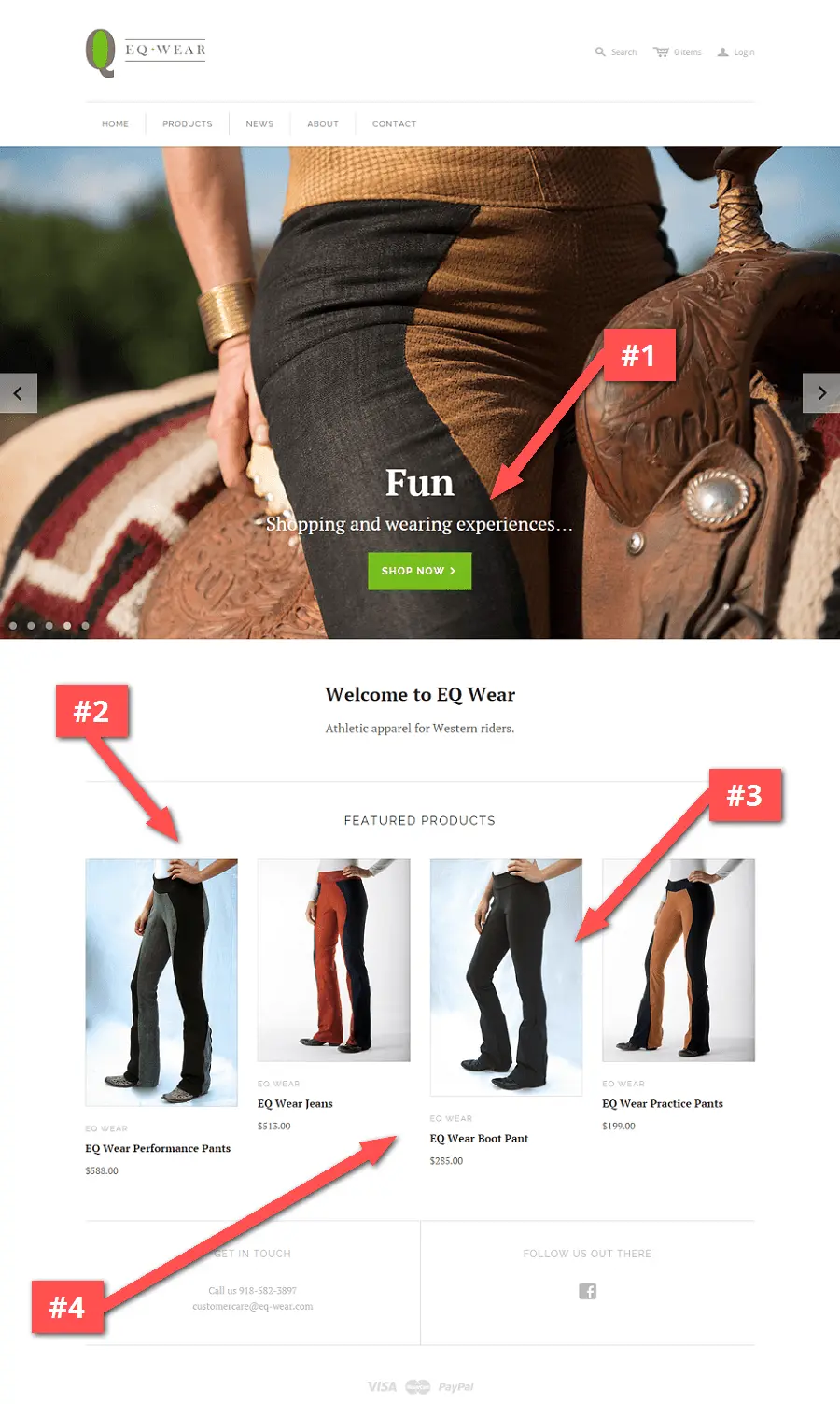
What to improve
#1 – Keep those CTA’s above the fold. Using proper spacing is a good practice, but taking a look at the logo and navigation bar, these take up too much space and push the rest of the content out of view.
The design goal is to have your more important tagline and call-to-action in the upper half of the screen.
#2 – Less clicks = Happier users. For ecommerce sites, people are going to click on images that are striking. These should always lead to either a product page or a high quality zoomed image.
However for this specific page, since these are the only products that they are selling, a better strategy would be to create a detailed product-focused homepage with zoomable images.
#3 – Start selling right away. Writing more detailed copy about your company and products will give visitors more context without having to click to another page.
If you don’t have hundreds of products (as is the case of this company), it’s okay to use your homepage as a product description page to directly include features, more images, testimonials, and a “Buy Now” button.
#4 – Use a secondary call-to-action. At the price level of the products, think about the amount of people that are immediately going to buy. When you’re selling a product for more than $100, you want to start by offering an incentive; a coupon, an ebook… something where you’re starting a relationship with your customer.
Since they may not be ready to buy at that exact moment, giving a second option to keep in touch can be vital to your business success!
eq-wear.com
4 – Massive Muscles Free Report
What we like
- The benefit is (somewhat) clearly explained.
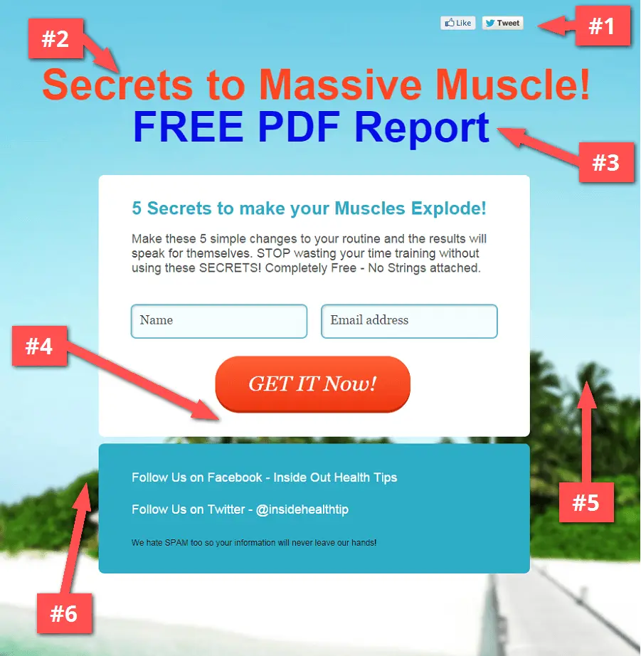
What to improve
#1 – Don’t ask for the share yet. We never like seeing “Like” or “Tweet” social buttons at the top of a page. Why would somebody share before reading anything about the page? Including these social media buttons only serve as a distraction.
#2 – Again, lead with the benefits. The headline doesn’t really inform as to what the page is about. This is the only opportunity you have to convince people into reading down the rest of the page. Swapping the tagline for the headline would actually help better explain this page.
#3 – Keep it simple. The red and blue headline text color reminds us of the web of yesteryears. We recommend to use only one text color for your headline. It’ll help give your page a more professional look.
#4 – Give more reasons to sign up. Add support copy about further benefits of signing up underneath the form. If you’re going to be following up by sending additional free information to your subscribers (say through an email drip campaign), those are each bullet points as a benefit that could be listed below the form as extra reasons for signing up.
#5 – Set the stage with images. The page feels somewhat “off” with the beach background image. There is nothing in the background or images that lead you to think that it’s about muscles.
It’ll take a bit of work, but you can find the perfect background image for your page!
#6 – Specificity cancels out scammy. Overall the page feels a little scammy, but being more specific helps cut down on that “scam factor alarm” that goes off inside of everybody’s head.
Going through the signup experience…
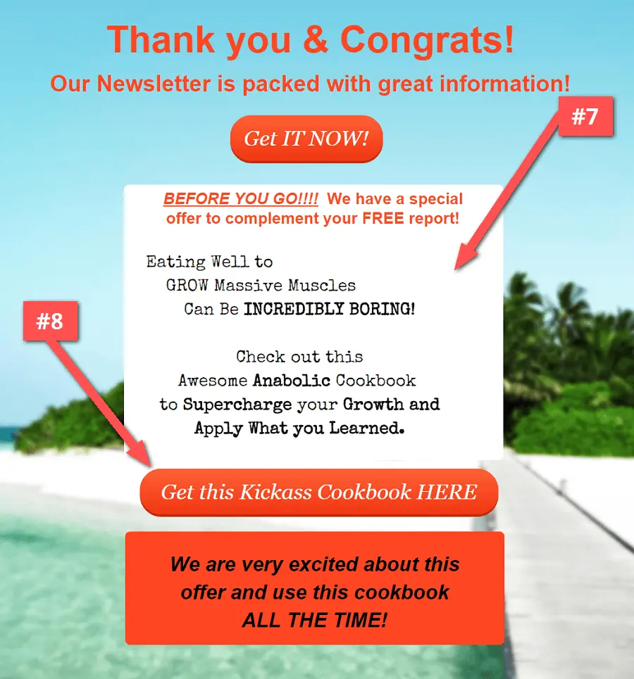
#7 – Include support copy before the “thank you”. This is the information that could be explained or put on the homepage… It took signing up to see this, when there is no harm in giving away this info about what’s their on the initial signup page.
#8 – Assure people get the goods. Clicking on the download ebook buttons, nothing happened! You want to be sure that when you promise something, it gets delivered. If you want people to share whatever you’re giving away, you have be 101% sure that all is working correctly in the signup and ebook delivery process.
massivemusclesfreereport.gr8.com
5 – The Love Lab, Denver
What we like
We actually really like this page. We even featured this design in our September 2014 roundup of favorite pages.
- A bold design and color scheme that not every company can get away with.
- The page is really clear that it’s a contest.
- A great headline that incites interest.
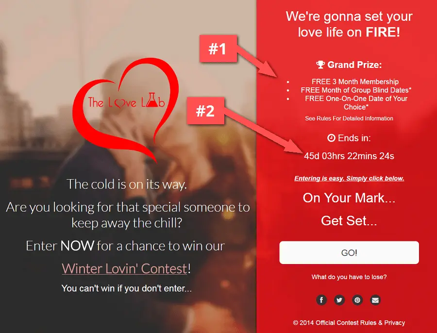
What to improve
#1 – Keep the contest prize simple. The prize list seems to initially confuse. For contest pages like this one, using a simplified prize list can help avoid over-thinking and get people to take action faster.
#2 – Add urgency! The contest is set to end at a very far date in the future. Adding a layer of urgency can have a strong psychological effect in getting people to sign up immediately. If that said 3 days to enter (instead of 45 days), people would be a little more motivated to enter now!
6 – LittleBearSees
What we like
- The use of a Halloween themed image.
- The question signup experience creates a “yes ladder” that leads to more voluntary action taken.
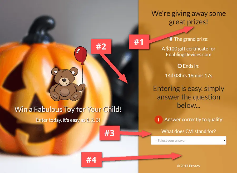
What to improve
#1 – Watch your wording. The headline implies there are additional prizes to win, however there is only a “grand prize” description. Be careful with using plurals to describe prizes, avoid confusing people that may expect more than 1 prize to be offered.
#2 – Tell them what you’re about. People may very likely be arriving at the page through a social share link a friend sent to them. You still want these people to get involved with your cause, so providing a bit more background and context about the company on the page can help spread your message (this is a non-profit).
#3 – Ask an obvious question. The question is obviously related to this page’s niche audience, so they should know the answer. But it’s also important not to make the question too difficult.
#4 – Link to relevant content. It might help to add a link to the company that is sponsoring the contest below the form. So if people want to get more information about your company, they can. However, this can sometimes lead to people clicking away from the form.
**What did you think?**
Hopefully you found these landing page teardowns beneficial. It’s always a lot of fun for us to go through and give our honest feedback.
If you want to get optimization advice for your page, or if you have any other specific questions about your marketing campaigns, be sure to JOIN US for our next Marketing Live Chats.
Click here and register to save your seat!{.btn.btn-primary.btn-lg}
Thanks for reading!
-Izzy Palmerin
Growth & Conversion Rate Optimization at KickoffLabs
P.S. Be sure to share this with your social network by clicking below…