Attention is today’s currency. You don’t get much of it to grab the attention of someone coming to one of your landing pages. Whether you’re building a giveaway, waitlist, or product launch page, the importance of your landing page’s headlines and subheadlines cannot be overstated. These words must grab attention and pull the audience into your story that’s filled with complimentary images, testimonials, microcopy, and a clear call to action.
Now that you’ve defined your brand voice let’s ditch the mundane and embrace the extraordinary.
Write Bold Headlines
Forget safe and predictable. In the realm of headlines, boldness reigns supreme. Take inspiration from the giants like Square. Their approach? They don’t just cater to businesses; they cater to every business. That’s not just a statement; it’s a declaration, an ambition. It’s about crafting a narrative that resonates, not just informs.
You’ll never stand out with a bland headline. Check out the bold headline and story below from Square.

They could have just said “A simple payment processing system made for businesses.” But that doesn’t stand out. It’s accurate, but bleh.
They didn’t just claim to work for “businesses” they claim to work for “EVERY Business”. Then they let you pick a type of business and work to tell a specific story for that business type to prove the big claim.
Weave Headlines into a Story
Imagine your headlines as the cover of a riveting book. They should not just capture attention but encapsulate a journey. Each subheadline is a chapter, unfolding a tale that speaks directly to your audience’s needs and desires. Consider Dropbox: their headlines aren’t just informative; they weave a compelling narrative.
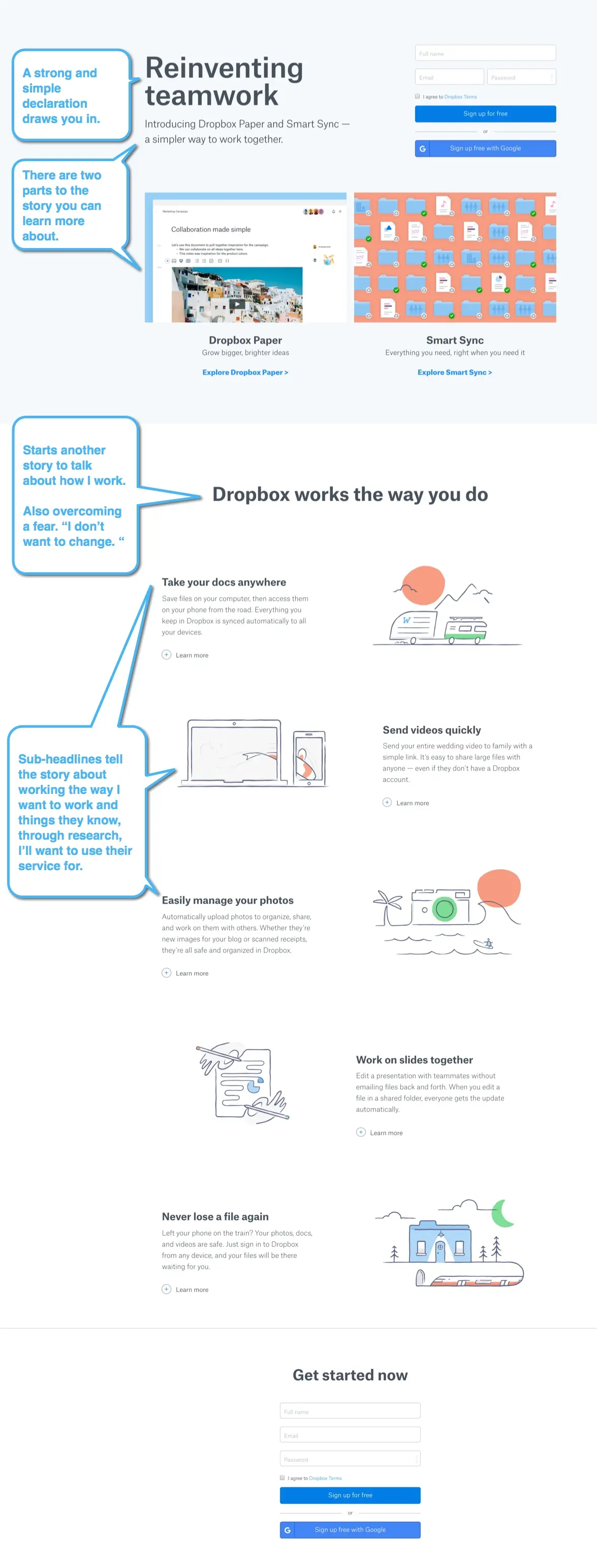
Something else to notice about these two examples so far… they keep the body text short as well. No more than 2-3 sentence paragraphs to back up the headlines. We’ll cover that more below.
Be specific. Avoid statements that anyone could make.
“It’s Easy!”
Generic is forgettable. Specificity is memorable. “It’s Easy!” is a headline that gets lost in the crowd. “The Simplest Contest Set Up – Anywhere” is a headline that stands out. It’s confident, clear, and makes a promise about your product’s unique value.
“The Simplest Contest Set Up – Anywhere”
Now you are taking a stand while telling a story about what your product does. The reader knows it’s about contests and that you believe you’ll be simpler to get started than any alternatives. That’s a good headline and a brand promise to potential customers.
Embrace themes from your brand voice
In the square example they repeat a strong theme over and over again. The sub-headlines are all about speed. Speed to get started. Speed to make your lines move faster. Speed to get paid. Speed to save time.
In the end you may not choose their solution, but you’d have a hard time leaving their page without knowing why they think they are right for your business.
Sell the Dream
Your headlines should not just sell a product; they should sell a dream. “You Need A Budget” transforms the mundane task of budgeting into an aspirational journey towards financial control. It’s storytelling that inspires.

Exclusion is Inclusion
Not every product is for everyone, and that’s okay. Your headlines should filter out the irrelevant, drawing in the most suitable audience who will find real value in what you offer. You might not able to scale like Square yet. Maybe your product is “Simple Budgeting for Content Creators”. That tells people that don’t create content it’s OK to walk away. This same principle applies when you’re writing copy for referral programs or newsletter campaigns – be clear about who it’s for.
The SHINE Formula for Headlines
Consider the following headline and look at the formula that was used to create it.
“Revolutionize Your Mornings: Discover the Quickest, Most Flavorful Coffee Maker Ever!”
- Specific: Targets coffee enthusiasts looking for a quick and flavorful coffee-making experience.
- Helpful: Promises a solution to slow and bland coffee routines.
- Immediacy: Encourages immediate engagement by highlighting the unique and appealing qualities of the coffee maker.
- Newsworthy: Stands out as an innovative product in the coffee-making world.
- Entertaining: Engages the audience with an exciting and lively tone.
Educate Through Headlines
Informative headlines are a treasure trove. They not only capture attention but also impart valuable insights. By educating your audience through your headlines, you position yourself as an authority in your field. Consider the following sub-headline for a coffee maker:
“Master the Art of Perfect Coffee: Learn How Our Advanced Brewer Delivers Barista-Quality Flavor in Half the Time”
The Role of Images & Videos With Copy
Way too many businesses rely on images and videos to tell their story. One thing you’ll notice about all the examples above is that even if they linked to a video and had images… you understood the story WITHOUT having to see or view them. The multi-media is only complimentary.
I know what you are saying… “I thought an image was worth a thousand words.”
It’s not.
Your words are worth thousands of dollars to your business, but the images and videos are just complimentary to your story.
Businesses probably focus too much on the multimedia aspects because they paid thousands of dollars for their product video and intricately designed imagery. That’s great if you have the disposable income. It may help tell your story. Unless you are selling a blockbuster summer movie a video IS NOT required to get people to take action.
Microcopy: Is read closer to the conversion
Microcopy, the subtle yet powerful text beneath your headlines, is the glue that holds your narrative together. It adds depth, provides clarity, and reinforces your message in a succinct, digestible format.
While I want to stress that this copy can make a difference… it won’t make nearly the difference changing out the main headlines and story will on your landing pages.
This copy exists simply to support those headlines and add additional details for the person who is engaged enough that they want to learn more. See an example here:
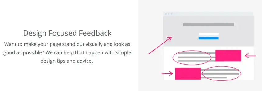
There are two sentences and an image there that support the headline above the text. You’ll see examples like this on the page above from Square as well.
- Support the primary headlines with answers, details, or proof statements that add clarification.
- 2-3 sentences that are easy to read with a larger than average font size.
- Don’t write novels on each point. It will make the page look like a wall of text.
- Keep it at an 8th grade reading level. You don’t need $100 vocabulary words on landing pages.
The Role of Social Proof
People are scared to go first. No one wants to feel like a guinea pig. My rule for social proof, however, is similar to images and videos. It’s complimentary. Good social proof helps to build trust with the visitor by letting them know that they are not alone, the problem is worth solving, and giving them someone to identify with.
Some of the best testimonials will address an objection or multiple objections. For example, the testimonial can stress: durability, price, quality, speed, customer support, popularity, and more.
There are several different kinds of social proof to consider adding to your landing pages. This is especially important for viral giveaways where showing participation numbers can drive more entries:
Personal Testimonials help people identify themselves
Testimonials are great “proofs” to demonstrate to your visitor just how great your product or service is by how well they served someone that sounds just like them. A quote that says “I had this problem and this company did an amazing job of providing a solution that wildly exceeded my expectations”.
For example:

Or even quotes from Twitter customers:
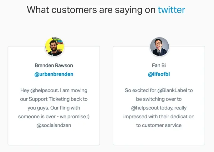
Numerical testimonials can make visitors feel safer
A numerical testimonial highlights some numbers to show that someone making a purchase wouldn’t be alone. Saying, for example, that you’ve already helped 170 people accomplish something is a powerful way to convince everyone that your solution can work for them as well. See how it’s done here:

Press worth mentioning
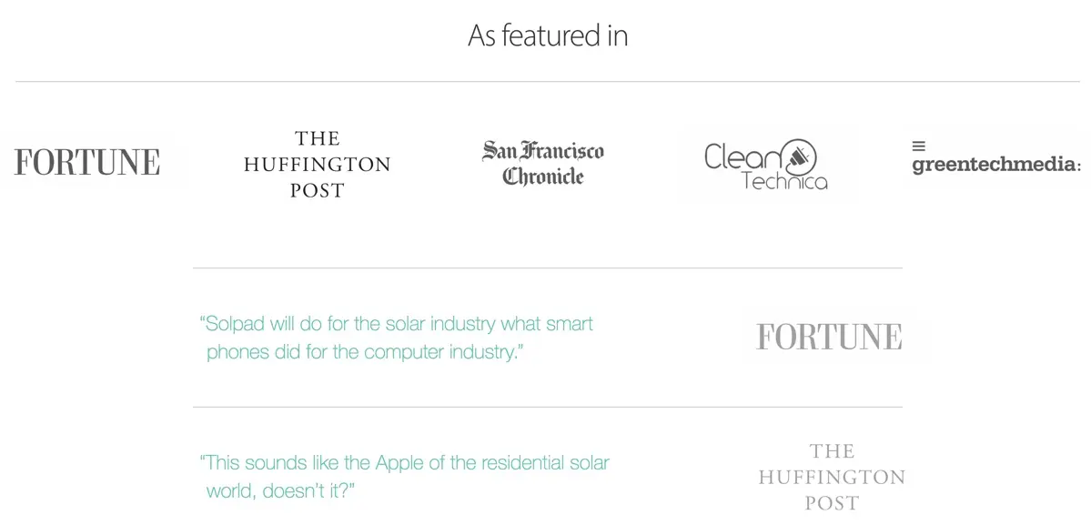
Do you have any press coverage that’s worth mentioning? This can make a visitor feel your solution is more real. Any public reviews or mentions can be powerful and you don’t even need to quote them. Just listing off reputable sources that have covered your product or technology can put visitors at ease.
No social proof yet?
If you are in a private beta you may want to reach out to beta customers for some early praise you can use to promote your launch in the form of a personal testimonial.
However if you don’t even have a beta yet you could still “cheat” by using industry quotes to steer your visitor in the right direction.
For example: If you are building a platform for solar energy then you could quote larger new outlets that talk about “Solar energy poised to grow 40% over the next year.”. It doesn’t mention your specific product, but helps people understand your solution could help solve big or important problems.
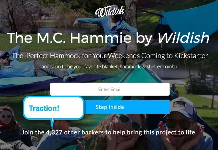
You could also start touting the number of people you have signed up so far. Check out this example:
Write a great call to action with incentive
A call to action generally combines a sub-headline, an optional form requesting information from the visitor, and a button that’s obvious. A great call to action is, first and foremost, easy to find and understand on your landing page.
Here are some rules for great calls to action:
- Make it discoverable. You should be able to step back 10’ from your computer and know where the call to action is.
- What do you do? It should be obvious to customers and noncustomers what you want them to do.
- Why should I take it? What’s in it for the visitor to take action. Will they get something for it? A free account? A demo? A lower price if done before a certain date? There needs to be something.
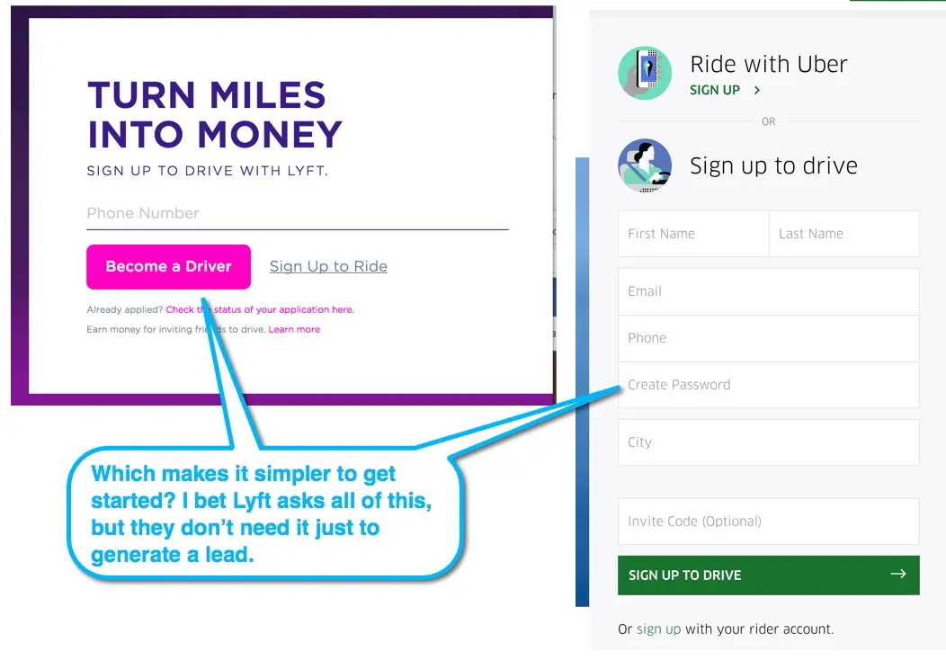
- Keep it simple. Nothing worse than a call to action that requires me to answer 10 questions. If you don’t need it right away then don’t demand it. Check out the Uber versus the Lyft call to action here:
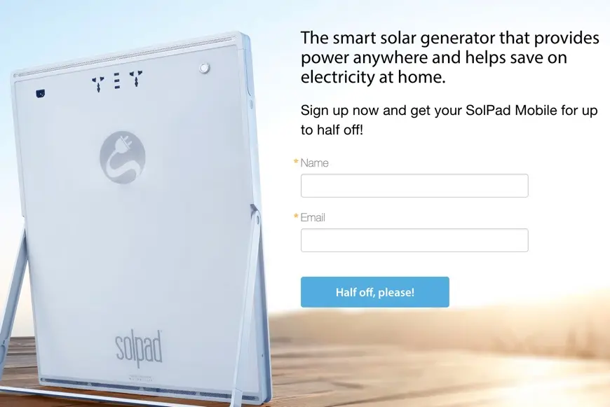
- Match call to action and button text. A call to action generally combines an incentive headline and button text. Do your best to make these match and be on brand. Like headlines… avoid being generic. Check out this example where the headline matches the button from SolPad.com
Related Resources
Ready to apply these landing page principles? Here are helpful resources:
- Inspirational Landing Page Examples - See these principles in action with real examples
- Product Sales Page Copywriting - Adapt these techniques for product pages
- Contest Landing Page Builder - Create professional landing pages with these copywriting principles
- Giveaway Copywriting - Write compelling copy for giveaway campaigns
The TLDR Version of Landing Page Copywriting
This was a lot. If you skimmed the headlines and got to the end here I want you to remember the following:
- Spend the most time on creating bold headlines that tell a compelling story when skimmed without the rest of your copy.
- Don’t rely on videos or images. They should only complement the story.
- Don’t write a novel. Minimize even the details down into easily digestible bits.
- Everyone can and should have some form of social proof.
- Create an obvious call to action that’s a “no brainer” for people to take you up on.
Read more Copywriting for Conversions with the next chapter:
6. Product Sales Pages
Practical tips and tricks for writing the highest converting product sales pages.
