Your landing page will succeed or fail based on the written copy. Whether you’re building a giveaway landing page, a waitlist page, or a product launch, no matter how well designed your page is… if the copy sucks… no one is going to buy it. Great copy rises above the design to convert visitors into leads.
What makes for great landing page copy? It’s something that piques a readers interest and gets them to read more into the landing page. Great copy starts with the headline. If you want to learn the principles behind these examples, check out our comprehensive landing page copywriting guide. Now lets look at some examples of remarkable landing page copy.
You’d expect the copy to inspire you and it doesn’t disappoint.
They used Pinterest to plan a dream trip. Join Pinterest to find (and save) all the things that inspire you.
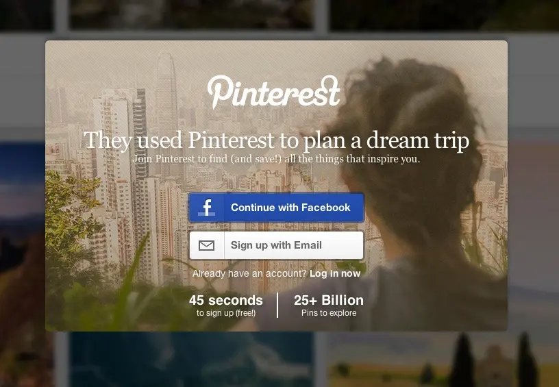
Beyond the headline they make two other claims:
-
“45 Second to sign up”
-
“25 Billion Pins to explore”
The headline is inspirational and makes the visitor imagine a tangible benefit of using the service. The first sub-headline serves to show how easy it is to sign up and removes friction by answering a common question. The second serves as their social proof. It screams “You won’t be alone! There are 25 Billion Pins!”. This same approach of using participation numbers works great for viral giveaways and referral programs.
Contently
For a service like Contently, that helps large brands generate content you’d expect the copy to be top notch… and it is.
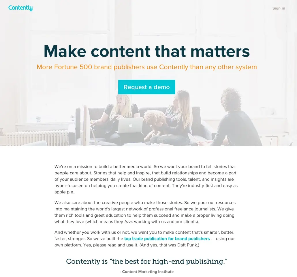
Make content that matters
Who wants to make content that doesn’t matter? The competition… that’s who. They focus on important content and they are going to make it for you. :)
More Fortune 500 brand publishers use Contently than any other system
This is their social proof statement. Its also aspirational to potential customers… who doesn’t want to take their company to the next level. Most of their customers probably aren’t in the Fortune 500… but this makes them dream as well as know that the content generated will be good enough for them.
Freckle
Freckle is a tool for time tracking.
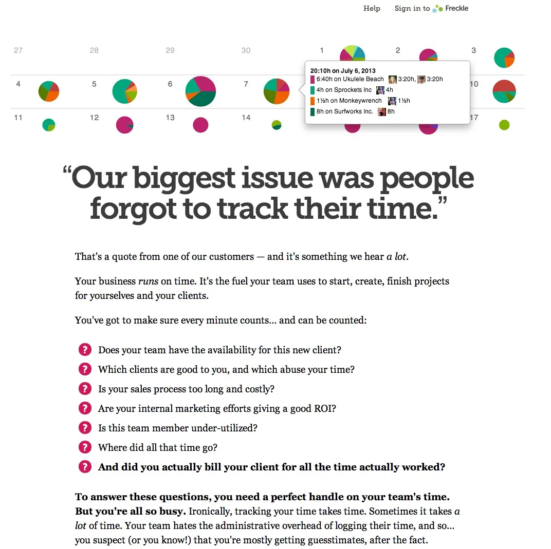
“Our biggest issue was people forgot to track their time.”
I love this because the headline is a customer quote that focusses on a problem statement rather than their solution. I mean, you could use a stopwatch and paper to track time… but then you might forget to start, stop, or report it. They are going to solve this for you.
While not strictly copy the dots on the top of the page show you actual time tracked with the application when you hover over them. It gives you a glimpse of what you are going to get.
Other great lines here include:
Your business runs on time. It’s the fuel your team uses to start, create, finish projects for yourselves and your clients.
You’ve got to make sure every minute counts… and can be counted:
And did you actually bill your client for all the time actually worked?
The page is filled with a combination of:
-
Statements that will cause people to say “yes. I have that problem”
-
Questions that lead people down a path of saying “You get me. Take my money!”.
Evernote
Two words.
Remember Everything
I mean, who hasn’t forgotten something important. It’s solution and a mission statement for the company all in one.
The sub-headline drills deeper to describe what and how they are going to do for you.
Evernote apps and products make modern life manageable, by letting you easily collect and find everything that matters.
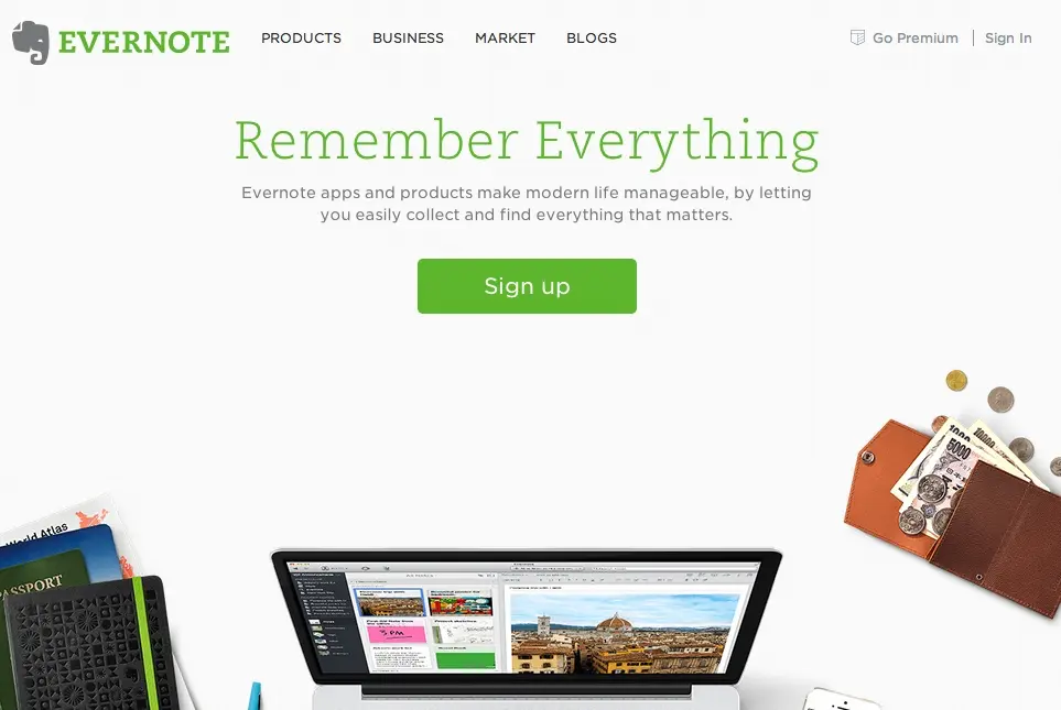
It plays on your fear that “OMG – Modern life is complex. I must be forgetting something important… I should save it… but how…”
Apple iPad
Just like the featured product the primary copy is light and remarkable.
iPad Air – The power of lightness
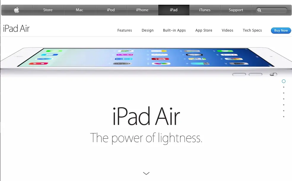
It’s a tease that encourages the person to click the arrow and learn exactly what makes it so powerful. Of course the image, and visual, is above the copy and helps illustrate the point by showcasing how thin it is.
Quora
Quora makes an amazing QnA product whose quality puts yahoo answers to shame. The headline implies just that.
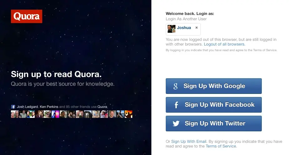
Sign up to read Quora.
Quora is your best source for knowledge
What’s good about this headline is that it basically beats you over the head with your next step. They want you to take their call to action and then give you a reason why… “it’s your BEST source for knowledge”. Who doesn’t want to be a part of that?
They follow with some social proof with the Facebook widget & the right side that gives you several ways to sign up.
Square
I love square and I’m not even a customer. I just love that our local farmers market no longer requires me to bring cash. That solved a big pain point for me and, ideally, their customers love it because I spend more money with them. :)
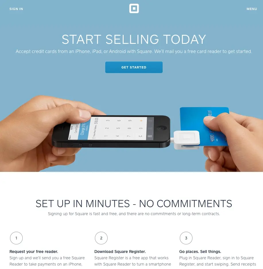
START SELLING TODAY
Accept credit cards from an iPhone, iPad, or Android with Square. We’ll mail you a free card reader to get started.
Everything, including the images, on this page re-enforces two things.
- You can use square to sell things anywhere.
- You can set it up quickly, for free, with no commitments.
They start with the three word version, expand to two sentences, then go into details below. The copy flows beautifully as you go down the page. This same progressive approach works well when building contest landing pages – start simple and add detail.
They use a slider… which I dislike, but the copy on the page doesn’t move or change with each slide. The slides just re-enforce the value proposition.
When you find something you want to view later, put it in your pocket.
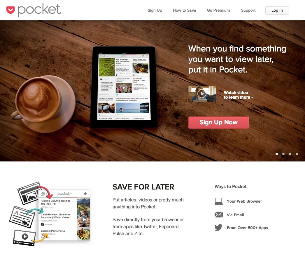
They saved the three word description for later on the page and went straight into the one sentence tagline. I think it works well here because the product isn’t something most people are used to. This is also probably why they lead with the extra slides and video to showcase why you need it.
AirBnb
This is a service I’ve used several times with great success. The headline doesn’t complicate anything.
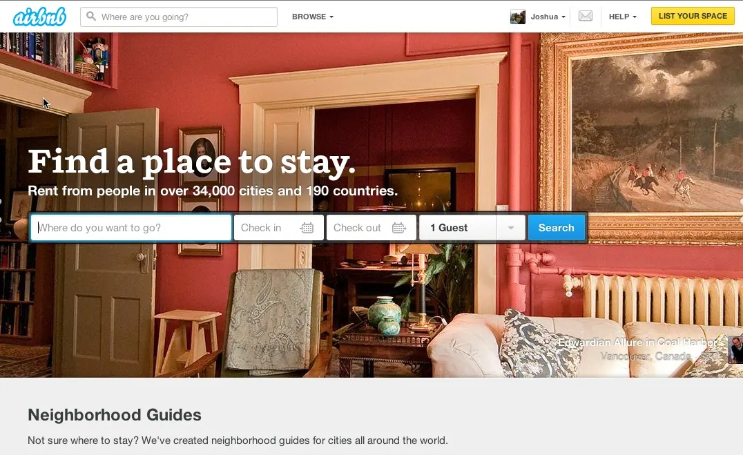
Find a place to stay.
Rent from people in over 34,000 cities and 190 countries.
Again, they use sliders, but the text and call to action locations don’t change. The images are real apartments you could stay in.
The primary headline describes exactly what problem they solve… finding a place to stay.
The sub-headline adds that you “rent from people”. That’s a differentiator. You aren’t renting from a single, large, hotel chain.
Then it follows with how many cities and countries you can find them in. The only suggestion I’d make is to highlight the number of rooms available… I know it’s a HUGE number. Maybe they found it too intimidating.
Paper
I’m a terrible artist, but it doesn’t matter with Paper. I love how good this app makes me look.
Paper. Where Ideas Begin.
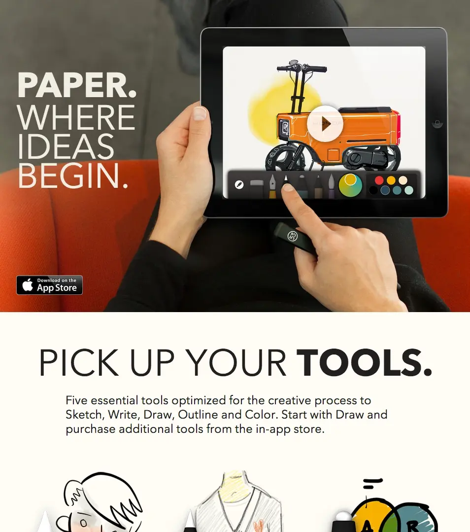
Unlike other copy we’ve seen I don’t think this stands on its own… because you have no idea, without the image, what they are really selling. The image and video, however serve to compliment the text well.
Pick Up Your Tools.
The section on tools holds the meat of their copy and really starts to outline the benefits. Phrases like “Capture ideas”, “Start with a sketch”. and “Think bold”. Probably resonate really well with each target audience. They back up that copy with an image that fits each one.
Related Resources
Ready to apply these insights to your own landing pages?
- Landing Page Copywriting Guide - Learn the principles behind these successful examples
- Product Sales Page Copywriting - Apply these techniques to product pages
- Contest Landing Page Builder - Build professional pages with great copy
- Brand Voice Guide - Develop a consistent voice like these brands
What have you learned?
When you are thinking about great copy, and looking at these examples, there are several themes that come through:
- They all start with very simple, in most cases, three word headlines designed to capture attention in the shortest amount of time.
- They are customer focussed. There are no “We” statements. All the copy focusses on “you”… the reader. It’s written in the second person.
- They are benefits focussed rather than feature focussed.
- The images are complimentary and NOT distracting from the text.
- If you use a slider… don’t mess with the copy. Give people a chance to read what you have.
- Most copy includes a differentiator.
- The primary call to action is never far from the headline text.
- Social proof is important and generally included within the first 2 seconds of reading.
- They tell a story that starts with 3 words, expands to a sentence, then adds paragraphs. It’s generally a triangle of text.
- They are aspirational. They make the visitor imagine how good life could be WITH the product or service they are selling.
Now that you’ve seen these principles in action, you can apply them to your own marketing campaigns. Whether you’re creating a newsletter signup, product waitlist, or viral giveaway, these copywriting fundamentals will help you convert more visitors into engaged customers.
Hope you enjoyed these examples. If you did… please share them below with your friends. :)
Read more Copywriting for Conversions with the next chapter:
8. Giveaway Copywriting
Write copy that drives giveaway entries and engagement.
