- Before the Designing Can Begin…
- Key Components of a Contest Landing Page
- How to Design Your Landing Page in 5 Steps
- Step 1: Create Your Landing Page Copy
- Step 2: Choose a High-Resolution Contest Photo
- Step 3: Craft a Compelling Call-to-Action
- Step 4: Create Your Contest Entry Form
- Step 5: Use a Marketing Platform to Put It All Together
- Build Your High-Converting Landing Page
- Create the Perfect Contest Landing Page Today with KickoffLabs
If you’re using a landing page to promote a viral contest, you might think that designing the page will be easy. A lot of people assume that landing page design is just a matter of throwing some text and images together with the contest details. But it’s actually so much more than that.
The way your landing page looks, reads, and comes across to your audience plays a huge role in the success of your campaign. Even something as simple as choosing unappealing colors, unprofessional fonts, or an improperly-placed call-to-action (CTA) can keep you from getting the leads and conversions you’re hoping for. So if you want your contest landing page to convert, designing it the right way is key. In this guide, we’ll give you some helpful tips, tricks, techniques, and strategies on how to make that happen.

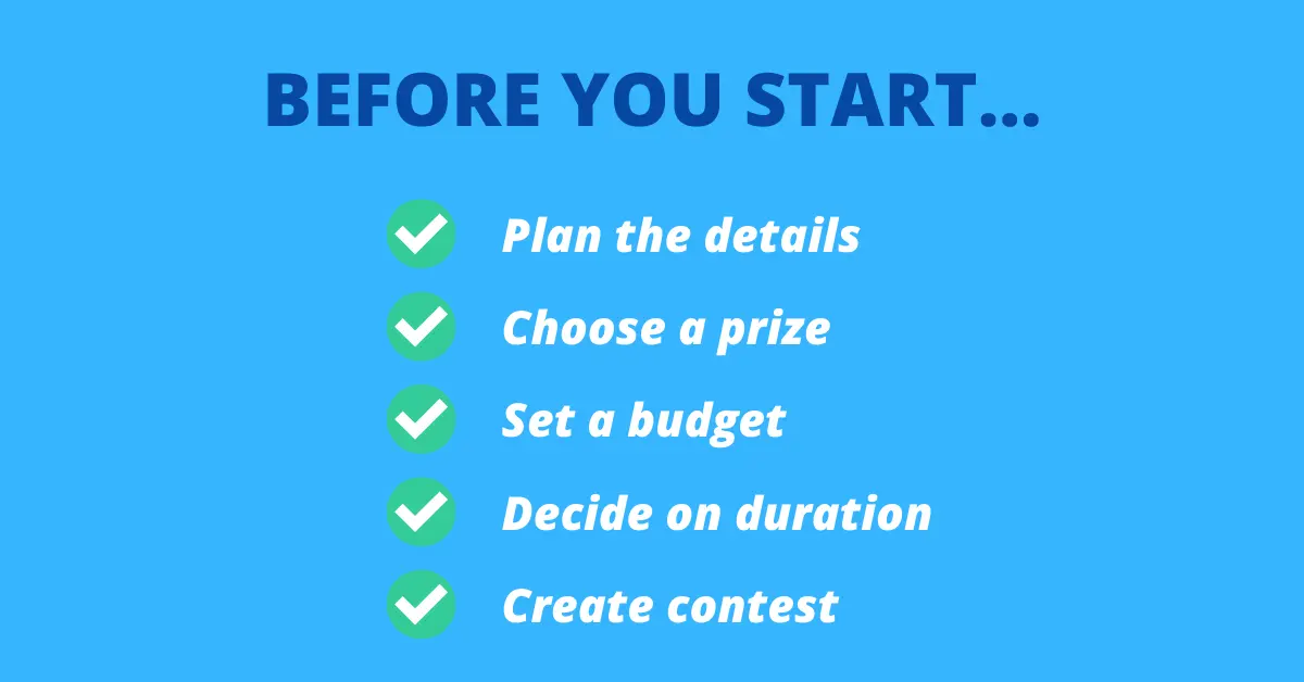
Before the Designing Can Begin…
Before you can start putting your design skills to work, there are a few things that need to be done. You can find all the details in our guide to best practices to creating viral contest landing pages, but for now, here’s the general gist of everything that comes before the design phase:
- Plan the basic details of the contest to get a clear picture of how you want it to run
- Choose a prize that’s relevant to your brand and offers value to your audience
- Set a budget for the contest (cost of prizes, marketing ads, etc.)
- Decide on the contest duration and start/end dates
- Create your contest (this is where the design magic happens!)

Key Components of a Contest Landing Page
It’s a great idea to outline your page before putting it all together to make sure you’re including everything that’s necessary to get people entered into the contest. There are a few things that MUST be included in your page design, like:
Attention-Grabbing Headline
If the main headline doesn’t jump off the page and immediately grab the attention of your audience, the readers are unlikely to keep reading, let alone input their entry details.
The headline should represent your contest well, but also motivate the audience to keep reading and take further action so that you can get more leads.
When running a sweepstakes campaign, your headline should clearly communicate the prize and create urgency to enter.
High-Quality Images
Just like your headline, the landing page image(s) should motivate people to enter your contest. Whatever image you use, it should be crisp, clear, high in quality, and relevant to your brand and contest.
Easy Entry Method
A challenging entry process won’t get your contest very far. If ANYTHING on your page is confusing, unclear, or time-consuming, people aren’t likely to put in the effort of trying to piece the details together. That’s why you need to keep things as simple and easy as possible.
Contest Details and Terms
Of course, your contest landing page needs to cover all the necessary contest details. What prizes are up for grabs? What are the steps to enter? Are there any restrictions on entering? When does the contest start? When does it end?
Including answers to questions like these on your landing page is a must, or else your potential contestants will be left in the dark, and chances are that they won’t enter the contest.

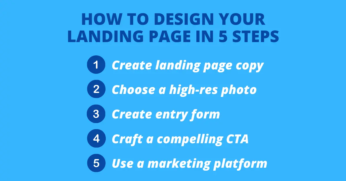
How to Design Your Landing Page in 5 Steps
Once you’ve figured out all the basic details, prizes, contest duration, and budget, you can officially focus on the creative aspects of landing page design. There are several aspects to the creative process, and they can be broken down into these five easy steps.
- Create your landing page copy
- Choose a high-resolution contest photo
- Create your contest entry form
- Craft a compelling call-to-action
- Use a marketing platform to put it all together
Below, you’ll find details on each of these steps, including tips and tricks to design the perfect contest landing page.

Step 1: Create Your Landing Page Copy
Creating the copy for your landing page is Step #1, and it entails writing out the contest details and choosing a creative, catchy headline. With a solid headline, your audience will most likely be persuaded to keep reading, so start with that before moving on to the contest details.
There are a few ways to capture the attention of your readers with the headline. It should be strong, clear, concise, and enticing enough that the reader feels compelled to move on to the rest of the text, also known as the “body” of the landing page.
Something like “Enter to Win a Free Month of Yoga!” would be the perfect example of a landing page headline for a contest run by an up-and-coming yoga studio. It’s short, sweet, and to the point, and that free month of yoga is a compelling reason for yogi readers to continue on and input their details to enter.
Next up is the body text of the landing page. This is where you’ll provide all the necessary details for entering, prize information, and any other need-to-know contest terms. Try to keep this as concise and easy-to-read as possible, but don’t forget any essential contest info.
Remember, this step is all about converting your audience to sign up. You can learn more on how to do that in our guide to writing copy that converts.
Step 2: Choose a High-Resolution Contest Photo
While it’s not entirely necessary to include an image in your landing page design, it’s definitely recommended. A picture is worth a thousand words, and when chosen correctly, that statement is 100% the truth.
High-quality images are the perfect attention-grabbing addition to the page, and they can help to represent your brand and contest. But choosing the wrong image can do more harm than good, especially if it’s low in quality or has absolutely nothing to do with your brand’s campaign.
Here are a few helpful tips on selecting the right image for your contest landing page:
- Make sure that you have the legal rights to the image you choose; you can access thousands of royalty-free images from these sites.
- Choose a crisp image with a high resolution - no fuzzy landing page photos, please!
- Select a photo that’s relevant to your brand, your audience, and your contest.
- If you’re using an image as your landing page background, make sure that it contrasts with the copy to avoid any difficult-to-read text.
Step 3: Craft a Compelling Call-to-Action
Now that you have your landing page copy and images all figured out, the next step is to compel your readers to officially enter into the contest and provide their details. This is done with a call-to-action, or CTA for short.
Your CTA is basically the final push to convince your audience that what you’re offering is worth it. It’s quite literally a “call to action”; you’re calling your readers to take action by entering into the contest.
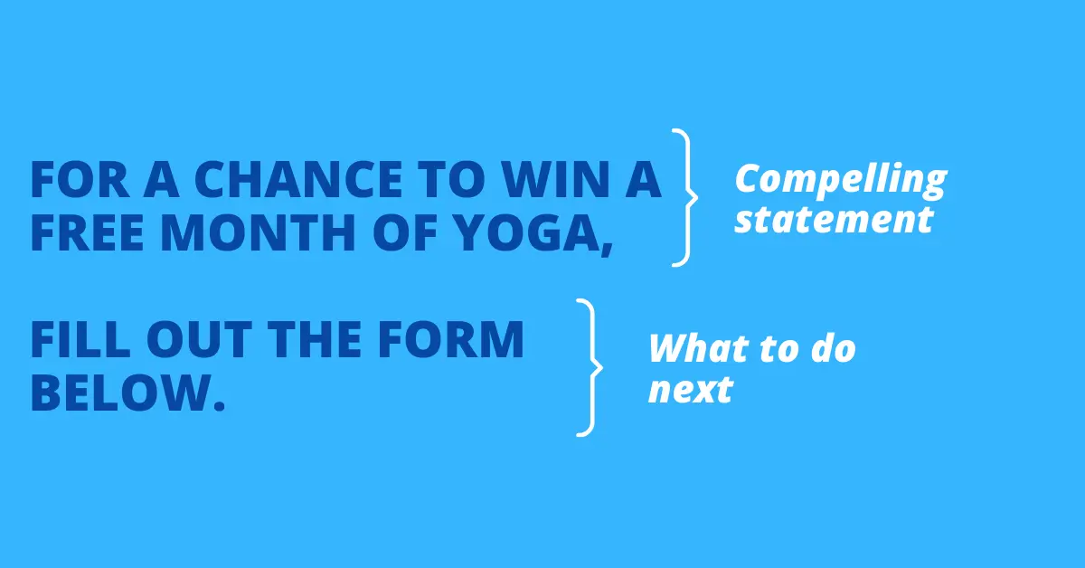
Most CTAs are made up of a persuasive statement with instructions on how to take the next step. For example, the final CTA for a Free Month of Yoga Contest could be something like this: “For a chance to win a free month of yoga, fill out the form below.”
In this CTA, clear guidance is provided on what to do next (fill out the form below) and the compelling statement is there as well (for a chance to win free yoga). There are a number of ways to write a CTA, but the main goals are to persuade the audience to enter and provide details on how to do it.

Step 4: Create Your Contest Entry Form
Every contest landing page needs a contest entry form, which brings us to Step #4 of the design process.
The entry form should be clearly visible on the landing page, but more importantly, it needs to provide easy steps for entering. The best entry forms just require the audience to input a name and email - anything more than this can be off-putting to the reader.
Nobody wants to spend all day typing in their details, so keep things as simple, fast, and easy as possible. Once a contestant has entered, you can keep them engaged through email marketing, like a “Thanks for entering!” email or emails with reminders on contest updates and required actions.
Our popup forms make contest entry even easier by capturing emails without leaving your main website.
Step 5: Use a Marketing Platform to Put It All Together
Finally, it’s time to put everything you’ve learned so far to use and actually create and launch your landing page. This may seem like the most challenging part of the process, but if you use the right platform, it might just be the easiest - and the most fun!
At KickoffLabs, we provide you with dozens of landing page templates on our platform that can be customized to your exact liking. Start by choosing a template, then you can add in your headline and body text, upload a photo, change the placement of images and text boxes, and more.
The KickoffLabs templates even allow you to design your landing page based on the type of campaign you’re running. We’ve got your back whether your contest encourages leads to make referrals to move up a leaderboard or if it just requires a simple email entry.
If you want to launch your contest in a matter of minutes, our simple Contest Box option makes it possible to promote your contest directly on your website.
Build Your High-Converting Landing Page
Start with a proven template:
- Landing Page Templates - 100+ pre-designed templates
- Contest Landing Page Builder - Drag-and-drop editor
- Popup Forms - Capture attention at the right moment
Choose your campaign type:
Create the Perfect Contest Landing Page Today with KickoffLabs
By using a contest landing page with an attention-grabbing headline, compelling copy, quality images, easy steps to enter, and a persuasive call-to-action, you’re well on your way to getting more leads and building your brand.
At KickoffLabs, we believe that designing the perfect landing page should be fun and easy. We provide you with over 45 customizable landing page templates and design tools. Go ahead and create an account to start designing today.
Read more Landing Page Design with the next chapter:
6. Common Mistakes
Learn how to avoid common mistakes that drive visitors away from your landing pages.

