Full Transcript
Josh Ledgard: Hi everyone. Welcome to KickoffLabs On
Growth. I'm Josh Ledgard, and today's episode is going to be about
product design. With me today is our designer at KickoffLabs, Lauralee
Flores. She does an amazing job designing not only the landing pages and
widget templates you use at KickoffLabs, but also evolving the
KickoffLabs application and the user experience of using our product,
which means the dashboard where you manage your campaigns, you go back
and you search for your leads, where you manage your landing pages, the
settings, all of that stuff.
Josh Ledgard: I love the perspective she
brings to these conversations when she and I are working on a design
challenge, and I wanted to tease out some of the things I've learned
from working with her over the last few years.
Josh Ledgard: Thanks for agreeing with me
at the last minute this morning to be a guest on the podcast.
Lauralee Flores: My pleasure.
Josh Ledgard: So before we get into it,
what's your background? And how did you get into product design and user
experience?
Lauralee Flores: So I came from a
psychology background. My undergraduate degree was in psychology. And I
did a graduate degree in applied psychology. And as I jumped into that
program, I became really interested in human-computer interaction, which
is basically what they used to call usability. And I really liked that,
and that's where I focused. But the program itself was one where we just
looked at the psychology of how people think and process information and
apply that to the design of products.
Lauralee Flores: At the time, usability
wasn't... I mean, there was no graduate degrees in usability or programs
or anything. There was only a few places where there were even jobs in
usability at the time. And a lot of my coworkers or people also in the
program thought that I was kind of crazy for being interested in that,
in the psychology of like websites and web applications, because a lot
of them were doing like... It was really big in the aeronautical
industry and the automotive industry with the displays in your cars and
stuff.
Lauralee Flores: But basically, we just
looked at the psychology and understanding really basic cognition on how
it makes sense for a person to experience something and be able to learn
and understand something, especially in high stress moments. So that's
where my educational background started with this.
Lauralee Flores: After graduate school, I
went on to a usability team, and a few years later was leading the
usability team. And I got really interested in kind of creating...
Because as part of it we would be running usability tests, and we'd need
to have different versions of a design together to see... We'd
experience something and say, "Oh, we need to change this." And as part
of changing it, sometimes we'd test a couple different designs. And I
started becoming really interested in the actual design of things. I saw
how integral and important that was. And so I kind of just started as
part of that work I would design some of the interfaces. It would just
make it faster instead of sending it over to the design team. I would
design it just as kind of a low fidelity design, just as something just
to test the concept out. And I kind of continued to follow that through
and really enjoyed the design part and continued to do that.
Lauralee Flores: And eventually, after a
number of years... And during that time, I also learned to code. And so
I kind of combined those. And that's kind of how I got into web and
product design.
Josh Ledgard: Somebody with your kind of
experience, that's what makes you perfect for working at a company like
ours, which is a really a tiny company. It's because you've got to go
and wear so many hats from the actual design to the interaction to like
user feedback and hearing that all directly. And so it's probably a good
thing for people to think about, especially if they want to work or are
working at a smaller company, like how can they expand into a different
hat, or how can they expand into a different part of design so they're
not just doing one thing, that they're bringing an improvement to all
the parts of the product.
Josh Ledgard: So what does a good product
experience mean to you?
Lauralee Flores: I think that when you
think about the experience of someone interacting with a product, it
really has to be based on the user and their success. So if someone
comes into using a product, their interaction with it needs to be not
only successful, like they're able to do the things that they want to
do, but it should be like a really pleasant experience. And I think that
that is what makes it a good experience. So they're able to go through.
It's easy. It's enjoyable. It's intuitive. They're able to see the
opportunities. I think the really great experiences are when someone's
going through and using your product, and they get this moment of like,
"Oh, I can do that. I didn't think I'd be able to do that." And then
that excitement. There's a level of excitement in saying, "Oh, that's
great that they're solving that problem for me."
I think the really great experiences are when someone's going
through and using your product, and they get this moment of like,
"Oh, I can do that. I didn't think I'd be able to do that." And then
that excitement.
Lauralee Flores: And so I think a good
experience is one that's really thoughtful, as part of like the product
creator, where someone's really thinking about the problems the users
experience and the flow that they go through, and making that smooth for
them and positive.
Josh Ledgard: It's almost like thinking
about moments of joy for a user. When I see the way you approach design,
I often think that you're looking for, what's the user's moment of joy
through this experience? Like at what point did they hit that... Not
just the aha moment, but that recapping and showing them, "Hey, this is
what you've done." And I think about that when...
Josh Ledgard: For example, we were working
at KickoffLabs in the onboarding, and this is an earlier revision of our
onboarding for a long time had the final step where we sort of
summarized everything that the person had done in one view, to kind of
give them an overview of like, "Hey, it only took you five minutes, but
look at everything you've set up. You've got these two landing pages.
You've got this contest, and you can go click on it, and it's live now."
And I think-
Lauralee Flores: Yes.
Josh Ledgard: It's moments like that I
like to look for too when we're designing a feature or product, of like,
"Oh..." It's that summarizing for the user all that they've
accomplished.
Lauralee Flores: Yes.
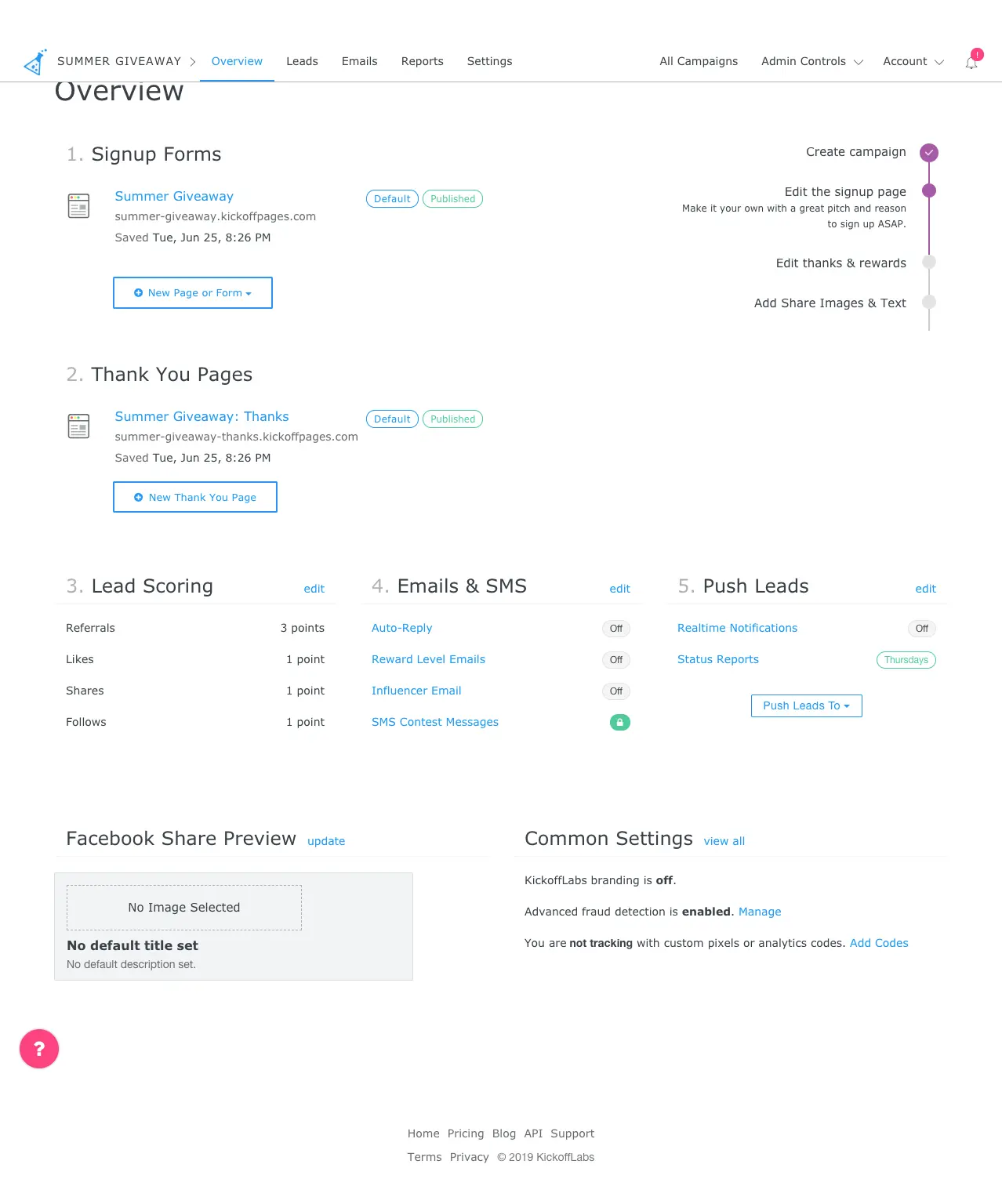
Josh Ledgard: And we eventually replaced
that with the dashboard, because I liked that concept so much, of
showing them an overview of this large thing that they just created,
creating a landing page campaign. And so now the dashboard kind of looks
a little bit like that, where we show them literally like, "Here's the
sign up page you created. Here's the thank you page you created. And
here's the emails that you can set up next."
Lauralee Flores: Exactly. I think what you
said is like you show them as they're going through and doing what they
want to do, but like show these tangible rewards that they're getting
from doing that. It brings joy. It brings excitement. It helps them get
closer to their goal. Yes, I loved that on the onboarding when they got
to that point, and now with the dashboard how they're able to see, "Oh,
look what I've done. Look what I created. And look how easy it is for me
to continue to get a little bit closer and iterate on where I've
gotten."
Lauralee Flores: Especially... We made a
change recently to make it even easier for people to create more landing
pages. So after they've gone through onboarding, they've created their
initial landing page, it's really easy now to click a button and
immediately get another landing page. And that experience of immediately
getting that reward of, "Oh, this is really easy," it's something that
took a bit of work in the background to make it smooth. But to see it
make it so easy for them to get where they wanted to go.
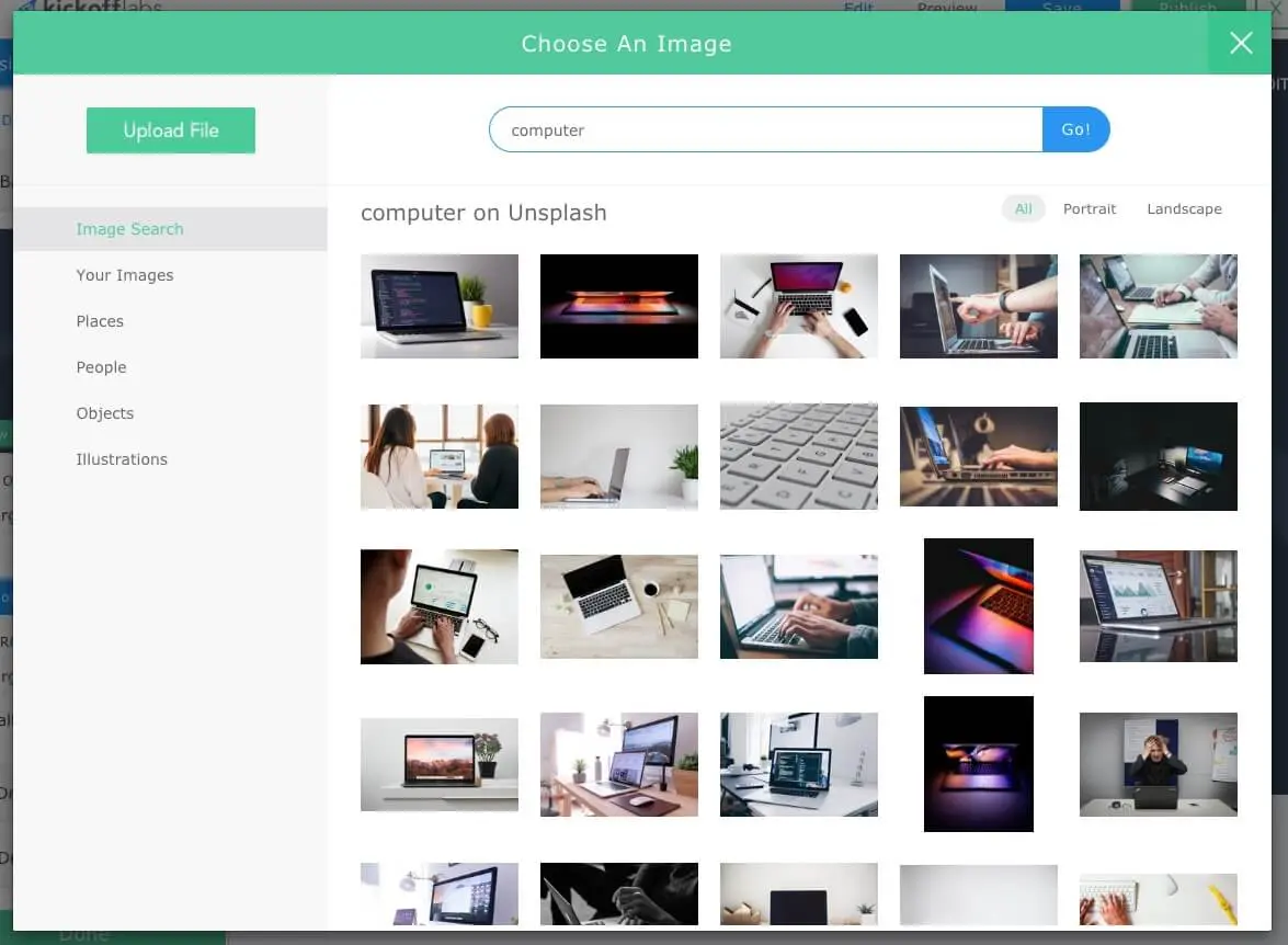
Josh Ledgard: Yeah, absolutely. So when we
set out kind of looking at a new feature, or improving an existing
one... And I want to get a little bit more specific here. So the thing
that we just shipped literally yesterday was an integration with
Unsplash. And for anybody that doesn't know, Unsplash is a service where
people have kind of royalty-free stock photos, and it's used in
products. And where we wanted to use it in the product was to improve
people's ability to select images in the product if they didn't already
have an image they wanted to use. So this primarily gets used in cases
where people are looking for a background image on a landing page that
fits with their brand, or other aspects of stock photography like
showing people using technology or something like that.
 Josh Ledgard:
 And so we had an image picker
already in the product, and obviously lots of products have image
pickers. And so when I said that we were going to work on that, where
did you go to look at in terms of like... So we're going to have a
chance at updating the whole picking experience. So how did you start
that process? Or where do you think about starting a process like that?
When we're taking a feature apart and kind of reimplementing it or
reimagining it?
Lauralee Flores: Yeah, I guess the first
place I start is I always try to put myself as much as possible in the
mind of our users. So I try to imagine someone who's just signed up.
They went through onboarding. They created the landing page. I just try
to get myself mentally where they're at. They're trying to get this page
to look really good, to make it look professional. And I picture them
going through that, and what challenges are they facing?
The first place I start is I always try to put myself as much as
possible in the mind of our users.
Lauralee Flores: So with the image picker
in particular, there wasn't a ton. Sometimes in other product designs
that we're doing, that is really crucial. For the image picker it wasn't
as much, because it's a pretty simple process. They're on the page. They
just need to update the image. For the image picker one, that was just a
really quick, just a minute of me thinking, "Okay, where are they at?
What are they doing?" But that's where I always start, is trying to
figure out where is the user's mental state. They're probably in a state
of excitement at this point. They're saying, "I'm getting this exactly
where I want." Or, hopefully not, in a state of like... I don't know,
maybe like, "I'm not quite sure what I want." Just trying to figure out
where they're at mentally. So that's kind of where I start.
Lauralee Flores: And then I also think
there's a lot of really great products out there that have also gone
through this, and thought through this, and spent a lot of time thinking
through and working through a solution for this. So if I can learn from
something they've done, that's my very next step, is first I try to
understand where our users are at, and then I go to say, "What examples
can I see, and what can I find about what works?"
Lauralee Flores: And so I try to find any
applications first. I look for applications that are already doing that.
And so for the Unsplash work, I looked at some other landing page
creators. And so I looked at like Unbounce, and I looked at Instapage.
And so when I'm looking at like an application, I want to see kind of
what not only the interface looks like, but I kind of want to look at
the interaction. I want to see the whole sequence of events that lead up
to how they solve this for their users. And I just try to learn from
them whatever I can. So that's my second step after thinking about our
users, is to jump in and try to experience this. And then-
I want to see the whole sequence of events that lead up to how they
solve this for their users. And I just try to learn from them
whatever I can.
Josh Ledgard: And that's one of things I
think that you do really well, I really enjoy working with you, is that
when we tackle something like this, you go and you do your research
about the people who have solved this before, maybe at even bigger
companies, and thought, "Well, they must have thought through this, so
what are the..." And you always do a great job of laying out on a canvas
like five different visions or views of this from other products, saying
like, "Hey, here's how these other products solved similar problems."
And it allows me, as somebody who's working with you on the design, to
say, "Okay. Well, like you said, from our users' perspective, which
elements of each of these things works really well for us in our case?"
Lauralee Flores: Yeah, I'm glad you brought
that up, because I forgot I did that. I do. I'll take a lot of pictures.
As I'm going through, I'll take pictures of things that I liked and ways
that they solved it. Sometimes I'll even include pictures of things that
I don't think worked well, because sometimes even there's something
within what they've done that sometimes will spark an idea. And so I do.
I use Sketch. And so I just create... Usually I have a page where we're
working on a design for it, but if not, I'll just create a new, empty
document. I'll take pictures, and I grab pictures as I'm going around.
Lauralee Flores: I also will bring pictures
from... I have two places I look usually just for designs, and these are
really just designs. They're not in applications. They're not live code.
It's just designs that other designers have put together for something
like this. And so for the image picker, I looked to see if there was an
image picker. And I look in Dribble. For those designers out there, you
know what Dribble is. I look in Dribble first, and then I actually have
a Pinterest board where I have gathered together a lot of product...
It's just called my product design board, where I kind of like scroll
through those products designs. And anything that I find that's
pertinent, I take a picture and I bring that in.
Lauralee Flores: And I think it's really
helpful, because you're really good at design ideas and coming up with
solutions too. There's lots of times when you come up with a solution I
haven't thought of. And we're able to work together based on these
images I pull together. And so I do it not only for myself to see them
all at once together in this board, but also just so that you can tease
out ideas that maybe didn't stand out to me when I looked at it
originally.
Josh Ledgard: And it strikes me the next
step that you go through, just thinking about our process, which is not
a very formal process being such a small company, but the next step that
you always go through, which is useful, is once we've walked through
these other designs and saying, "Okay, here. We like this from this
product. We like this from this product," and we start applying it to
ours, is you generally come up with a few different approaches of the UI
within our product. And it's almost the same view, except now we're
looking at it as a sketch of, here's what these different models look
like for our users within our product. And then we take that step.
Josh Ledgard: That's like the next step, is
like applying those best practices. Okay, well how does this approach
look in our product? How would this approach look? And you sort of map
the best of these designs into your product.
Okay, well how does this approach look in our product? And you sort
of map the best of these designs into your product.
Lauralee Flores: Exactly. So I do the same
general process for almost everything that I design, whether that's
inside products for websites. Like right now I'm working on some landing
pages that I'm designing, and that's what I do, is I'll take pictures of
different things. I pull them together. And it's amazing the insight and
the ideas that come together when you think about your solution.
Everything's been designed, and it's not specifically for your user, so
you don't want to just take a design that someone else did and put it in
yours. You really have to think about your users, and your flow, and
your product, and how your customers are coming uniquely to solve the
problem that you're trying to solve for them. And so you're able to pull
those together.
Lauralee Flores: And then we just create.
Sometimes it's really clear to us, I feel like. Sometimes we really
know, "Okay, that's a really good idea with this one, and that's a good
idea with this other one." And we pull them together, and it just really
works. Sometimes we have to go through a number of iterations of it. But
I feel like we do a pretty good job at designing pretty quick and making
progress pretty fast and not spending a lot of time on just the design
itself.
Josh Ledgard: Yeah. I think that's a good
point, thinking about how we think about it from the user's perspective
of your product. So in the Unsplash example, one of the things that
stood out to me is, I thought like, "Oh, we'll just have this search
that goes to Unsplash." And I wasn't thinking about many other ways of
like filtering the search. But when you started putting it from our
users' perspective, you might search for an image that you want as a
background, and the backgrounds on landing pages are typically wider
than they are tall, because they'll span the whole width of a section or
a page. And the problem with just a general image search is that you get
back portrait images as well as landscape images, the wider ones. And
the portrait images will often get cut off at the top and the bottom in
the wide case.
Josh Ledgard: And so if I was just copying
like insert an image into like a blog post or something that other tools
have, like in WordPress, like their insert an image thing, I wouldn't
think at all about the landscape or the horizontal. But when you start
putting it in the context of our users, you realize how important that
is, because oftentimes people will end up choosing these portrait if we
just put them in there without any sort of label. And they'll say, "Why
is the top of the head cut off?" Or, "Why the eyes cut off?" We get
those support requests back, and I'm always trying to think of, "Okay,
well, what user objections or what support requests are going to come if
we don't offer this?"
Josh Ledgard: And so we ended up having to
implement that filter before we shipped, because I think we were trying
to think through, "Okay, what is an objection or a problem that users
are going to run into based on our experience with working with these
users?" And I know that we get a lot of support tickets about, "Why is
this image cut off?" And I feel like I've spent way too much time
explaining geometry to people.
Okay, what is an objection or a problem that users are going to run
into based on our experience with working with these users?
Lauralee Flores: And screen ratio sizes.
Josh Ledgard: And screen ratio sizes. If I
could not explain geometry or screen ratio sizes anymore, it'd be good.
Lauralee Flores: That's a really point you
bring up, because you're right. That was something that we didn't see in
any other image picker really, but it really pertained to ours. And
what's interesting about that is that filter that Josh just mentioned
that we added in didn't come from any of those that we saw. It was
really based on that.
Lauralee Flores: And I had gone back after
we said, "Oh, you know..." Josh brought that up one time when we were
talking through the design of the Unsplash work, and he brought that up,
and I said, "Oh, you're right." And so I went back and looked through
different ways that people filter. And so I go back. It's kind of like I
will go through the process. I'll look at designs that other people
design, and then we'll go into the solution, and sometimes I go back to
look at designs and say, "Oh yeah, how did people solve this?"
Lauralee Flores: And oftentimes, it's
really helpful. Sometimes it only takes me maybe five minutes of just
looking around for just a minute to say, "Am I headed in the right way,
like direction?" And just looking at a few ideas to make sure it's...
Because what you want to do is, you want to make sure that what you
create is something that's really clear. It's almost like a sanity check
for me. Am I thinking about this the right way? And so I take a look
around to see how other people filter sort, and I'm like, "Oh yep. This
seems to be really effective."
Lauralee Flores: Because your users are
using other products, not just yours. And so you also have to keep in
mind that what they're used to in different places is what they're going
to expect from your product. And so not only do you want to be really
clear and have it look really nice and also be a really good experience
for your users, but you need to make sure to keep in mind that they're
using other products, and they have certain expectations coming into
using your product based on their experience with other products. So you
want to kind of make sure that you're not doing anything too radical and
too different.
They have certain expectations coming into using your product based
on their experience with other products.
Josh Ledgard: Yeah, I think that's a really
good point. There's places where there's opportunities within your
products, and maybe around your products unique values, where you have
to go kind of off the rails and independent and do something that is
going to be unique that might require some user education. But like a
feature like this, the image picker, I think it's a great example,
because it's like, well, that is a solved problem that users like people
who work in marketing or people who have used marketing tools before,
they've probably experienced 20, 30 other image pickers, and if we did
something radically different, it'd probably just cause user
frustration.
Lauralee Flores: Yes. Exactly.
Josh Ledgard: Whereas when we're thinking
about on our side like the viral mechanics that you can do within
KickoffLabs, I think that's our opportunity to add something unique to a
design conversation around landing pages, is how we represent where
people are within a contest or how many referrals they've tracked, and
how we implement that. That's a chance for us to be unique and do
something that doesn't exist in many other places, because it just
doesn't. But you have to identify the areas of the product that this is
where we think we need to stand out, or we should stand out, and these
are the areas where it just has to flow with user expectations within
the context of what they expect.
Lauralee Flores: Yeah. And going along with
that is that you want to be unique, and you can put your own twist on
your own designs and certain parts of your interface as you're working
on your product, but you really just keep in mind where they're coming
from. Is this going to be fun and different for your users? If so, go
for it. Is this going to be like a source of frustration for them? Then
that's something that you just want to keep in mind.
Josh Ledgard: Yeah, and so we've kind of
covered through the process. We've uncovered this initial research. Does
it exist before? What are the best parts of each of these solutions?
Your users' context, and then fitting the best of the research you've
done into your users' context. And then that kind of leads us to the
implementation, when you start working through it. And of course all of
our designs and implementations end up looking exactly like they did in
the sketch in the end, right?
Lauralee Flores: You know, it kind of
depends. A lot of times we will start jumping into a design,
implementing it, and we'll make some slight changes, especially like
Sketch with the font sizes, it's, "Oh, that looked good on this size,
but you know, we really actually need five columns." Like for the image
picker, we ended up going with five columns instead of what we'd kind of
originally imagined as four columns. So we kind of adjust as we go
along. But you know, it gives us a good enough start.
Lauralee Flores: And sometimes, and this
isn't usually the case for product design specifically, but there are
certain cases for small parts of the interface that sometimes we're
pretty clear on. We don't even need to design. We can jump right into
creating it. But I definitely would say that we don't spend too much
time, like we mentioned before, focused on the actual design part,
because as we realize, as you jump into creating it, you're going to
learn a lot more and see actually if that design works once you're able
to kind of go through the experience of using it.
But I definitely would say that we don't spend too much time, like
we mentioned before, focused on the actual design part, because as
we realize, as you jump into creating it, you're going to learn a
lot more and see actually if that design works once you're able to
kind of go through the experience of using it.
Josh Ledgard: So once we've got a design to
a point where we've walked through it and we feel like it works, how do
you know, what are the clues you get to know if a design is successful
or not?
Lauralee Flores: Let's see. That's a good
question. I mean at this point we've thought a lot through what other
people, what designs we've looked. We've gone out and we've looked
around, and we feel confident in our direction, I'm sure, at that point.
And I think onboarding was a good example of this, of whether a design
is successful. Sometimes I don't really think that we know. We've done
at this point our best guess kind of at like what we think is going to
be good, and we go through it, but I don't think that we can really say
that what we've done and we've created is really successful until we put
it out there for our users to use and experience, and see if that makes
them get more wins. If it makes them more successful, then we know that
what we did was really good, and if the experience of what they've done
is a positive one for them.
I don't think that we can really say that what we've done and we've
created is really successful until we put it out there for our users
to use and experience
Lauralee Flores: So like I mentioned that
onboarding was something that was a really fun project that we've gone
back and iterated and changed and modified and customized based on user
feedback. I feel like the first phase that we did of onboarding, which
was basically, for those of you who aren't familiar, once you want to
create a new campaign, like you're starting something new, or you just
sign up for KickoffLabs, it walks you through the process of creating
that campaign. And there's just a few steps, but we just wanted to make
it really easy for customers to go through and be able to accomplish
those steps really fast and easily. And we've modified that as we've
gotten feedback and as we've seen where customers still had struggles.
Lauralee Flores: So I think that when you
consider this, whether a design is successful is trying not to invest
yourself in saying, "This is the design I created. It's beautiful and
perfect, and nobody can change it." But say, "Is this helping the user?
Is this accomplishing the goal that they're trying to accomplish within
our product? And how can we make it better? We've got this first phase
out there. What can we do to make this better for them, or even
smoother?" And just be constantly looking for ways to improve. I think
that's kind of the best way I could say whether something's successful
or not, is just say, "Is it helping them? Good. What else can we do to
make it even better for them?"
What can we do to make this better for them, or even smoother?" And
just be constantly looking for ways to improve.
Josh Ledgard: Yeah, and I think an
important part of that I wanted to talk about was the data, because
when I look at some of the bigger things we work on like the onboarding,
or even the smaller things like the Unsplash thing, I've always got a
metric or two in mind that we're measuring to see if I feel like it's
making an improvement. And so with onboarding, we knew from the product
that people were much more likely to upgrade if they'd gone and
published landing pages and had like a signup on the page. And so I
looked at it from the perspective of, how can we get people to that
success, that first aha success, like, "Oh, I've got this campaign with
a landing page faster." And so now I looked at it, said, "Okay, can we
get that percentage of people that have a published campaign much
higher?"
I've always got a metric or two in mind that we're measuring to see
if I feel like it's making an improvement.
Josh Ledgard: And now we go with the
onboarding steps, walking people through. We went from probably 40 to
60% of people having a published page of any kind that sign up for a
free account to probably more like 85 to 90% after we implemented the
onboarding. And so to me, that's a great way to know if a design is
successful. I'm kind of numbers-driven that way.
Lauralee Flores: Yeah, absolutely.
Josh Ledgard: And then I was just looking
at some of the numbers in the designer, because I'll peruse some of our
metrics and see how things are trending. And I realized just a couple
months ago we implemented the ability to copy a section, and I always
want to know retrospectively, was that worth the feature? And just as
some context, copying a section means if you have a section on your
landing page and you just want to reuse that section again. We had a
couple users asking for it in support, and I thought like, "Oh, I can
see the use case for that, and I can see how it aligns with our goals of
getting people to success and getting people published landing pages
faster." So I went ahead and implemented it.
Josh Ledgard: But going back, did I know it
was successful? I'd probably have to say yes, I know now it's
successful, because when I compare when people are adding sections,
because you can also brand new sections to a landing page, to copying
sections, the copying existing section is as popular as adding the top
four new design sections.
Lauralee Flores: Oh wow.
Josh Ledgard: This basically means that
it's providing as much value as the top four sections that people go
when they say add section in the designer. And so to me, that means it's
a fairly popular feature, up there with like adding when it comes to
building the landing page. And so it meant that it wasn't just the two
or three people who emailed support. It was the two or three people that
emailed support and the couple hundred other people that just never
bothered to email us. And so this would be really useful, because all
those people are now using that feature. And it's a small thing, but
it's good to go back even on the smaller features you implement and say
like, "Did this really improve the user's experience?" And even if you
didn't have the question in mind at first, it's always good to go back
at the end and look at a feature like that and know whether or not it
was worth the investment.
And so it meant that it wasn't just the two or three people who
emailed support. It was the two or three people that emailed support
and the couple hundred other people that just never bothered to
email us.
Lauralee Flores: Yes, absolutely. Because
every additional feature you add has the potential of making the product
not as easy to use or as intuitive, so I think it's a great thing to
look at, to say, "Okay, is this feature being used? Is it helpful for
people?" If not, we should consider removing it. Because that's part of
what makes a product really great, is finding those things that
customers want and that they're using and that help them, and removing
those things that are just distractions that the don't actually want.
Every additional feature you add has the potential of making the
product not as easy to use or as intuitive.
Lauralee Flores: I love that. I remember
that discussion that we had about whether to add that copy section.
Josh Ledgard: Yeah, and I don't think we
used a ton of data at the time to make that decision on whether it was a
good idea, and so I didn't really know until this morning, when I was
thinking about this podcast, if it had succeeded or not. But I went back
and started looking at some of the features that we did.
Josh Ledgard: And I want to say, I'm glad
you brought up the point about removing things as an important part of
product design, especially if you've got a product that has been out
there for a year or two at least, then chances are you've got some thing
sin the product that aren't benefiting users, or that you've added for
the sake of maybe one or two customers. It's not something that's
generally applicable. And that's a really important thing to look at in
design too.
Josh Ledgard: And I know that probably the
biggest time we've gone through recently in that was when we updated the
dashboard, when it showed like the overview of the campaign, where it
has the landing pages and the emails and the features of the campaign.
And for that, we really took a data-driven approach. I think I looked at
every single pixel on that page so many times, and I said, "Is this
pixel helping somebody, yes or no?" And I took it and just like did the
KonMari method on it.
Josh Ledgard: And I think I sent you like
some designs and said, "You know, I changed our dashboard today, and I
think I removed everything. Can you help me with this process?" And it
was really useful, because it forced me to look at the stats in our
product and say like, "How many people are using this button?" Or, "How
many people are using this quick link we have to edit the landing page?"
Or, "Do we need all of the specific landing page options exposed on the
campaign homepage, or can we hide of some of those a little bit deeper,
or can we even get rid of some of them?"
And it was really useful, because it forced me to look at the stats
in our product and say like, "How many people are using this
button?"
Josh Ledgard: And so I think about that
effort that we did as redesigning our dashboard as addition by
subtraction, because I think we actually removed more things than we
added-
 Lauralee Flores:
 Yes.
Josh Ledgard: In that case. But I know it
was successful, because one of the immediate impacts is we saw probably
a 30 to 40% boost in our upgrade rate after we did that, and we got
feedback back from customers saying that, "Oh, this is a great, simple
layout," or, "I like the direction you guys have taken." And the
language that customers used sometimes, say like, "Oh, this feels really
simple." And that's exactly what we were going for when we redesigned
the dashboard, is to kind of getting out of our users' way and focusing
on just the things that are most important. And for people that are
looking for that feature, it's still there, and I think it's okay that
they might have to go and look at a support doc to find it, or email
support, because I'd rather have the one or two people email than 80% of
the people confused about how do they do the common thing.
Lauralee Flores: Yeah. Yeah, I'm so glad
you brought up the dashboard improvement that we made, because I think
that what was so great about that was that's a perfect example of... The
dashboard that we had before was an improvement on the dashboard that we
had before that, but this new dashboard that we had was one where not
only did we remove stuff, we added things.
Lauralee Flores: At this point, we'd been
running for our business customers and enterprise customers, we do a
free landing and campaign review, so we go through and we look at your
campaign and we give you some ideas on best case practices and stuff,
and look through your landing page and give you some ideas on how to get
your campaign to perform better. And we had gone through that so many
times that at that point, when we were doing the dashboard, we're able
to use that. And now, like as we do those landing page reviews, before
we had to jump into different pages, and now when we do those landing
page reviews, I can go through the whole campaign right from that first
page. I can say, "Here's your landing pages." And I can identify any
improvements that you might have with like your domain or anything
there, with what you've got published. We see exactly details about the
emails that are sending out, how you're rewarding leads. And so you go
through and we can see all the really important parts of the campaign in
a really simple way. Like you said, we did remove a lot, but the vital
parts of what's there is right there on that dashboard.
Lauralee Flores: And so I think yeah, I
love that point that you made about if you've got a product that's been
out there for a year or two or longer that hasn't changed, try to take a
step back and ask yourself, "What can we remove?" If you had to walk
someone through your product, is there anything you have to go through
multiple pages to explain it? Can you make it simpler? And I love that.
I'm glad you brought that up. I'd forgotten about that work and that
improvement that we made there.
If you've got a product that's been out there for a year or two or
longer that hasn't changed, try to take a step back and ask
yourself, "What can we remove?"
Josh Ledgard: Yeah, and we didn't just
remove. I mean, like you said, we did add a bunch to that page, but it
was things that we were getting questions about all the time. So we
would get questions and support all the time about, "Where do I set the
share images for my contest?" Or, "Where do I make sure what I'm sharing
on Facebook is what I want it to be?" And so we thought, "You know
what?" I mean, this comes up with so many people. And to me a good rule
of thumb if you've got a product out there with any traction is if three
or four people take the time to email you, there's probably three or
four hundred people that just ignore and don't bother to email you
because they'll try and work around the problem. And so we took the
social sharing settings, and we just exposed it right on the dashboard.
So that was adding something to the dashboard, but it helped people
get... I don't think we get nearly the amount of questions on the social
sharing that we used to get since then. I don't have a real quantitative
number. It just feels like the questions have gone down, because it's
front and center.
a good rule of thumb if you've got a product out there with any
traction is if three or four people take the time to email you,
there's probably three or four hundred people that just ignore and
don't bother to email you because they'll try and work around the
problem.
Josh Ledgard: And like you said, we had a
checklist of things we were always clicking and looking to make sure
people had set and we wanted them to set as part of using the product.
And now that checklist, we basically took that we were doing and
put that in front of the users. Like there's literally on the dashboard
it says, "One - Sign up pages. Two, thank you pages. Three - points. And
four, emails. And we're walking people through that checklist right on
the front of that page. And I think that that's really... If people are
thinking about onboarding and the homepages of their products and their
dashboards, I think that's important to think about. It's like, when you
look at your customers, and you look at what they're doing in the
product, what are the three to 10 things you look for? And then ask
yourself, "Are those three to 10 things exposed for the customer in an
easy way?" And it can have a big payoff, or at least it did for us. It
was a good improvement and a good uptick in terms of people converting
on our side.
Josh Ledgard: So we've talked a lot about
designs that work well at KickoffLabs. Where would you improve on our
process or what we're doing or specific features? Where would you want
to improve?
Lauralee Flores: I think that the area for
improvement... And as we're talking through this, I feel like we're
doing some things really well, and we're constantly improving, and we
take feedback, and I think those things we do really, really well. We
listen to our customers, and I think that our customer support has been
a really, really helpful area for us to identify problems.
Lauralee Flores: And I think that maybe one
area that we could improve on is being maybe more proactive in saying...
Okay, customers reach out to us about problems, but maybe we should be
reaching out to customers and walking through and maybe running more
usability tests or reaching out and seeing if they're running into any
problems. That's something that we could do a little bit better and
actually get on the phone and talk to user. We did that for a little
bit. We've gotten away from that in the last little bit. But I think
getting back into doing that a little more, I think would be one area we
could improve.
Lauralee Flores: And then I think I like
what you're saying about the numbers, especially with that copy section.
Because I remember we talked about it. We'd seen it come up a couple
times in support. And I personally had the same kind of pain point
as creating some landing pages and stuff myself, and so I wanted that
feature myself. But being able to maybe see quantitatively and pay
attention to those features that we do add and say, "Are they working?
Is this really improvement?" and keeping track of those numbers I think
maybe could be another area, for me at least, that I could do to improve
a little bit more, to say, "We added this feature. Does it work?" Or,
"We're going to change this part in the product. Let's do a test to make
sure that the customers are more successful after the change of the
design." And actually test that using data to make sure that it is an
improvement, and so that you know for sure. Using more data-driven
results, I think, is one area that I could also improve in. I think that
if we got a little bit more that we could say with more confidence that
these change that we're making in these designs and these changes are
all good.
Josh Ledgard: Yeah, I agree. I think the
biggest thing for us is being more, like you said, I think more
proactive about identifying customer problems, so reaching out to them
and finding out where they're getting stuck more personally, or watching
them use the product more. I've learned a lot the couple of support
cases where I've shared a screen with a customer recently and kind of
had them doing it. It's always frustrating. You're like, "Don't click
there. Don't [crosstalk 00:41:31]" You're walking them through and you
kind of see the problems people have. And we could definitely do more of
that, to walk people through and see where they're getting stuck.
Josh Ledgard: And then validating that
that's the right area of investment with some of the data we've got on
the product, because now that we've got a good amount of traction, we
can see where are trends, what are people using, or what do we think
they should be using.
Lauralee Flores: Yes. Totally agree.
Josh Ledgard: Cool. So that takes us way
past the time that I was expecting to have, but I really enjoyed the
conversation today, going through the design, and I hope that... Well, I
know that people will learn something about product design just kind of
going through how we were designing the product, and the thought process
that we've had, and the process that we've had at KickoffLabs. If you
find that helpful, feel free to email us. I'm josh@kickofflabs.com, and
Lauralee, you're lauralee@kickofflabs.com.
Lauralee Flores: Yep.
Josh Ledgard: If anybody has any feedback
on this episode, or comments or questions about the design at
KickoffLabs, or you've got some feedback about the design at
KickoffLabs. I look to forward to chatting again with you, and probably
in one of our next talks we'll talk about designing for conversions.
Lauralee Flores: I look forward to that.
That'll be fun.
Josh Ledgard: Cool. Thanks again for
joining me today.
Lauralee Flores: Thank you.
