It’s no accident that so many successful companies have the same basic formula for their landing pages. There are a set of best practices that typically work to convert visitors into leads and then into customers. Here is a collection of 10 qualities shared by successful landing pages.
A Large Descriptive Headline
One line description of what the product/service is all about and written in large letters with high contrast with the background.
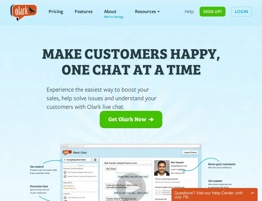
“MAKE CUSTOMERS HAPPY, ONE CHAT AT A TIME”. Tells you what Olark does in one second.
This is probably the single most important element to any successful landing page and for some reason gets wildly ignored on many landing pages we’ve seen. You should spend at least as much time crafting this pitch as you do for the rest of the copy on your site.
The number of seconds a landing page has to grab a first-time visitor’s attention is under four seconds.
Bottom line, you need to have a clear, powerful and emotional headline to pull the reader through the computer screen (within their first few seconds on your page) and make them want to stick around.
Some tips for headline writing
When writing headlines we’d try to answer the following questions:
What’s the primary benefit of our product/service for this reader?
How can we write it in a way that clearly describes it at useful, unique, ultra-specific, and urgent?
Focus on “benefits” and NOT “features”. For example.
Product: iPad Air
Feature: 64-bit A7 Chip
Benefit: Apps run faster. Games are more responsive. And everything you do with iPad Air feels quicker, because it is quicker. Up to twice as quick, in fact.
It’s fun to read about how changing a button color increased click-through’s by 300%, but that’s not what commonly boosts conversions on a landing page – by far and away, the headline and initial body paragraph have given our pages more of a lift than any other variable over time.
A Single Clear Call to Action
You can have the CTA in multiple places (“GET STARTED FOR FREE”), but they should all want the user to do the one thing. It’s the rule of one that’s based on the goal of your landing page.
All of your content should be designed to move people toward that action and design the page so that it’s as easy as possible for them to take that action.
The worst thing you could do is make someone THINK!
It’ll make them question what they’re even doing on your site, it’ll make them second guess the purchasing decision they were about to make, etc.
Designing for the “Rule of One” eliminates all of that indecision, stress and anxiety for your users.
Simple – Less is More
Sticking to just 2–3 colors and very high quality fonts. Avoid distractions by choosing to publish less information. Successful landing pages are very selective in what they show to the users. If the users are attracted, you can always fill in the details later after they complete your call to action.
We’ve found, once we reach peak conversions with a particular landing page it can become helpful to start removing things in tests. If you remove something and the conversion rate doesn’t change… keep it off since you didn’t need it!
Designed to Reduce Friction
Reducing friction also means getting inside your user’s head. It means understanding the things that will typically hold someone back from starting your trial, signing up for your email list, or purchasing your product. What questions or concerns will typically come to their mind?
- Do I really need this?
- Is this product any good?
- Who else is using this?
- What are they doing to do with my email address?
- Will they steal my credit card?
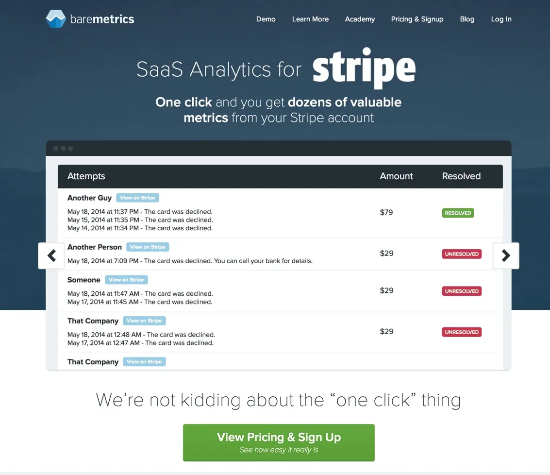
Check out what BareMetrics does to reduce friction by making signup as simple as one click in order to connect to their service. This is something that could be really complicated… but they’ve focussed on making it simple:
Social Proof – Used By
Nothing says “I’m a real company” better than having heard of their others customers. Having some larger customers also helps say “If it’s good enough for them… it will be great for me!”
Check out what WPEngine Does on their home page.
Social Proof – Testimonials
Check out the great testimonial in the middle of the current GetDrip home page. IMO nobody can speak to your potential customers better than your current customers.
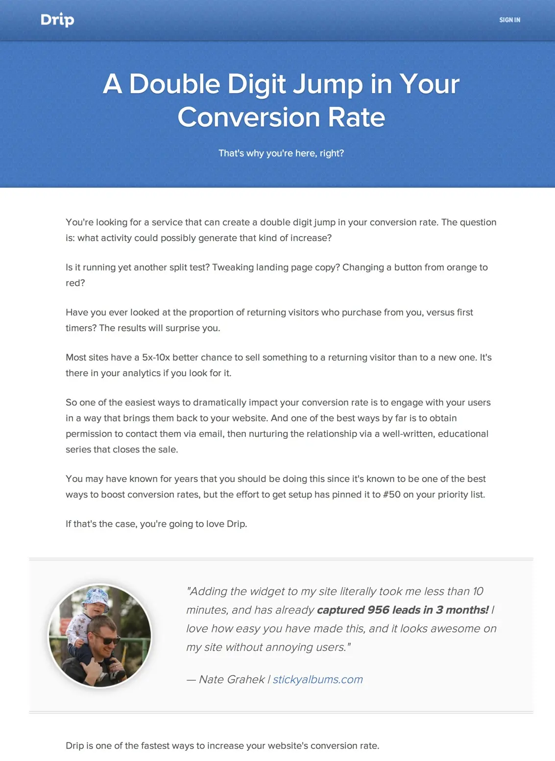
That was seriously the first image on the home page… not the product… but a customer.
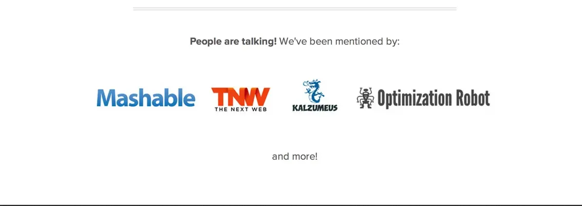
Social Proof – As seen in
If you click the image above and scroll down you’ll also see the “As Seen In” section on GetDrip. This helps the visitor believe in the company more than they would have otherwise.
Let the Product Do the Talking
It’s become trendy to include a short video or animated set of images that clearly describe the product. Right now no one does this better than MailChimp:
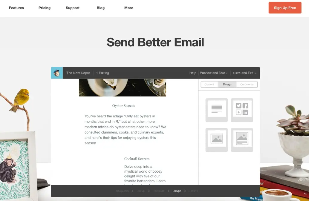
Open the page to really see the effect
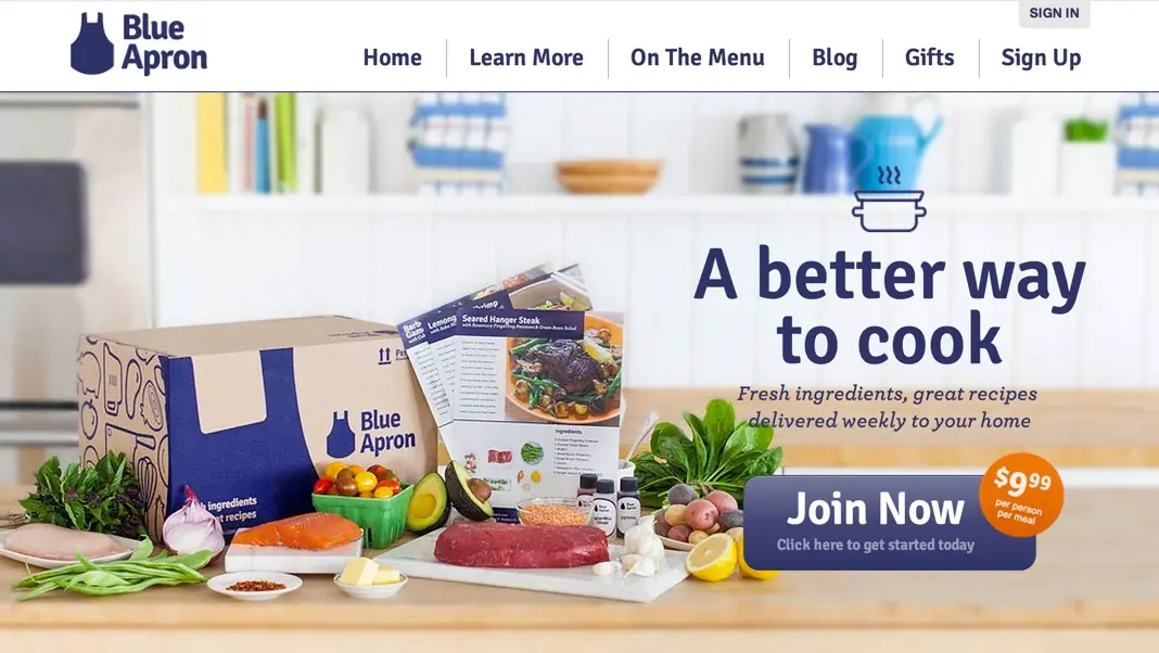
Of course you can simply include a brief set of images that relate to sub-headlines and re-enforce the core value proposition of the product. Check out the Blue Apron home page that we recently reviewed…
Provide a Secondary Call to Action
If the primary call to action could be intimidating or time consuming (start a trial, pay for something, etc) you should have a secondary call to action whose goal is simply to capture lead information and start a relationship with the visitor. Ideally this is something that helps them solve their problem, for free, and educates them about your product.
In Summary…
- Have a large, descriptive headline.
- Have a single, clear, call to action.
- Keep it simple.
- Reduce as much friction as possible.
- Include social proof that includes customer testimonials, press mentions, and “used by”.
- Let the product do the talking.
- Provide a great secondary call to action.
If you enjoyed this article you may enjoy our free email course on landing pages. Check it out!