You have decided that a jaw-dropping background image for your web landing page is the right idea. Great! But how and where do you find one that fits your business? How do I make sure the images on my landing page improves the conversion rates?
There are several things to take into account for choosing the right images for your landing pages. In this article, you’ll learn what to look for, where to find, and how to optimize your landing page images.
Follow along as we go over each step, in addition to providing some great advice you won’t want to ignore.
A great background image is a powerful way to boost any value proposition.
What to Look For in a Background Image
Selecting the perfect background image starts off with knowing what to look for in a great background image. Sure, you could choose any old picture for your landing page, but a carefully selected image is proven to give you far greater results.
Before you get down to searching for that perfect image, you’ll need to make a few considerations to ensure you’re picking the best image possible. Here are some of the best practices for choosing your perfect background image.
You’ll want to make sure your image:
Draws the eye
You only have a few mere seconds to really grasp your visitors attention. Your pictures are there to incite initial interest and get your viewer to read your sales copy.
An eye-catching image will compel people to stay on the page and can be used to direct them to take a desired action.

Yum! That looks tasty! Use images that are irresistible to your target audience.
Just don’t make it too distracting…
You need to strike the perfect balance between beautiful and distracting. If the image is too bold then it could pull attention away from your main call to action, having a negative effect on your conversion rate.
Matches your identity
Consider the color scheme you’ve chosen for your landing page. Is the image going to clash? Or is it going to complement the overall design?
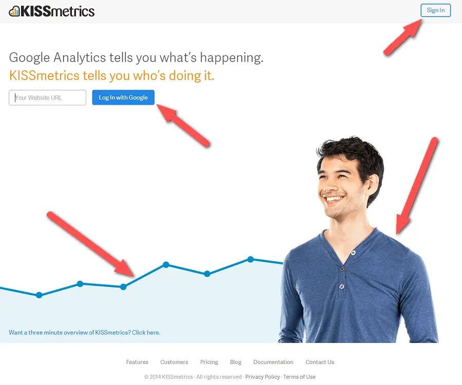
Notice how KISSmetrics uses a blue overall color scheme for their landing page.
You’re better off keeping your background image coherent to your landing page and brand color scheme. That way you’ll focus attention to the CTA and build brand recognition along the way :)
Contrasts with your text
Sometimes image backgrounds can clash with font colors and make it difficult to read what’s on the page. Your copy should be easy to read against your background image.
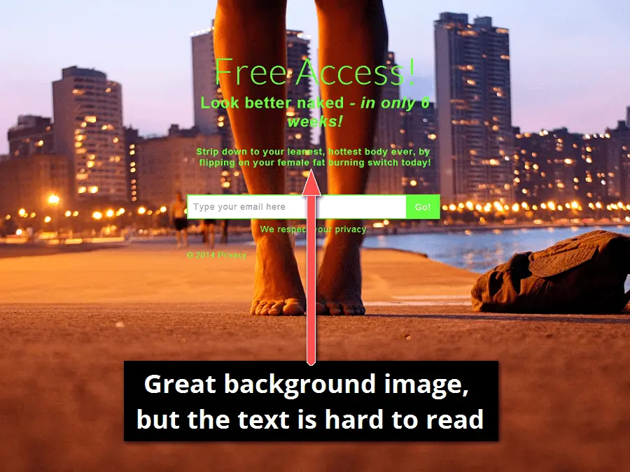
This background image can work great if it had a shaded box around the text or darkened / blurred the background image to increase the readability of the copy.
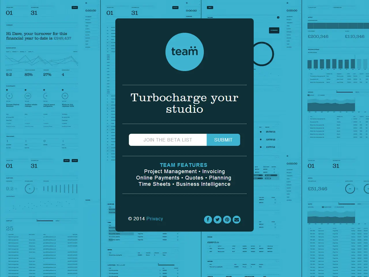
Compliments your layout
Layout is incredibly important for increasing conversion rates. With careful placement, your image will draw attention to certain aspects of your copy.
Use a background image that compliments your layout and emphasizes the CTA.
Don’t center your form on the focal point of the image. What you want to avoid is your image taking attention away from your main call to action or sign up form.
Image Quality
Your image needs to be clear and crisp. You don’t want an image that is pixelated.
If you’ve never worked with images you’re probably wondering how to get a nice, clear, crisp image while keeping the image size small. I’m glad you asked.
Image Sizes
You want a nice high quality image that isn’t too large. Large images will slow down the time it takes to load your page. About half of your visitors will abandon your page if it takes more than 3 seconds to load. So how can you have nice, clear, crisp images that don’t slow down your pages loading time noticeably?
The first thing I recommend is to make sure and get your image sized correctly. You don’t need an image that is 5,000 pixels wide. Here is a great article that will help you size your images correctly: Landing Page Image Guide
In that support article you will see a section about compressing your images. That is my second recommendation. I compress every image before it ever goes on any web page. You should do the same. When done correctly compressing an image reduces the size of your image (sometimes by more than 75% of the size!) without impacting the quality of that image.
Text and Logo in Background Images
You may be tempted to add the headline and logo into your background image. Or maybe just some text you want your customers to read when arriving on your page. Resist that temptation. Here are a couple reasons why you should not add text or your logo to your background images.
You don’t know what screen size your customers will be viewing your page. They may be on a desktop computer with a wide screen, or a laptop, or maybe they’ll be on a tablet, or their phone. You cannot guarantee that the content in your background image will be viewable on all these different screen sizes.
The role of the background image is different than the role of the content on your landing page. Background images are meant to be in the background and merely supporting the page. They aren’t meant to carry the burden of being the primary content on the page.
The content on your page lays on top of your background image. As the screen size changes your content responds to these changes and will lay over top of different parts of your background image. If you have content in your background image you run the risk of having your primary content lay on top of and cover up the content in your image. This will not only be a bad experience for your customer, but it will look really bad.
Content is meant to live on your page not in your images and therefore the search engines will not be able to find your content. What this means is that when people are searching for what you offer they may not find you because your content was never indexed into the search engines. In other words, placing content in your images negatively impacts your Search Engine Optimization (SEO).
I promise you, placing text and logos inside your images will cause you a lot more trouble than placing them on top of your images. So, save yourself a lot of time and hassle and just keep your background images free of text and logos.
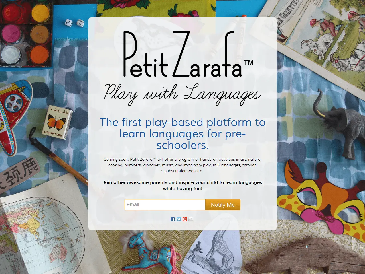
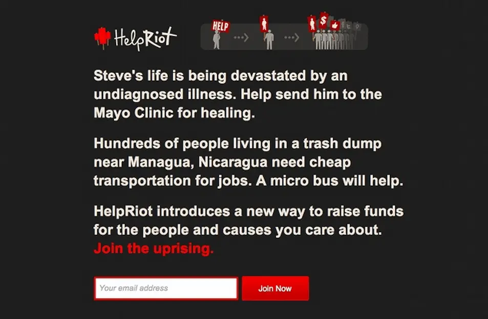
Conveys a message
Don’t pick an image that draws more attention than the primary objective of the page.
Instead choose a background image that can complement or even help explain your business without taking away from the main call-to-action. Use your background image to reinforce the overall message, not as an attempt to communicate all at once!
This page does a great job of showing visitors what the product is about without making it too distracting.
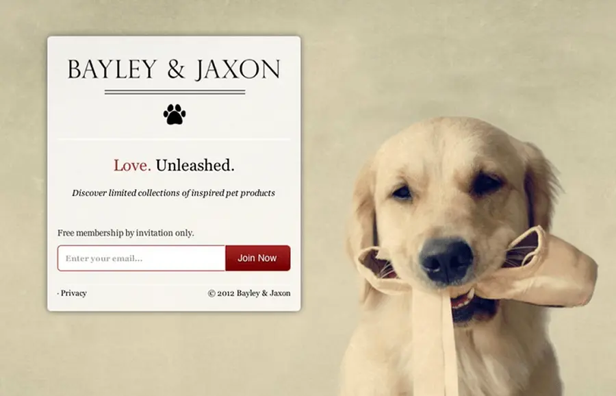
Uses real people
Depending on the nature of your product or business, including people (or basically anything with a face) in your images can be a powerful influencer.
There are several reports and tests that can confirm human photos have positive impact on visitor’s first impression of trustworthiness.
![]()
The new study claims that faces don’t always attract as much attention as we think they do…
![]()
Example: a hotel search website, featuring an incredibly happy couple with clearly visible faces. Yet users only seem to care about the search box and the call to action in the center.
While it’s a great study, I happened to notice one key trait in most of the images: The faces are looking at something!
As humans, we have a tendency to look at faces (they can be very powerful and convincing), but more influential to us is the direction that people are looking at.
Think of it as a form of social proof: where the person in the image is saying with their eyes “hey! this product is great!”
Use this kind of directional cue to your advantage when choosing a background image and direct your visitors attention to your primary objective.
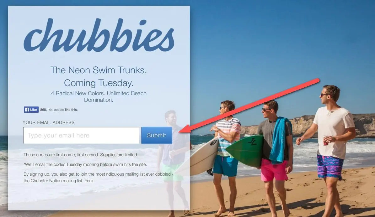
Notice the direction the guys are looking in? BOOM! Enter your email address.
Carefully selected images of real people adds a human element to the page and can help to increase visitor trust levels.
One word of advice when using images of people; avoid using stock images and favour non-paid or self taken images, it comes across as more genuine.
Works on Mobile
Do the images on your page look good on a mobile device? Here are some things to look for when you are testing your landing page images on phones.
- Fully rendered: The images should not be cut off.
- Loads Quickly: If you optimized your images this shouldn’t be a problem.
- Not too Large: Sometimes you may need to swap out images if they are too large and cause scrolling on mobile.
No image? No problem.
Maybe you don’t need one. Use the power of compelling copy to get your message across.
You can create some striking effects using basic typography with a soothing, solid background color.
I actually kind of like this route, because it forces you to put extra effort into writing your copy.
Where to Find Images
There’s a number of places online where you can find potential images for your landing page. As with most website or business options, there are paid and free versions.
There are pros and cons to each, but ultimately the benefits for paid images (at least from a business perspective) far outweigh the disadvantages.
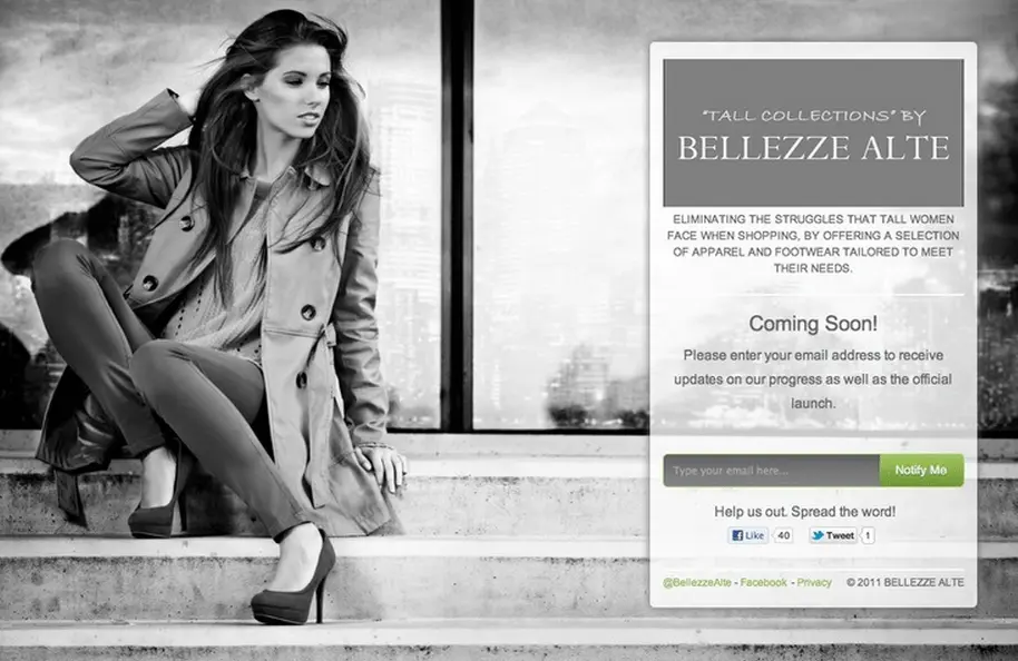
I am a huge fan of stock images when they are used correctly. You don’t want a stock image that looks like a stock image. You want a stock image that fits specifically what you are offering. This could be easy or hard depending on what it is you offer.
Let me show you an example of a stock images used correctly.

Can you see how this images, although stock, doesn’t look and feel like it because it is so perfectly suited for the page?
Here’s an examples of a stock image used incorrectly.
Do you see how the images are very general and not at all specific to their page?
Of course, if you have professional photographs of your products/services that is the best case. But, if you’re validating an idea and don’t have any professional images yet, you can use stock photography but just make sure it’s specific to what you’re offering.
It Pays to… Pay?!
Let’s look at the paid options available, namely because our customers have had a lot of success with the following services. Going with a paid option has a distinct speed and simplicity advantage:
PROS
- Save time – Images from many paid services are often separated into categories and tags making it extremely quick to filter your chosen area.
- Right sizing – Most of the paid options offer the images in a variety of sizes. Most of the time you really only need the medium-sized version that’s roughly 1600×1200 pixels. No need to try and optimize, crop, or resizing the image yourself.
- Quality and resolution – Generally speaking, paid services will have a higher number of higher quality images in various sizes, making design a lot easier. The resolution will very high quality so you don’t need to worry about blurry, pixelated images.
- Test Images – Most of these services let you download a small branded version of the image… so you can test to see if the full size one will look good.
- Usage rights – What if you accidentally misread the usage guidelines or if one day you’ll be hit with an unexpected fine? Nah. You paid for it… no fuss, no muss.
- Smarter search and browsing – Needless to say the paid image providers aim to offer a better service than their free counterparts. Most of these marketplaces offer the ability to look for similar shots once you find some you like. If you value your time you’ll value this compared to the free approach.
CONS
- Not exclusive – A lot of the stock images have been seen around the web before and are played out. People can tell if your using the same ol’ stock images.
- Predictable – Sometimes stock photos look, well like stock photos.
- It costs money – You have to pay for it :), but if you’re really in business this shouldn’t be an issue.
_Who’s a good stock photo?
_
-
Shutterstock: Boasting a library of over 35 million images, vectors and footage clips shutter stock is a popular option.
-
Big Stock Photo: Bigstock offers yet another choice for landing page images. A nice feature with this is additional categories, such as typography.
-
iStockphoto: Another site with images numbering in the millions. Payment varies based on whether you pay-as-you-go or use cost-saving subscriptions (as with many other sites). This site has a strong community, as plenty of ratings and reviews are present for pictures.
-
Fotolia: Compare low prices along with tags, categories, and other perks makes this another worthy stop on your royalty free stock photo search.
-
Getty Images: The library at Getty features millions of stock images and illustrations with thousands of hours of video. Not a cheap option as price can be worked out on a number of variables such as time you intend to use the image for, however the selection is great and the UI very easy to navigate.
Freedom from Fees
Not so crazy about spending money for an awesome background image? I don’t blame you, we know what it’s like to keep it lean.
Getting your landing page background for free doesn’t mean you’re cheap – you’re just a do-it-yourself kind of a person. Well, at least you’re finding the pictures yourself:
PROS
- No cost – All images are free and will usually remain that way providing you properly sourced them.
- Increasing choices – The free image selection is still not as large as its paid counterpart, however, there are increasingly more sites that offer free images significantly increasing your choice.
CONS
- Takes time – No way of sorting through images. Prepare on spending tons of time sorting through images that aren’t as relevant to your vision as you’d like them to be.
- Make adjustments – In order to get your background image “pixel perfect”, you may have to do some additional cropping or scaling of the image.
- Complicated licensing – Have to deal with different licensing and attribution types. Free doesn’t come without a cost. Take a look at the intricate Creative Commons licenses.
As you can imagine, this option involves a lot more legwork. It will certainly require more time and hunting for the perfect picture.
Try searching Bing or Google Images for “<Your Theme/TOPIC> Wallpaper” images for a good start.
Both search engines have options to filter by size (You want X-Large), color (match your scheme), and type of image.
Although slightly less intuitive than Bing or Google Image Search, it’s still a goldmine of a library. This site will let you filter your search to include only results from certain sites. If you don’t like the UI on this site, you could always just head to the source site listed on their main page.
- **Flickr
I’ve been noticing a strong trend in a lot of companies sourcing their images on Flickr. This (in my humble opinion) is possibly one of the best options for finding free quality images. Most of the content are photographs taken by real people – no stock photo cheesiness here.
Good places to start off are here and here.
More Awesome tools for Images
-
Unsplash: Free and downright glorious, Unsplash delivers high-resolution, professionally snapped images you’d be proud to use. Perfect for content marketers that believe stock photos should never actually look like stock photos.
-
Canva: The darling tool of many content marketing pros, Canva offers up image design so snazzy it could start a fashion trend. With drag-and-drop simplicity and an extensive library of free templates, it’s a quirky way to create share-worthy graphics.
-
Pexels: The Robin Hood of stock photography, Pexels offers a bounty of free professional-grade images. It’s a go-to resource for when you need your visuals to shout “top-notch” and whisper “still on budget”.
-
Pixlr: This software’s got all the bells and whistles you never knew you needed. It’s ideal for anything from quick edits to full-scale image manipulations, giving you pro-level power without the Adobe price tag.
-
Placeit: Shake your design worries away like a Polaroid picture with Placeit. It lets you drop your content into customizable mockups, perfect when you want to show off your brand in context, or just for some low-key boasting.
-
Freepik: With Freepik, finding the perfect image is not as arduous as finding a needle in a haystack. This repository is filled to the brim with free vector art, photos, and PSD files for marketers who love variety and, of course, free stuff.
-
PicMonkey: Let’s be honest, who wouldn’t want a monkey for an assistant? PicMonkey makes image creation and editing as easy as, well, pie. It’s a one-stop-shop for the busy marketer who’d rather be monkeying around than stuck in tedious photo editing.
-
Midjourney: AI image generation. Midjourney is an example of generative AI that can convert natural language prompts into images.
-
Dalle: This is ChatGPTs partner in crime for generating images with AI. Available for use with a GPT plus account.
Take it yourself
I’m certain that some of you are budding photographers. You may already have the perfect image in your library. It might be worth a peek and the advantage is that it will be more personal to you.
With free images, you are getting what you pay for. It’s possible to find the odd gem but it’s likely that you’re going to be searching for a while. When using images from free sources, ensure to have proper accreditation to prevent any future backlash.
We’ve also published a guide for taking your own product shots. Check it out!
Exclusives for KickoffLabs Customers
If by now you haven’t found the right images for your campaign. No worries, we’ve got you covered…
We added over 200+ FREE background images you can use on ANY landing page. There’s a great selection of people, places, blurred images, and amazing wood textures to choose from. We also integrate directly with Unsplash!
We’ve also published free Canva templates you can use for generating contest announcements. For example:
Login now to start using the bonus included images or upload your own.
How to optimize your images
You’ve followed the steps above and have chosen the perfect background image for your website. Optimizing your images for maximum conversion rate doesn’t stop there. Here’s what to do after you have the perfect image ready:
Shrink image size
Did you know that 47% of consumers expect a web page to load in 2 seconds or less? It’s obvious that page load time has an enormous effect on your page conversion rates.
Especially since background images tend to be a lot larger in file size, this can significantly increase the time it takes to load your page.
Use an image optimization tool like Kraken.io or Yahoo! Smushit to reduce the file size.
In many cases I’ve been able to easily reduce file sizes by over 75%. Do your visitors a favor and shrink your images before your upload them to your page.
By the way, you should always be optimizing images for small file size regardless of whether it’s for a background image or not.
Name and tag your image
Your current image probably has a generic name like “person_standing_facing_front_1600x120.webp” or something of the sort. If you’re looking to get any SEO juice out of your newly chosen background image, you need to change the name of the image and the alt tags within your code.
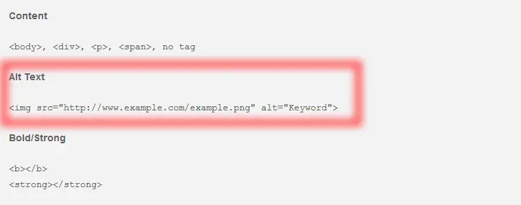
Add a descriptive, keyword-rich title to both so that search engines can crawl your image file name.
A/B testing
If we’re being completely honest there are a number of different options and considerations to be made in ensuring your landing pages success. It’s going to take a short while and a bit of trial and error to discover what combination resonates best with your audience.
The best way to measure and improve your conversion rate is to implement some A/B testing. Create a few different pages and see which brings in the best results, tweak your less successful pages to get the best overall result.
What should you test?
Here are a couple suggestions to get you started:
A/B Test #1
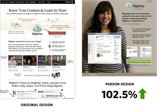
If you’re looking to increase the trust factor of the page, try experimenting with human faces in your background images.
Look at how the folks over at Basecamp (formerly 37Signals) increased their signup rate by 102.5% using a large, person-based background image.
A/B Test #2
If the goal of the page is to direct people’s attention to a main CTA, I would experiment with different background images using directional cues to focus attention on the primary objective of the page. Whether that be the headline, CTA or signup form.
![]()
How can you get more insights as to how your images may be affecting the user experience?
Use heatmaps and user recordings as complementary data to A/B testing:
In Conclusion
You’re well on your way to conversion rate optimization bliss! But if your copy, CTA, form or page layout is lacking, an amazing background image WILL NOT save you from CRO failure. It’s just one piece of the conversion rate optimization puzzle.
A great background image, combined with good landing page design, is only one of the fundamental steps in achieving success from your landing pages, websites and marketing campaigns.
Read more Landing Page Design with the next chapter:
5. Contest Design
Combine these principles and create the ultimate contest page design.