Imagine a world where you could go viral with your contests, automate your lead generation, educate your prospects, and basically win at life. Now, what if I told you that all of this could be done with a simple, dedicated landing page? And you wouldn’t even need to know much at all about coding, copywriting, or running a contest? Mind: blown, right?
This blog post is about to rock your world, because we’re going to dive head first into exactly what a dedicated landing page is and why you need one to promote your contest. We’ll look at how the big players create contests that generate word of mouth referrals and increase brand awareness. Finally, we’re going to show you exactly how to create a landing page that converts and gets shared like crazy. Let’s get started.
Psst. We’ve created a list of amazing contest landing pages. Grab your copy now
Why You Need a Landing Page
Unlike your home page that can be a smorgasbord of everything related to your brand, a landing page hones into one specific event, product, service, or topic. For every marketing campaign you run (and that includes your next contest) you need to have a dedicated landing page.
If you’re running a contest, the whole purpose of a landing page is to get people stoked about it. Midway through your landing page, they should be salivating over the prize. By the end, they should be fully convinced that entering your contest will be the best thing that they have done all day. Not only that, these new entrants should also want to tell their friends about your contest, so that they too can share in this good fortune.
This, my friends, is how your contest goes viral. Having a killer prize is good, but having a dedicated landing page where people can easily email, tweet, or pin your page is what makes your contest the most popular kid in class.
The term to notice there is “easily,” and we’ll discuss that in depth a little later on.
How to Advertise Your Landing Page
Before we jump into how to create the best contest landing page ever, let’s talk briefly about where you should advertise your landing page.
A landing page normally exists outside of your main menu navigation options,f like a hidden room to your website that only opens if you push in a certain book. We don’t want that at all. We want to advertise your landing page so that everyone who comes across your site will know about it and want to visit it.
I recommend two ways to advertise your contest’s landing page on your website:
1. A timed pop-up or exit intent widget
Don’t assault visitors with too much information at once. Give them a chance to get acquainted with your page before popping up the exciting news about your new contest. I recommend a five second delay. CrazyEgg surveyed several sites and found that pop-ups can drive conversions by as much as 1000%.
A timed pop-up or an exit intent widget can help drive conversions. Think about all of the visitors who leave without knowing anything about your contest. Installing an easy widget like our Contest Box will notify your visitors that there’s an awesome contest going on.
2. A call-to-action on your sidebar
It’s human nature for people to click away pop-ups without reading them sometimes. That’s why you also need a shout-out to your contest on your site’s sidebar. Use this space to make them curious enough to click.
Derek Halpern over at Social Triggers recommends a clutter-free sidebar for maximum impact. If you have too much going on, you could drown out the message about your contest. As with everything else, make sure your sidebar delivers value and not a hodge podge of information.
Of course, you can also test different ways to advertise your contest on your site. Create a Hello Bar across the top of your page that hints to your new contest. You can even add a blurb about your contest on your site header.
Whatever method you choose, make sure that you link to the contest’s optimized and dedicated landing page. Now, let’s discuss exactly what to include on that landing page.
Components of an Amazing Landing Page
1. Writing That Grabs Attention
I always say, kill ‘em with copy. You need to have content that jumps off the page, shakes your visitor’s hand, and tells them how awesome it is that they are on your page at this particular time in history. As a visitor, I should get excited by reading your copy. I should be able to envision myself winning the prize, and I should want to sign up immediately. Set the scene with your words.
Now, I know that copywriting can be intimidating for some of us. We’ve actually created . But here are the basics: cut the fat and explain exactly how entering your contest is a great idea.
We also have 10 examples of remarkable copy that you can check it here, as well.
2. A Hero Shot
Whether you’re including an image of your prize, a funny video about your brand, or some other visual, you need an element that immediately engages your landing page visitors. This visual sets the tone for the type of contest you’re running.
Take a look at this landing page from Charity:Water:
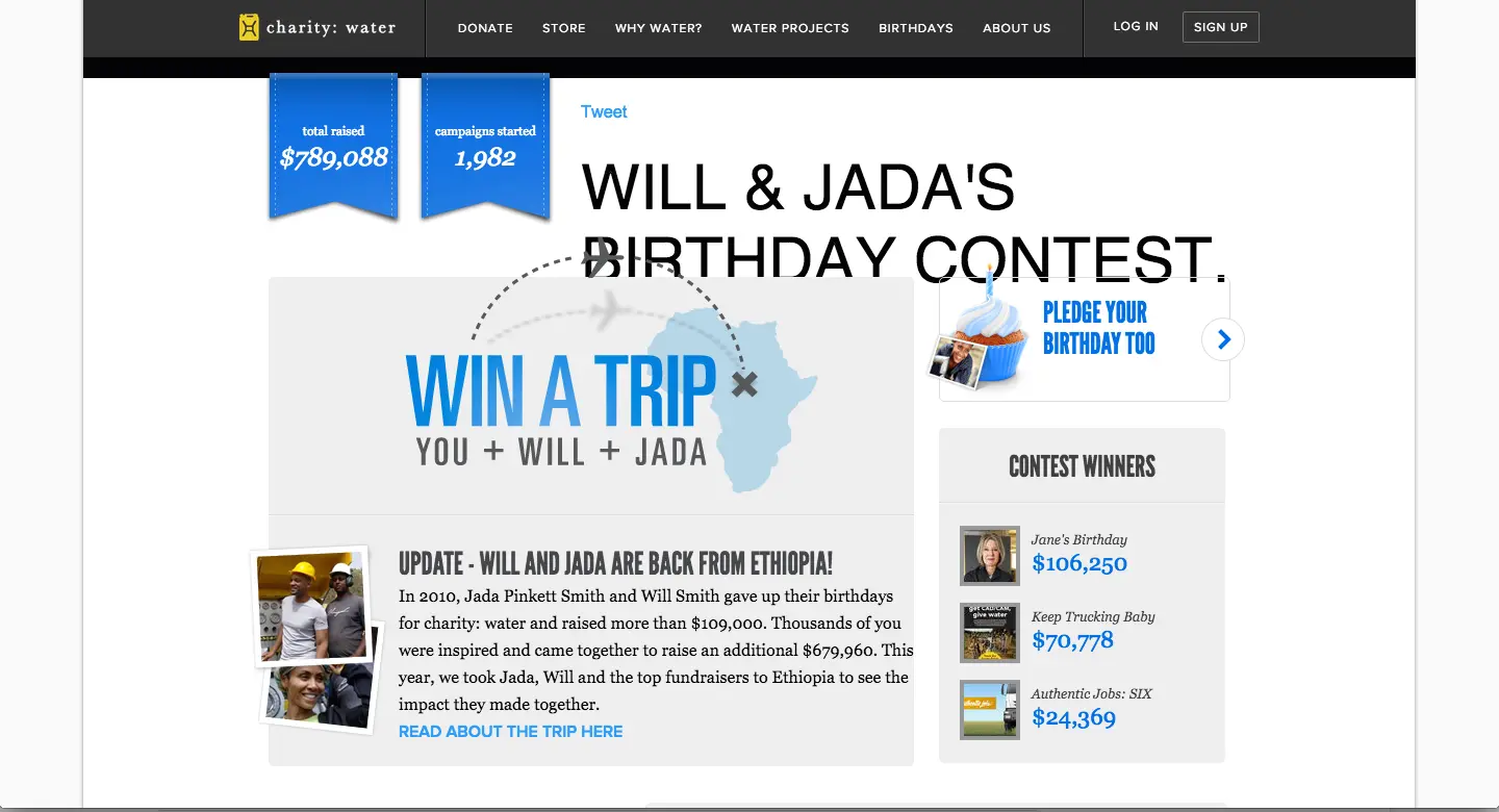
Courtesy Charity:Water
This page includes a moving and inspiring video that makes you want to get involved.
Now, compare that with this upbeat landing page from Tropicana:
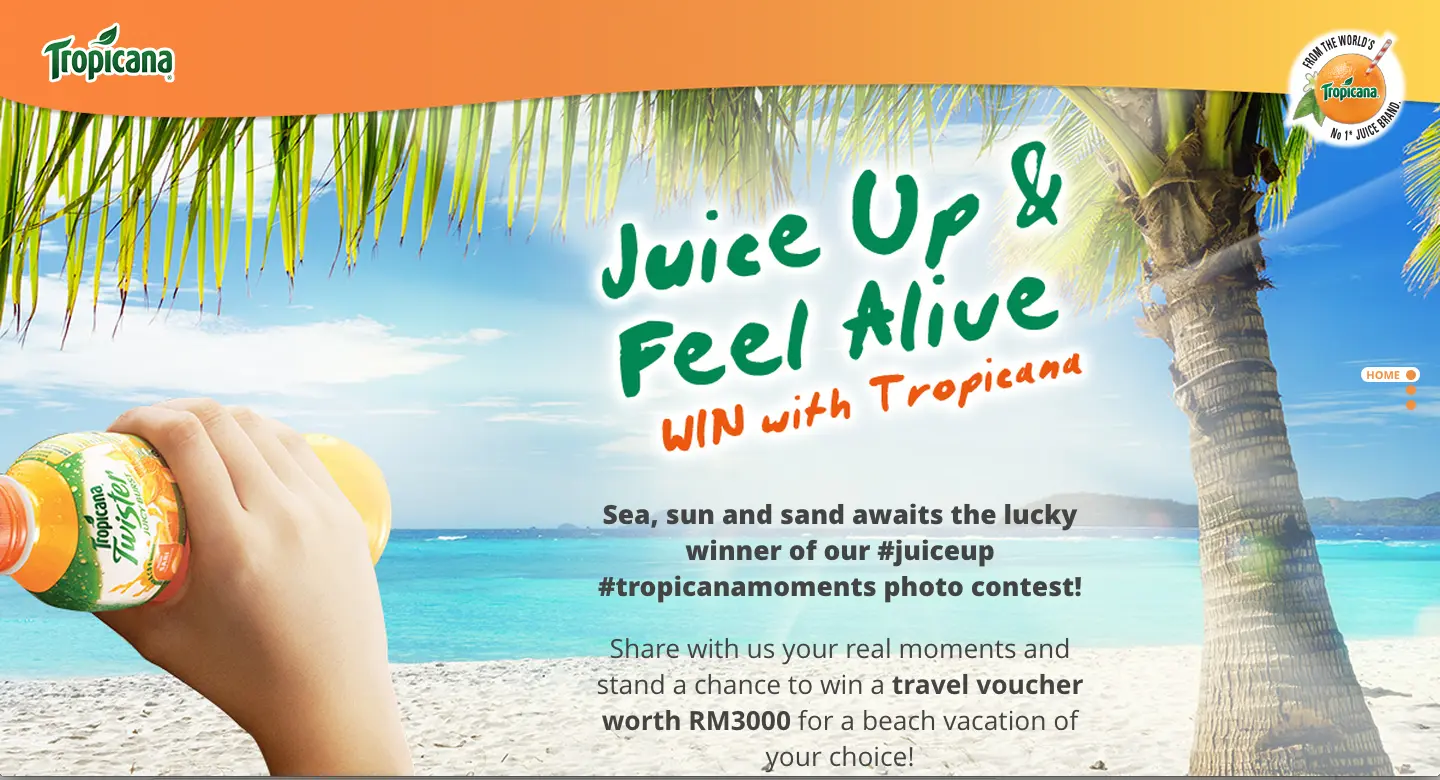
Courtesy Tropicana
This page offers a different vibe with a lovely beach backdrop that makes you want to be there, drinking a Tropicana Twister.
Both of these landing pages capture visitors with visual elements.
The beauty of this hero shot is that it can also act as a viral element. This works particularly well for funny videos or interactive games, like the one Chipotle used on its recent Friend or Faux campaign:
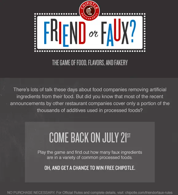
Courtesy Chipotle Friend or Faux
3. A Simple Form
There’s no reason why you need to ask for someone’s zip code on your contest entry form. Here’s an equation to remember: The more questions you ask, the less entries you’ll receive. Don’t ask invasive questions that your visitors may not be ready to divulge. Instead, stick with first name and email address.
In fact, here at KickoffLabs, we have a way to make it even easier. It’s called Magic Contact data, and it allows you to pull all sorts of information just from an email address. All you really need to ask for is an email address and our Magic Contact Data will provide you with detailed social and demographic information about your leads; like name, location, social network profiles, and other publicly available information.
4. A Request for Shares
While some people will take the time to copy and paste your landing page’s URL into their social feeds or emails, most people won’t. That’s why you need to make it dead simple for them to share your contest with others. Ask them, and then ask them again.
How do you do that?
First, on your landing page, you need to explicitly ask those who enter your contest to share it with others. You may also choose to incentivize this request (i.e. you’ll get more entries if you email this page to three of your friends).
You should include a spot for social shares. Include a pre-written tweet or email text that makes it easy for your visitors to spread the message.
Social referrals are crucial to marketing your contest. These types of referrals can give your contest a Viral Boost that can even double your conversion rate. Check out at how KickoffLabs customers use social referrals to supercharge their landing page conversion rates. Amazing stuff.
Next, you’ll send an email out confirming entry into your contest, a gracious thank you, and a second request to spread the love. This targets all those who didn’t see your share request on your landing page, or those who said to themselves, I’ll get to it, but then forgot.
Don’t Forget This Part:
Pinky promise me that you’ll commit to A/B testing for your dedicated landing page. This will help you understand what version works best for your audience. That way, in your future contests, you’ll know what method will grab the most contests entries.
Final Thoughts
Creating a landing page for your contest is what separates you from the competition. It’s taking that extra step to delight your site visitors and get them engaged and excited about your contest. Follow these tips to create a landing page of epic conversions.
Did you know that you can try it out for free right now? Check out our contest landing page to create your own landing page in less than 60 seconds.
And do you want some more creative ways for advertising your landing pages? Check out our article on how to drive traffic without spending a dime.
Psst. We’ve created a list of amazing contest landing pages. Grab your copy now
