If you would have asked me, before I started KickoffLabs, if I thought creating a beautiful landing page is pretty straightforward, I would have answered you with a confident yes. However, after working with KickoffLabs customers for several years, I can see the challenges you face as you try your best to create beautiful landing pages that also convert exceptionally well.
There are design issues I see over and over on our customers’ landing pages where even small changes would make the page so much better looking, more trustworthy, and improve conversion rates. Most of these changes don’t require any sort of design sense. But they would make a real difference.
Why Design Matters for Conversions
Your landing page has about 3 to 5 seconds to make a first impression. In that time, visitors decide whether your page looks professional and trustworthy or whether they should hit the back button. Design is what drives that snap judgment, and it happens before anyone reads a single word of your copy.
The good news is that effective landing page design is not about being creative or artistic. It is about following proven principles that make pages easy to scan, visually organized, and focused on a clear call to action. You do not need to be a designer to apply these principles. You just need to know what they are.
Common Design Mistakes We See
After reviewing thousands of KickoffLabs customer pages, the same design problems come up repeatedly:
- Too many fonts and colors that make the page feel chaotic and untrustworthy
- Low-quality or irrelevant images that do not support the message
- Cluttered layouts with no clear visual hierarchy guiding the eye toward the signup form
- Text that is too small, especially on mobile devices where most traffic now comes from
- Calls to action that blend in with the rest of the page instead of standing out
- No whitespace between sections, making the page feel cramped and overwhelming
Each of these problems is fixable with simple adjustments. You do not need to hire a designer or start over. Small, targeted changes to fonts, spacing, color contrast, and image selection can dramatically improve both how your page looks and how well it converts.
What You Will Learn in This Guide
That’s why I’m sharing this guide with you, so you can make your next landing pages really shine. We cover the practical fundamentals that anyone can apply:
- Design requirements and the basic principles every landing page needs to follow
- Fonts and colors including how to choose a readable font pairing and a color palette that builds trust
- Images and how to find, select, and position the right background and hero images
- Contest page design that combines these principles into high-converting giveaway and referral pages
- Common mistakes that drive visitors away, and how to identify and fix them on your own pages
- Design resources including free tools, image libraries, and templates to speed up your work
Whether you are building a landing page in the KickoffLabs builder, on your own website, or in another tool entirely, these principles apply universally. Explore the chapters below.
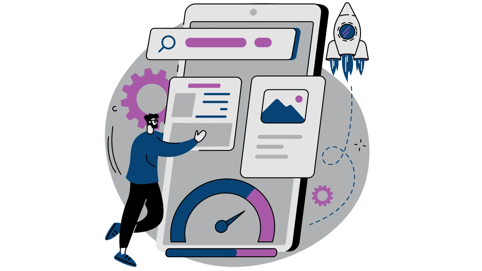
2. Design Requirements
Learn some design basics and how to apply them to your landing pages.

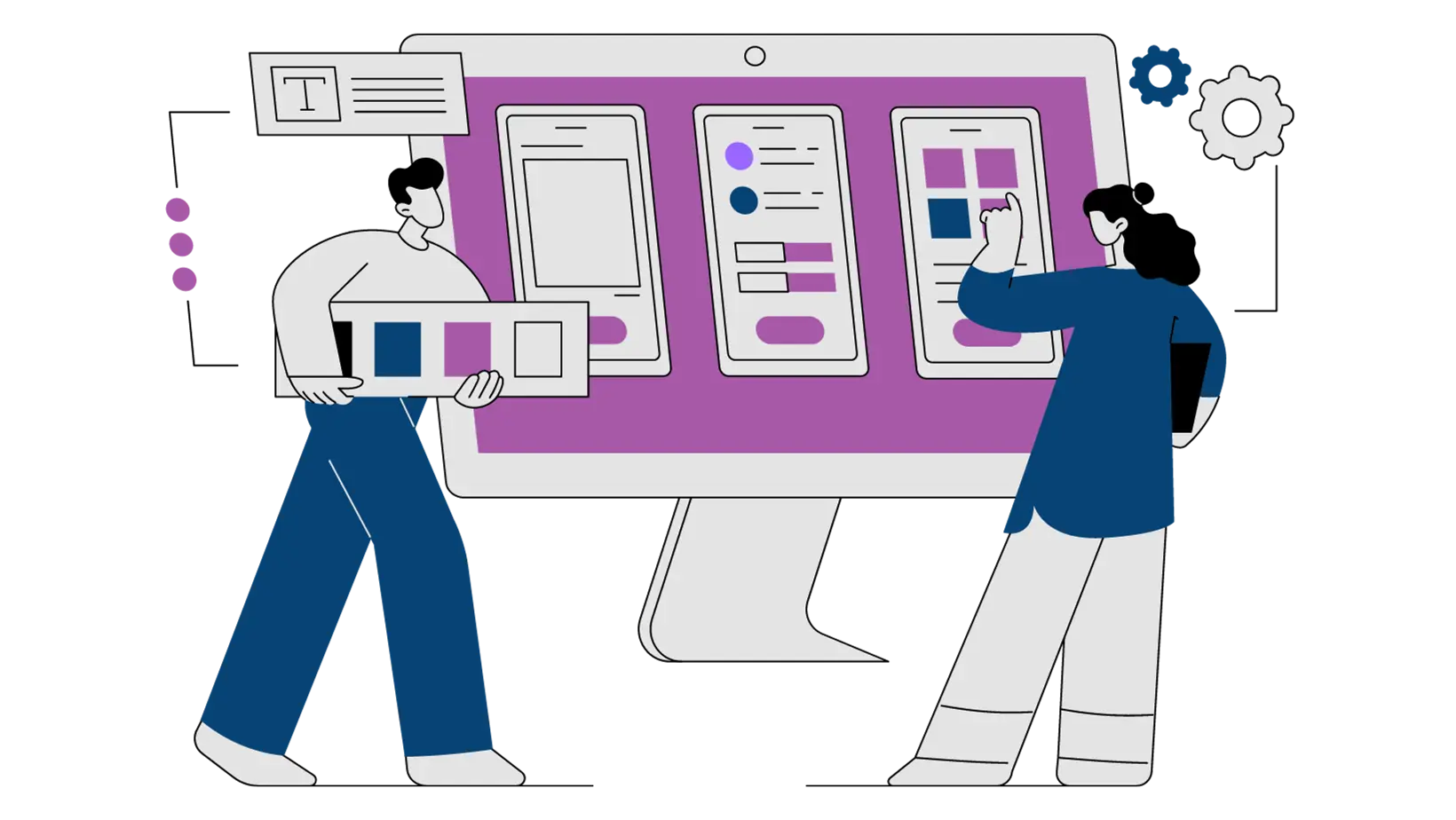
3. Fonts & Colors
Learn how to choose the right fonts and colors for your landing pages.
4. Images
Learn how to choose the right images for your landing pages.

5. Contest Design
Combine these principles and create the ultimate contest page design.
6. Common Mistakes
Learn how to avoid common mistakes that drive visitors away from your landing pages.

7. Design Resources
Learn how to avoid common mistakes that drive visitors away from your landing pages.