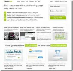
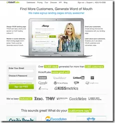
You may recall that last week we were running an big A/B test on our home page. Well, the results are in. They were a little surprising at first, but I think they make sense.
Option A: Text/Feature heavy with signup form on the first row.
Option B: Do we sell macs?
So which did better?…
| Visits | Signups | Paid | |
| A: Text/Signup | 387 | 37 (9.4%) | 5 (1.3%) |
| B: Macbook | 426 | 31 (7.2%) | 19 (4.5%) |
At first glance you’d say the text heavy page won in terms of signups… and it did. HOWEVER… tracking these folks through our funnel all the way revealed that nearly 2/3 of the people that signed up from the Macbook home page eventually paid! WINNER!
Those are the numbers and here are my theories:
- The Macbook home page clearly explained what the visitor was going to get with our service. That probably:
- Turned away some people that were probably bad leads to begin with.
- Left a better impression with the people that signed up… since they got exactly what we showed… so they paid.
-
The sign up form was featured higher on the text heavy page… I honestly think some people missed it on the Macbook page. We’ve made some adjustments you can see live to call this form out since as week.
-
The Apple product sets the expectation that you are going to have to pay for the service.
-
The copy on the Macbook home page is clearer.
What do you think? How would you improve our home page?
The lessons… for anyone looking to generate leads…
-
The more clearly you explain what you are going to be selling… the better leads you’ll get.
-
Not all leads are created equal.
-
Signups don’t always equal sales.
-
People hate to read. I think I’ve learned that they actively avoid it based on some of the questions we get. The fewer words you can use to paint a great picture the better.
-
You can get more leads with ambiguity… but do you want them?


