
It’s time to talk footers. Excited yet?

Image Courtesy of ReactionGifs
I know most people dismiss footers as a proverbial wasteland. Add your copyright here. Place your privacy notice there. Include obligatory links to your social media, and you’re done.
But is there something else you can do with your footer to increase your lead conversion?
Absolutely!
Don’t forget the footer. Here’s why: Click To Tweet
In this post, we’ll discuss the top 10 ways you can optimize your footer for lead conversion purposes. Whether you’d like to start off slow by building brand awareness and growing your email list, or you’re looking for a solid way to turn visitors into customers, don’t forget the footer.
By the way, I won’t bore you with the elementary stuff. I’m going to assume that you’ve already covered the basics (such as the aforementioned copyright, privacy policy, and social media links). Let’s just jump right into the footer practices that will impact your conversion rates the most.
Check out this list of website footer best practices to follow!
1. Keep the Footer Simple
To be the most effective, your footer needs to be simple and focused on the key actions you want the site visitor to take next.
Afterall, your visitor has made it all the way to the end of your page. So, your footer is your chance to direct the visitor into a deeper relationship with your brand, whether that’s signing up for your emails, trying your product, or so on.
That’s why you want to keep your footer as uncluttered and single-minded as possible. Don’t have too many scattered ideas and don’t get carried away with a ton of links.
Speaking of links, I’m old enough to remember when keyword stuffing was a thing. In a desperate attempt to rank for certain keywords in Google, brands would add a gazillion keywords to their footers in hopes of ranking. If you’re still doing this antiquated strategy, trust me, it ain’t working.
Besides, search engines devalue footer links, so you’re not really impressing Google.
As for the humans, too many links muddy up the message. Don’t overwhelm the visitor.
2. Decide What You Want to Accomplish
Now that you’re convinced footers should be simple, let’s talk about your goals. Start by answering these questions:
What are your business goals?
Not all businesses want to sell, sell, sell. Some businesses want to build brand recognition. Some want to build a relationship. And others want to build a community.
There’s no wrong answer here. Every business will have different goals, and those goals are likely to change as your business grows and evolves. Answer this question for where you are right now.
What type of conversion do you want?
What would you consider to be a successful conversion? It ties in with your business goals. A successful conversion may be a new email subscription or a signup for your trial service.
What call to action do you want the (potential) customer to take?
What is the single most important call to action you want every visitor on your site to take? Determining a single call to action can be tough because not all site visitors will want the same thing (more on this later). You’ll have to determine a universal action that’s good for all site visitors.
Your universal call to action may be an opt-in for your email list, a request to download your popular white paper, or invitation to a free consultation.
3. Add Your Primary Call to Action With Your Footer
When you determine your universal call to action, place it in a prime location on your footer.
And by “prime”, I mean that the visitor should notice your primary call to action before everything else.
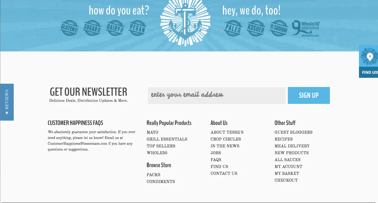
Notice how Tessemae’s makes the newsletter opt-in the focal point of their footer?
There’s no doubt that you’ll want to include more than one call to action in your footer. That’s fine, but I do recommend that you limit how many you to place there. You don’t want to ask your users to do three or four different things at the same time.
Let this be your mantra: I will not overwhelm.
4. Group Menu Items Logically
As I mentioned earlier, not everyone will be on your site for the same reason. Your footer should accommodate the different types of customers you’re hoping to attract.
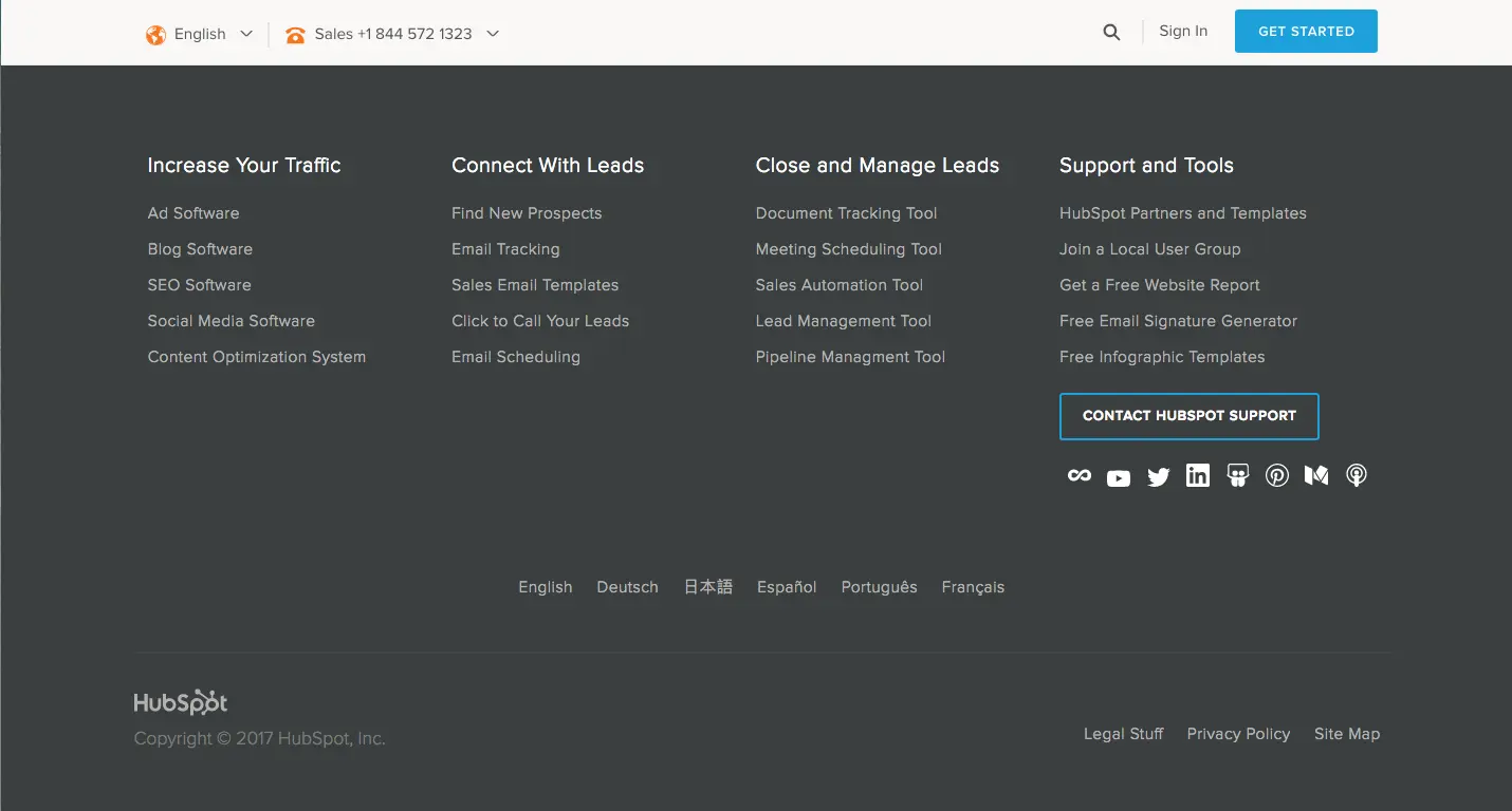
I love how HubSpot creates different pathways for the different needs of its customers. There’s a path for those who want to increase traffic and there are other paths for those who want to connect with or manage leads. And finally, there’s a generalized list of support and tools that could be applicable to a variety of HubSpot users.
Like HubSpot, have a section for each link group. For example, if you want to promote your products, create a group dedicated to your products and list your most popular ones in hierarchical order. You can do the same thing with courses, blog posts, resources, podcasts, you name it.
Grouping like items together helps your visitor self-segment and reach the next step quickly and efficiently.
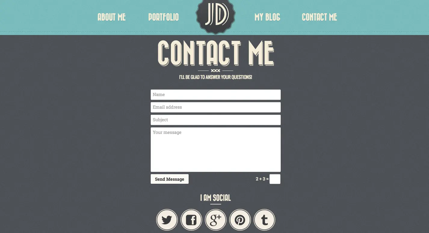
5. Add a Contact Form
Contact forms are to footers as peanut butter is to jelly. It just makes sense to add a contact form in your footer because people want to reach you.
If they have questions and want to reach out, that’s a good thing. But if they have to scroll all the way to the top and click on another link to get to your contact page, that’s a pain.
Make it easy for people to reach you with a contact form nestled in your footer.
Another idea to use instead of a contact form is a live chat module.
Live chats are incredible for conversion. Visitors can get their most pressing questions answered immediately without going through the agony of waiting for an email response. Eliminate their hesitations with answers and team members on ready.
6. Image of Yourself
It’s selfie time!
You may be reluctant to include an image of yourself (or your team) in your footer, but here’s why you should:
Including an image of a person can improve signups dramatically. Study after study shows that placing a human face on your page will boost conversions.
Why?
It turns out the images of fellow humans creates a sense of empathy. When you see a smiling person, the Internet stops feeling so cold and starts feeling warm and personal.
But images aren’t just for About Us and landing pages. Images belong in your footer, too. You can include an image of you (and/or your team) to create a connection with the visitor. It’s also helpful if you’re asking the visitor to do something, such as:
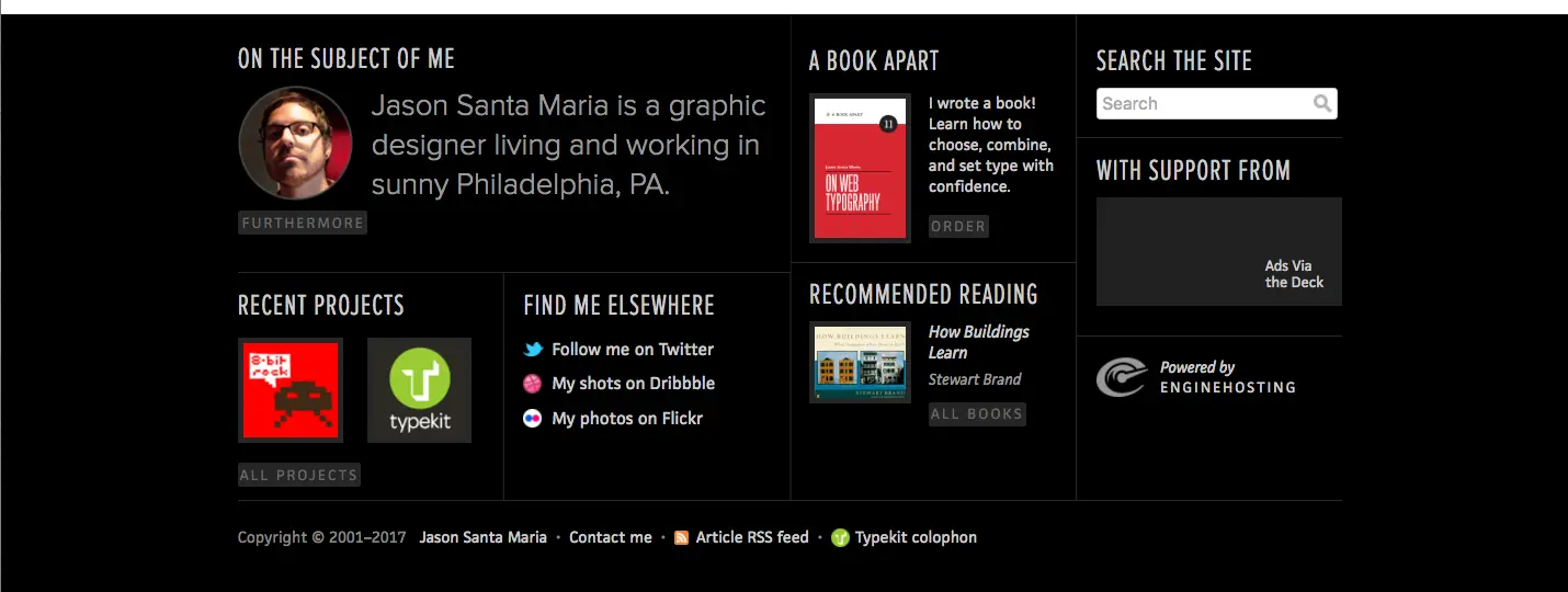
Image Courtesy of Jason Santa Maria
Final Thoughts
The footer is often overlooked, but it’s the perfect place to drive your call(s) to action one last time. While the footer may be an afterthought for other brands, you should make it a priority. This is your opportunity to reward for readers who’ve scrolled all the way to the end of your page. Make it worth their while.
Don’t forget to download this list of website footer best practices.