Let me save you the scroll: (Spoiler alert!) The answer is definitely to Pop-Up.
If you’re old enough to remember Windows 95, you know of a world before pop-ups. Life was simpler then– all you had to do was train your eyes to ignore those hilariously irrelevant banner ads and you had it made. But then some mad scientist at Tripod (remember them?) had the bright idea to create a pop-up ad, and you’ve been rolling your eyes and clicking “x” ever since. Nice.
Find out how pop-ups increased conversions by as much as 1375%. Subscribe to receive this extra resource.
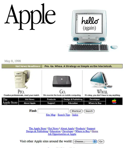
(From 10 Famous Websites and How They Looked in 1998)
But, have you ever wondered why pop-ups are still around 20 years later? Yes, they can be hopelessly annoying, but the ones that get it right are like magic. There are some pop-ups that present you with the exact thing that you want at the exact time that you want it. You can’t help but subscribe, download, or engage with a pop-up that’s doing some sort of Vulcan mind meld with you.

Pop-ups have remained popular for two decades because they have the power to persuade your site’s visitors towards your call-to-action. In fact, pop-ups are actually more popular nowadays because marketers are beginning to understand their usefulness.
Consider this startling statistic:
Up to 96% of your site visitors will never return to your site. It’s not because they don’t like you, it’s mostly because they’ve forgotten about you or can’t remember your website address..
How often have you vaguely remembered a website that you enjoyed, but couldn’t find your way back there with a map?
Or let’s say you visited a website, loved it, and then bookmarked it (smart) but, if your bookmarks look anything like mine, it’s easier to navigate the Amazon rainforest than to find that interesting website you looked at last month.
This is one of the reasons why the site you visited needed a pop-up, and why you need one, too. People forget. Bookmarks get lost. Having a pop-up that invites visitors to your mailing list, for example, takes the pressure off of them to remember to visit your site, and gives you a lot more say over the flow of traffic to your site.
But, between you and I, most sites are doing pop-ups all wrong. In its most effective formhighest calling, a pop-up is intuitive. It reads your mind and answers your most pressing questions.
However, many pop-ups are just scratching their own itch: buy my totally unrelated ebook, join my possibly spammy newsletter, sign up so I can shake you down on my webinar.
Maybe this is why you’re leery of using pop-ups on your site, because you don’t want to mimic the bad experiences that you’ve had in the past.
In this post, we’ll explore ways to create a non-spammy, intuitive pop-up that will help you convert like crazy. Are you ready? Let’s do this!
Types of Pop-ups
Let’s first explore the different types of pop-ups. In your haste to close them, you may not notice that there’s five different types of pop-ups in rotation currently:.
Welcome Mat
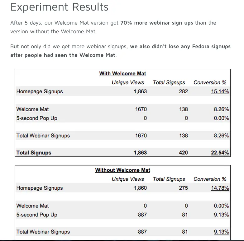
The Welcome Mat is a pop-up gate that appears before you can access a website’s content. While this can be terribly annoying when arbitrarily done, a welcome mat has the potential to be insanely useful if you have pressing information you want to share with your site’s visitors. The folks at Fedora found that a Welcome Mat increased webinar signups by 70%. Heck, even I signed up. This type of pop-up works best when you’re trying to convey a sense of urgency.
Scroll Activated
A Scroll Activated pop-up appears once the reader scrolls to a certain point on your page. This pop-up can activate at the midway point or at the end of blogpost. You set the parameters based on your needs. Kissmetrics does a great job of adding a subtle pop-up when readers near the end of a blog post. It functions as a non-obtrusive call-to-action that nudges readers to a higher level of engagement: in this case, an email newsletter.
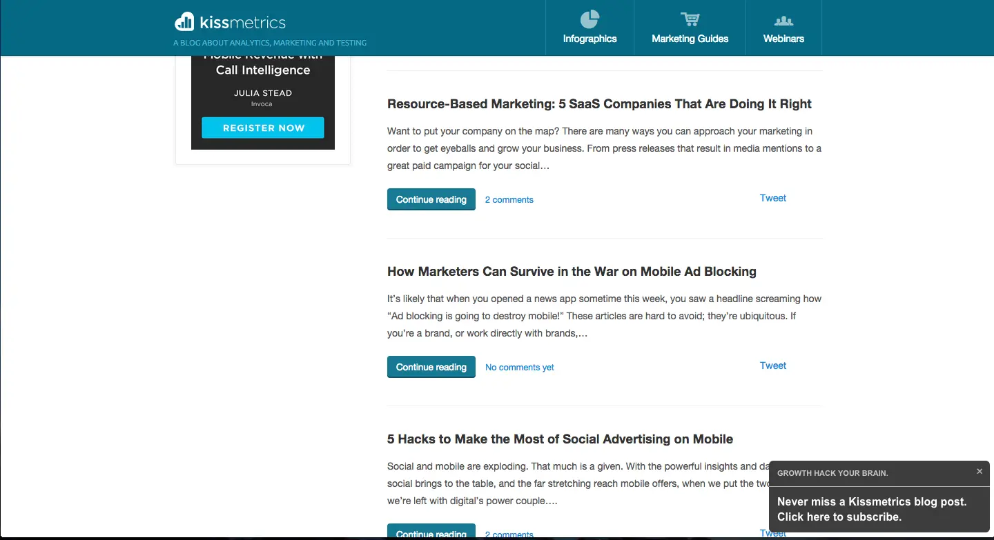
(Kissmetrics)
You can also create a call-to-action that promotes recommended, related content as Business 2 Community does on its blog posts.
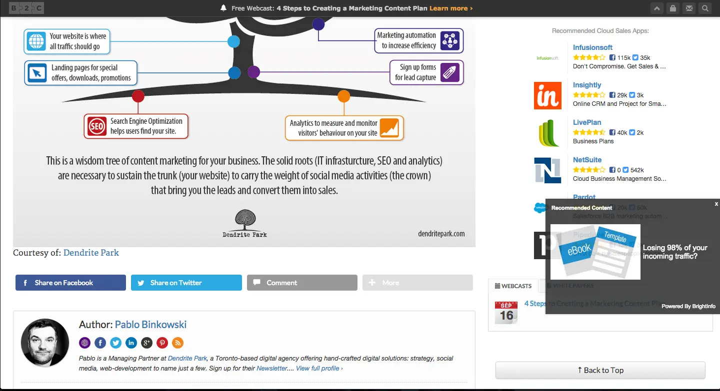
(Business2Community)
Timed
A timed pop-up doesn’t just assault you as soon as you walk in the door. It gives you a moment to relax and compose yourself, and then BAM!
When it comes to a timed pop-up (as with most things), timing is everything.
The brilliant minds at AppSumo recently performed a study showing that the best time to pop-up is at the five second mark. Seconds matter, and in this case, it can more than double your conversion rate.
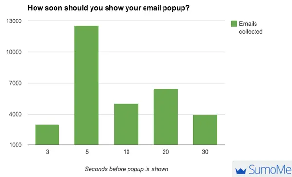
(AppSumo)
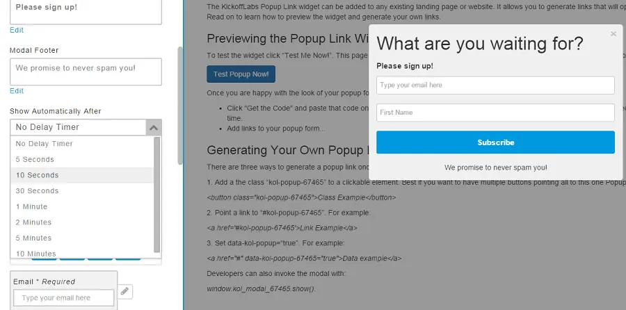
Here at KickoffLabs, we also offer a timed pop-up that’s incredibly easy to install (simply copy and paste a few lines of code onto your site). Check out this video on exactly how to do it.
Let Me Ask You a Question
This type of pop-up has become a new source of comedy for me. These pop-ups ask a question that most of the site’s readers would absolutely answer in the positive, but what’s funny is the impossible choice they present to you. When doing this type of pop-up, be sure to avoid condescending choices that could belittle your audience. Basically, check out these gems and do the exact opposite:
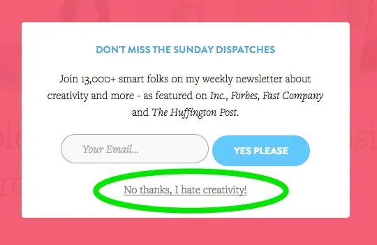
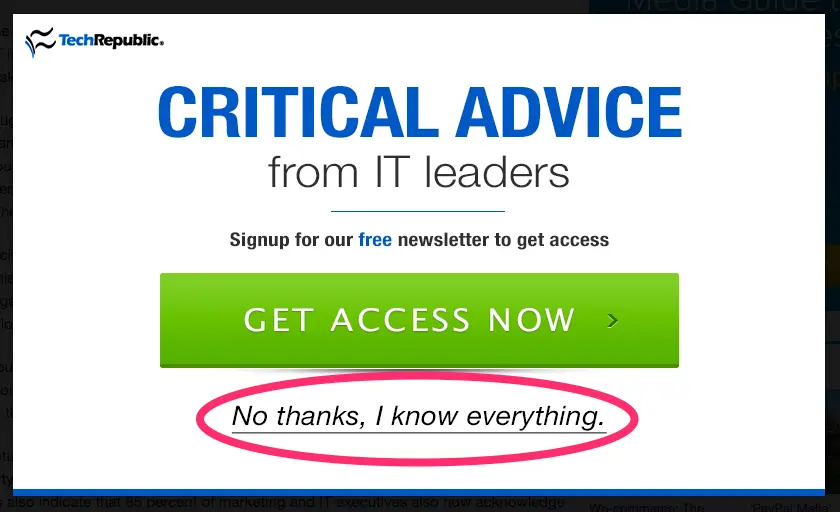
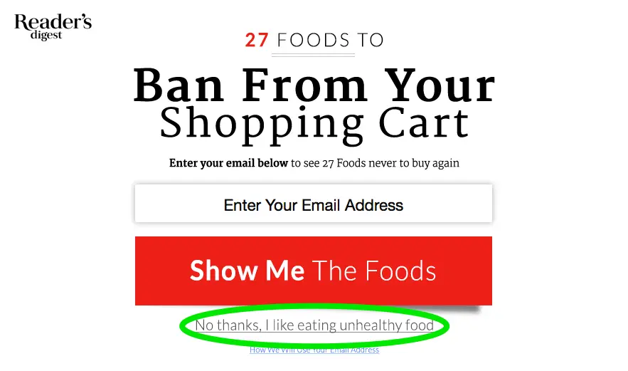
(courtesy The Cruelest Opt Out Forms)
Exit Intent
Exit Intent pop-ups activate when you move your mouse up towards the browser’s back button. These types of pop-ups are a last-ditch effort to capture visitors before they disappear into the misty fog of the Internet. Whether you’re trying to get customers to sign up for your newsletter or read more content, an exit intent can drive traffic where you most need it to go.
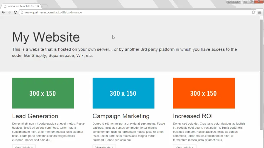
(KickoffLabs)
As you’ve probably noticed, it’s not uncommon to see more than one type of pop-up on the same website.
Having as many as three pop-ups may sound like overkill, but if done correctly, they can actually boost your conversions and help to segment your list. How?
While some users may not be interested in your ebook, they’ll probably join your newsletter for updates to your blog. Or they may be interested in getting that percentage off promo code that you’re dangling in front of them. You can segment users based on which pop-up they opted-in to, and create an optimized track that can enhance user experience with your brand.
Best Practices
There are rules to using a pop-up correctly. While I don’t want to dampen your creativity, we should go over a few points on how to implement pop-ups that enhance your user’s experience.
Use a Clear Call-to-Action. Don’t mumble or fumble. Explain exactly what the user will receive by following through on your action.
Make it Stand Out Visually. Red is the best color to grab attention. It outperforms every other color.
Be Relevant. Don’t over-use the same old pop-up on every page of your website. Add variety, include multiple types of pop-ups (but not all at once).
Add an Incentive. Make it worth their while. Add a promo code or include the word “free.” Your pop-up offer should be worth what you’re asking (subscribe, read more, enroll).
Include Social Proof. Some of the best newsletter subscription pop-ups are showoffs. They describe exactly how many people have already subscribed, which increases their trustworthiness.
Don’t Talk Down to Your Audience. Remember that they’re adults, just like you, and they want to feel good about following your call-to-action, not guilted into it.
Final Thoughts
Pop-ups are not evil. In fact, pop-ups can be the single best marketing strategy you can implement on your website. If you remember to follow the best practices for your pop-ups, you’ll see greater conversions in no time. Most important, don’t forget to test your pop-ups to find out what works best for your audience. Let us know how it goes.
Find out how pop-ups increased conversions by as much as 1375%. Subscribe to receive this extra resource.
