At KickoffLabs, we know better than anyone that running a successful campaign is hard work, and knowing exactly what speaks to your audience isn’t always easy. The first step is generating traffic, which is challenging enough, but what comes next is even more difficult.
It’s important to remember that digital marketing tactics like SEO and paid advertising can only get you so far. Sure, these strategies bring the traffic, but after that, it’s up to you to constantly optimize and convert those visitors to generate more leads.
This is no easy feat, but the good news is that there are a few effective methods for boosting your conversion numbers by constantly optimizing. A/B testing is one of them, and better yet, it’s one of the most successful.
What Is A/B Testing?
Let’s look at an official definition of A/B testing from the geniuses at Harvard Business Review. According to HBR’s refresher on A/B testing, it’s all very simple: “A/B testing, at its most basic, is a way to compare two versions of something to figure out which performs better.”
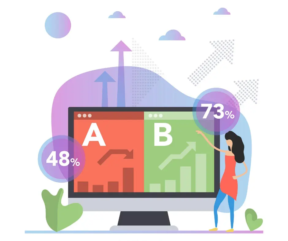
In the context of running an online campaign or contest, it’s essentially just an experiment, or a “test”, that compares two different versions of a webpage, app, or landing page. The goal of running this test is to see which version gets better results. And by results we mean conversions.
Also referred to as split testing and sometimes called bucket testing, the main objective of A/B testing is to improve overall conversion rates, therefore generating more leads.
You should never underestimate the power of marketing your message the right way, and running an A/B test can help to get you there.
How A/B Testing Works
To keep things simple, we’ll focus on testing landing pages, which is what A/B testing is most often used for. You’ll start with one landing page, then create a second page that is meant to get the same point across to your audience.
These two pages could have a few very minor differences, or they can be completely unique from each other. It’s up to you, but it’s essential that you publish both pages to the same URL location and that each page gets the same amount of traffic.

When Page A, also called the “Original”, and Page B, the “Challenger”, receive the same number of visits at random, it’s easy to see which one outperforms the other. There are five aspects of running a successful A/B test:
- Collect Data: Before the testing can commence, you’ll need to gather some insight on your current landing page situation. Try to hone in on a page with low conversion rates since a page like this could definitely benefit from some A/B testing.
- Form Hypothesis: Form a list of different ideas/hypotheses for page variations that you think will be successful. Then prioritize each list item based on what you expect the impact to be and how easy it will be to implement.
- Create Pages: You probably already have one landing page created, so this step just involves making your second page with the variations you decided on in step 2.
- Run the Test: Now you’ll just sit back and let the test take its course.
- Analyze Data: Once the test is complete, the final step is analysis. The conversion numbers should speak for themselves, but try to dig even deeper than that to see how users interacted with each page.
By performing these five steps, you get the chance to gather real data and make changes to your campaign that could ultimately make a huge impact.
Why Is It Effective?
When you test two pages that vary in terms of content, design, and overall vibe and you present these pages at random, you’ll be able to get a much clearer picture of what speaks to the average user within your target audience.
Perhaps Page A uses a muted color scheme while Page B goes all out with its bright design.
Making these changes and then analyzing the results (the conversion rate of each page) is without a doubt the easiest way to take your landing page game to the next level. A/B testing is basically a direct route into the minds of the page visitors to find out which page variations will bring you the most success.
To top it all off, users don’t even realize they’re being tested in the majority of A/B tests, which means that the data you collect will be 100% honest and unbiased.
A/B Tests That Show Results and Generate Leads
Now that we’ve covered all the A/B testing basics, let’s get into some specific A/B testing methods that are sure to give you some answers. Each of the tests listed below is easy to implement, but even better, they have all been proven to show real results.
Swap Out Landing Page Visuals
Since a picture is worth a thousand words, imagery should be a major focus when creating your landing pages. An amazing part of A/B testing is that you can test out a different image for each page to see which one speaks to visitors most.
So go ahead and start browsing through free image resources, land on two quality candidates, and start testing to see which one works best for your campaign.

Change Around the Color Schemes
Colors are directly linked to emotion, so it’s no surprise that a lot of A/B tests focus on variations in landing page color scheme. For example, a page that is designed in a red color scheme might invoke a sense of urgency, while green is known to be much more soothing.
Both could have a positive effect, so the best way to figure out if your campaign will get more conversions from a more“urgent” design or one that’s more calming is to - you guessed it - perform an A/B test.
Reword Your Headlines
No matter what, a landing page headline needs to be compelling and attention-grabbing, but there are many ways to go about this. An A/B test makes it possible to test out two different headlines, so feel free to play around with wording.
Make Changes to the CTA Button
What we said about color scheme alterations earlier can be directly applied to the Call to Action buttons on each landing page. Try one page with a red CTA button that says something like “Get Started Here”, and another page with the same CTA phrase, but instead of red, make the simple switch to green.

Another easy change you can make to the CTA button is to switch around its position on the page. It’s easy to assume that such a minor thing wouldn’t make an impact, but you’d be surprised. Optimal CTA placement is different for every landing page, so try one page with an “above the fold” button and one with the CTA found at the lower half of the page.
Alter Your Form Field Layout
For some users, the biggest turn off of a landing page is being asked to fill out a lengthy form with field after field asking for personal information. Chances are you’ll lose a lot of potential leads if you have four or five fields to complete.
On the flip side, increasing the number of fields can help you to weed out the leads who aren’t committed and find the ones who are actually likely to follow through. So try both and see which one brings the best results.
Why KickoffLabs Does A/B Testing Better
At KickoffLabs we were reluctant to add A/B testing for a while. A lot of our customers run smaller campaigns where it becomes hard to get statistically significant data. We also know customers run tests that accidentally end up costing them leads because one version does so much better than the other one. So we built a smarter A/B testing platform to solve these issues.
We implemented a “multi-arm bandit” testing strategy.
The name “multi-armed bandit” describes a hypothetical experiment where you face several slot machines (“one-armed bandits”) with potentially different expected payouts. You want to find the slot machine with the best payout rate, but you also want to maximize your winnings. The fundamental tension is between “exploiting” arms that have performed well in the past and “exploring” new or seemingly inferior arms in case they might perform even better. There are highly developed mathematical models for managing the bandit problem, which we use in Google Analytics content experiments.
What makes this a smarter A/B testing solution?
Every lead is vitally important to your business. You work very hard to get those potential leads to your landing pages. A/B testing does an excellent job of helping you optimize your conversion process. However, an unfortunate consequence of this is that some of your potential leads are lost in the validation process.
Using the Multi-Arm Bandit algorithm helps minimize this waste. Our calculations proved that it could lead to nearly double the actual number of conversions for our customers running A/B tests.
You can now have your cake and eat it too.
What do I have to do to use it?
Nothing. Simply create a new A/B test and keep all the defaults.
I fear SkyNet and want to control my own A/B weighting
No problem. Just click the ‘use manual weighting’ checkbox and you are back in the drivers seat.
Are you ready to start testing?
At KickoffLabs, we’re here for you every step of the way. Our mission is to help you set the framework for running a successful viral contest from start to finish, and A/B testing is a major aspect of this.