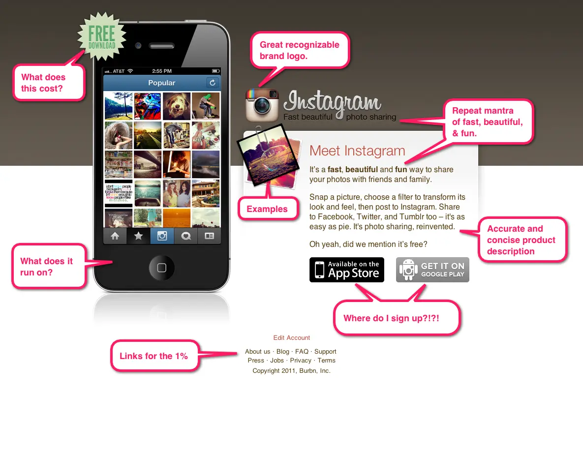
Instagram just sold to Facebook for 1 BILLION dollars. I’ve captured their landing page at http://instagram.com so it can be studied further before Facebook gets their hands on it. What makes this the perfect landing page for a billion dollar company?
Lets walk through the image I’ve marked up here:
Starting from the top left corner where most users eyes will go first…
1. If you can highlight a great price… do it. Who doesn’t LOVE free? Right away this says “Anyone can join this party”.
2. A great visual that answers “what” questions. A phone with rotating images of the app. Says right away that you need a smartphone and that this is an App I’m selling you on.
3. Memorable logo that helps explain the product. You’ll notice that everything on this page is designed to help explain the value proposition… right down to the logo. It’s a straightforward old-timey camera with some color for flare.
4. A tagline that sells their mantra or vision. You’ll see the words “fast”, “Beautiful” and “Fun” several times along with similar words like “Easy” and “sharing”. It’s straight out of the Steve Jobs school of presentation by repetition. They took their vision and explained it 4-5 ways on this page.
5. A concise product description that both sells AND educates. Nothing worse than not knowing what you are going to get. This description is also your help manual that tells you exactly how you use the app. Again… a page straight out of Apple ads that educate as well as sell.
6. Clear calls to action for downloads. Not only do the App store logos stand out because they are the only non-colorful things on the page… the pricing tag and images on the phone will also lead to a download. It’s hard to click on this page and NOT end up downloading the app. :)
7. Repetition of the price… “Did we mention it’s free”… in case someone read that far.
8. It’s all above the fold. In fact the very bottom of the page doesn’t go more than 600 pixels from the top. Enough for grandma to still see most of it with 6 different browser toolbars installed on her Windows XP netbook.
9. Great examples. The words “Meet Instagram” are right next to two great example screenshots. Again… another way to focus on what you get out of the product.
10. Links for the 1%. There are links at the bottom for the 1% of people that need to know more. But they don’t take up any of the primary real estate. You have to work a bit to find them.
I’m not saying you can’t sell for 1 billion dollars without a great landing page… but it sure helps. :) What’s great about this example is that on the surface it looks like they skimped on their website. But the reality is that they:
A. Didn’t need a great website because their focus was on mobile.
B. A lot of effort clearly when into this landing page through thoughtful copy and design. The same attention to detail in their app is excuded in this “packaging”… yet another page out of the Steve Jobs era Apple.
So, go on, go forth and create the next billion dollar landing page. But when you do… remember that KickoffLabs only asks for a small fraction of that valuation. :)
– Josh, Co-founder KickoffLabs
Start Building Smarter Campaigns Today!
PS: If you’d like your own billion dollar landing page… [We’ve got you covered with our “Instabillion” landing page theme. ](https://kickofflabs.com

