Fonts and colors on a landing page, a fancy way to say “how to dress your webpage to impress.” These aren’t just any words and hues you tossed together in a fever dream; they’re chosen with purpose and poise. They’re the digital equivalent of choosing whether to wear a tuxedo or a sandwich board to an interview. It’s about picking the perfect serif font for your CTA and a color scheme that screams “I’m the answer to all your problems.”
If you already have a visual brand guide created then you are ahead of the curve here. If not then this guide could help you create one with fonts and colors.
For example, imagine your company sells artisanal, gluten-free, blueberry dog biscuits (yeah, you’re that cool). You might opt for a rustic serif font speaking to the handmade quality and pair it with a blue color palette instead of say, fire-engine red.
Why?
Because in this world of picky pooches and discerning owners, fonts and colors matter. They control your brand story, engage your audience, and boost your conversion rates.
Limit Your Color Palette
When your customers first arrive on your page one of the first thing that they will see are the colors. The way you use colors is extremely important. The use of too many colors on the page is one big way that a page looks unprofessional. With that loss of professionalism your brand also loses it’s credibility. And too many colors makes it unclear where you should click or what you should do on the page.
Do you see how adding too many colors makes it hard to digest what you should pay attention to and what you should do on the page? There’s just too much to take in.
Limit Yourself to a Couple Colors
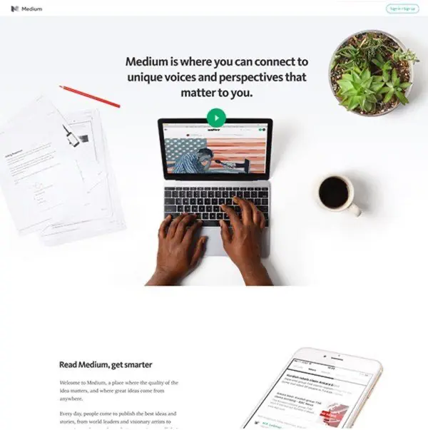
As a general rule you should limit the number of colors on your page to 1 to 3 colors. Our landing page templates are designed with cohesive color schemes that you can customize to match your brand.
Do you see how limiting the colors on the page brings out those colors and still makes it look beautiful. You can also see how limiting the colors on your page makes your call-to-action stand out!
If you’re a designer and want more you can. But even designers probably wouldn’t ever go over four or five colors – especially on a landing page. This is how multiple colors look on a landing page when done correctly.
Do you see how the colors go together? They don’t contradict each other and make it unclear where to look. If you’re not a designer stick with only using 1 to 2 colors on your page
Assign a role for each color.
You will want one color to act as your call-to-action. This would be your buttons, for instance. This color should be a strong color that stands out.
Try to limit your one color to only the calls-to-action that you really want to stand out. If you feel like you need one more color throughout your page try to make sure it’s not a color that really stands out but one that complements the page.
Not all pages will need this complimentary color but on some landing pages it is important for the page to look nice. I recommend trying to limit your page to one strong color and if needed one complementary color.
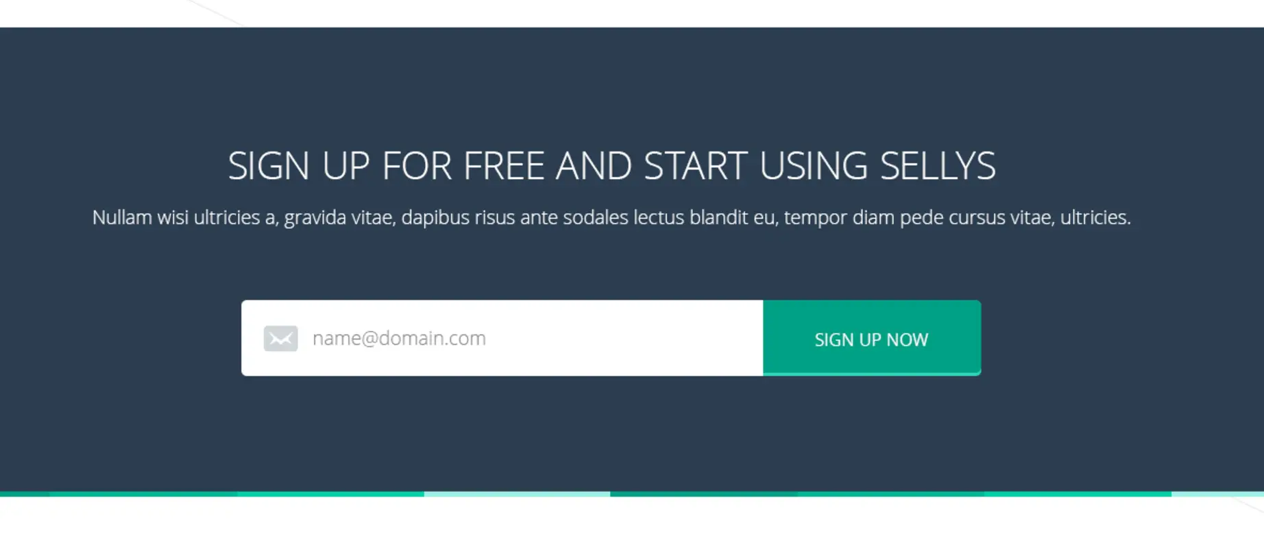
Here’s a page where the call-to-action color is green. Wherever the green is used it stands out because it’s the only real color on the page.
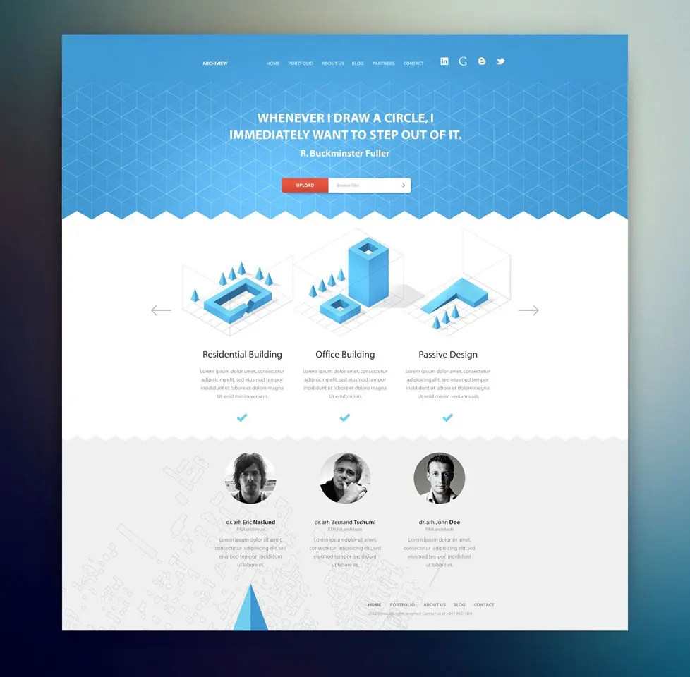
Here’s an example of how to use a complementary color on a page:
Can you see how the complimentary color (the dark blue) doesn’t overpower the call to action color? It’s there to help the page but doesn’t pull your attention there the most.
Tools to Generate Color Pallets
-
Coolors: Coolors is like Tinder for designers. Seriously, you just generate a color palette and then keep hitting your spacebar until you find something you are not embarrassed to bring home to mum. Naturally perfect for creating color schemes that do not reminiscent of an acid trip.
-
Adobe Color CC: Adobe - these guys supposedly know a thing or two about design software. Adobe Color CC lets you extract color themes from images. So the next time you’re moved to tears by an incredibly touching sunset, you can de-romanticize it by turning its lovely hues into a color palette.
-
Colormind: If you’re feeling adventurous and want to leave your color design decision to a machine, Colormind is your go-to AI-based color palette generator. Perfect for those odd days when you feel like letting a robot make your decisions.
-
Paletton: Ancient Greek philosophers reflected on science, the meaning of life… and most assuredly, on color palette generating tools. Paletton is the Pythagoras of palette creators - logical, precise, and perfect for when you’ve got a little more time to dive into color theory.
-
ColorSpace: We love ColorSpace not just because it’s free but also because its generator provides you with a whole set of matching color palettes just by inputting a single color. Perfect for the lazy ones who don’t want to press that spacebar too often.
-
Khroma: Khroma is like the Cupid of color palettes; input colors you like, and it’ll matchmake the perfect palette for you — excellent for the romantics amongst us, not so great for those who like to play hard-to-get.
-
Color Hunt: Those who want a more social media inspired tool, Color Hunt is a gift from the palette heavens. If scrolling endlessly through Instagram feeds is your style, you’ll enjoy raiding through these user-created palettes till you find the one.
-
Canva Colors: Just when you thought you’d gotten away from the wrath of Canva, here comes Canva Colors. This straightforward tool gives you complimentary colors from a base hue. Ideals for those shackled by time or just too lazy to move beyond Canva.
-
ChatGPT: No. Really. Describe your business in detail ChatGPT and tell it to “design a color palette for our company website”. You can refine it’s selections with follow-ups in the chat.
Choosing Fonts and Typography
Choosing the correct fonts for your landing pages is another area that will make a big difference in the design of your page.
One Font Family
This might be the easiest of all the design principles to implement perfectly. Follow this one rule and you will be fine. Limit your fonts to one font family.
A font family is the font you read on the page. For example: Helvetica, Arial, Verdana, Times New Roman. These are all different font families
If you’re a designer you might want to add another font family to the page and that’s fine – you will know when it’s needed. If you’re not a designer limit yourself to one font family.I can’t think of ever seeing a landing page with more than 2 fonts that looked really clean and good. I can think of a lot of pages that had only one font family that looked great.
Style Fonts to Communicate More Effectively
With one font family you can do a lot of things with your text to make it stand out.
Most font families give you have the option to add italics, bold, underline and so on. You can also change the size of your words/sentences and modify whether they are upper-case, lower-case, or capitalized.
This page has one font family. Do you see how the size, weight, and changing of case allows some words to stand out and others to play a secondary role on the page?
At the same time can you see how too many fonts impacts the page negatively?

As a basic rule don’t modify your text styles in any way unless you feel like your message isn’t coming across on the page. Only then make things italics, bold, or upper-case.
If you start making changes like, for instance making all titles upper-case, please be consistent. Don’t make some upper-case and some just capitalized. If you decide titles are upper-case then make each title upper-case.
When creating your contest landing page, maintaining font consistency helps build trust and improves readability across all devices.
Don’t Write Novels
Do you feel like reading the words here:
Doesn’t that just feel like a lot of work to read through all of that text? Now look at part of this page:
Because the words are cut down you’re more likely to read them and it will be a lot more fun!
Take a look at the text on your page. Is there anything that you could remove? How can you cut down the words on your page so that you’re more direct and clear. Reducing the amount of text on your page or breaking it up into more digestible parts will actually increase the likelihood that your customers will read your words.
Your customers are most likely going to scan your page. They may read small one to two sentence paragraphs, so keep it simple.
Little Detail That Makes a Big Difference
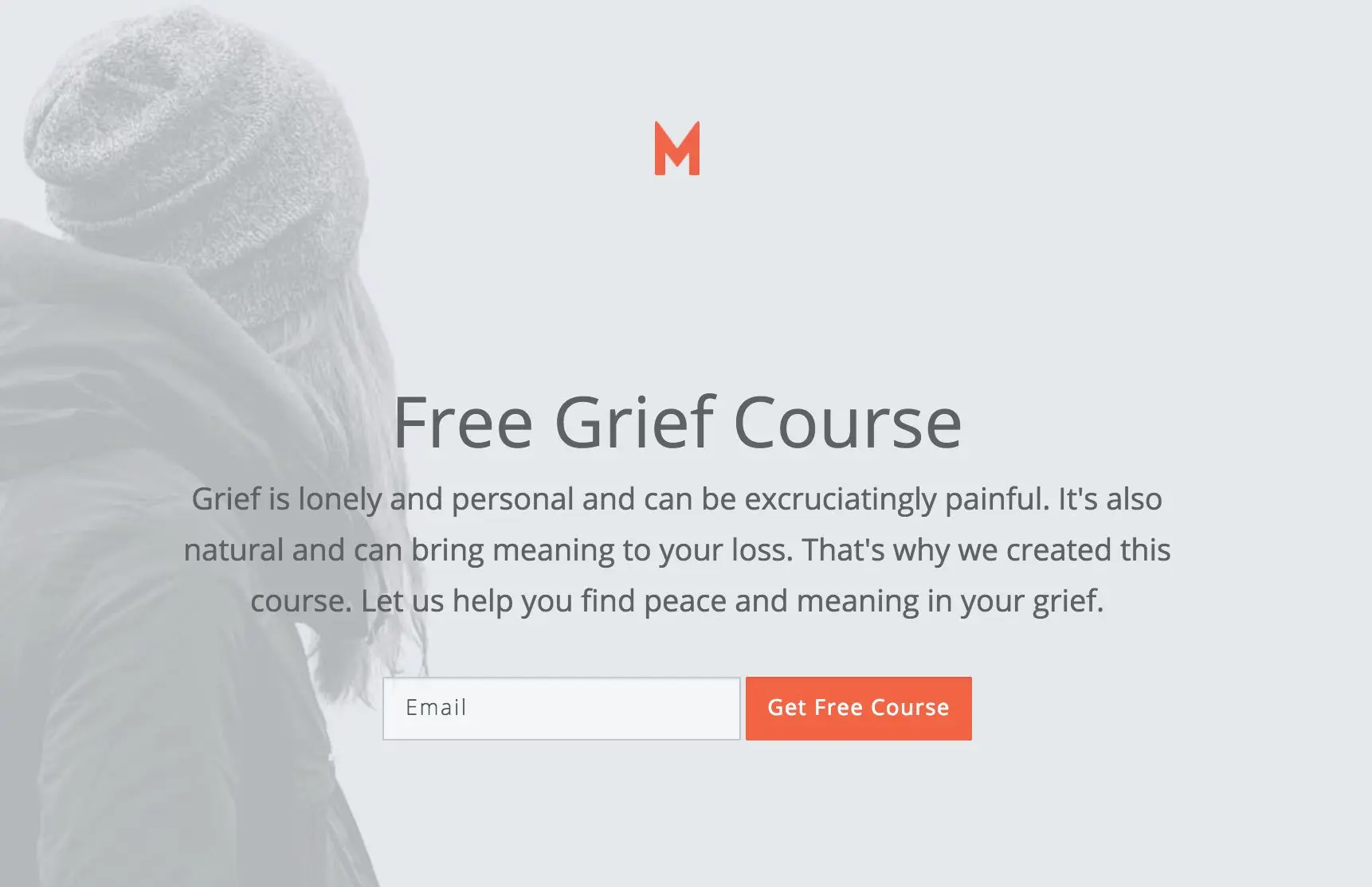
Choosing a nice font for your page can be a little detail that can make a huge difference. I was working on a page where the topic was grief. The main heading on the page (“Free Grief Course”) looked too hard (the edges were too squared). Take a look at the page below and see if you can notice how the font gives the page a certain feel. The page was meant to bring comfort and understanding and the font detracted from this feel.
Now look at how changing the font for only the title (“Free Grief Courses”) changed the feel of the page. This new font family is softer and rounder and worked better with the content and message of the page.
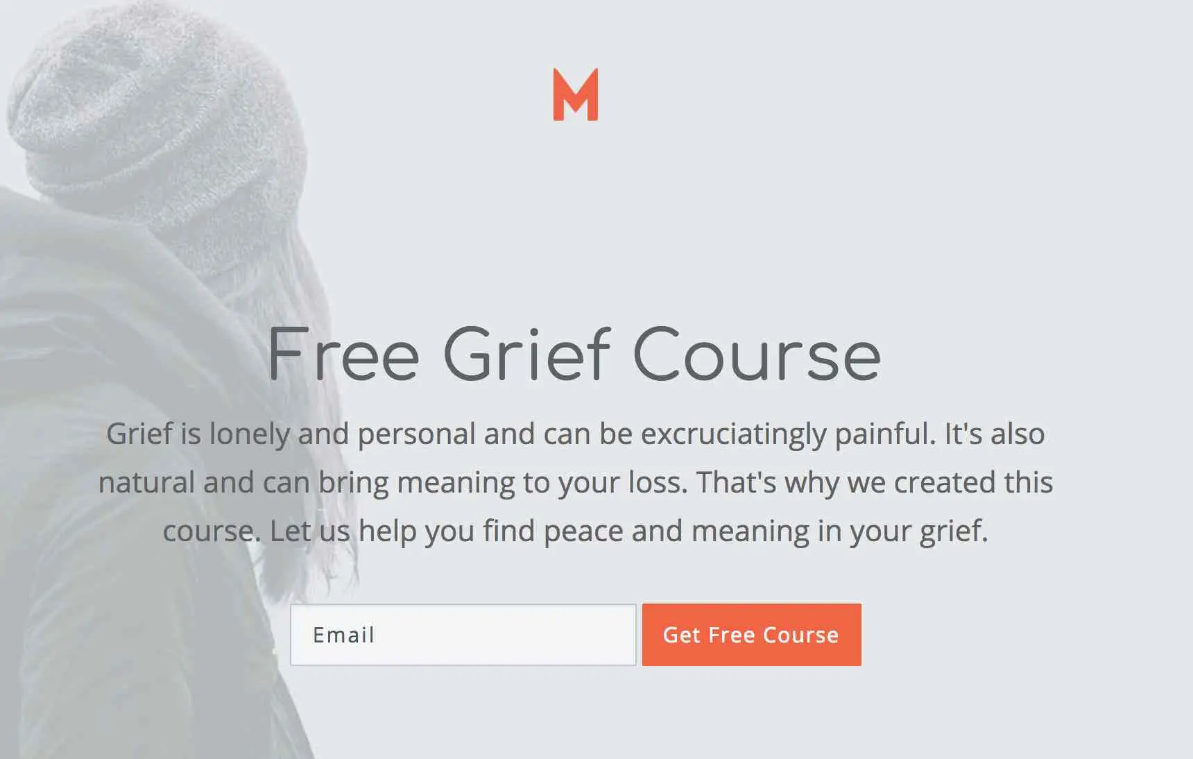
Can you see the difference a font can make in how a page feels? It’s a little detail that can make a big difference. So take a few moments to consider what font family you should use on your page and if that matches what you’re offering.
Make Fonts Mobile Responsive
The first thing I look for is to make sure the fonts respond to the size of the screen. They should become smaller as the page size decreases. Sometimes even with that reduction there are some customizations you will need to make (adjusting some text to be smaller and sometimes slightly larger).
Super large fonts might look great on a desktop, but only allow for 6 letter words on a phone before they are cut off in the middle of the word.
Help Getting You Started with Fonts
At KickoffLabs all of our landing pages have a default font family that we recommend you at least consider for your landing page. You might find, like I did with the grief course page, that a particular font doesn’t quite work. But, we will help you start off with a nice font family that is easy to read on the web and will look really nice on most pages.
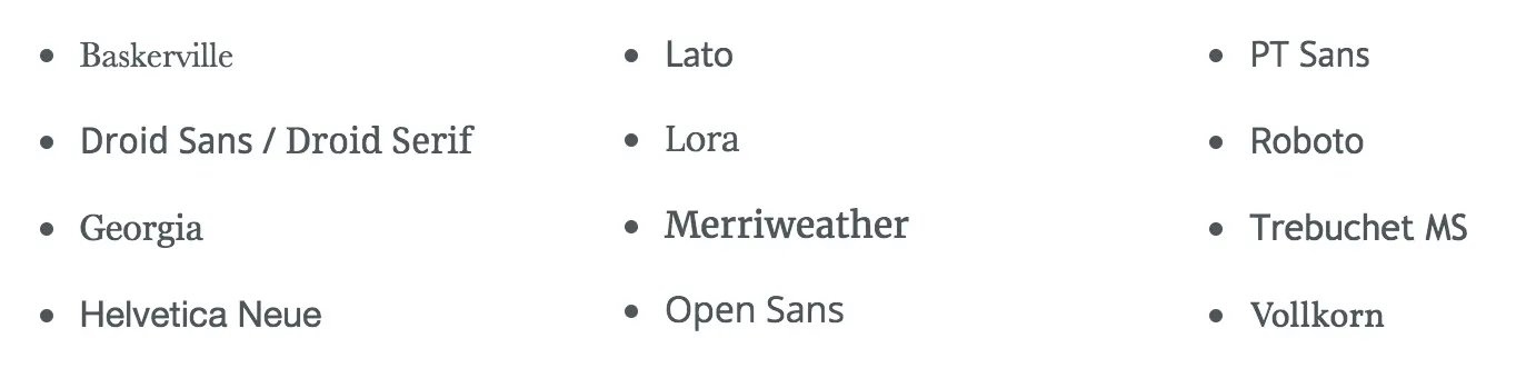
If you choose to change fonts, I recommend you consider some of these font families (ordered alphabetically):
Tools for Picking Fonts and Font Pairings
-
Adobe Fonts: This isn’t just an amateur font library. Adobe Fonts provides the heavyweight championship of font choices, integrating seamlessly with other Adobe products. If you’re wondering what font pairs well with “Comic Sans”, you’re in the wrong place… Adobe professionals tend to prefer our aesthetic.
-
FontPair: A somewhat lesser known but equally handy tool. FontPair offers matches made in typography heaven, pairing Google fonts in a rather charmingly OCD manner. Intend to self-publish a cookbook? FontPair is your sassy culinary sous-chef of letter aesthetics.
-
Type Genius: It’s not just a clever name, promise. Type Genius finds ideal font pairings for your project without breaking a sweat. Its dedication to the art of lettering matches yours for your work—just less midnight-oil burning.
-
Fontjoy: It’s kind of like having a matchmaker for your aesthetic needs. Fontjoy uses machine learning algorithms to find the best font pairings. Yes, artificial intelligence akin to Roomba, but for attracting eyeballs on your content.
-
Canva Font Combinations: Canva sneaks into another list again, sneaky sneaky. They are not only good with design templates but also offer a nifty little tool for font pairing. It’s like being handed fashion advice on a silver platter.
-
Typ.io: If you take your font pairings with a bit of contextual seasoning, Typ.io is your gallant knight in shining armor. It shows fonts used in real designs, which helps users see how they work in a practical environment.
-
Fonts In Use: Ever experienced typography envy? Fonts In Use is a public archive showcasing typography in real-life settings. Cataloged designs range from websites to book covers.
-
Google Fonts: Your devout and always there for you, free, grizzled typography veteran. They have hundreds or font families and pairings for amateurs to gurus alike.
-
ChatGPT: The Open AI team is back at it. This time they can pick good font combinations for you. Describe your brand and let it pick fonts for you. You can optimize your picks by asking it to choose from “Free Google Fonts” for example.
Branding & Logos
Make it clear who is offering the products/services on your page. Usually this is a simple logo at the top. And maybe something in the footer about your company, privacy policy, copyright info that confirms to your customer who you are and that this is a legitimate offering.
Logo Size
You want your customer to know it’s you but not to scream it in their face.
![]()
As a basic rule you want your image to be large enough that you can read it or recognize your brand but not larger than any other element on the page. Here’s the size I would place that same logo on that page:
![]()
It’s still large enough to be read and recognized but not so large it overpowers the page.
Make Your Logo Background Transparent
While we’re talking about branding let me just share one thing I’ve noticed across a lot of landing pages. A simple logo that has a transparent background are usually the ones that look the nicest on landing pages. Making sure your logo has a transparent background isn’t hard to do. Save it as a png (jpg’s do not support transparent backgrounds) with the option to keep the background transparent. Here’s the difference between a transparent background and one that’s not.
Transparent:

Not Transparent:

Make sure the colors, logo, offering, etc is consistent with your brand. If someone is familiar with your company, when they get to your landing page it should look and feel like your company’s landing page. It shouldn’t be a surprise at all. They should recognize it as you.
Consistency
Take a look over your page and make sure you stay consistent. Let me walk you through a few things to look at specifically.
Remember to limit your colors to 1 to 2. Choose one of those colors to be your main call to action and use it consistently for that purpose. If you need another color use that to make your page look nice. Stay simple and consistent with your colors.
Look at the text on your page. If you’ve chosen to capitalize the titles are you doing that for all the titles?
Keep the elements on your page the same. For example, if you’ve chosen to make your buttons rounded, make sure they’re all rounded. This holds true for images, form (and button) sizes, font sizes, and links. Choose one style and stay consistent.
One other small details is to make sure the padding you provide around the elements on your page holds consistent across each section. Don’t have one section that has plenty of white space and another that doesn’t have any.
Keep the padding consistent across the page.
Conclusion
Follow these simple guides to make your landing page look professional, beautiful, and perform better:
- Limit the colors on your page to 1 to 3 colors. Assign your colors a role and make sure the color with the most contrast to the rest of the page is the color you use on your calls to action.
- Limit the number of fonts on your page to just one. Only change the style of that font in order to better communicate with your customer.
- Make sure your landing page looks just as good on mobile as it does on desktop because statistically about half of your traffic will come from mobile devices.
- The logo on your page should be big enough to be read and recognized but not really any bigger.
The more you see these principles applied to landing page design the easier it will be for you to apply them to your page.
Build Your High-Converting Landing Page
Start with a proven template:
- Landing Page Templates - 100+ pre-designed templates
- Contest Landing Page Builder - Drag-and-drop editor
- Popup Forms - Capture attention at the right moment
Choose your campaign type:
Read more Landing Page Design with the next chapter:
4. Images
Learn how to choose the right images for your landing pages.