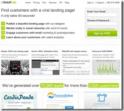
We just launched a dramatic A/B test on our home page.
Minor tweaks had run out of steam with our current page. We’ll call this A.
Here is what we’ve learned about the current page:
People say…
- “Too much text. “
- “I don’t understand what you do. “
- “Do you work with…?”
- “I don’t know what to focus on..”
And we know…
- Minor tweaks weren’t dramatically changing our conversion rates.
- It does feel text heavy and “dense”
- People weren’t scrolling to see our “social proof”
So we came up with the new design half of you will see: We’ll call this B.
- It moves the social proof higher
- Puts an example of what we do front and center.
- Reduces the text on the page.
- Attempts a simpler message.
So place your bets… which one is going to do better over the next week? I’m also looking for suggestions in B for how to uncrowd the signup form, but keep the social proof high. Suggestions welcome.
Check back in if you are interested. I’ll post the results when we are happy with them. ![]()


