You can include a lot of content on a landing page, but keeping it simple is the best course.
We’ve all heard the basics of what makes a good landing page, and to be honest, you’re probably as sick of hearing them as we are… … It goes without saying that you need an eye catching CTA or an aesthetically pleasing design, but are these basic steps really going to convince people to sign up? While the basics are known (yet not always followed!), we’re going to highlight 5 fundamental points that will turn your average webinar landing page into one that visitors simply can’t walk away from!
1 – Don’t Try To Win Everybody Over
There’s a temptation to include as much information as possible, to really highlight why your webinar is worth your customer’s time. Unfortunately, providing too much information can often work against you. Trying to pinpoint key information on a cluttered page is likely to turn people away. Make use of that whitespace and make it easy for your reader to understand the benefits of registering. 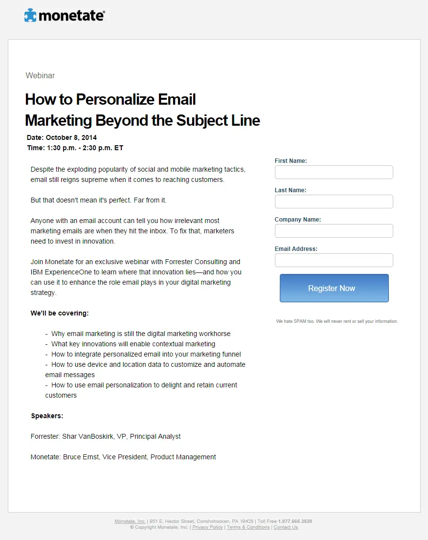 Simplicity also applies to the registration fields. No one wants to sit for 30 minutes completing a form, only include the bare essentials and maybe one or two key metrics that will later help you segment your audience for follow up marketing emails. Focus on your 1 ideal customer, give them the information they need and call them to action. The more customer types you focus on the more cluttered your page becomes.
2 – Sell Customers On What They Stand To Gain
Your landing page USP (unique selling proposition) has the potential to make or break your campaign. In short, your USP should highlight what your audience will gain from spending an hour of their time watching your webinar, so you need to make sure it seems like it’s worth their time. You could take the route of offering a very dry and boring explanation of what is offered and what they’ll learn. You could however, get a little creative and really focus on the benefits. 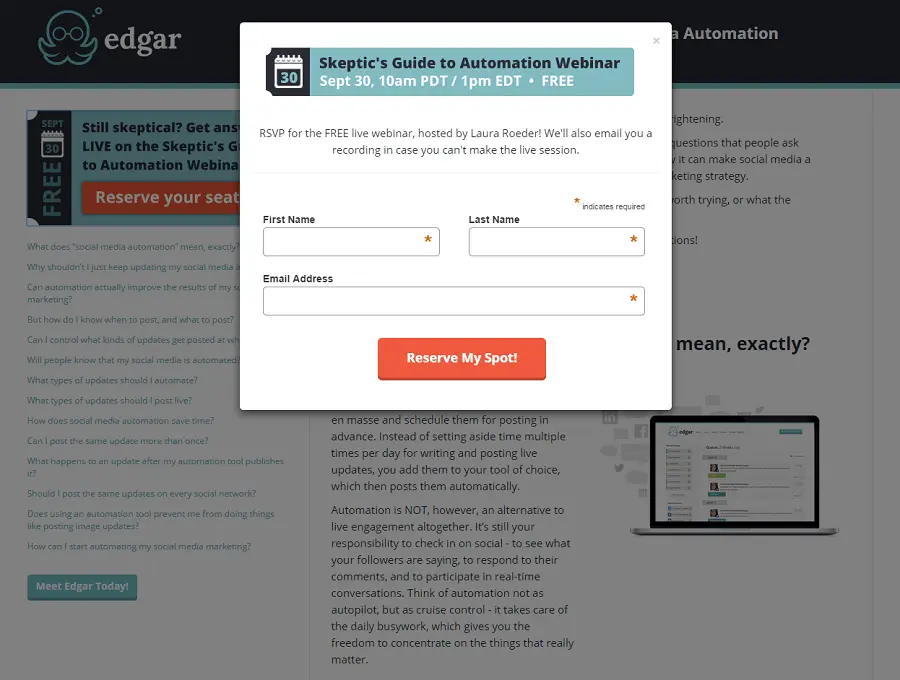 What’s the customer’s ultimate reason for seeking out your webinar? Is it to learn more about subject x or is it to become a powerhouse in their niche, look and feel incredible or be able to live the life they’ve always dreamt of? Charles Revson, the creator of Revlon cosmetic products, famously said:
“They sold hope, not cosmetics”
3 – Sell Customers On Why You’re Different
There are plenty of places people can turn to online for information. What make’s your webinar different? If you’ve got an industry expert to lead the webinar include a hero shot and short bio on the page. Explain why this person is a big deal and why they’re worth listening to. 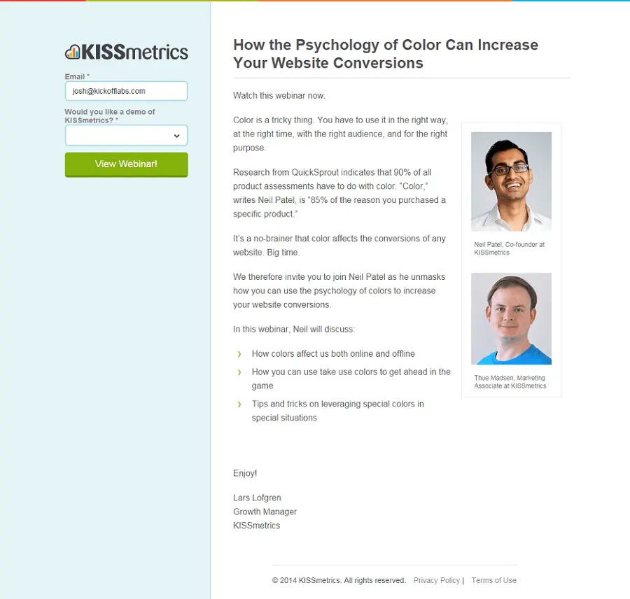 To add more value to the page, include testimonials from happy previous customers. If possible, include their picture and full name as this adds to the authenticity of every testimonial. Providing social proof and authenticating value on the page could be the difference between a registration and a potential customer walking away, don’t take the chance. What makes your webinar different and your USP can sometimes be the same, but there is a distinction. Offer customers something to gain while doing it differently than everyone else.
4 – Use Video To Gain An Advantage
People are consuming more of every type of content on the Web, but it seems that video is the fastest growing type of content. And this is great news for those that produce webinars… A study conducted has shown that video content can help increase conversion rates by up to 80%! 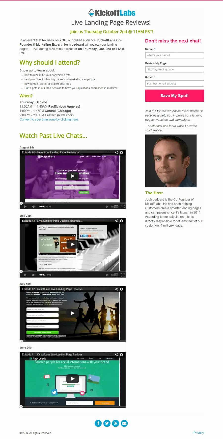 Instead of only using text on your landing page, create a video that sells potential users. This can also help on smartphones and mobile devices. It’s easier for people to watch a video on their phone instead of scrolling through a long landing page full of text.
5 – Limit Number of Places Or Seats
One of the oldest tricks in the book is to limit the number of available places or seats to an event. It seems counter productive, but if properly executed the perceived exclusivity and urgency can drive people who are on the fence to take the plunge and hand over their details. 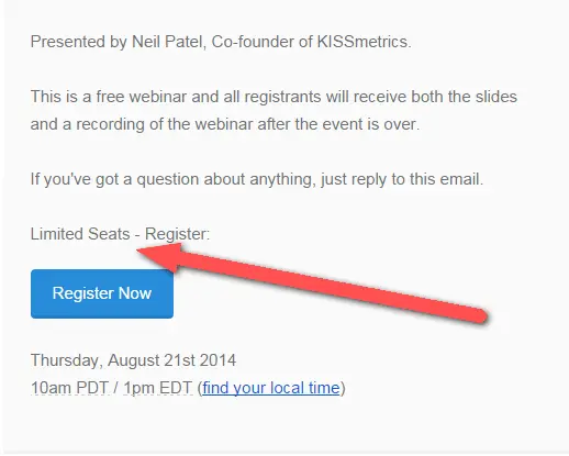 Everyone wants to be a part of an exclusive group and will jump at the first opportunity to join one including your webinars. Start small so the webinar fills up. As your webinars grow in popularity, slowly increase the number of seats always making sure that it fills up.
Conclusion
Take these tips and apply them to your landing page to see real improvements in your conversions. They’re simple things for the most part, but we’ve seen that they can really help.
If we come across your landing page and you’ve not taking our hints on board, you’ll only have yourself to blame!
Avoid falling into this trap by getting your page professionally reviewed by us for FREE during our next webinar.
How convenient is that? Just head over here and submit your page: https://kickofflabs.com Get Your FREE Landing Page Review{.btn.btn-lg.btn-primary.btn-block}
Thanks for reading!
| -Josh Ledgard Co-Founder | KickoffLabs |
Header image source: David Jakes