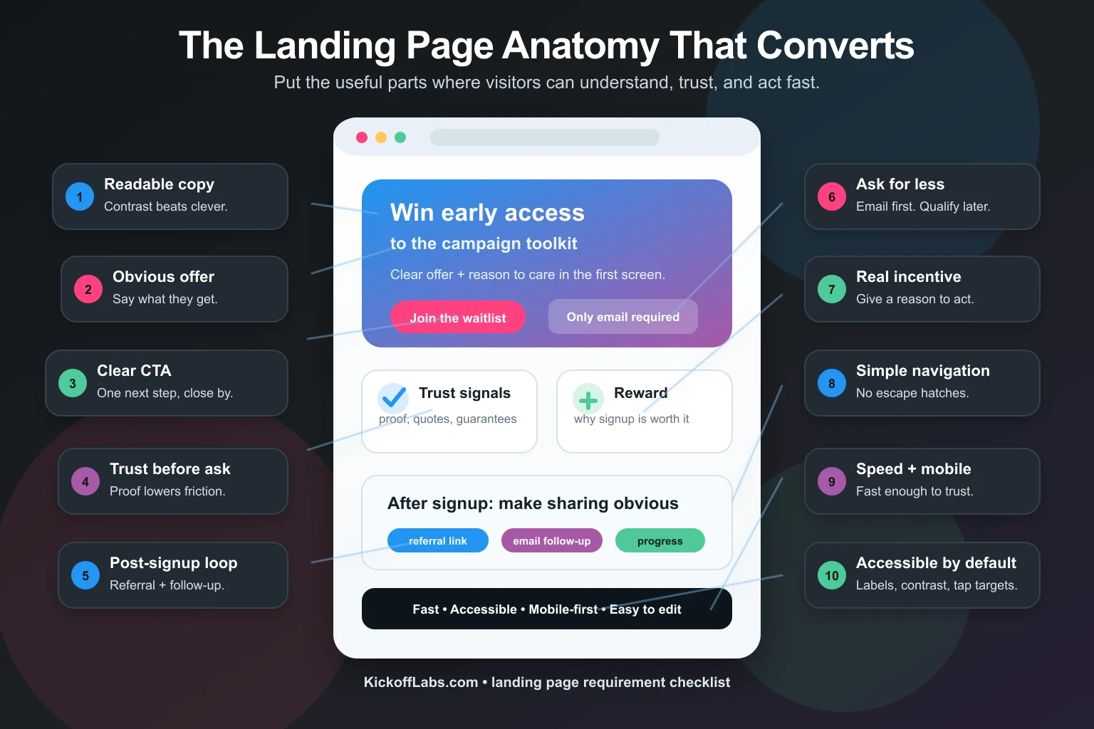
- What are the must-haves of a converting landing page?
- 2. Clearly state the offer
- 3. Give people a reason to sign up
- 4. Make the call to action painfully obvious
- 5. Ask for less information
- 6. Make visitors feel something
- 7. Build trust before you ask for action
- 8. Use visuals that support the copy
- 9. Keep the page simple
- 10. Keep landing pages fast
- 11. Use landing-page-friendly navigation
- 12. Make the page accessible and mobile-first
- Complete landing page design requirements checklist
- Build a high-converting landing page with KickoffLabs
Most landing pages don’t fail because the background image is wrong.
They fail because the visitor can’t answer three questions fast enough:
- What is this?
- Why should I care?
- What do I do next?
AI summary: A good landing page in 2026 needs readable copy, one obvious offer, a clear call to action, trust signals, strong visuals, fast load time, accessible forms, and mobile-first design. If the page makes people think too hard, asks for too much, or buries the sign up form under clever design, it will lose conversions.
The rest of our landing page design guide gets into fonts, colors, and layout details. This article is the practical requirements checklist.
Use it before you publish a giveaway landing page, waitlist page, email opt-in page, or any campaign page where the goal is to turn attention into leads.
What are the must-haves of a converting landing page?
If people have to squint, they leave.
That sounds obvious. It is also one of the most common landing page mistakes we see. A founder picks a beautiful background image, drops light text over the busy part of the photo, and then wonders why nobody signs up.
Your design has one job: help the offer land. If the design makes the words harder to read, the design is losing.
Fix readability before you fix style
Start with these basics:
- Use enough contrast between text and background.
- Put text on simple backgrounds, overlays, or solid sections.
- Keep body text large enough to read on a phone.
- Avoid thin fonts on image-heavy sections.
- Read the page outdoors on your phone. If it fails there, it fails in the real world.
On KickoffLabs you can use section backgrounds, text colors, overlays, and font-size controls to keep the message clear.
Please, I beg you: make the words easy to read before you worry about making the page clever.
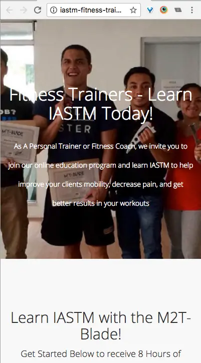
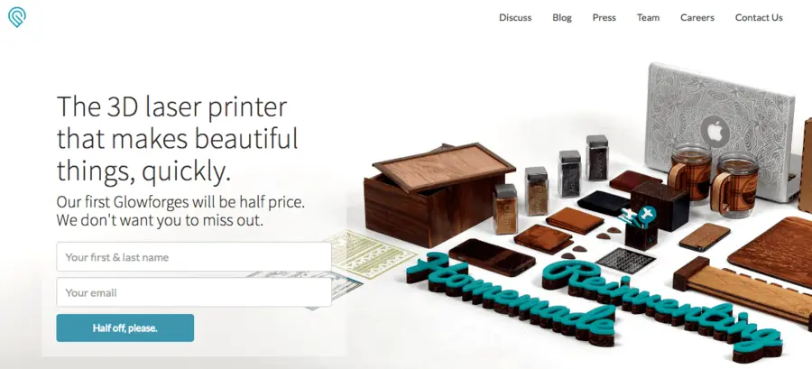
2. Clearly state the offer
Your visitor does not know what you mean.
You have been living with the idea for months. They just landed from an ad, a social post, a referral link, or a search result. Assume they know nothing.
The top of the page should tell them exactly what they get.
Bad offer copy sounds like this:
Join the future of wellness.
Better offer copy sounds like this:
Enter to win a free year of at-home personal training.
The second one wins because nobody has to decode it.
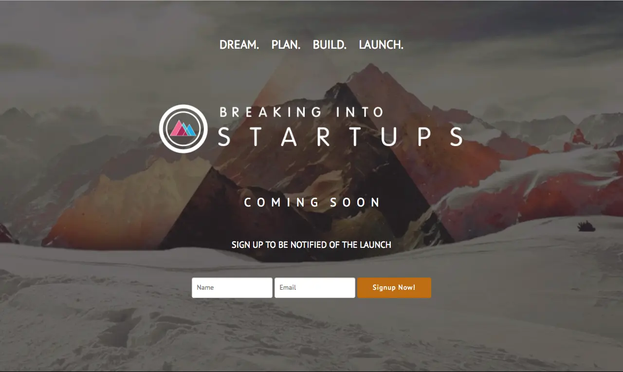
Do you know what is being offered here? Maybe a startup course. Maybe a community. Maybe a book. Maybe something else entirely.
That uncertainty is expensive.
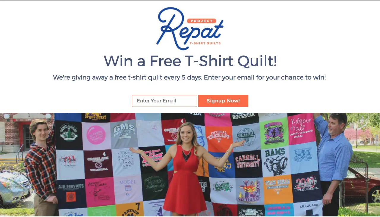
This one is obvious. They are giving away free t-shirt quilts every five days. The image supports the offer instead of competing with it.
Before you publish, send the page to ten people who do not know your campaign. Ask, “What do you think I’m offering?” If they can’t answer in one sentence, fix the page.
3. Give people a reason to sign up
A clear offer is not enough.
You also need a clear reason.
People protect their inboxes. They do not hand over an email address because your hero section is pretty. They sign up when the value is obvious.
That reason could be:
- Early access to a product.
- A chance to win a relevant prize.
- A discount or founder-only offer.
- A downloadable checklist, guide, or template.
- Bonus entries for sharing with friends.
- Status, exclusivity, or access to a limited community.
The thank-you page should repeat that reason and explain what happens next.
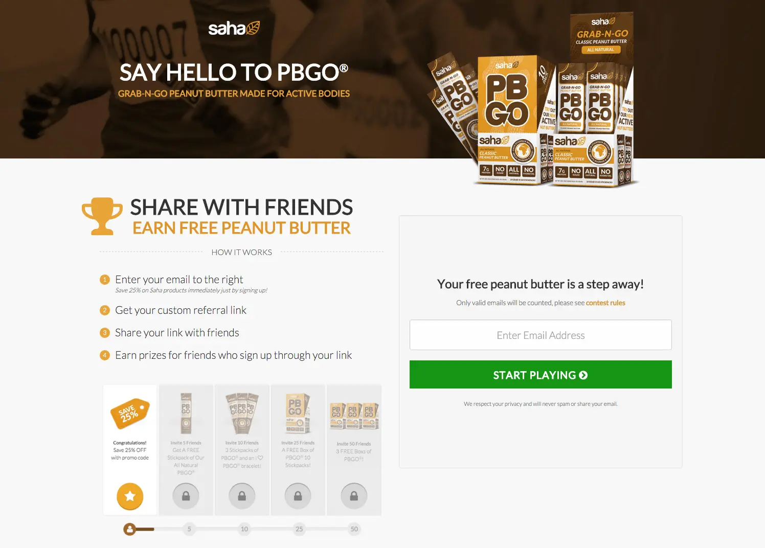
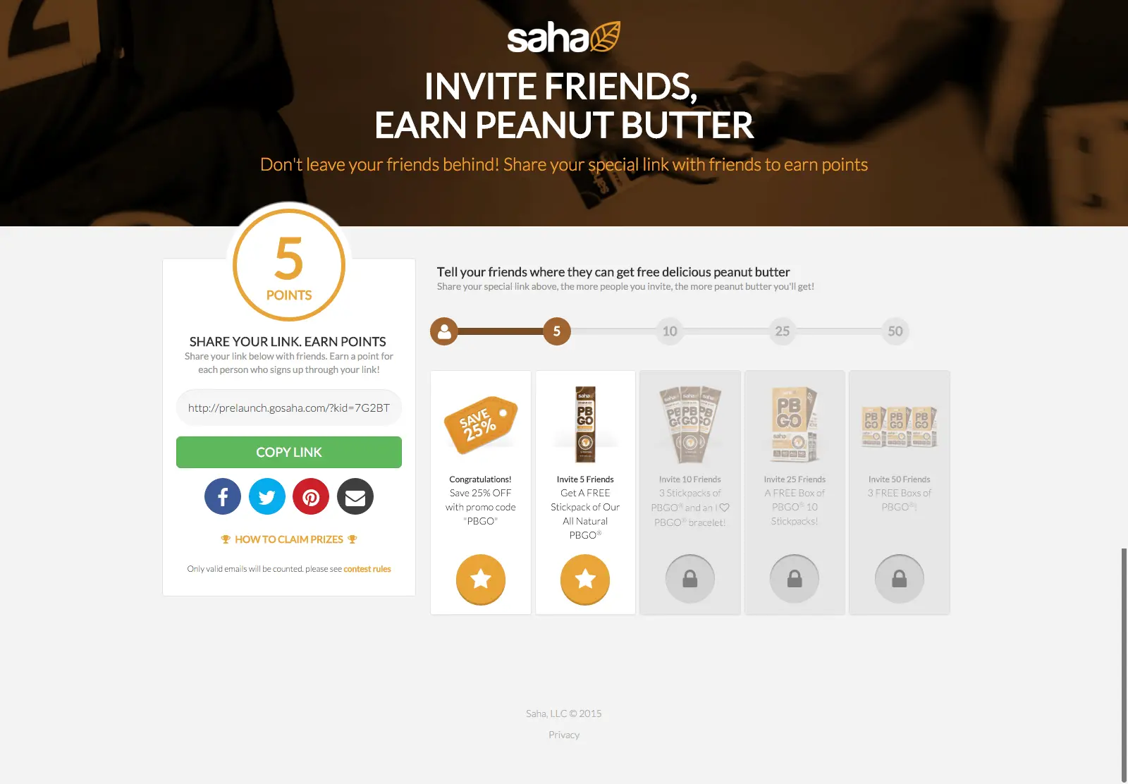
If you are running a referral campaign, this is where the page can do more than say “thanks.” Show the reward, the share link, the number of friends needed, and the next milestone. KickoffLabs handles this with referral tracking, reward levels, and campaign thank-you pages built for sharing.
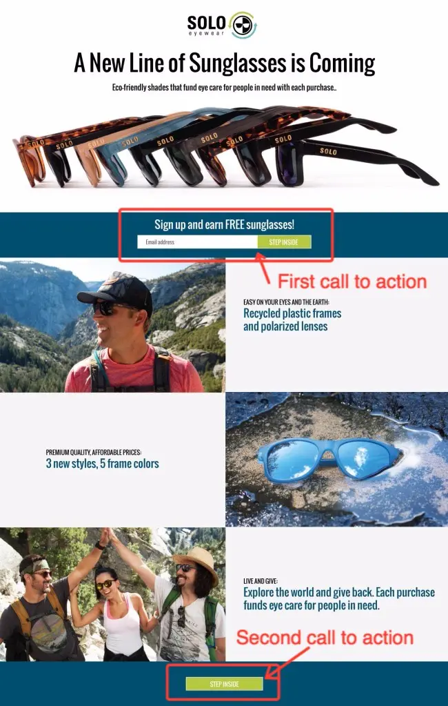
4. Make the call to action painfully obvious
Step back from your monitor.
Can you still see what people are supposed to click?
That is not a design joke. It is a good gut check. If your call to action disappears from ten feet away, it is probably also disappearing on a distracted phone screen.
A strong landing page CTA has four things working together:
- The visitor can read the page.
- The headline states the offer.
- The subhead explains why it matters.
- The form or button makes the next step obvious.
For most campaign pages, the next step is not complicated. Join the waitlist. Enter the giveaway. Claim early access. Get the guide.
Do not make the button say “Submit” if it can say something more useful.
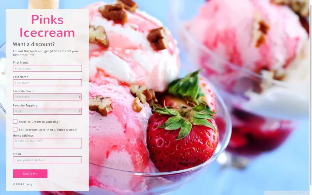
5. Ask for less information
Every extra form field is a tax.
Sometimes that tax is worth paying. Most of the time it is not.
If you are validating a product, collecting an email address may be enough. If you need segmentation, add one useful field. If you ask for phone, company size, job title, budget, shoe size, and mother’s maiden name, your conversion rate will have opinions.
Use this rule: only ask for information you will actually use in the next step of the relationship.
If you are running a dessert giveaway, asking for favorite flavor might make sense. If you are building a waitlist, you may only need email and maybe one qualifying question.
6. Make visitors feel something
A landing page is not a brochure. It is a moment.
Your visitor should feel excitement, relief, curiosity, urgency, or confidence. Pick the emotion that fits the campaign and design for it.
A waitlist for a serious B2B product should feel credible and useful. A sneaker giveaway should feel energetic. A founder validation page should feel honest and early, not like a fake enterprise site pretending to be bigger than it is.
The page does not need to be dramatic. It needs to be specific.
Generic pages get generic reactions.
7. Build trust before you ask for action
Trust is not decoration.
If a visitor feels like they landed in the internet’s red-light district, they are gone. Good design helps, but explicit trust signals help even more.
Useful trust elements include:
- Customer testimonials.
- Real product screenshots.
- Press or partner logos, if you have permission to use them.
- Clear rules and eligibility for giveaways.
- Privacy language near the form.
- A real company name and contact path.
- Proof that the prize, launch, or offer is legitimate.
For contests and giveaways, trust also means rules. Link to your terms. Explain eligibility. Tell people when the winner is selected. If you need a primer, read our contest law best practices and USA giveaway laws guide.
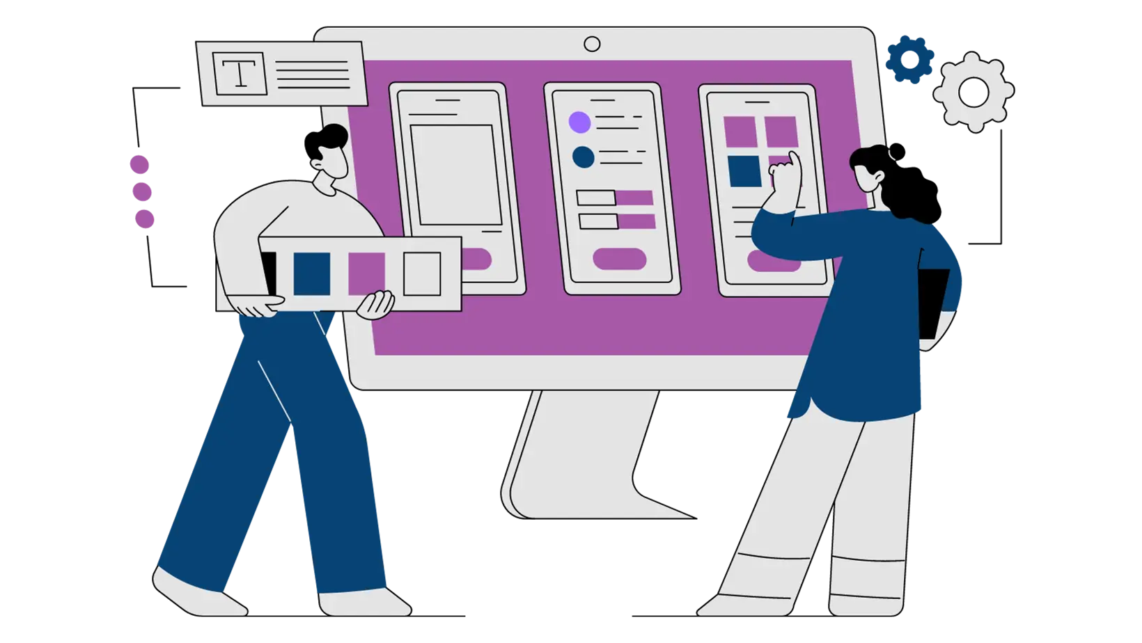
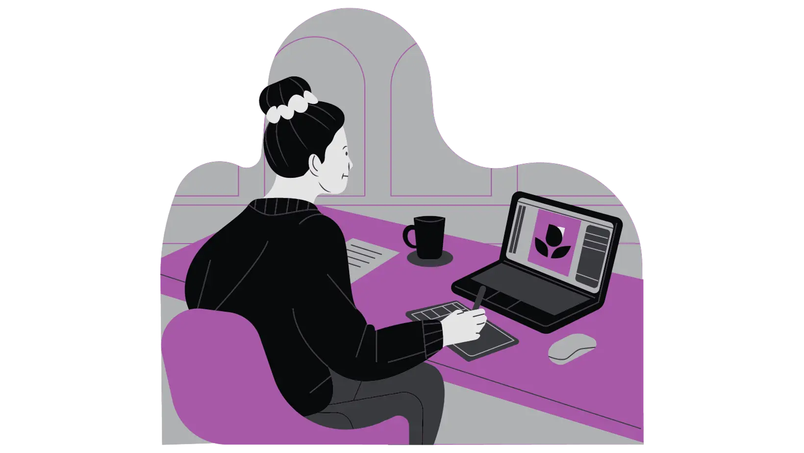
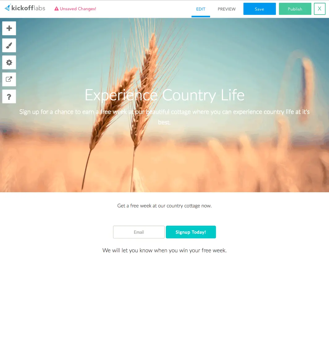
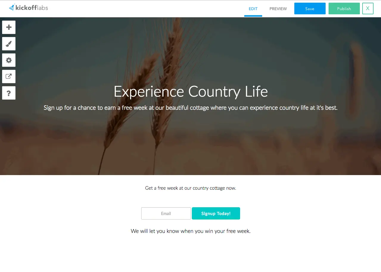
8. Use visuals that support the copy
A visual should make the offer easier to understand.
It should not be there because the template had an empty image slot.
Strong visuals include:
- A product mockup.
- A prize photo.
- A simple UI screenshot.
- A founder video thumbnail.
- A before/after outcome.
- A diagram showing how referrals or rewards work.
Weak visuals include:
- Random stock photos.
- Abstract illustrations that do not connect to the offer.
- Busy background images behind important copy.
- Screenshots that are too small to read.
If the copy and image can each stand on their own, you are in good shape. If the copy requires the image to make sense, or the image contradicts the copy, fix it.
9. Keep the page simple
Repeat after me: simple is better.
Your landing page is not the place to prove you thought of every possible objection. It is the place to move one person to one action.
That means:
- One primary CTA.
- One clear offer.
- One dominant visual direction.
- Short sections.
- No mystery navigation.
- No animations that fight the message.
You can always A/B test more detail against less detail. KickoffLabs makes landing page A/B testing practical because you can launch variations without rebuilding the whole campaign.
A/B test shorter pages
Try shorter versions until performance drops.
That tells you what people actually needed to make the decision. Not what your internal team felt emotionally attached to.
Cut copy to keep attention
Your visitor’s attention is limited.
Cut words, images, widgets, and sections until the core message is obvious. If a section does not help someone understand the offer, trust the offer, or take the next step, it is probably furniture.
Give the page room to breathe
Crowded pages feel stressful.
Use whitespace, section breaks, and clean hierarchy. Let the headline be the headline. Let the form be the form. Let the eye move without fighting ten competing elements.
Limit font changes
Use one or two fonts. That is enough.
If you are not a designer, pick a clean readable font and move on. Typography rabbit holes have swallowed better founders than you.
Limit distracting animation
Animation should clarify, not perform.
If a motion effect slows the page down or pulls attention away from the form, cut it. Your conversion rate will not miss it.
10. Keep landing pages fast
Speed is a design requirement.
A slow page is a broken page, especially on mobile. Heavy images, third-party scripts, and bloated frameworks can kill the campaign before anyone reads the headline.
Do this:
- Optimize image size. Do not upload a 20MB image because it looked great in a design file. Use web-ready images.
- Reduce requests. Every extra script, widget, and image adds friction.
- Avoid unnecessary frameworks. Use the simplest implementation that gets the job done.
- Prioritize above-the-fold content. The first screen should load fast and explain the offer.
- Minimize redirects. Do not make the visitor bounce through link shorteners before they reach the page.
If your campaign depends on paid traffic, this matters even more. Slow pages burn budget.
For more cleanup ideas, read 14 ways you are driving people away from your landing pages.
11. Use landing-page-friendly navigation
Your normal website navigation is probably too much for a campaign landing page.
A campaign page should not invite people to wander through your About page, blog archive, careers page, and footer maze before they sign up.
Use reduced navigation when the goal is conversion:
- Keep the logo.
- Keep a privacy/rules link where needed.
- Remove distractions that compete with the CTA.
- Add a secondary “learn more” link only if it helps qualified visitors decide.
This is especially important for pre-launch waitlists and giveaways where the campaign has one measurable goal.
12. Make the page accessible and mobile-first
Mobile-first is not optional.
If you promote a giveaway or waitlist through social, a lot of your traffic will arrive on phones. The page needs to read well, load fast, and work with thumbs.
Check these before publishing:
- The headline fits on a phone without becoming a wall.
- The form is easy to complete with one hand.
- Buttons are large enough to tap.
- Inputs have labels.
- Images have useful alt text.
- Color contrast is strong.
- Keyboard navigation works.
- Video has captions when audio matters.
- Nothing auto-plays in a way that blocks the experience.
Accessibility is not just compliance. It makes pages easier for everyone.
Complete landing page design requirements checklist
Before you publish, run this list:
- The copy is readable on desktop and mobile.
- The offer is clear in the first screen.
- The reason to sign up is obvious.
- The CTA is visible and specific.
- The form asks for only what you need.
- The page creates the right feeling.
- Trust signals are present.
- Visuals support the copy.
- The layout is simple.
- The page loads fast.
- Navigation does not distract from the goal.
- The page is accessible and mobile-first.
If you only remember one thing, remember this: design less.
Start with a simpler template than you imagined. Write a clearer headline than you want to admit you need. Remove anything that gets between the visitor and the sign up.
Build a high-converting landing page with KickoffLabs
You do not need to start from a blank canvas.
KickoffLabs gives you campaign-ready templates, referral tracking, reward levels, email follow-up, analytics, and publishing tools built for pages that need to convert.
Start here:
- Landing Page Templates — pre-designed templates for campaigns.
- Contest Landing Page Builder — drag-and-drop editing without coding.
- Giveaway Landing Page — launch a sweepstakes or contest.
- Waitlist Landing Page — validate demand before launch.
- Reward Levels — turn signups into referrals.
- Email Marketing — follow up after people join.
A landing page is not art class. It is a machine for turning attention into action. Build it that way.
Read more Landing Page Design with the next chapter:
3. Fonts & Colors
Learn how to choose the right fonts and colors for your landing pages.