Do you have a website with lots of visitors but no conversions? Are people coming to your site but turning back around just as quickly? The reason may be that you’ve over-designed your site with confusing elements and conflicting calls to action.
Let’s begin with this mantra: good design is invisible. It’s not just about how your website looks, it’s also about how it works.
When a visitor comes to your site, their first priority isn’t to be impressed by your dazzling fullscreen background video or wooed by your multiple newsletter opt-ins. The most important concern for your visitor is to find the content that they’re looking for in the simplest way possible. Your most important concern is to get the visitor to buy what you’re selling, whether that’s a product, a service, a webinar, a contest, or a community.
Good design is about connecting what you want with what your visitor wants. And yes, it should be subtle.
Put yourself in the shoes of a first time visitor. When they visit your website or blog, are they able to easily find what they’re looking for? Or do they need the powers of telepathy in order to locate a specific page?
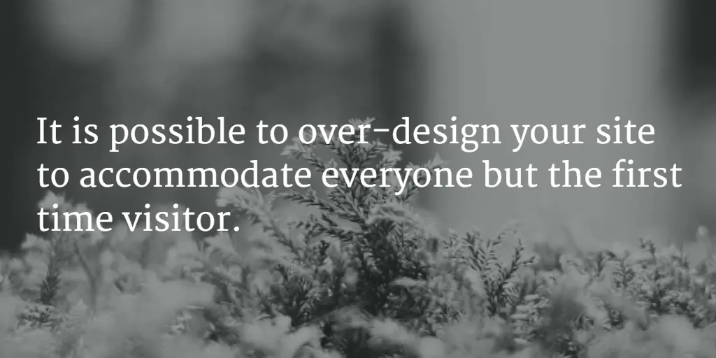
While having a beautiful website design is surely welcomed, it is possible to over-design your site to accommodate everyone but the first time visitor. Every first time visitor arrives on a website in a slightly dazed and confused state. The last thing they need is to be bombarded with a bunch of arrows that point them in opposite directions.
By the way, be sure to check out our free list of resources for boosting your conversions with thoughtful web design.
Let’s start by answering these questions:
-
Is your sidebar cluttered with irrelevant ads, webinar opt-ins, ebook offers, tag clouds, archives, and other eye sores that are competing with each other and your blog post for attention?
-
Do you have more than one call to action on your landing page?
-
Do you automatically cater to more than one type of audience on your site?
If you answered yes to one or more of these questions, your site is over-designed. But the good news is, it’s not too late to rescue your site. Let’s take a look at the different ways that you could be over-designing, and what you can do instead to boost your conversion rate.
Are You Designing For Everybody?
Some of the best and brightest brands have over-designed websites. Why? Because they’re unclear about their target audience and are trying to appease too many visitors with one single design. Ideally, you’ll have one target audience in mind for each separate page. That’s the person you’ll speak to with your content, your tone, your images, and your product or service.
When you’re speaking to too many different people, it creates a lack of focus. You have blog posts for different targets, but no clear separation. If a visitor arrives on your home page via a Google search, they don’t know where they fit in because your site caters to everyone.
So, what do you do if you’re targeting more than one audience?
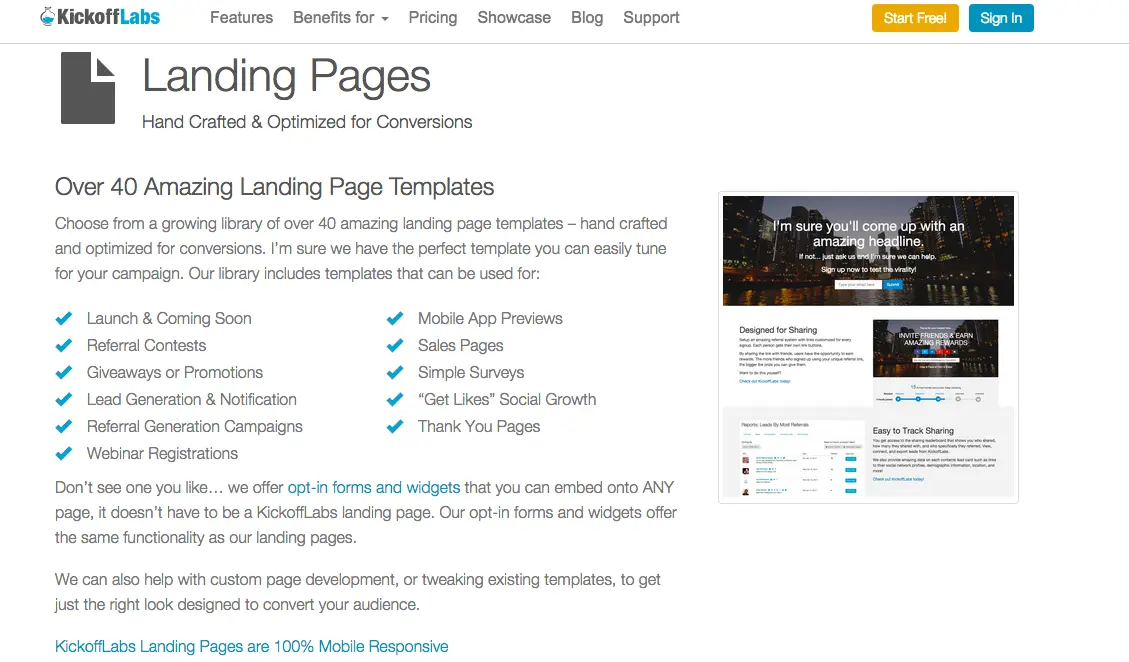
Solution: Create multiple landing pages. Landing pages aren’t just for coming soon notifications. You can, and should, use them to speak directly with each target audience.
Let’s say you market to freelancers as a whole, but you further segment into two groups: wedding photographers and graphic artists. Although the two groups share common pain points (unsure how to find clients, unsure how to market themselves), they also have different needs (needing to take credit card payments in person vs. setting up an online store to sell art).
The best way to get each group to your site is to target each group individually. And the best way to do that is through a landing page, not just your brand keywords.
A well crafted landing page will improve your search engine ranking for a specific keyword or phrase. You can increase the odds that a visitor who searches for that specific phrase will land on the page you created just for them. This means that your visitor won’t need to follow a long and winding path simply to find what you offer them.
Does Your Page Take More Than Four Seconds to Load?
If your page takes more than four seconds to load, don’t think that the “page load” spinner animation is saving it.
If your design requires an interstitial page load element, the results had better be worth the 4 seconds you have to grab someone’s attention.
Generally, you’ll see this page load element on pages with lots of large images and fancy animations. When we’ve tested these types of pages against simple pages that load instantly, fancy loses. Getting people the information they want more quickly trumps any fancy effects.
Do you have rotating headline text?
We see this with carousels or rotating image galleries. People often rotate text with each image to make a point. I think it’s because they are trying to serve several different audiences with one page instead of having a page designed for each audience, or coming up with a great tagline that fits all your audiences.
Generally having one static headline– that’s readable– converts better because it’s less distracting for the reader and allows them to focus. If you have four headlines you think are important consider putting them in order down the page and creating a unique “learn more” page designed to speak specifically to that individual audience. People will find them.
Check out what Apple does on the rotating image for the Apple Watch landing page.
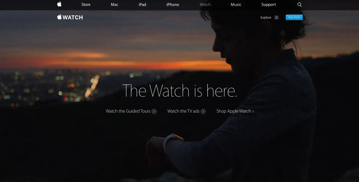
The text remains static while the image slowly rotates. Also note that, other than the top images, there are no other animations on the page. The text is also readable on top of ALL the images they use. Which leads to…
Can You Read the Text Without Struggling? What About from 10 Feet Away?
People will often choose a great looking background image that sacrifices the readability of the headline. For example, white text on top of clouds is hard to read. Your job is to make it easy for people to quickly scan your landing pages. They shouldn’t work against the reader.
Do text and images fade in as people scroll down?
We see this on longer form landing pages or single page sites. This type of animation is distracting. It prevents people from scanning the text on your landing pages.
Most pre-built designs don’t get animations right. It takes a lot of effort to deliver web animations that enhance the content as opposed to simply obscuring it. For an example of a company that does subtle animations and parallax properly, check out the Apple landing page for the new Macbook.
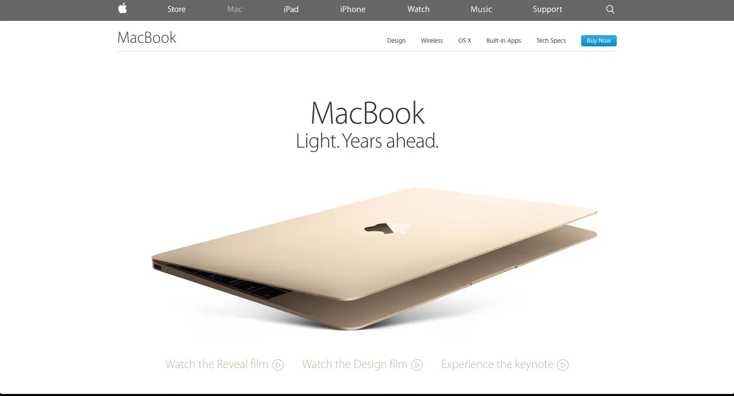
Some things to notice on this page:
- There is no loading progress bar before the page loads.
- The TEXT is instantly visible. You can scroll and scan the page.
- Most of the images are already partially visible. They simply slide in or rotate as you move around the page. This means nothing flashes at the reader while they are reading the text. The images are purely complimentary.
If you don’t have the design resources to custom build animations for your product and message then all the fancy sliding/fading/rotating on your page is probably lowering your conversion rate. Remember that fancy animations are not required for your site to look good or convert well. Text content is king.
Not convinced? Try an A/B test an animated version of your page against a static version. What have you got to lose?
Do You Have Too Many Calls to Action?
After you’ve reeled your visitor in with an optimized landing page, are you giving them with too many options for where to go next?
Is your landing page part of the 48% of landing pages with more than one call to action? Are you asking for people to sign up for your upcoming class and join your mailing list?
Once visitors land on your blog, are they intimidated by your overly-crowded sidebar? Do you really need a blogroll, 10+ advertisements (mostly for your own ebooks), and several opt-ins for your free webinars?
It’s exhausting.
Although you’re excited about everything you’re offering, your visitor isn’t. They’re on your site for one reason: to learn more about the topic that they’re browsing. That makes it easy for you to tailor your design to their needs.
Solution: Say goodbye to the sidebar. Say hello to pop-ups.
Get rid of the sidebar? Blasphemy! Or is it? Consider these big name brands that do just fine without a sidebar: Buffer, Boagworld, and Squarespace, just to name a few. (And we’d like to humbly submit our name to that group as well.)
Instead of relying on the sidebar for your conversions, go with a pop up or exit intent widget to catch your visitors before they leave. And, what’s even better– you can optimize these pop ups to directly correlate with each specific blog topic.
Visitors who are consuming your blog will probably love an in-depth ebook on the same topic. Why not pitch one to them as they leave? Or, those who are perusing your online store may be tempted to buy when presented with a discount pop up as they’re leaving.
The Bottom Line
Don’t let design drown out your message. Erase everything with the potential to distract and discourage conversions. Remember that not everyone comes in on the homepage, so wherever they find you– you find them.
You’ll earn bonus points if your content can convince the visitor to explore your site even further.
Would you like our list of resources for boosting your conversions with thoughtful web design? Download it for free here.