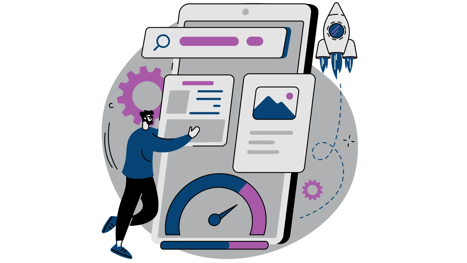
- 1. Slow page load times. People give up after 4 seconds.
- 2. Bombarding visitors with alternative offers and intrusive advertisements
- 3. Visitors seeing something unexpected and unrelated to what they came for.
- 4. Making visitors dig for what they came for with content that’s not skimmable.
- 5. Sending the wrong people to your landing pages
- 6. Filling your landing with poor grammar and terrible spelling mistakes.
- 7. Producing a lot of low quality content that’s hard to understand.
- 8. Making your landing pages hard to read.
- 9. Making your landing pages ugly.
- 10. Making the visitor feel like they are being scammed.
- 11. Using lots of attention grabbing images that steal the show from your call to action.
- 12. Not having a clear next step.
- 13. Asking for way too much information.
- 14. Pretending mobile devices don’t exist and everyone is always at their desktop.
- In review – Proper Landing Page Etiquette
- Build Your High-Converting Landing Page
Ever walk into a bar and know, very quickly, you shouldn’t order anything there?
I’m from a small town in Massachusetts. For a summer living outside of Atlanta, that simply made me a “northerner” or “yankee boy” to the locals so I had to pick my watering holes carefully in the evenings.
It was one of those nights the heat from the pavement was still radiating off the road well past sunset. Enough to make me sweat just walking from my car into a bar I’d just discovered. From the outside, I could see some TVs and a glowing sign for “Wings”. Sounds good, right?
Something was off as soon as I walked in the door. I was greeted by a large gruff looking dude wearing a confederate flag. The TVs were blaring NASCAR. Above the bar were five $20 confederate bills with a sign that said “Keep your confederate money. South gon’ rise again!” I’m fairly certain the bartender shot me a look and made proper use of the spittoon that was surrounded by peanut shells on the floor. This was probably not a good time to have been wearing my Boston Red Sox hat.
I took a deep breath and walked out. I’m sure the bar had a type… but it clearly wasn’t me. When I think back on it, there were all kinds of reasons I bounced… but what if I missed out on a great experience? Did I judge too quickly? What if I’d missed this?

Every day people have this same experience on your website. The question is: If you wanted more of them to stay and spend money… what could you do?
Your “bounce rate” is when people do this to your website. It’s the percentage of visitors who come to your landing page and leave without engaging with any content, filing out your opt in form, or clicking through to another page. It’s people who just saw the page they landed on and said “nope… that’s not for me.” You want this to be as low as possible. You want to keep people around, get them to engage, and take the next step down your sales funnel.
Ok. Great. So you know what the bounce rate is… but do you know what causes it? Here are the 14 most common causes of a high bounce rate.
1. Slow page load times. People give up after 4 seconds.
“I love slow web pages.” – said no one ever
Want to slow down your landing pages?
- Use the cheapest hosting you can find. You pay for what you get.
- Add a few of oversized images that can’t be downloaded quickly.
- Use too many images that distract from the copy on your page and cause too many requests on each page load.
- Use custom fonts that must be downloaded before anyone can even read the page.
- Add a lot of fancy sliders and javascript effects that must also be downloaded to work.
All of these factors can lead to slow page loads. The golden rule is that people are going to leave if you make them wait more than 4 seconds for a page to download. Two seconds or less is really the ideal.
How do you know if you’ve gone above 2 seconds? Use one of these two tools to see how quickly the average visitor might see your landing page.
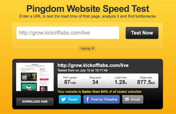
If you are over 2 seconds, you should consider looking for low hanging fruit of images, fonts, scripts, or content you could be cutting to lower the page load time. Sometimes less is more… unless you want people to bounce before you even had a chance.
2. Bombarding visitors with alternative offers and intrusive advertisements
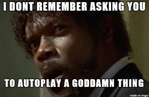
I love going to a page that might solve my problem only to be asked to watch a 30 second video that started auto-playing at the highest possible volume first. I stick around to the end of that experience just to see what happens. :)
Certain types of banner ads are also distracting, and they can reduce the amount of trust your visitors feel when on your site. Without trust, they are unlikely to provide you with email addresses, contact information, or payment info. Be careful of the kinds of ads you use: If your site is ad supported make sure that the ads are relevant to the visitor and related to the material on the page.
Intrusive advertisements will reduce the reputation of your landing pages and diminish the value of your content in the eyes of your visitor. If worthless pop-up ads appear within the first five seconds, the visitor is going to bounce higher than Chuck Norris on a trampoline.
Understand that the goal of each individual page is and make sure your ads and secondary calls to action aren’t getting in the way of that.
With our popup forms, you can capture attention at the right time without disrupting the user experience.
3. Visitors seeing something unexpected and unrelated to what they came for.
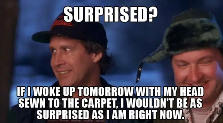
Not everyone likes surprises.
Let’s say you create an ad for “Amazing Dietary Supplements”, but your visitors land on a page that primarily promotes “Faster Weight Loss”. Now… the faster weight loss may indeed be a benefit to the supplements… but it was the supplements that people came for.
If the ad headline is not front and center on the landing page you created, you will have lost the trust necessary to facilitate a conversion and the visitor is going to bounce higher than the empire state building.
4. Making visitors dig for what they came for with content that’s not skimmable.
Headlines and subheadings help visitors scan blocks of text quickly. The content they expect to find should be located in the appropriate section. If they cannot spot the content by scanning the headlines or subheadings, they will not take the time to search your site.
People do not read online text in the same way they read a book. Your landing page is not Game of Thrones. Most people aren’t going to read it cover to cover. Imagine you are writing for Cliff Notes instead.

Visitors quickly scan blocks of text looking for useful and engaging content, but they will not spend a lot of time trying to locate it. Before publishing your text to the site, have a friend scan the content to see if they catch the most important points. You can also use sites like http://fivesecondtest.com and http://usertesting.com to get 3rd party opinions on whether or not people can quickly understand your pitch.
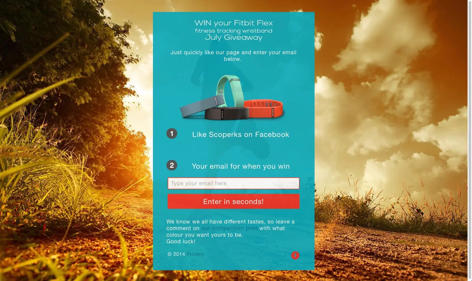
5. Sending the wrong people to your landing pages
This is right up there with giving visitors something they did not expect. If your landing page sells a product that’s targeted at private music teachers, but you advertise all over communities of public school teachers… you are close… but you’ve missed the mark.
Anyone with a budget can drive a ton of traffic to a landing page… the question is whether or not you can drive the RIGHT traffic to your landing page. The RIGHT traffic means visitors that are primed to convert because they:
- Are clearly within your target audience.
- Have been primed by your pitch before they came to the landing page.
- Ideally have been referred by a friend… because your landing pages make it easy for someone to share after the conversion. Did I mention that’s a specialty of ours at KickoffLabs?
![]()
The right traffic will almost be able to predict what your landing page says because they’ll be expecting it. You’ll earn their trust and their conversions.
Our giveaway campaigns and waitlist programs are specifically designed to attract and convert the right audience through viral sharing.
6. Filling your landing with poor grammar and terrible spelling mistakes.
I can’t spell. I’ve also got really bad grammar skills. We joke that we should just make that a thing with KickoffLabs. Every page should contain at least one spelling and one grammar mistake. Done properly it may eventually be endearing… Or it could just cause more people to bounce without even trying our service.
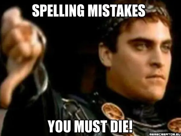
Visitors are looking for any reason not to buy what you are selling and give you their personal information or credit card. Don’t give them ones that are easy to avoid. If you are like me, you should probably employ someone that can actually speak proper English (or language of your choice) to review every written word you produce. There are also a lot of great proofreading services out there including:
7. Producing a lot of low quality content that’s hard to understand.
The quality of copy on your landing page goes well beyond the grammar and spelling. The copy needs to quickly communicate to the visitor that:
- You understand their problem.
- You have a solution that could be used to solve it.
- They need to just take the following next step.
If a visitor fails out at any of these checkpoints, they are going to bounce before they go any further.
8. Making your landing pages hard to read.
Any distracting elements can reduce the credibility of your site, which causes visitors to search for the nearest exit. Most common problems involve issues of legibility. For example, red cursive text on a black background will not read well, and certain kinds of fonts are also difficult to read. People scan content quickly online, so they will not want to work just to read lines of text.

9. Making your landing pages ugly.
A poor or unpolished visual design can distract visitors to your site, but it can also reduce the amount of time the person is willing to look at the page for purely aesthetic reasons.
We like to look at attractive things, and Web pages are no different from any other object. Attractive items will tend to keep viewers’ attention, and this is exactly what you want. Conversely, pages with bad design, few graphical elements and poor layout tend to provoke high bounce rates.
Now, this is not to say that good design will guarantee a great conversion rate. It doesn’t work that way. But I can say that poor designs will lower your conversion rate from your potential.
10. Making the visitor feel like they are being scammed.
Ever traveled abroad and been approached by people on the street who introduce themselves with the phrase “My friend… my friend… ” followed by their pitch. Did it occur to you that they may have jumped the gun on the use of the word “Friend”? These are probably people you want to avoid when you are traveling in unfamiliar regions. The same is true for visitors to your landing page.
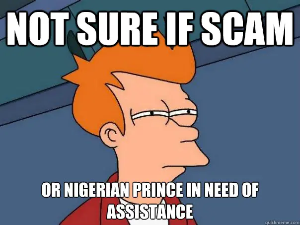
Within the first few seconds of arriving at a website, visitors will automatically scan for content and design elements that communicate:
• Credibility
• Safety
Many people focus on the overall content of the site to establish the reliability of the second item in the list above. The perceived safety of the site is related to the quality of the content and the appearance of the pages. If they communicate safety, the visitor will be encouraged to stay, explore and may even make a purchase.
If the visitor is not convinced that the site is credible, reliable and safe for any reason, they will bounce from the page within the first few seconds after arriving. The design of the landing page is critical to prevent this bounce rate from affecting your page rankings and future sales.
11. Using lots of attention grabbing images that steal the show from your call to action.
This falls under the concept of a poorly designed page, but I see it often enough that I need to call it out. People spend so much time curating stock art, background images, rotating sliders, thumbnails, and other images that steal attention.
When a landing page is filled with distracting images, it lowers the readability and therefore increases the bounce rate. Images are great, but should be combined with equally great copy that they reenforce with a visual.
12. Not having a clear next step.
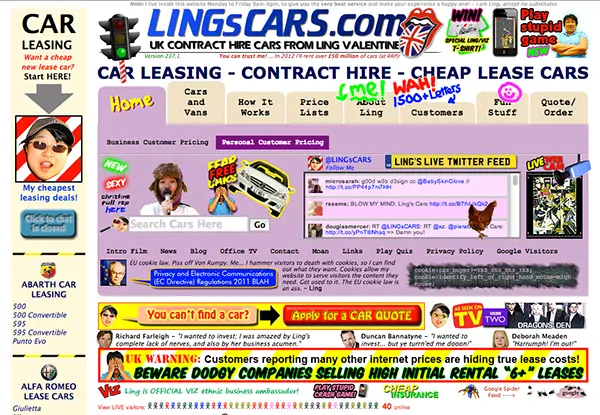
Let’s say you’ve avoided all of the advice so far… you still have a chance to increase your bounce rate by making your primary call to action hard to find. Having a clear call to action means the visitor knows quickly what their next step should be and where it is on the page.
You can’t miss the call to action in the landing page of the competition ran by this awesome UK Price Comparison site, and KickoffLabs customer :)
13. Asking for way too much information.
It’s just rude on a first date to ask for someone’s mother’s maiden name, social security number, bank account, whether they prefer ice cream or frozen yogurt, which side of the bed they want to sleep on, etc.
Your landing page is no different. As a general rule, you should not be asking for information that you are NOT going to actually use to help the potential customer on the next step of their journey.
You don’t need five different ways to contact everyone, but if you are selling desserts… you may want to know their ice cream preference… as long as you are going to start using it to provide them with more personalized offers.
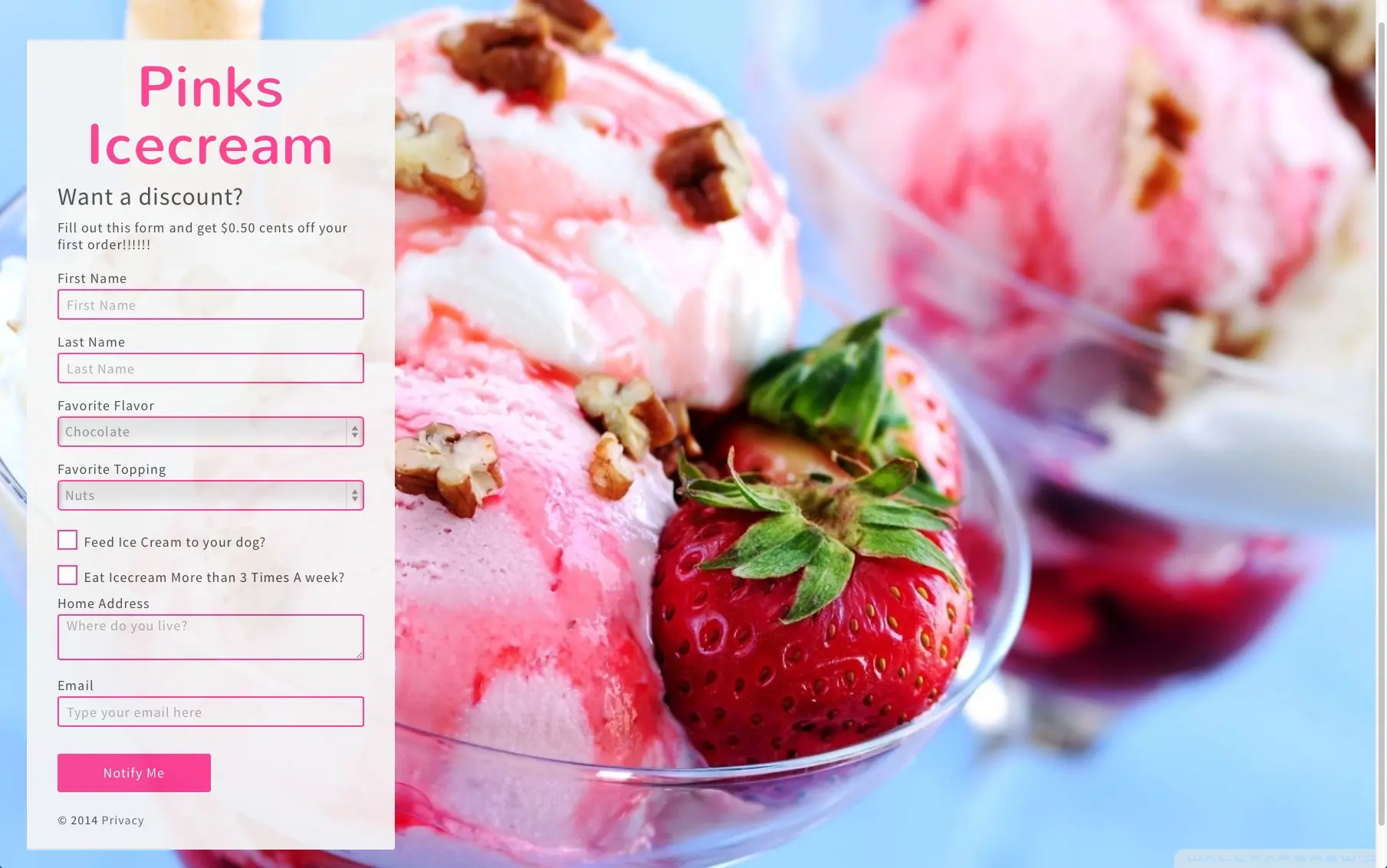
Now – that may not seem like much information… but when you consider the payoff… would you answer all those questions for 50 cents?
14. Pretending mobile devices don’t exist and everyone is always at their desktop.
You’ve heard the phrase “mobile first” right? If you want to scare people away, just ignore that. Make your landing pages unresponsive so that people have to scroll, pinch, and zoom around to fill out your opt in forms. I’m sure that strategy will keep working for another five years.
Did you know that 45% of our landing page traffic comes from mobile devices? Yeah… neither did I until I looked at our customer numbers. That means that to keep people engaged you have to prepare for that.
In review – Proper Landing Page Etiquette
That’s a lot to take in. Here is a checklist of things to review on your landing pages…
- Landing pages load under 2 seconds.
- You don’t bombard people with intrusive ads that distract from your primary call to action.
- Your headlines match the advertisement that promoted the landing page.
- Visitors can quickly find what they are looking for.
- You sent the right people to your landing pages.
- Spelling and grammar have been checked out.
- The content provided is high quality.
- The text is clearly readable across devices.
- The page isn’t so ugly it erodes trust. Ideally it’s well designed.
- The images don’t distract from the call to action.
- You avoid creating that icky “I’m being scammed” feeling.
- You have a clear next step for the visitor that doesn’t make them choose.
- You avoid asking for too much information that you aren’t going to use right away.
- Make sure you are ready for the “mobile first” world.
Think of each landing page as a social contact. You want to avoid certain behaviors all of the time, but this is especially important when constructing a landing page because this is where you create a first impression that will encourage the visitor to get to know you better.
One of the biggest problem I see on landing pages today is that the person publishing them looks for ways to cram more “stuff” on the page that isn’t helping with the conversion. Long form landing pages are great… but the focus of those pages is on the text copy and NOT:
- Fancy sliders with lots of images
- A huge navigation menu that links everything to your main site
- Pop-up polls
- SEO keyword stuffing
- Advertisements and secondary promotions
- Chat windows
- Click to call buttons (that aren’t primary calls to action)
- Fancy pants animations
- Social buttons and demands to “like us” before they even know what you are all about.
Simple page layouts can communicate a lot of information in a short period of time. Part of the process of simplification should involve removing all of the crap I mentioned above. This reduces the clutter, and it will make your text blocks easy to read.
Focus on what you really want the visitor to do on your landing page. Make sure all the copy, images, and call to action buttons are gently nudging people in that direction. Visitors will scan your landing page quickly to see if you have what they came to your site to find.
You need to make sure that they can find whatever they need quickly. By doing this, you may also be able to convince them to opt-in, pay up, or click through to the next page in your sales funnel.
Want our help lowering the bounce rate on your landing pages? Why not sign up for a free account, create smarter landing page campaigns, and see what we’re all about.
Build Your High-Converting Landing Page
Start with a proven template:
- Landing Page Templates - 100+ pre-designed templates
- Contest Landing Page Builder - Drag-and-drop editor
- Popup Forms - Capture attention at the right moment
Choose your campaign type:
Read more Landing Page Design with the next chapter:
7. Design Resources
Learn how to avoid common mistakes that drive visitors away from your landing pages.