Email marketing is great. It’s trackable, it’s personal, and you have far less competition when you’re inside of someone’s inbox. However, just getting invited to the inbox isn’t enough. If you really want to increase sales and grow your community, you need to get your subscribers to actually open your emails.
How do you do that?
I’m glad you asked. Here’s the very definitive (and only) guide you need to guaranteeing more opens for your various email campaigns.
Send at the Right Time

So, when’s the right time of day to send your emails? It depends.
I know– that answer sucks. You’ll have to test to find the right time for your subscriber base, but perhaps I can point you the right way.
Where do the majority of your subscribers come from? Are they mobile or desktop-bound?
Subscribers on desktop computers open emails in the morning, around 10 AM.
Subscribers on mobile devices (primarily smartphones) open emails in the late afternoon, around 4 PM. Click through rates are highest in the late afternoon, also.
The majority of emails are opened via smartphones. We’ll talk about how to optimize your mobile email experience a little later. Keep in mind that subscribers on mobile devices are more likely to read your emails when they’re away from work, generally on off-hours– almost at the end of the day or after work.

Send on the Right Day
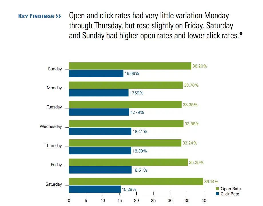
Have you given thought to what day of the week you send out your emails? You may think that Monday through Friday are the best times to send an email, and you’re not alone. Most businesses send emails during the weekdays, especially on Tuesday.
That’s why you should send your business emails on the weekends, starting with Friday.
Friday actually boasts the highest click through rate of the entire week. Click To Tweet
On Saturday and Sunday, people receive less business emails. This equals less competition in the inbox. Your subscribers are more likely to see your email and open.
However… click through rates are lower on Saturday and Sunday.
So, what does this mean for your email campaign?
On Saturday and Sunday, don’t send emails that depend on the subscriber clicking your call to action. Instead, during those days send email courses and other content where your subscriber can consume the content.
On Friday, send emails with calls to action.
Remember to test. What works for one audience won’t necessarily work for another.
Focus on the Sender Name & Email
if people don’t recognize you, they won’t open your emails. Always remind your subscribers who you are and where you’re from.
##
Tailwind does a great job at this. Take a look:
![]()
Melissa at Tailwind
Instead of just using Tailwind, this brand includes the sender’s name: Melissa at Tailwind. The subscriber can immediately identify the brand (in this case, Tailwind), but adding “Melissa” introduces a friendly, human component here.
While you don’t have to include your brand name, especially if it’s longer, I highly recommend using a personal “human” name as your sender name. It makes your email look like it was written by an actual person and not a marketing department. It’s less salesy and more folksy.
Use the Perfect Subject Line
Did you know that 64% of people open emails because of the subject lines? It makes sense, right?
But here’s some research that surprised even me. According to an Informz study the perfect subject line is less than 10 characters long. That equals approximately three words (three small words).
Three word subject lines only make up 1.6% of all email subject lines sent but they get way more opens than any other length. A subject line with 10 characters or less receives an astounding 49.73% open rates.
Why do shorter subject lines resonate so well?
It turns out that more people are opening via mobile devices. On smaller screens, space is limited. Only four to seven words from your subject line may be visible in a mobile email client. This makes it important to get straight to the point as quickly as possible.
But, I get it– it’s hard to come up with a three word subject line. That’s why you need to pair it with this strategy:
Optimize the Preheader
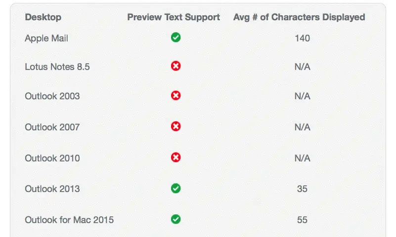
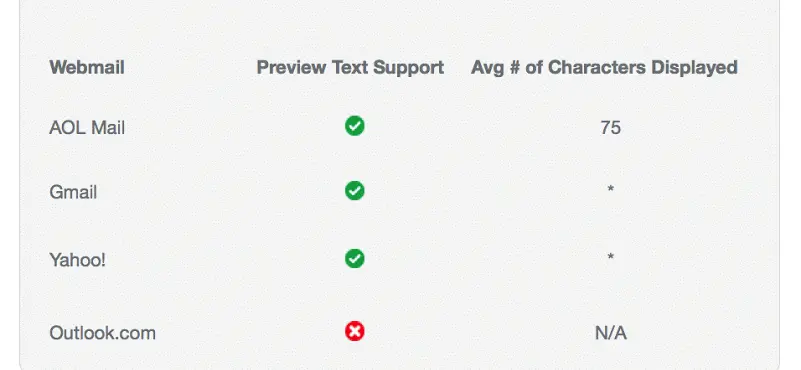
The preheader is the preview text shown right next to the subject line. It’s a snippet that subscribers use to pre-screen your email.

While not all email clients have preheader text, the majority do. Here’s a rundown of which email clients offer preheader text to their users:
On Desktops:

On the Web:

Next to your subject line, your preheader is the most valuable real estate you have to convince the subscriber to open your email.
You know from the above tip to keep your subject line short. Here’s where you can expound upon it and add more reasons to open it.
A lot of brands make the mistake of using the following as their preview text:
Having trouble viewing this email?
That’s a no-no for two reasons:
It implies that I’m going to have trouble viewing your email, even if that’s not the case. Remember, your subscribers use this text to pre-screen emails. With only a split second to make an impression, do you really want it to be a negative one?
It doesn’t preview the contents of the email. By not telling me what’s within the email, you’re wasting valuable “ad” space.
Instead, move that type of message toward the end of your email, and immediately launch into what value the subscriber will get upon clicking the email. This is your last shot– make it count.

Optimize for Mobile Opens
More emails are opened on mobile devices. Approximately 53% of email opens happen on smartphones. That’s more than desktop which hovers around 22%, and webmail at 25%.
Make mobile a priority.
Here are a few of my top mobile strategies:
Keep it short and targeted. No one wants to read a blog post on a smartphone. Three (short) paragraphs or less is optimal.
Don’t go crazy with images. I’m a plain email advocate because it’s simpler to load and consume.
Go bold with your text size. Don’t use anything less than 14px for body content and 22px for headline text.
Optimize for the Email Client
As we discussed earlier in the pre-header section, your subscriber’s email client can affect how they receive and interact with your email campaigns.
Your email should be optimized for the email client your subscribers use. For smartphone users, Apple’s iPhone Mail App is prom queen. For desktop users, Outlook is the undisputed champion. For web-based users, Gmail is the belle of the ball.
Take a look at what systems your subscribers use and plan accordingly. Some clients don’t recognize background images, for example. The answer is: test, test, test.
Have you tested your campaigns to make sure that they look good on these clients?
Even if you prefer to send an HTML email, it’s a good practice to create a plain text version also. This can help you avoid the dreaded spam filter that snags many beautiful emails.

Segment for the Win
A segmented email lets them know you care.
What is a segmented email? It’s an email that’s been crafted for a specific group. It’s not just a general email that you send to every soul on your email list. Instead of spraying your entire list, you’ve taken the time to split your email list into groups, or segments. You can split them up by any number of identifying factors, such as demographics or open rates.
Then, you can create emails that are highly targeted to one group. For example: you can send all of your subscribers in Canada a special message that coincides with a holiday celebrated in Canada like Boxing Day.
You can also create personas and then send emails targeted to these groups, depending on what you’d like to accomplish from each group.
Segmented emails have higher engagement rates. It turns out that emails sent to a group of less than 100 subscribers have the highest open rates. So, it doesn’t matter how big your list is– it does matter how targeted your email is.
Over to You
Try one or all of these email strategies in your next campaign and let us know how well it worked for you.