- 1. Make the Copy Readable
- 2. Clearly State The Offer
- 3. The Call to Action Should Be Clear
- 4. Visitors Should Feel Something
- 5. Develop Trust
- 6. Use Strong Visuals that Compliment the Copy
- 7. Keep Your Page Simple
- 8. Keep Landing Pages Snappy with Fast Load Times
- 9. Implement Reduced or Friendly Site Navigation on Landing Pages
- 10. Landing Pages Should Follow Your Brand’s Design Consistently
- 11. Ensure your Landing Pages are Accessible
- 12. Make it Mobile Optimized
- Complete list of Landing Page Design Requirements
In this article, I’m going to walk you through some principles to keep in mind when you’re creating landing pages for your contests. These principles will shape the design of your page and are the foundation to a beautiful and effective landing page. The rest of our landing page design guide will get into the details of the design itself.
For now, let’s start with landing page design principles and requirements to keep in mind.
It’s important to remember that as much as your landing page feels like it’s meant to be yours, it’s not. A truly appealing and effective landing page is meant for your customer. What does this mean in practical terms?
1. Make the Copy Readable
When your customer lands on your page they must first be able to read the words on your page. I know this may sound obvious but, trust me, for a lot of people, it’s not.
Notice how some words are hard to read? Just trying to read the words causes a little bit of strain. I see this all the time. You want your customers to be able to see your image, but it’s much more important for them to be able to read the words on your page.
Tips for Fixing Readability
On KickoffLabs you have a number of controls to allow you to add enough contrast so that your customer can always see the words on your page. If you have an image in the background you can choose the color overlay to make sure there’s enough contrast with your text to make it readable.
You can also choose the background color for any section on your page (in Part 2 we talk about how to not over-do this). Remember the purpose here is to make sure the text on your page can be read by your customer.
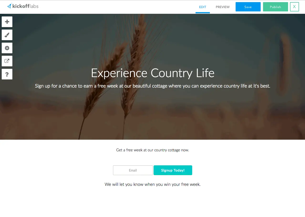
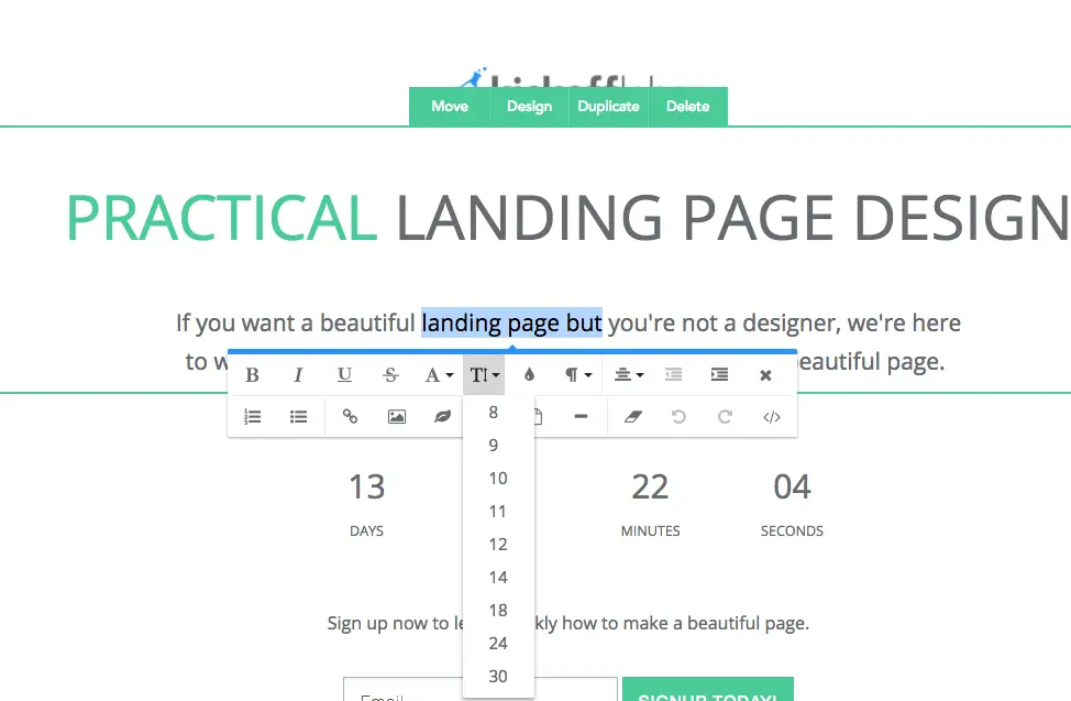
You can choose the color of the text on the page.
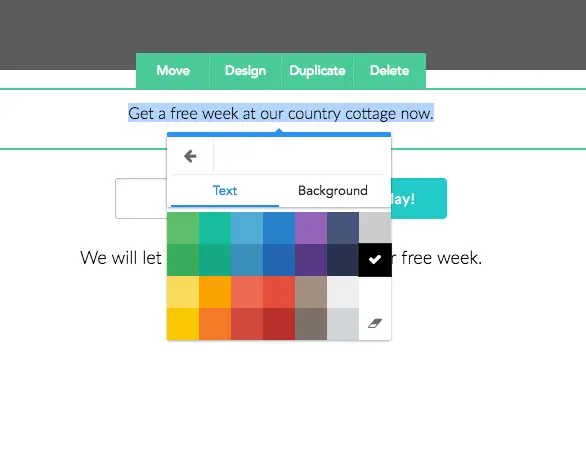
And the size.
Please, I beg you, make sure your customer can easily and without any effort read the words on your page.
2. Clearly State The Offer
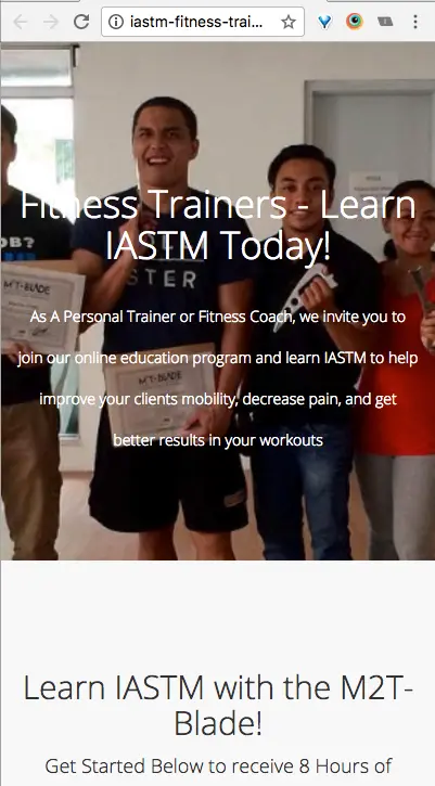
Now that your customers can read the words on your page they need to understand what you’re offering them. I know YOU know what you’re offering, but they don’t. Assume that they have no idea who you are and what you offer. Clearly state what it is you’re offering them or what they would be signing up for.
![]()
Do you know what is being offered here? Me neither. I have a general idea it has something to do with building a startup but I don’t really know if it’s a course, a community, a book, or something completely different.
![]()
Do you know what is being offered here? Yes, they are giving away free t-shirt quilts every 5 days. It looks like they also sell t-shirt quilts. Cool.
Not only did the words make it clear what they are offering but the image helped communicate and support the text on the page. The image you use can either help communicate your offering to your customer or confuse them.
Make it completely obvious to anyone coming to your page what you’re offering them. Share your page with 10 people who don’t know what you do and ask them what it is you’re offering. Without helping them (I know you’re going to want to, but resist!) see if they can answer you correctly.
Why They Should Sign Up
With those fundamentals out of the way, let’s get to what will make the difference between a mediocre landing page and a truly exceptional one. Ensure that your design clearly communicates WHY your customer should sign up. I know you want them to, but why should they WANT to put in their email and give you their attention and time? It must be worthwhile enough to them.
Giving something worthwhile away as a reward is a great incentive. Ask yourself what will entice them to sign up and make it something they don’t want to miss out on.
![]()
This holds true for your thank you page as well. After your customer signs up re-iterate on your thank you page why they signed up and why they should share this with their friends.
![]()
If they invite 5 friends what will they earn here? Free grab-n-go peanut butter! This is why they signed up in the first place and it’s reinforced here. The reward will probably make them want to share this with their friends.
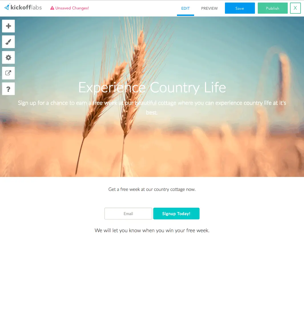
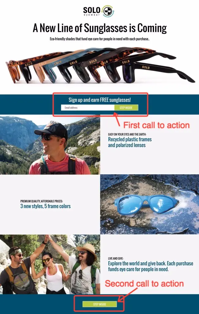
3. The Call to Action Should Be Clear
Let’s take a step back and look at one more very important and subtle principle you need to make sure you get right on your landing page. Litteraly. I go 10 feet back from my monitor and ask myself if I can see the call to action on a landing page!
Follow this logic with me for a second. You’ve ensured that your customer can read the words on your page. You’ve made it clear to them what you’re offering AND why they should sign up. Now you need to make sure they know with absolute certainty what action they need to take next. Make it easy and clear. Make it obvious and enticing. Simply stated, make sure it’s completely clear.
![]()
All of the principles we’ve covered you can see on this image on just three rows.
- You can read the text on this page.
- The first line states what is being offered: a 3D laser printer.
- The second line states why they should sign up: sign up early and get it for half the price.
- Now the obvious next step is to sign up.
The action you want them to take is what is referred to as, a “call to action”. Makes sense, right? What do you want them to do when they get to your page? Sign up, click on a link, something else? For landing pages it is almost always to sign up.
Your call to action should be close to the WHAT and WHY part of your page. If you have a long page include one form at the top right next to the what and why and an additional call to action throughout the page.
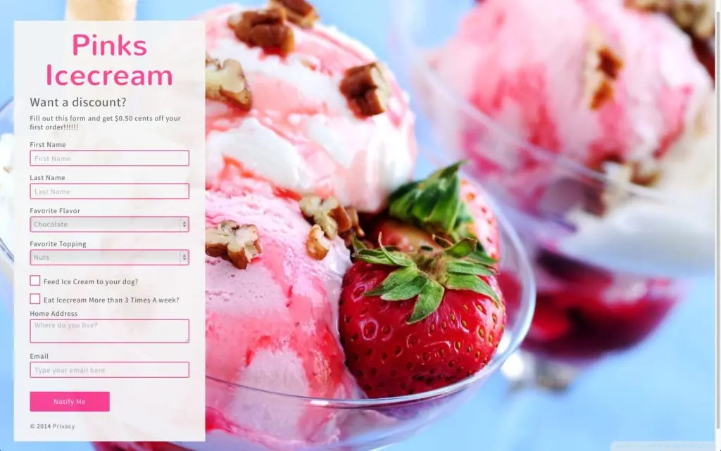
While we’re talking about your call to action remember to not ask for too many things. You should ask for one to two things at most and if you absolutely have to you can ask for a third thing. Most of the time you should just ask for their email. At KickoffLabs, on our Premium plans and up you get Magic Contact Data. This is awesome because with just an email address the Magic Contact Data will provide you with tons of other information about your customer: their name, gender, location, social networks, and much more.
As a general rule, you should not be asking for information that you are NOT going to actually use to help your potential customer on the next step of their journey.
You don’t need five different ways to contact them, but if you are selling desserts you may want to know their ice cream preference… as long as you are going to start using it to provide them with more personalized offers.
4. Visitors Should Feel Something
The design of your page should resonate with your customer. It should elicit a reaction, even if it’s a small one. This is what you’re striving for. This is the culmination of your all your work. A potential customer arrives at your page and feels excitement at what you’re offering.
Your call to action is clear and simple and they feel excited to sign up as quickly as they can and then they share with their friends what they just discovered. All because of a feeling. This is the goal.
Remember that when a potential customer arrives on your page, you’re goal is to get them to feel something – excitement, relief, happiness, or even lust. Take a moment to consider the feeling you want to elicit. Later in the design guide we dive more into how to get the design to bring out that reaction.
5. Develop Trust
Trust is a feeling every landing page should conjour up for the visitor. Visitors that feel like they’ve wandered into the red light district are going to bounce. While good design fosters trust you can also add explicit trust signals including:
- Testimonials
- Expert quotes
- Certifications
- Trust badges
- Usage brags
6. Use Strong Visuals that Compliment the Copy
We know that you have great product images and videos. These assets should be placed to compliment the copy on the page. Keep in mind that both the copy and the visuals should be able to stand on their own. A visual shouldn’t be required for the copy to be effective and vice-versa. That’s what we mean when we say use “strong” visuals.
7. Keep Your Page Simple
This principle touches almost every other principle. Repeat after me: Simple. Is. Better.
Your title and subtitle should clearly state what you’re offering and why they should sign up and nothing more. The more succinct and clear you can be the better. Keep your title and subtitle simple and clear.
Keep your call to action simple. Only ask for one to two things in your form.
Don’t complicate things, don’t feel like you need to add more text or images or whatever. If you’re not sure you need it, don’t add it. Or you can always A/B test your pages – one with less text and one with more and see which one performs better. On KickoffLabs, A/B testing is so easy you should do it.
Just remember, don’t let all your explanations and images and text get in the way of your customer signing up. Everything should be working towards getting them to sign up. Remove everything that might get in the way.
A/B Test Shorter Pages
Consider running A/B tests on shorter and shorter versions of your landing pages until the conversion rate lowers. Then you know exactly how short and simple your pages could be.
Cut Copy to Keep Attention
Your users attention and interest is limited.
Cut words, images, styles and anything else to get to the core of your message.
You want to make sure your design doesn’t get in the way of your message but that it brings it out even more.
Provide Space to Breath
Crowding all the elements and text together on a landing page will make the page feel cluttered and busy. Breaking up sections and elements with space will make your page feel cleaner, simpler, and feel less busy. We’ll go into this more later in the design guide.
Limit Font Changes
You shouldn’t have more than 2 fonts on a page. If you’re not a designer you should probably find one good font and stick with that. Trust me, if you’re not a designer you probably don’t know the nuances of how to properly pair fonts.
Limit Distracting Animations
With the advent of CSS3, animations have become really easy for designers and developers to implement on landing pages. But the reality is that oftentimes these animations are distracting or slow down the load time on your page and therefore negatively impact the conversion rate on your page. Consider removing animations.
Please just take a moment and ask yourself, “what can I remove to make my page more clear and impactful?” and remove anything that comes to mind.
8. Keep Landing Pages Snappy with Fast Load Times
Fast loading times are crucial. Heavy images or complex scripts that slow down the page can lead to a high bounce rate. This is especially true on mobile devices.
-
Optimize Image Size: Large or high-resolution images can slow down your web page loading time. We see people using 20mb images designed for Times Square when a smaller, web optimized, version will do. Consider compressing images without losing quality to keep your site speedy and attractive.
-
Reduce Requests - Keep Pages Shorter: Every file and image on your landing page requires a HTTP request. The more requests your page makes, the longer it takes to load. Minimize these by combining and simplifying your files as much as possible. This is a good reason to keep your page as short as is required to actually convert.
-
Minimize Use of Frameworks and Libraries: These tools can save time but they’re often bloated with unnecessary extras that slow down your site. Use native JavaScript and CSS to help streamline your site’s code.
-
Prioritize Above-the-Fold Content: The first impression has GOT to be good. Make sure it loads fast and visitors know what you ae offering before they begin scrolling. This creates the perception of a faster-loading page, enhancing user experience.
-
Minimize Redirects - Avoid Link Shorteners: Every redirect triggers an additional HTTP request, increasing loading time. Keep these to a minimum — only use them when absolutely necessary. We try to avoid link shorteners so pages come up without redirection.
These are just a few tips to keep people from bouncing before they’ve signed up… or even know what you are offering. Learn more from our article on 14 Ways you are Driving People Away From Your Landing Pages
9. Implement Reduced or Friendly Site Navigation on Landing Pages
If your landing page is part of a larger website, ensure that navigation to and from the landing page is intuitive and doesn’t confuse the visitor.
- It shouldn’t draw attention away from the call to action.
- It should be simple.
- If you remove the navigation consider adding a secondary call to action somewhere that guides people to “Learn More”.
10. Landing Pages Should Follow Your Brand’s Design Consistently
Aim for a consistent look and feel across all your properties in order to strengthen brand recognition. This means your color scheme, typography, and logo usage should have uniform standards for your company. If you use rounded corners then don’t flip flow between rounded and square edges.
A good set of visual brand standards would include…
-
Color Palette Selection: When selecting your color palette, consider its emotional impact. Different colors can evoke a range of emotions, so opt for colors that align with your brand’s personality.
-
Typography Matters: Be thoughtful when choosing your brand’s fonts. Different types of typography can communicate specific qualities about your brand, so choose one that speaks to your brand’s character.
-
Imagery Guidelines: It’s essential to consider the types of images that align with your brand. Make sure to provide guidelines on photography style, illustration style, and icon design to maintain the visual consistency.
-
Logo Usage: Clearly illustrate how your company’s logo should be used in various contexts. Provide guidelines regarding size, spacing, and color variations to conserve its integrity.
-
Target Audience Appeal: Never lose sight of your target audience. Ensure that the visual elements you select appeal to your target demographic and align with their preferences.
11. Ensure your Landing Pages are Accessible
Ensure that your landing pages cater to all, including those with visual impairments. Incorporate principles of design accessibility to make sure everyone can connect with your brand. It’s not only important for impaired customers. Good accessability also boosts your ranking in search engines. For example… having “alt text” defined for images helps google know when to show them in image search results.
We do these things by default with KickoffLabs landing pages, but here are some basics to keep in mind:
-
Test Keyboard Navigation: It’s vital to remember that not every user will be able to use a mouse. For a quick check you can open your landing page and start hitting TAB. Can you navigate to your form, fill it out, and submit the form without a mouse?
-
Provide Descriptive Links: Instead of vague phrases like “click here,” use more descriptive links that give context to the destination. This makes navigation more intuitive, particularly for users relying on screen-readers. Consider alignment with the call to action like “Join the Waitlist” as your submit button text.
-
Properly Label Forms: Every form input should have an associated label. It aids users in understanding the data they need to input and provides crucial context for those using assistive technologies.
-
Include Alt Tags for Images: Alt tags provide a text alternative to images and are essential for blind or visually impaired users. Descriptive alt tags enhance comprehension and interaction with your website.
-
Closed Caption for Videos: Offer closed captions. This assists users with hearing impairments by providing a visual transcription of any relevant audio information. This isn’t just good for the hearing impaired. Some people don’t want to stop the music, but they want to learn more about your product. I’m one of those people.
-
Avoid Automatic Media and Navigation: Suddenly starting audio, video, or shifting to another page can be disorienting. Provide control to the user to choose when to start these actions instead.
12. Make it Mobile Optimized
Just about every web design platform has a little button to either preview or build your pages to be mobile friendly. Quick stat: If you are driving traffic from Facebook Ads then over 80% of your traffic is going to be on a phone. Google ad traffic is close to 60% in our experience. So - even if your website, overall, gets mostly desktop traffic I know landing pages you advertise and promote on social media will need to be mobile first.
Complete list of Landing Page Design Requirements
In summary the first step to getting a beautiful and effective landing page is by following some basic principles.
- Make the copy readable
- Have a clear call to action
- Include a strong “why” a lead should sign up.
- Next steps should be easy to find.
- Make people feel something
- Include trust elements
- Use strong visuals that compliment the copy
- Keep your landing pages simple.
- Be mobile first
- Make it snappy, accessible, and on-brand.
If my non-designers need to take away one lesson before you begin… design less. Consider using a simpler template than you imagined to start with and try not to over design anything. If you find yourself messing too much with images, fonts, animations, colors, and anything else that might get in the way or distract your customer from signing up you need to step back and focus on the copy instead.
Read more Landing Page Design with the next chapter:
3. Fonts & Colors
Learn how to choose the right fonts and colors for your landing pages.